How can I help you?
KeyTips in Blazor Ribbon component
31 Mar 202624 minutes to read
The Blazor Ribbon component supports keyboard navigation through keytips, enabling users to interact with the Ribbon interface without a mouse. Keytips can be enabled by setting the EnableKeyTips property, allowing users to quickly access commands using keyboard shortcuts.
The keyTips will be shown when the Alt + Windows/Command(on macOS) keys are pressed.
KeyTips for different ribbon elements
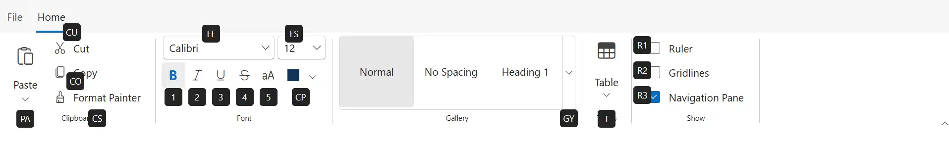
Ribbon items keytip
Keytips can be added to Ribbon items by using the KeyTip property in the RibbonItem directive.
@using Syncfusion.Blazor.Ribbon;
@using Syncfusion.Blazor.Navigations;
@using  Syncfusion.Blazor.Buttons;
@using Syncfusion.Blazor.DropDowns;
@using Syncfusion.Blazor.SplitButtons;

<div id="ribbonContainer">
    <SfRibbon ID="ribbon" EnableKeyTips="true">
        <RibbonFileMenuSettings Visible=true MenuItems="@fileMenuItems"></RibbonFileMenuSettings>
        <RibbonTabs>
            <RibbonTab HeaderText="Home" KeyTip="H">
                <RibbonGroups>
                    <RibbonGroup HeaderText="Clipboard" GroupIconCss="e-icons e-paste" KeyTip="CD">
                        <RibbonCollections>
                            <RibbonCollection>
                                <RibbonItems>
                                    <RibbonItem AllowedSizes=RibbonItemSize.Large Type=RibbonItemType.SplitButton KeyTip="PA">
                                        <RibbonTooltipSettings Title="Paste" CssClass="custom-tooltip" IconCss="e-icons e-paste" Content="Paste content here.</br> Add content on the clipboard to your document."></RibbonTooltipSettings>
                                        <RibbonSplitButtonSettings Content="Paste" IconCss="e-icons e-paste" Items="@formatItems"></RibbonSplitButtonSettings>
                                    </RibbonItem>
                                </RibbonItems>
                            </RibbonCollection>
                            <RibbonCollection>
                                <RibbonItems>
                                    <RibbonItem Type=RibbonItemType.Button KeyTip="CU">
                                        <RibbonButtonSettings Content="Cut" IconCss="e-icons e-cut"></RibbonButtonSettings>
                                    </RibbonItem>
                                    <RibbonItem Type=RibbonItemType.Button KeyTip="CO">
                                        <RibbonButtonSettings Content="Copy" IconCss="e-icons e-copy"></RibbonButtonSettings>
                                    </RibbonItem>
                                    <RibbonItem Type=RibbonItemType.Button KeyTip="CS">
                                        <RibbonButtonSettings Content="Format Painter" IconCss="e-icons e-format-painter"></RibbonButtonSettings>
                                    </RibbonItem>
                                </RibbonItems>
                            </RibbonCollection>
                        </RibbonCollections>
                    </RibbonGroup>
                    <RibbonGroup Orientation=Syncfusion.Blazor.Ribbon.Orientation.Row GroupIconCss="e-icons e-bold" EnableGroupOverflow="true" HeaderText="Font" CssClass="font-group" KeyTip="FB">
                        <RibbonCollections>
                            <RibbonCollection>
                                <RibbonItems>
                                    <RibbonItem Type=RibbonItemType.ComboBox KeyTip="FF">
                                        <RibbonComboBoxSettings AllowFiltering=true DataSource="@fontFamilyItems" @bind-Index="@fontFamIndex" Width="150px" FieldSettings="@fieldSetings"></RibbonComboBoxSettings>
                                    </RibbonItem>
                                    <RibbonItem Type=RibbonItemType.ComboBox KeyTip="FS">
                                        <RibbonComboBoxSettings DataSource="@fontSizeItems" Width="65px" PopupWidth="85px" FieldSettings="@fieldSetings" @bind-Index="@fontSizeIndex"></RibbonComboBoxSettings>
                                    </RibbonItem>
                                </RibbonItems>
                            </RibbonCollection>
                            <RibbonCollection>
                                <RibbonItems>
                                    <RibbonItem Type=RibbonItemType.GroupButton ID="formatGroup" KeyTip="GB">
                                        <RibbonGroupButtonSettings Selection=GroupButtonSelection.Single
                                                                   Items="@formatGroupItems">
                                        </RibbonGroupButtonSettings>
                                    </RibbonItem>
                                    <RibbonItem Type=RibbonItemType.ColorPicker KeyTip="CP">
                                        <RibbonColorPickerSettings @bind-Value="@colorPickerValue"></RibbonColorPickerSettings>
                                    </RibbonItem>
                                </RibbonItems>
                            </RibbonCollection>
                        </RibbonCollections>
                    </RibbonGroup>
                    <RibbonGroup GroupIconCss="e-icons e-paste" HeaderText="Gallery">
                        <RibbonCollections>
                            <RibbonCollection>
                                <RibbonItems>
                                    <RibbonItem Type=RibbonItemType.Gallery KeyTip="GY">
                                        <RibbonGallerySettings ItemCount="3" Groups="galleryGroups"></RibbonGallerySettings>
                                    </RibbonItem>
                                </RibbonItems>
                            </RibbonCollection>
                        </RibbonCollections>
                    </RibbonGroup>
                    <RibbonGroup HeaderText="Tables" GroupIconCss="e-icons e-table">
                        <RibbonCollections>
                            <RibbonCollection>
                                <RibbonItems>
                                    <RibbonItem Type=RibbonItemType.DropDown AllowedSizes="RibbonItemSize.Large" KeyTip="T">
                                        <RibbonDropDownSettings Content="Table" IconCss="e-icons e-table" Items="@tableItems"></RibbonDropDownSettings>
                                    </RibbonItem>
                                </RibbonItems>
                            </RibbonCollection>
                        </RibbonCollections>
                    </RibbonGroup>
                    <RibbonGroup HeaderText="Show" GroupIconCss="e-icons e-copy">
                        <RibbonCollections>
                            <RibbonCollection>
                                <RibbonItems>
                                    <RibbonItem Type=RibbonItemType.CheckBox KeyTip="R1">
                                        <RibbonCheckBoxSettings Label="Ruler"></RibbonCheckBoxSettings>
                                    </RibbonItem>
                                    <RibbonItem Type=RibbonItemType.CheckBox KeyTip="R2">
                                        <RibbonCheckBoxSettings Label="Gridlines"></RibbonCheckBoxSettings>
                                    </RibbonItem>
                                    <RibbonItem Type=RibbonItemType.CheckBox KeyTip="R3">
                                        <RibbonCheckBoxSettings Label="Navigation Pane" @bind-Checked="@checkedState"></RibbonCheckBoxSettings>
                                    </RibbonItem>
                                </RibbonItems>
                            </RibbonCollection>
                        </RibbonCollections>
                    </RibbonGroup>
                </RibbonGroups>
            </RibbonTab>
        </RibbonTabs>
    </SfRibbon>
</div>

@code {

    private int? fontFamIndex = 2;
    private int? fontSizeIndex = 4;
    private string colorPickerValue = "#123456";
    private bool checkedState = true;

    private class ComboBoxItem
    {
        public string Text { get; set; }
        public string Value { get; set; }
    };

    FieldSettingsModel fieldSetings = new FieldSettingsModel
    {
        Text = "Text",
        Value = "Value"
    };

    List<DropDownMenuItem> formatItems = new List<DropDownMenuItem>()
    {
        new DropDownMenuItem{ Text = "Keep Source Format" },
        new DropDownMenuItem{ Text = "Merge Format" },
        new DropDownMenuItem{ Text = "Keep Text Only" }
    };

    List<MenuItem> fileMenuItems = new List<MenuItem>()
    {
        new MenuItem { Text = "New", IconCss = "e-icons e-file-new", Id = "new" },
        new MenuItem { Text = "Open", IconCss = "e-icons e-folder-open", Id = "open" },
        new MenuItem { Text = "Rename", IconCss = "e-icons e-rename", Id = "rename" },
        new MenuItem {
            Text = "Save",
            IconCss = "e-icons e-save",
            Id = "save"
        }
    };

    List<ComboBoxItem> fontFamilyItems = new List<ComboBoxItem>
    {
        new ComboBoxItem { Text = "Algerian", Value = "Algerian" },
        new ComboBoxItem { Text = "Arial", Value = "Arial" },
        new ComboBoxItem { Text = "Calibri", Value = "Calibri" },
        new ComboBoxItem { Text = "Cambria", Value = "Cambria" },
        new ComboBoxItem { Text = "Cambria Math", Value = "Cambria Math" },
        new ComboBoxItem { Text = "Courier New", Value = "Courier New" },
        new ComboBoxItem { Text = "Candara", Value = "Candara" },
        new ComboBoxItem { Text = "Georgia", Value = "Georgia" },
        new ComboBoxItem { Text = "Impact", Value = "Impact" },
        new ComboBoxItem { Text = "Segoe Print", Value = "Segoe Print" },
        new ComboBoxItem { Text = "Segoe Script", Value = "Segoe Script" },
        new ComboBoxItem { Text = "Segoe UI", Value = "Segoe UI" },
        new ComboBoxItem { Text = "Symbol", Value = "Symbol" },
        new ComboBoxItem { Text = "Times New Roman", Value = "Times New Roman" },
        new ComboBoxItem { Text = "Verdana", Value = "Verdana" },
        new ComboBoxItem { Text = "Windings", Value = "Windings" }
    };

    List<ComboBoxItem> fontSizeItems = new List<ComboBoxItem>
    {
        new ComboBoxItem { Text = "8", Value = "8" },
        new ComboBoxItem { Text = "9", Value = "9" },
        new ComboBoxItem { Text = "10", Value = "10" },
        new ComboBoxItem { Text = "11", Value = "11" },
        new ComboBoxItem { Text = "12", Value = "12" },
        new ComboBoxItem { Text = "14", Value = "14" },
        new ComboBoxItem { Text = "16", Value = "16" },
        new ComboBoxItem { Text = "18", Value = "18" },
        new ComboBoxItem { Text = "20", Value = "20" },
        new ComboBoxItem { Text = "22", Value = "22" },
        new ComboBoxItem { Text = "24", Value = "24" },
        new ComboBoxItem { Text = "26", Value = "26" },
        new ComboBoxItem { Text = "28", Value = "28" },
        new ComboBoxItem { Text = "36", Value = "36" },
        new ComboBoxItem { Text = "48", Value = "48" },
        new ComboBoxItem { Text = "72", Value = "72" },
        new ComboBoxItem { Text = "96", Value = "96" }
    };

    List<GroupButtonItem> formatGroupItems = new List<GroupButtonItem>
    {
        new GroupButtonItem
        {
            IconCss = "e-icons e-bold",
            Selected = true,
            Content = "Bold",
            KeyTip="1"
        },
        new GroupButtonItem
        {
            IconCss = "e-icons e-italic",
            Content = "Italic",
            KeyTip="2"
        },
        new GroupButtonItem
        {
            IconCss = "e-icons e-underline",
            Content = "Underline",
            KeyTip="3"
        },
        new GroupButtonItem
        {
            IconCss = "e-icons e-strikethrough",
            Content = "Strikethrough",
            KeyTip="4"
        },
        new GroupButtonItem
        {
            IconCss = "e-icons e-change-case",
            Content = "Change Case",
            KeyTip="5"
        },
    };

    List<GalleryGroup> galleryGroups = new List<GalleryGroup>
    {
        new GalleryGroup
        {
            Header = "Styles",
            ItemWidth = "100",
            Items = new List<GalleryItem>
            {
                new GalleryItem { Content = "Normal" },
                new GalleryItem { Content = "No Spacing" },
                new GalleryItem { Content = "Heading 1" },
                new GalleryItem { Content = "Heading 2" },
                new GalleryItem { Content = "Heading 3" },
                new GalleryItem { Content = "Heading 4" },
                new GalleryItem { Content = "Heading 5" }
            }
        }
    };

    List<DropDownMenuItem> tableItems = new List<DropDownMenuItem>()
    {
        new DropDownMenuItem{ Text = "Insert Table" },
        new DropDownMenuItem{ Text = "Draw Table" },
        new DropDownMenuItem{ Text = "Convert Table" },
        new DropDownMenuItem{ Text = "Excel SpreadSheet" }
    };
}
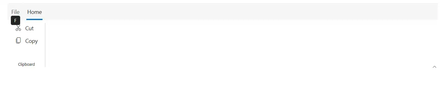
File menu keytip
A keytip can be added to the File menu by using the KeyTip property.
@using Syncfusion.Blazor.Ribbon;
@using Syncfusion.Blazor.Navigations;
@using  Syncfusion.Blazor.Buttons;
@using Syncfusion.Blazor.DropDowns;
@using Syncfusion.Blazor.SplitButtons;

<div id="ribbonContainer">
    <SfRibbon ID="ribbon" EnableKeyTips="true">
        <RibbonFileMenuSettings Visible=true MenuItems="@fileMenuItems" KeyTip="F"></RibbonFileMenuSettings>
        <RibbonTabs>
            <RibbonTab HeaderText="Home">
                <RibbonGroups>
                    <RibbonGroup HeaderText="Clipboard">
                        <RibbonCollections>
                            <RibbonCollection>
                                <RibbonItems>
                                    <RibbonItem Type=RibbonItemType.SplitButton AllowedSizes="RibbonItemSize.Large">
                                        <RibbonSplitButtonSettings Content="Paste" IconCss="e-icons e-paste" Items="@formatItems"></RibbonSplitButtonSettings>
                                    </RibbonItem>
                                </RibbonItems>
                                <RibbonItems>
                                    <RibbonItem Type=RibbonItemType.Button>
                                        <RibbonButtonSettings Content="Cut" IconCss="e-icons e-cut"></RibbonButtonSettings>
                                    </RibbonItem>
                                    <RibbonItem Type=RibbonItemType.Button>
                                        <RibbonButtonSettings Content="Copy" IconCss="e-icons e-copy"></RibbonButtonSettings>
                                    </RibbonItem>
                                </RibbonItems>
                            </RibbonCollection>
                        </RibbonCollections>
                    </RibbonGroup>
                </RibbonGroups>
            </RibbonTab>
        </RibbonTabs>
    </SfRibbon>
</div>

@code {

    List<DropDownMenuItem> formatItems = new List<DropDownMenuItem>()
    {
        new DropDownMenuItem{ Text = "Keep Source Format" },
        new DropDownMenuItem{ Text = "Merge Format" },
        new DropDownMenuItem{ Text = "Keep Text Only" }
    };

    List<MenuItem> fileMenuItems = new List<MenuItem>()
    {
        new MenuItem { Text = "New", IconCss = "e-icons e-file-new", Id = "new" },
        new MenuItem { Text = "Open", IconCss = "e-icons e-folder-open", Id = "open" },
        new MenuItem { Text = "Rename", IconCss = "e-icons e-rename", Id = "rename" },
        new MenuItem {
            Text = "Save",
            IconCss = "e-icons e-save",
            Id = "save",
        }
    };
}
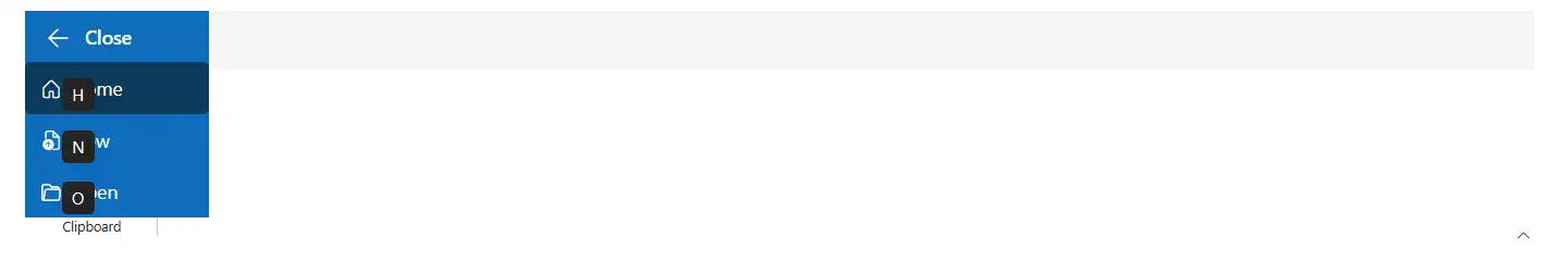
Backstage menu keytip
Keytips can be added for the backstage button and menu items by using the KeyTip property.
@using Syncfusion.Blazor.Ribbon;
@using Syncfusion.Blazor.Navigations;
@using  Syncfusion.Blazor.Buttons;
@using Syncfusion.Blazor.DropDowns;
@using Syncfusion.Blazor.SplitButtons;

<div id="ribbonContainer">
    <SfRibbon ID="ribbon" EnableKeyTips="true">
        <RibbonBackstageMenuSettings KeyTip="F" Visible="true" BackButtonSettings="@backStageBackButton">
            <BackstageMenuItems>
                <BackstageMenuItem KeyTip="H" ID="home" Text="Home" IconCss="e-icons e-home"></BackstageMenuItem>
                <BackstageMenuItem KeyTip="N" ID="new" Text="New" IconCss="e-icons e-file-new"></BackstageMenuItem>
                <BackstageMenuItem KeyTip="O" ID="open" Text="Open" IconCss="e-icons e-folder-open"></BackstageMenuItem>
            </BackstageMenuItems>
        </RibbonBackstageMenuSettings>
        <RibbonTabs>
            <RibbonTab HeaderText="Home">
                <RibbonGroups>
                    <RibbonGroup HeaderText="Clipboard">
                        <RibbonCollections>
                            <RibbonCollection>
                                <RibbonItems>
                                    <RibbonItem Type=RibbonItemType.SplitButton AllowedSizes="RibbonItemSize.Large">
                                        <RibbonSplitButtonSettings Content="Paste" IconCss="e-icons e-paste" Items="@formatItems"></RibbonSplitButtonSettings>
                                    </RibbonItem>
                                </RibbonItems>
                                <RibbonItems>
                                    <RibbonItem Type=RibbonItemType.Button>
                                        <RibbonButtonSettings Content="Cut" IconCss="e-icons e-cut"></RibbonButtonSettings>
                                    </RibbonItem>
                                    <RibbonItem Type=RibbonItemType.Button>
                                        <RibbonButtonSettings Content="Copy" IconCss="e-icons e-copy"></RibbonButtonSettings>
                                    </RibbonItem>
                                </RibbonItems>
                            </RibbonCollection>
                        </RibbonCollections>
                    </RibbonGroup>
                </RibbonGroups>
            </RibbonTab>
        </RibbonTabs>
    </SfRibbon>
</div>

@code {

    List<DropDownMenuItem> formatItems = new List<DropDownMenuItem>()
    {
        new DropDownMenuItem{ Text = "Keep Source Format" },
        new DropDownMenuItem{ Text = "Merge Format" },
        new DropDownMenuItem{ Text = "Keep Text Only" }
    };

    BackstageBackButtonSettings backStageBackButton = new BackstageBackButtonSettings
        {
            Text = "Close",
            IconCss = "e-icons e-arrow-left",
            Visible = true
        };
}
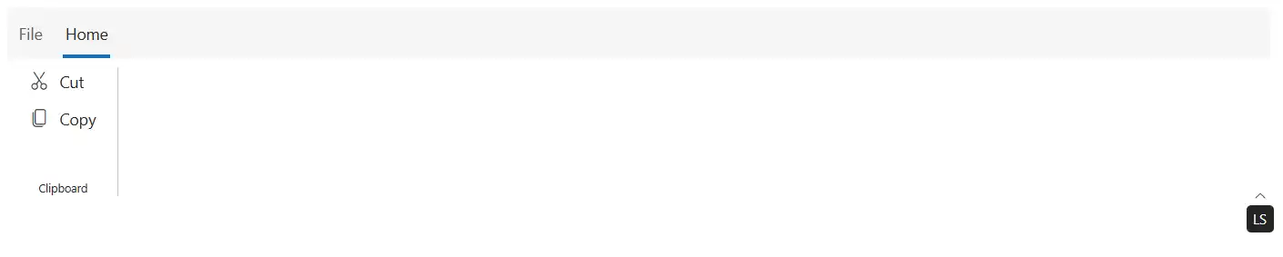
Ribbon layout switcher keytip
A keytip can be added to the layout switcher by using the LayoutSwitcherKeyTip property to switch between the Classic and Simplified Ribbon layouts.
@using Syncfusion.Blazor.Ribbon;
@using Syncfusion.Blazor.Navigations;
@using  Syncfusion.Blazor.Buttons;
@using Syncfusion.Blazor.DropDowns;
@using Syncfusion.Blazor.SplitButtons;

<div id="ribbonContainer">
    <SfRibbon ID="ribbon" EnableKeyTips="true" LayoutSwitcherKeyTip="LS">
        <RibbonFileMenuSettings Visible=true MenuItems="@fileMenuItems"></RibbonFileMenuSettings>
        <RibbonTabs>
            <RibbonTab HeaderText="Home">
                <RibbonGroups>
                    <RibbonGroup HeaderText="Clipboard">
                        <RibbonCollections>
                            <RibbonCollection>
                                <RibbonItems>
                                    <RibbonItem Type=RibbonItemType.SplitButton AllowedSizes="RibbonItemSize.Large">
                                        <RibbonSplitButtonSettings Content="Paste" IconCss="e-icons e-paste" Items="@formatItems"></RibbonSplitButtonSettings>
                                    </RibbonItem>
                                </RibbonItems>
                                <RibbonItems>
                                    <RibbonItem Type=RibbonItemType.Button>
                                        <RibbonButtonSettings Content="Cut" IconCss="e-icons e-cut"></RibbonButtonSettings>
                                    </RibbonItem>
                                    <RibbonItem Type=RibbonItemType.Button>
                                        <RibbonButtonSettings Content="Copy" IconCss="e-icons e-copy"></RibbonButtonSettings>
                                    </RibbonItem>
                                </RibbonItems>
                            </RibbonCollection>
                        </RibbonCollections>
                    </RibbonGroup>
                </RibbonGroups>
            </RibbonTab>
        </RibbonTabs>
    </SfRibbon>
</div>

@code {

    List<DropDownMenuItem> formatItems = new List<DropDownMenuItem>()
    {
        new DropDownMenuItem{ Text = "Keep Source Format" },
        new DropDownMenuItem{ Text = "Merge Format" },
        new DropDownMenuItem{ Text = "Keep Text Only" }
    };

    List<MenuItem> fileMenuItems = new List<MenuItem>()
    {
        new MenuItem { Text = "New", IconCss = "e-icons e-file-new", Id = "new" },
        new MenuItem { Text = "Open", IconCss = "e-icons e-folder-open", Id = "open" },
        new MenuItem { Text = "Rename", IconCss = "e-icons e-rename", Id = "rename" },
        new MenuItem {
            Text = "Save",
            IconCss = "e-icons e-save",
            Id = "save",
        }
    };
}
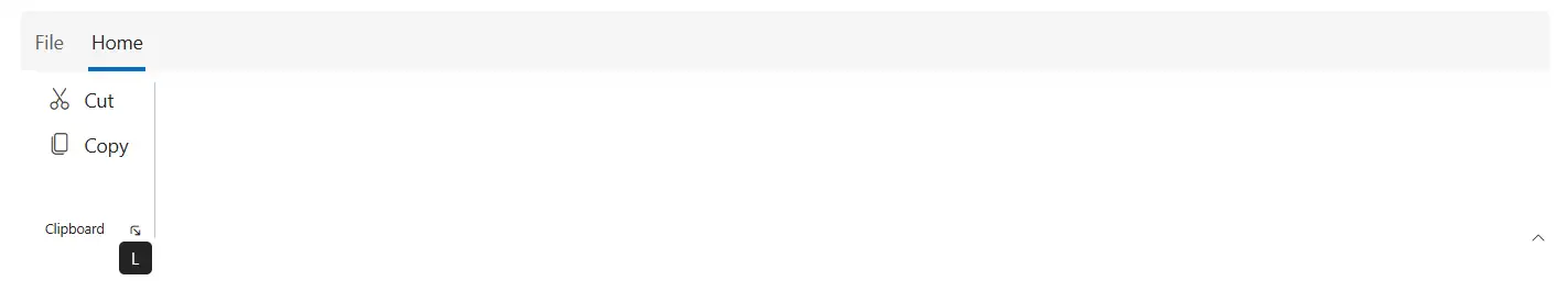
Ribbon launcher icon keytip
A keytip can be added to the launcher icon by using the LauncherIconKeyTip property to quickly open additional options in Ribbon groups.
@using Syncfusion.Blazor.Ribbon;
@using Syncfusion.Blazor.Navigations;
@using  Syncfusion.Blazor.Buttons;
@using Syncfusion.Blazor.DropDowns;
@using Syncfusion.Blazor.SplitButtons;


<div id="ribbonContainer">
    <SfRibbon ID="ribbon" EnableKeyTips="true">
        <RibbonFileMenuSettings Visible=true MenuItems="@fileMenuItems"></RibbonFileMenuSettings>
        <RibbonTabs>
            <RibbonTab HeaderText="Home" KeyTip="H">
                <RibbonGroups>
                    <RibbonGroup HeaderText="Clipboard" ShowLauncherIcon="true" LauncherIconKeyTip="L">
                        <RibbonCollections>
                            <RibbonCollection>
                                <RibbonItems>
                                    <RibbonItem Type=RibbonItemType.SplitButton AllowedSizes="RibbonItemSize.Large">
                                        <RibbonSplitButtonSettings Content="Paste" IconCss="e-icons e-paste" Items="@formatItems"></RibbonSplitButtonSettings>
                                    </RibbonItem>
                                </RibbonItems>
                                <RibbonItems>
                                    <RibbonItem Type=RibbonItemType.Button>
                                        <RibbonButtonSettings Content="Cut" IconCss="e-icons e-cut"></RibbonButtonSettings>
                                    </RibbonItem>
                                    <RibbonItem Type=RibbonItemType.Button>
                                        <RibbonButtonSettings Content="Copy" IconCss="e-icons e-copy"></RibbonButtonSettings>
                                    </RibbonItem>
                                </RibbonItems>
                            </RibbonCollection>
                        </RibbonCollections>
                    </RibbonGroup>
                </RibbonGroups>
            </RibbonTab>
        </RibbonTabs>
    </SfRibbon>
</div>

@code {

    List<DropDownMenuItem> formatItems = new List<DropDownMenuItem>()
    {
        new DropDownMenuItem{ Text = "Keep Source Format" },
        new DropDownMenuItem{ Text = "Merge Format" },
        new DropDownMenuItem{ Text = "Keep Text Only" }
    };

    List<MenuItem> fileMenuItems = new List<MenuItem>()
    {
        new MenuItem { Text = "New", IconCss = "e-icons e-file-new", Id = "new" },
        new MenuItem { Text = "Open", IconCss = "e-icons e-folder-open", Id = "open" },
        new MenuItem { Text = "Rename", IconCss = "e-icons e-rename", Id = "rename" },
        new MenuItem {
            Text = "Save",
            IconCss = "e-icons e-save",
            Id = "save",
        }
    };
}
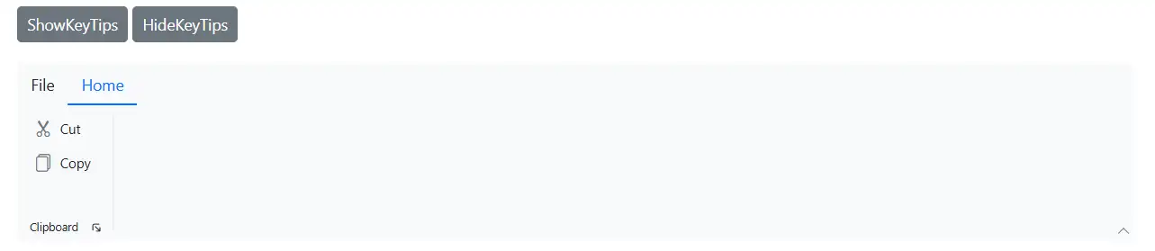
Methods
Show keytips
The ShowKeyTipsAsync method displays keytips dynamically for the Ribbon.
- To activate a specific key action, pass the corresponding keytip string as an argument.
- For example, calling
ShowKeyTipsAsync('H')will look for the specific item associated with the H key and trigger its respective action.
Hide keytips
The HideKeyTipsAsync method removes all visible keytips from the Ribbon dynamically.
@using Syncfusion.Blazor.Ribbon;
@using  Syncfusion.Blazor.Buttons;
@using Syncfusion.Blazor.DropDowns;
@using Syncfusion.Blazor.Navigations;
@using Syncfusion.Blazor.SplitButtons;

<div id="ribbonContainer">
    <SfButton @onclick="handleShowKeyTips">ShowKeyTips</SfButton>
    <SfButton @onclick="handleHideKeyTips">HideKeyTips</SfButton> <br/><br/>
    <SfRibbon ID="ribbon" EnableKeyTips="true" @ref="ribbon">
        <RibbonFileMenuSettings Visible=true MenuItems="@fileMenuItems"></RibbonFileMenuSettings>
        <RibbonTabs>
            <RibbonTab HeaderText="Home" KeyTip="H">
                <RibbonGroups>
                    <RibbonGroup HeaderText="Clipboard" ShowLauncherIcon="true" LauncherIconKeyTip="L">
                        <RibbonCollections>
                            <RibbonCollection>
                                <RibbonItems>
                                    <RibbonItem Type=RibbonItemType.SplitButton AllowedSizes="RibbonItemSize.Large" KeyTip="V">
                                        <RibbonSplitButtonSettings Content="Paste" IconCss="e-icons e-paste" Items="@formatItems"></RibbonSplitButtonSettings>
                                    </RibbonItem>
                                </RibbonItems>
                                <RibbonItems>
                                    <RibbonItem Type=RibbonItemType.Button KeyTip="X">
                                        <RibbonButtonSettings Content="Cut" IconCss="e-icons e-cut"></RibbonButtonSettings>
                                    </RibbonItem>
                                    <RibbonItem Type=RibbonItemType.Button KeyTip="C">
                                        <RibbonButtonSettings Content="Copy" IconCss="e-icons e-copy"></RibbonButtonSettings>
                                    </RibbonItem>
                                </RibbonItems>
                            </RibbonCollection>
                        </RibbonCollections>
                    </RibbonGroup>
                </RibbonGroups>
            </RibbonTab>
        </RibbonTabs>
    </SfRibbon>
</div>

@code {

    SfRibbon ribbon;

    private async Task handleShowKeyTips()
    {
        await ribbon.ShowKeyTipsAsync();
    }
    private async Task handleHideKeyTips()
    {
        await ribbon.HideKeyTipsAsync();
    }

    List<DropDownMenuItem> formatItems = new List<DropDownMenuItem>()
    {
        new DropDownMenuItem{ Text = "Keep Source Format" },
        new DropDownMenuItem{ Text = "Merge Format" },
        new DropDownMenuItem{ Text = "Keep Text Only" }
    };

    List<MenuItem> fileMenuItems = new List<MenuItem>()
    {
        new MenuItem { Text = "New", IconCss = "e-icons e-file-new", Id = "new" },
        new MenuItem { Text = "Open", IconCss = "e-icons e-folder-open", Id = "open" },
        new MenuItem { Text = "Rename", IconCss = "e-icons e-rename", Id = "rename" },
        new MenuItem {
            Text = "Save",
            IconCss = "e-icons e-save",
            Id = "save",
        }
    };
}
Guidelines for adding keytips
Before adding keytips to Ribbon items, follow these best practices:
- Avoid assigning the same keytip to multiple items.
Each keytip must be unique. If multiple items share the same keytip (for example,
HorHF), only the first occurrence is activated; subsequent items using the same keytip are ignored.
- Do not use the same first letter for single- and multi-character keytips on different items.
When using multi-character keytips (for example,
F,FP, andFPF) for different items, pressingFactivates only the first-level keytip (F), andFPandFPFare ignored.