Tooltip in Blazor Ribbon component
30 Jun 202614 minutes to read
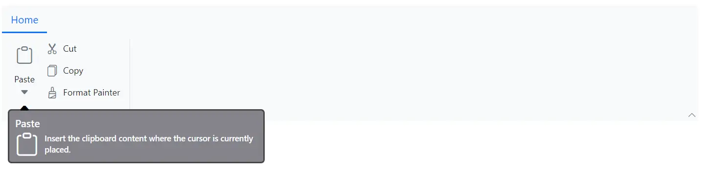
The Ribbon component supports tooltip to show additional information in the Ribbon items. The tooltip appears when the user hovers over a Ribbon item. The tooltip can be configured using the TooltipSettings property within the RibbonItem directive.
Adding Title
You can use the Title property to set the tooltip title for each Ribbon item.
Adding Content
You can use the Content property to set the tooltip content for each Ribbon item.
Adding Icon
You can use the IconCss property to specify the icons to be displayed in the tooltip.
Below example demonstrates on how to configure Title, Content and IconCss in the TooltipSettings property.
@using Syncfusion.Blazor.Ribbon;
@using Syncfusion.Blazor.SplitButtons;

<div style="width:75%">
    <SfRibbon>
        <RibbonTabs>
            <RibbonTab HeaderText="Home">
                <RibbonGroups>
                    <RibbonGroup HeaderText="Clipboard">
                        <RibbonCollections>
                            <RibbonCollection>
                                <RibbonItems>
                                    <RibbonItem Type=RibbonItemType.SplitButton TooltipSettings="splitBtnTooltip">
                                        <RibbonSplitButtonSettings Content="Paste" IconCss="e-icons e-paste" Items="@formatItems"></RibbonSplitButtonSettings>
                                    </RibbonItem>
                                </RibbonItems>
                            </RibbonCollection>
                            <RibbonCollection>
                                <RibbonItems>
                                    <RibbonItem Type=RibbonItemType.Button TooltipSettings="cutBtnTooltip">
                                        <RibbonButtonSettings Content="Cut" IconCss="e-icons e-cut"></RibbonButtonSettings>
                                    </RibbonItem>
                                    <RibbonItem Type=RibbonItemType.Button>
                                        <RibbonButtonSettings Content="Copy" IconCss="e-icons e-copy"></RibbonButtonSettings>
                                    </RibbonItem>
                                    <RibbonItem Type=RibbonItemType.Button>
                                        <RibbonButtonSettings Content="Format Painter" IconCss="e-icons e-format-painter"></RibbonButtonSettings>
                                    </RibbonItem>
                                </RibbonItems>
                            </RibbonCollection>
                        </RibbonCollections>
                    </RibbonGroup>
                </RibbonGroups>
            </RibbonTab>
        </RibbonTabs>
    </SfRibbon>
</div>

@code {
    RibbonTooltipSettings splitBtnTooltip = new()
        {
            Title = "Paste",
            Content = "Insert the clipboard content where the cursor is currently placed.",
            IconCss = "e-icons e-paste"
        };

    RibbonTooltipSettings cutBtnTooltip = new()
        {
            Title = "Cut",
            Content = "Places the selected text or object on the clipboard so that you can paste it somewhere else.",
            IconCss = "e-icons e-cut"
        };

    List<DropDownMenuItem> formatItems = new List<DropDownMenuItem>()
        {
        new DropDownMenuItem{ Text = "Keep Source Format" },
        new DropDownMenuItem{ Text = "Merge Format" },
        new DropDownMenuItem{ Text = "Keep Text Only" }
        };
}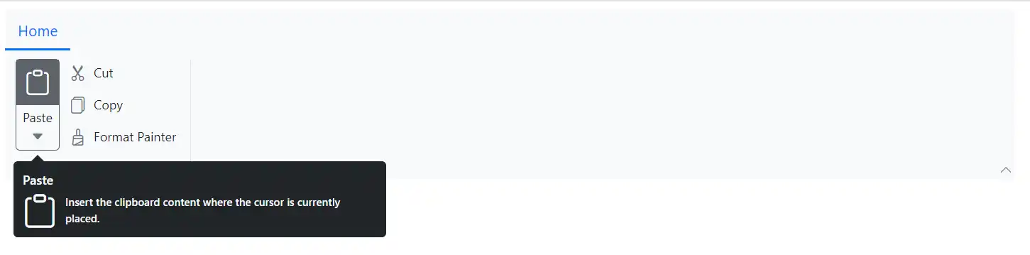
Customization
You can use the CssClass property to customize the appearance of the tooltip with your own custom styles.
@using Syncfusion.Blazor.Ribbon;
@using Syncfusion.Blazor.SplitButtons;

<div style="width:75%">
    <SfRibbon>
        <RibbonTabs>
            <RibbonTab HeaderText="Home">
                <RibbonGroups>
                    <RibbonGroup HeaderText="Clipboard">
                        <RibbonCollections>
                            <RibbonCollection>
                                <RibbonItems>
                                    <RibbonItem Type=RibbonItemType.SplitButton TooltipSettings="splitBtnTooltip">
                                        <RibbonSplitButtonSettings Content="Paste" IconCss="e-icons e-paste" Items="@formatItems"></RibbonSplitButtonSettings>
                                    </RibbonItem>
                                </RibbonItems>
                            </RibbonCollection>
                            <RibbonCollection>
                                <RibbonItems>
                                    <RibbonItem Type=RibbonItemType.Button TooltipSettings="cutBtnTooltip">
                                        <RibbonButtonSettings Content="Cut" IconCss="e-icons e-cut"></RibbonButtonSettings>
                                    </RibbonItem>
                                    <RibbonItem Type=RibbonItemType.Button>
                                        <RibbonButtonSettings Content="Copy" IconCss="e-icons e-copy"></RibbonButtonSettings>
                                    </RibbonItem>
                                    <RibbonItem Type=RibbonItemType.Button>
                                        <RibbonButtonSettings Content="Format Painter" IconCss="e-icons e-format-painter"></RibbonButtonSettings>
                                    </RibbonItem>
                                </RibbonItems>
                            </RibbonCollection>
                        </RibbonCollections>
                    </RibbonGroup>
                </RibbonGroups>
            </RibbonTab>
        </RibbonTabs>
    </SfRibbon>
</div>

@code {
    RibbonTooltipSettings splitBtnTooltip = new()
        {
            Title = "Paste",
            Content = "Insert the clipboard content where the cursor is currently placed.",
            IconCss = "e-icons e-paste",
            CssClass = "custom-tooltip"
        };

    RibbonTooltipSettings cutBtnTooltip = new()
        {
            Title = "Cut",
            Content = "Places the selected text or object on the clipboard so that you can paste it somewhere else.",
            IconCss = "e-icons e-cut",
            CssClass = "custom-tooltip"
        };

    List<DropDownMenuItem> formatItems = new List<DropDownMenuItem>()
        {
        new DropDownMenuItem{ Text = "Keep Source Format" },
        new DropDownMenuItem{ Text = "Merge Format" },
        new DropDownMenuItem{ Text = "Keep Text Only" }
        };
}

<style>
    :root {
        --borderColor: rgb(72, 72, 72);
    }

    /* To customize the appearance of the tooltip */
    .custom-tooltip.e-ribbon-tooltip.e-popup {
        border: 2px solid var(--borderColor);
        border-radius: 5px;
        background: #84848a;
    }

    /* To customize the arrow of the tooltip */
    .custom-tooltip.e-ribbon-tooltip .e-arrow-tip .e-arrow-tip-inner.e-tip-top,
    .custom-tooltip.e-ribbon-tooltip .e-arrow-tip .e-arrow-tip-inner.e-tip-bottom {
        color: #000000;
    }

    .custom-tooltip.e-ribbon-tooltip .e-arrow-tip-outer.e-tip-top {
        border-bottom: 8px solid var(--borderColor);
    }

    .custom-tooltip.e-ribbon-tooltip .e-arrow-tip-outer.e-tip-bottom {
        border-top: 8px solid var(--borderColor);
    }

    /* To change the size of the tooltip title */
    .custom-tooltip.e-ribbon-tooltip .e-tip-content .e-ribbon-tooltip-title {
        font-size: 14px;
    }

    /* To change the size of the tooltip content */
    .custom-tooltip.e-ribbon-tooltip .e-tip-content .e-ribbon-text-container .e-ribbon-tooltip-content {
        font-size: 11px;
    }
</style>