Cell Customizations in Blazor Scheduler Component
30 Jun 202618 minutes to read
The cells of the Scheduler can be easily customized using the cell template.
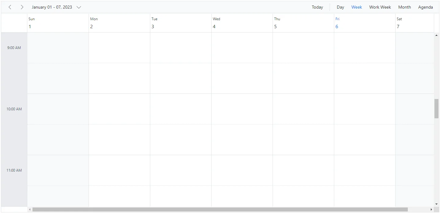
Setting cell dimensions in Vertical Views
The height and width of the Scheduler cells can be customized either to increase or reduce its size through the CssClass property, which overrides the default CSS applied on cells of vertical views.
@using Syncfusion.Blazor.Schedule

<SfSchedule TValue="AppointmentData" CssClass="schedule-cell-dimension" Height="550px">
    <ScheduleViews>
        <ScheduleView Option="View.Day"></ScheduleView>
        <ScheduleView Option="View.Week"></ScheduleView>
        <ScheduleView Option="View.WorkWeek"></ScheduleView>
        <ScheduleView Option="View.Month"></ScheduleView>
        <ScheduleView Option="View.Agenda"></ScheduleView>
    </ScheduleViews>
</SfSchedule>

<style>
    .schedule-cell-dimension.e-schedule .e-vertical-view .e-date-header-wrap table col,
    .schedule-cell-dimension.e-schedule .e-vertical-view .e-content-wrap table col {
        width: 200px;
    }

    .schedule-cell-dimension.e-schedule .e-vertical-view .e-time-cells-wrap table td,
    .schedule-cell-dimension.e-schedule .e-vertical-view .e-work-cells {
        height: 100px;
    }

    .schedule-cell-dimension.e-schedule .e-month-view .e-work-cells,
    .schedule-cell-dimension.e-schedule .e-month-view .e-date-header-wrap table col {
        width: 200px;
    }

    .schedule-cell-dimension.e-schedule .e-month-view .e-work-cells {
        height: 200px;
    }
</style>
@code{
    public class AppointmentData
    {
        public int Id { get; set; }
        public string Subject { get; set; }
        public string Location { get; set; }
        public DateTime StartTime { get; set; }
        public DateTime EndTime { get; set; }
        public string Description { get; set; }
        public bool IsAllDay { get; set; }
        public string RecurrenceRule { get; set; }
        public string RecurrenceException { get; set; }
        public Nullable<int> RecurrenceID { get; set; }
    }
}
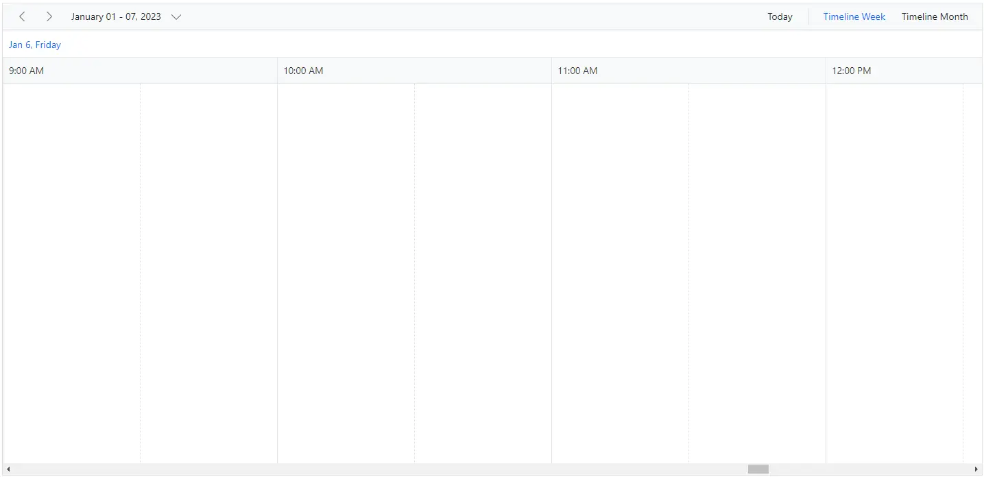
Setting cell dimensions in Timeline Views
The height and width of the Scheduler cells can be customized either to increase or reduce its size through the CssClass property, which overrides the default CSS applied on cells of timeline views.
@using Syncfusion.Blazor.Schedule

<SfSchedule TValue="AppointmentData" CssClass="schedule-cell-dimension" Height="550px">
    <ScheduleViews>
        <ScheduleView Option="View.TimelineWeek" MaxEventsPerRow="10"></ScheduleView>
        <ScheduleView Option="View.TimelineMonth" MaxEventsPerRow="10"></ScheduleView>
    </ScheduleViews>
</SfSchedule>

<style>
    .schedule-cell-dimension.e-schedule .e-timeline-view .e-date-header-wrap table col,
    .schedule-cell-dimension.e-schedule .e-timeline-view .e-content-wrap table col {
        width: 200px;
    }

    .schedule-cell-dimension.e-schedule .e-timeline-month-view .e-date-header-wrap table col,
    .schedule-cell-dimension.e-schedule .e-timeline-month-view .e-content-wrap table col {
        width: 200px;
    }
</style>
@code{
    public class AppointmentData
    {
        public int Id { get; set; }
        public string Subject { get; set; }
        public string Location { get; set; }
        public DateTime StartTime { get; set; }
        public DateTime EndTime { get; set; }
        public string Description { get; set; }
        public bool IsAllDay { get; set; }
        public string RecurrenceRule { get; set; }
        public string RecurrenceException { get; set; }
        public Nullable<int> RecurrenceID { get; set; }
    }
}
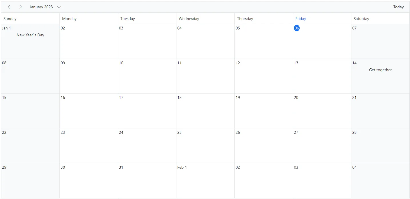
Customizing cells using CellTemplate
The CellTemplate is used to customize the cell background with specific images or appropriate text on the given date values.
@using Syncfusion.Blazor.Schedule

<SfSchedule TValue="AppointmentData" Width="100%" Height="650px" @bind-SelectedDate="@CurrentDate">
    <ScheduleTemplates>
        <CellTemplate>
            <div class="templatewrap">
                @{
                    @if ((int)(context as TemplateContext).Date.Month == 11 && (int)(context as TemplateContext).Date.Day == 23)
                    {
                        <div class="caption">Thanksgiving day</div>
                    }
                    @if ((int)(context as TemplateContext).Date.Month == 12 && (int)(context as TemplateContext).Date.Day == 9)
                    {
                        <div class="caption">Party time</div>
                    }
                    @if ((int)(context as TemplateContext).Date.Month == 12 && (int)(context as TemplateContext).Date.Day == 13)
                    {
                        <div class="caption">Party time</div>
                    }
                    @if ((int)(context as TemplateContext).Date.Month == 12 && (int)(context as TemplateContext).Date.Day == 22)
                    {
                        <div class="caption">Happy birthday</div>
                    }
                    @if ((int)(context as TemplateContext).Date.Month == 12 && (int)(context as TemplateContext).Date.Day == 24)
                    {
                        <div class="caption">Christmas Eve</div>
                    }
                    @if ((int)(context as TemplateContext).Date.Month == 12 && (int)(context as TemplateContext).Date.Day == 25)
                    {
                        <div class="caption">Christmas day</div>
                    }
                    @if ((int)(context as TemplateContext).Date.Month == 1 && (int)(context as TemplateContext).Date.Day == 1)
                    {
                        <div class="caption">New Year"s Day</div>
                    }
                    @if ((int)(context as TemplateContext).Date.Month == 1 && (int)(context as TemplateContext).Date.Day == 14)
                    {
                        <div class="caption">Get together</div>
                    }
                }
            </div>
        </CellTemplate>
    </ScheduleTemplates>
    <ScheduleViews>
        <ScheduleView Option="View.Month" MaxEventsPerRow="2"></ScheduleView>
    </ScheduleViews>
</SfSchedule>
<style>
    .e-schedule .e-month-view .e-work-cells {
        position: relative;
    }

    .e-schedule .templatewrap {
        text-align: center;
        position: absolute;
        width: 100%;
    }

    .e-schedule .caption {
        overflow: hidden;
        text-overflow: ellipsis;
        vertical-align: middle;
    }
</style>

@code {
    DateTime CurrentDate = new DateTime(2023, 1, 15);
    public class AppointmentData
    {
        public int Id { get; set; }
        public string Subject { get; set; }
        public string Location { get; set; }
        public DateTime StartTime { get; set; }
        public DateTime EndTime { get; set; }
        public string Description { get; set; }
        public bool IsAllDay { get; set; }
        public string RecurrenceRule { get; set; }
        public string RecurrenceException { get; set; }
        public Nullable<int> RecurrenceID { get; set; }
    }
}
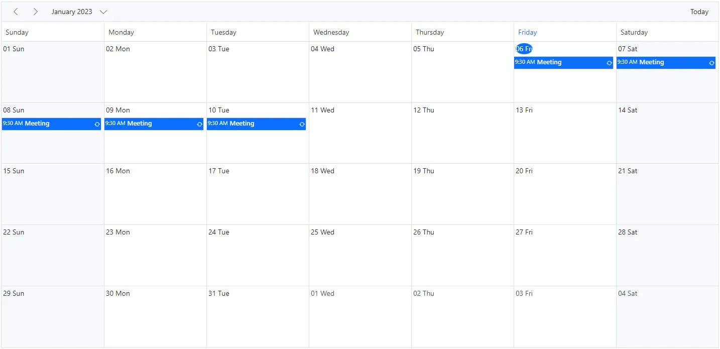
Customizing cell header in month view
The month header of each date cell in the month view can be customized using the CellHeaderTemplate
@using Syncfusion.Blazor.Schedule
@using System.Globalization
<SfSchedule TValue="AppointmentData" Width="100%" Height="650px" @bind-SelectedDate="@CurrentDate">
    <ScheduleTemplates>
        <CellHeaderTemplate>
            <div>@context.Date.ToString("dd ddd", CultureInfo.InvariantCulture)</div>
        </CellHeaderTemplate>
    </ScheduleTemplates>
    <ScheduleEventSettings DataSource="@DataSource"></ScheduleEventSettings>
    <ScheduleViews>
        <ScheduleView Option="View.Month"></ScheduleView>
    </ScheduleViews>
</SfSchedule>
@code {
    private DateTime CurrentDate = new DateTime(2023, 1, 6);
    List<AppointmentData> DataSource = new List<AppointmentData>
    {
        new AppointmentData { Id = 1, Subject = "Meeting", StartTime = new DateTime(2023, 1, 6, 9, 30, 0) , EndTime = new DateTime(2023, 1, 6, 11, 0, 0),
        RecurrenceRule = "FREQ=DAILY;INTERVAL=1;COUNT=5" }
    };
    public class AppointmentData
    {
        public int Id { get; set; }
        public string Subject { get; set; }
        public DateTime StartTime { get; set; }
        public DateTime EndTime { get; set; }
        public bool IsAllDay { get; set; }
        public string RecurrenceRule { get; set; }
        public Nullable<int> RecurrenceID { get; set; }
        public string RecurrenceException { get; set; }
    }
}
Customizing cells using OnRenderCell event
The cells can also be customized by using OnRenderCell event. In the OnRenderCell, the argument RenderCellEventArgs returns the ElementType as WorkCells and AllDayCells when the cell is rendering.
@using Syncfusion.Blazor.Schedule

<SfSchedule TValue="AppointmentData" Width="100%" Height="550px" @bind-SelectedDate="@CurrentDate">
    <ScheduleEvents TValue="AppointmentData" OnRenderCell="OnRenderCell"></ScheduleEvents>
    <ScheduleEventSettings DataSource="@DataSource"></ScheduleEventSettings>
    <ScheduleViews>
        <ScheduleView Option="View.Day"></ScheduleView>
        <ScheduleView Option="View.Week"></ScheduleView>
        <ScheduleView Option="View.WorkWeek"></ScheduleView>
        <ScheduleView Option="View.Month"></ScheduleView>
        <ScheduleView Option="View.Agenda"></ScheduleView>
    </ScheduleViews>
</SfSchedule>
<style>
    .e-schedule .e-vertical-view .e-work-hours.custom-class {
        background-color: ivory;
    }
</style>

@code{
    private DateTime CurrentDate = new DateTime(2023, 3, 10);
    public string[] CustomClass = { "custom-class" };
    public void OnRenderCell(RenderCellEventArgs args)
    {
        //Here you can customize with your code
        if (args.ElementType == ElementType.WorkCells)
        {
            args.CssClasses = new List<string>(CustomClass);//The default work hours color is changed to ivory color
        }
    }
    List<AppointmentData> DataSource = new List<AppointmentData>
    {
        new AppointmentData { Id = 1, Subject = "Meeting", StartTime = new DateTime(2023, 3, 10, 9, 30, 0) , EndTime = new DateTime(2023, 3, 10, 12, 0, 0) }
    };
    public class AppointmentData
    {
        public int Id { get; set; }
        public string Subject { get; set; }
        public string Location { get; set; }
        public DateTime StartTime { get; set; }
        public DateTime EndTime { get; set; }
        public string Description { get; set; }
        public bool IsAllDay { get; set; }
        public string RecurrenceRule { get; set; }
        public string RecurrenceException { get; set; }
        public Nullable<int> RecurrenceID { get; set; }
    }
}
Customizing the minimum and maximum date values
Providing the MinDate and MaxDate property with some date values, allows the Scheduler to set the minimum and maximum date range. The Scheduler date that lies beyond this minimum and maximum date range will be in a disabled state so that the date navigation will be blocked beyond the specified date range.
@using Syncfusion.Blazor.Schedule

<p>Setting date</p>
<SfSchedule TValue="AppointmentData" Height="650px" MinDate="new DateTime(2023, 1, 2)" MaxDate="new DateTime(2023, 1, 30)" @bind-SelectedDate="@CurrentDate">
    <ScheduleViews>
        <ScheduleView Option="View.Day"></ScheduleView>
        <ScheduleView Option="View.Week"></ScheduleView>
        <ScheduleView Option="View.WorkWeek"></ScheduleView>
        <ScheduleView Option="View.Month"></ScheduleView>
        <ScheduleView Option="View.Agenda"></ScheduleView>
    </ScheduleViews>
</SfSchedule>
@code{
    private DateTime CurrentDate = new DateTime(2023, 1, 10);
    public class AppointmentData
    {
        public int Id { get; set; }
        public string Subject { get; set; }
        public DateTime StartTime { get; set; }
        public DateTime EndTime { get; set; }
    }
}
Customizing the weekend cells background color
You can customize the background color of weekend cells by utilizing the OnRenderCell event by adding the CssClasses and checking the ElementType option within the event.
@using Syncfusion.Blazor.Schedule

<SfSchedule TValue="AppointmentData" Width="100%" Height="550px" @bind-SelectedDate="@CurrentDate" CssClass="schedule-cell-customization">
    <ScheduleEvents TValue="AppointmentData" OnRenderCell="OnRenderCell"></ScheduleEvents>
    <ScheduleEventSettings DataSource="@DataSource"></ScheduleEventSettings>
    <ScheduleViews>
        <ScheduleView Option="View.Day"></ScheduleView>
        <ScheduleView Option="View.Week"></ScheduleView>
        <ScheduleView Option="View.WorkWeek"></ScheduleView>
        <ScheduleView Option="View.Month"></ScheduleView>
        <ScheduleView Option="View.Agenda"></ScheduleView>
    </ScheduleViews>
</SfSchedule>
<style>
    .schedule-cell-customization.e-schedule .e-vertical-view .e-work-cells.custom-class {
        background-color: #ffdea2;
    }

    .schedule-cell-customization.e-schedule .e-month-view .e-work-cells:not(.e-work-days) {
        background-color: #f08080;
    }
</style>
@code {
    private DateTime CurrentDate = new DateTime(2023, 3, 10);
    public string[] CustomClass = { "custom-class" };
    public void OnRenderCell(RenderCellEventArgs args)
    {
        //Here you can customize with your code
        if (args.ElementType == ElementType.WorkCells)
        {
            if (args.Date.DayOfWeek == DayOfWeek.Sunday || args.Date.DayOfWeek == DayOfWeek.Saturday)
            {
                args.CssClasses = new List<string>(CustomClass);
            }
        }
    }
    List<AppointmentData> DataSource = new List<AppointmentData>
    {
        new AppointmentData { Id = 1, Subject = "Meeting", StartTime = new DateTime(2023, 3, 10, 9, 30, 0) , EndTime = new DateTime(2023, 3, 10, 12, 0, 0) }
    };
    public class AppointmentData
    {
        public int Id { get; set; }
        public string Subject { get; set; }
        public string Location { get; set; }
        public DateTime StartTime { get; set; }
        public DateTime EndTime { get; set; }
        public string Description { get; set; }
        public bool IsAllDay { get; set; }
        public string RecurrenceRule { get; set; }
        public string RecurrenceException { get; set; }
        public Nullable<int> RecurrenceID { get; set; }
    }
}
And, the background color for weekend cells in the Month view through the CssClass property, which overrides the default CSS applied on cells.
.schedule-cell-customization.e-schedule .e-month-view .e-work-cells:not(.e-work-days) {
    background-color: #f08080;
}
How to disable multiple cell and row selection in Schedule
By default, the AllowMultiCellSelection and AllowMultiRowSelection properties of the Schedule are set to true that allows user to select multiple cells and rows. If you want disable the multiple cell/row selection, you can disable the AllowMultiCellSelection and AllowMultiRowSelection properties.
NOTE
By default, the
MinDateproperty value is set to new DateTime(1900, 1, 1) andMaxDateproperty value is set to new DateTime(2099, 12, 31). The user can also set the customizedMinDateandMaxDateproperty values.