Sidebar for specific content in Blazor Sidebar
14 Aug 20263 minutes to read
By default, Blazor Sidebar initializes context to the body element. Using the Target property, set context element to initialize Sidebar inside any HTML element apart from the body element.
The Sidebar expand behavior can be customized using the Type property. It supports the Auto, Over, Push, and Slide types, with Auto as the default type.
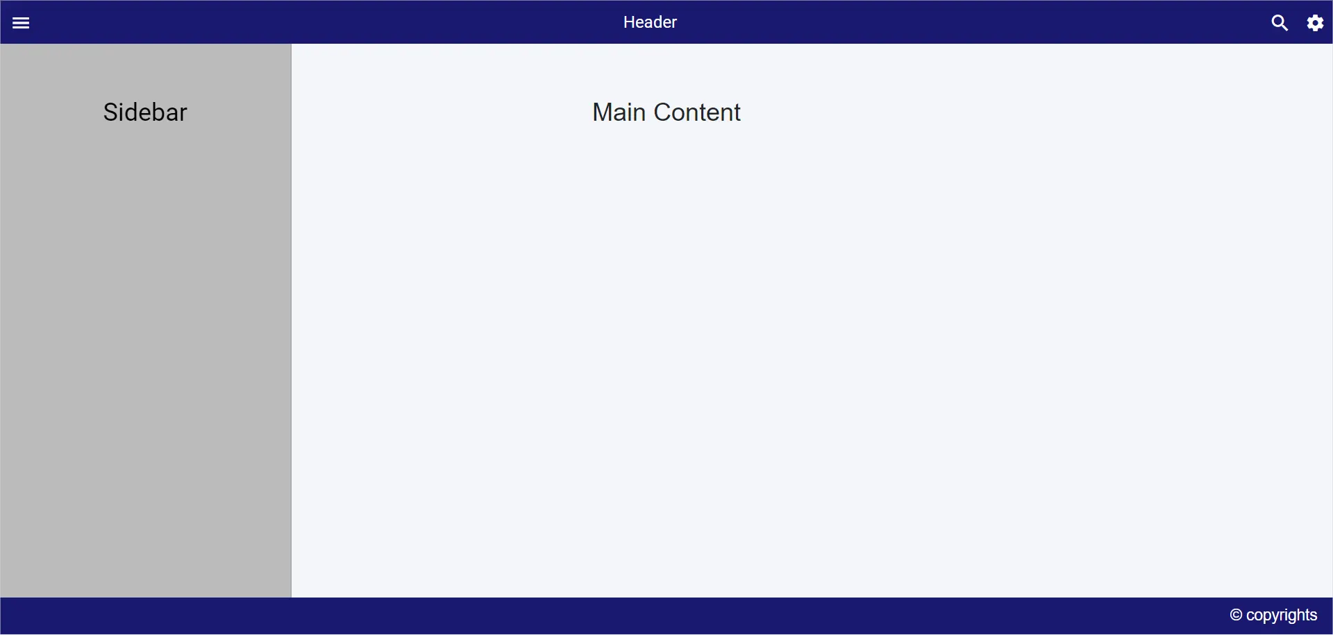
In the following sample, click the toggle button to expand or collapse the Sidebar.
@using Syncfusion.Blazor.Navigations
<SfSidebar @ref="sidebarObj" Width="280px" Type=SidebarType.Push @bind-IsOpen="SidebarToggle" Target="@Target">
<ChildContent>
<div style="text-align: center;" class="text-content">Sidebar</div>
</ChildContent>
</SfSidebar>
<div id="head">
<SfToolbar CssClass="CustomToolbar">
<ToolbarItems>
<ToolbarItem PrefixIcon="e-icons e-menu" TooltipText="Menu" OnClick="Toggle"></ToolbarItem>
<ToolbarItem Align="@ItemAlign.Center">
<Template>
<div class="e-folder">
<div class="e-folder-name" style="margin-top: 7px;">Header</div>
</div>
</Template>
</ToolbarItem>
<ToolbarItem PrefixIcon="e-icons e-search" TooltipText="Search" Align="@ItemAlign.Right">
</ToolbarItem>
<ToolbarItem PrefixIcon="e-icons e-settings" TooltipText="Popup" Align="@ItemAlign.Right">
</ToolbarItem>
</ToolbarItems>
</SfToolbar>
</div>
<div class="maincontent text-content" style="text-align: center;">
Main Content
</div>
<div class="footer" style="height:35px; width:100%;text-align:center;line-height: 35px;font-size:15px;">
<span style="float:right; margin-right:15px;">© copyrights</span>
</div>
@code {
SfSidebar sidebarObj;
public string Target = ".maincontent";
public bool SidebarToggle = false;
public void Toggle()
{
SidebarToggle = !SidebarToggle;
}
}
<style>
.e-sidebar {
background-color: #bbbbbb;
color: black;
}
.text-content {
font-size: 1.5rem;
padding: 3rem;
}
.maincontent {
height: 400px;
background-color: rgb(244, 246, 249);
}
.CustomToolbar, .footer, .e-toolbar .e-toolbar-item .e-tbar-btn .e-icons,
.e-toolbar .e-toolbar-items, .e-toolbar .e-toolbar-item .e-tbar-btn.e-btn {
background-color: midnightblue;
color: white;
font-size: 16px;
}
</style>