User Interaction in Blazor Sparkline Component
29 Jun 20265 minutes to read
User interaction features in the Sparkline include the tooltip and the tracker line.
Tooltip
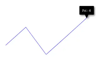
When the mouse hovers over a data point, the Sparkline can display details about the value of the data point via a tooltip. The following example shows how to enable the Sparkline tooltip with a custom format.
@using Syncfusion.Blazor.Charts

<SfSparkline Width="500" Height="200" TValue="WorkLog" DataSource="WorkLogs" XName="Day" YName="Hour" Fill="blue" ValueType="SparklineValueType.Category">
    <SparklineAxisSettings MinX="-1" MaxX="7" MaxY="8" MinY="-1">
    </SparklineAxisSettings>
    <SparklineTooltipSettings TValue="WorkLog" Visible="true" Format="${Day} : ${Hour}">
    </SparklineTooltipSettings>
</SfSparkline>

@code {
    public class WorkLog
    {
        public string Day { get; set; }
        public double Hour { get; set; }
    };

    public List<WorkLog> WorkLogs = new List<WorkLog> {
        new WorkLog { Day = "Mon", Hour = 3 },
        new WorkLog { Day = "Tue", Hour = 5 },
        new WorkLog { Day = "Wed", Hour = 2 },
        new WorkLog { Day = "Thu", Hour = 4 },
        new WorkLog { Day = "Fri", Hour = 6 }
    };
}
Tooltip Customization
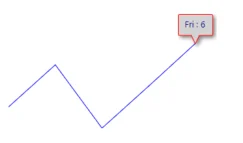
The following properties can be used to customize the Sparkline tooltip:
- Fill – Specifies fill color for the tooltip
- Format – Specifies custom content of the tooltip by assigning the properties from the datasource.
- SparklineTooltipTextStyle – Specifies font family, font style, font weight, color, opacity and size of the tooltip content
- SparklineTooltipBorder – Customize border width and color of the tooltip.
The following example shows customizing tooltip format, text color, and fill color.
@using Syncfusion.Blazor.Charts

<SfSparkline Width="500" Height="200" TValue="WorkLog" DataSource="WorkLogs" XName="Day" YName="Hour" Fill="blue" ValueType="SparklineValueType.Category">
    <SparklineAxisSettings MinX="-1" MaxX="7" MaxY="8" MinY="-1">
    </SparklineAxisSettings>
    <SparklineTooltipSettings TValue="WorkLog" Visible="true" Format="${Day} : ${Hour}" Fill="lightgray">
        <SparklineTooltipTextStyle Color="darkblue"></SparklineTooltipTextStyle>
        <SparklineTooltipBorder Color="red" Width="1"></SparklineTooltipBorder>
    </SparklineTooltipSettings>
</SfSparkline>
NOTE
Refer to the code block for the WorkLogs property value.
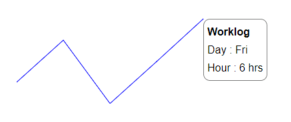
Tooltip Template
The tooltip can be rendered as a custom component by specifying the Template property in SparklineTooltipSettings, which accepts one or more UI elements as input and renders them as part of the tooltip.
@using Syncfusion.Blazor.Charts

<SfSparkline Width="500" Height="200" TValue="WorkLog" DataSource="WorkLogs" XName="Day" YName="Hour" Fill="blue" ValueType="SparklineValueType.Category">
    <SparklineAxisSettings MinX="-1" MaxX="7" MaxY="8" MinY="-1">
    </SparklineAxisSettings>
    <SparklineTooltipSettings TValue="WorkLog" Visible="true" Fill="lightgray">
        <Template>
            @{
                <table style="width:100%; background-color: #ffffff; border-spacing: 0px; border-collapse:separate; border: 1px solid grey; border-radius:10px; padding-top: 5px; padding-bottom:5px">
                    <tr>
                        <td style="font-weight:bold; color:black; padding-left: 5px;padding-top: 2px;padding-bottom: 2px;">Worklog</td>
                    </tr>
                    <tr>
                        <td style="padding-left: 5px; color:black; padding-right: 5px; padding-bottom: 2px;">Day : @context.Day  </td>
                    </tr>
                    <tr>
                        <td style="padding-left: 5px; color:black; padding-right: 5px">Hour : @context.Hour hrs </td>
                    </tr>
                </table>
            }
        </Template>
    </SparklineTooltipSettings>
</SfSparkline>
NOTE
Refer to the code block for the WorkLogs property value.
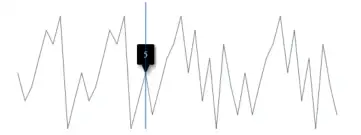
Track Line
The track line highlights data points closest to the mouse position or touch interaction. Enable it by setting the Visible property to true in SparklineTrackLineSettings. The track line color and width can be customized using the Color and Width properties.
@using Syncfusion.Blazor.Charts

<SfSparkline Width="500px" Height="200px"
             DataSource="new int[]{ 5, 3, 4, 6, 8, 7, 9, 1, 3, 5, 3, 4, 6, 8, 7, 9, 1, 3, 5, 2, 4, 6, 7, 9, 5, 8, 3, 6, 1, 7, 4, 2, 5, 2, 4, 6, 7, 9, 5, 8, 3, 6, 1, 7, 4, 2 }">
    <SparklineAxisSettings MinX="-1" MaxX="46" MaxY="10" MinY="-1">
    </SparklineAxisSettings>
    <SparklineTooltipSettings TValue="int" Visible="true">
        <SparklineTrackLineSettings Visible="true" Color="#033e96" Width="1">
        </SparklineTrackLineSettings>
    </SparklineTooltipSettings>
</SfSparkline>