Style and Appearance in Blazor SpeechToText component
29 Jun 20265 minutes to read
Customizing the button
You can use the ButtonSettings property to customize the appearance of the start and stop buttons in the speech to text conversion.
Setting start content
You can use the Text property to define text content for the listening start state in the SpeechToText button.
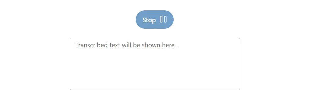
Setting stop content
You can use the StopStateText property to define text content for the listening stop state in the SpeechToText button.
Setting icon css
You can use the IconCss property to apply a CSS class to customize the icon appearance for the listening start state.
Setting stop icon css
You can use the StopIconCss property to apply a CSS class to customize the icon appearance for the listening stop state.
Setting icon position
You can display the icon on the top, bottom, left, or right side of the button text content using the IconPosition property.
Setting primary
You can use the IsPrimary property to configure the button as a primary action button.
Below code sample demonstrates how to configure the button with above mentioned properties.
@using Syncfusion.Blazor.Inputs
@using Syncfusion.Blazor.Buttons

<div class="speechtext-container">
    <SfSpeechToText ButtonSettings="@buttonSettings" @bind-Transcript="@transcript"></SfSpeechToText>
    <SfTextArea RowCount="5" ColumnCount="50" @bind-Value="@transcript" ResizeMode="Resize.None" Placeholder="Transcribed text will be shown here..."></SfTextArea>
</div>

@code {
    string transcript = "";
    SpeechToTextButtonSettings buttonSettings = new SpeechToTextButtonSettings()
    {
        Text = "Start",
        StopStateText = "Stop",
        IconCss = "e-icons e-play",
        StopIconCss = "e-icons e-pause",
        IconPosition = IconPosition.Right,
        isPrimary = true
    };
}

<style>
    .speechtext-container {
        margin: 50px auto;
        gap: 20px;
        display: flex;
        flex-direction: column;
        align-items: center;
    }
</style>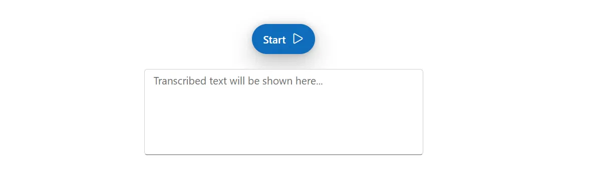
Customizing the tooltips
You can use the TooltipSettings property to customize the content and positions of the tooltip.
Setting start content
You can use the Text property to customize the content to be displayed in the tooltip when the speech recognition begins.
Setting stop content
You can use the StopStateText property to customize the stop button tooltip text which is displayed on-hover.
Setting tooltip position
You can use the Position property to determine the placement of tooltips relative to the button.
Below code sample demonstrates how to configure the tooltip settings with above mentioned properties.
@using Syncfusion.Blazor.Inputs

<div class="speechtext-container">
    <SfSpeechToText TooltipSettings="@tooltipSettings" @bind-Transcript="@transcript"></SfSpeechToText>
    <SfTextArea RowCount="5" ColumnCount="50" @bind-Value="@transcript" ResizeMode="Resize.None" Placeholder="Transcribed text will be shown here..."></SfTextArea>
</div>

@code {
    string transcript = "";

    SpeechToTextTooltipSettings tooltipSettings = new SpeechToTextTooltipSettings()
        {
            Position = TooltipPosition.BottomRight,
            Text = "Click the button to start recognition",
            StopStateText = "Click the button to stop recognition"
        };
}

<style>
    .speechtext-container {
        margin: 50px auto;
        gap: 20px;
        display: flex;
        flex-direction: column;
        align-items: center;
    }
</style>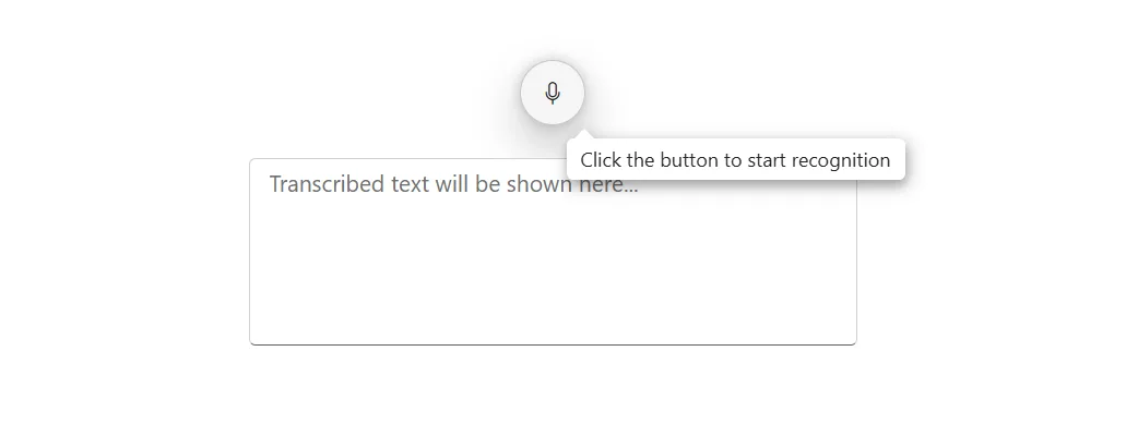
Setting button styles
The SpeechToText component supports the following predefined styles that can be defined using the CssClass property. You can customize by adding the cssClass property with the below defined class.
| CssClass | Description |
|---|---|
e-primary |
Used to represent a primary action. |
e-outline |
Used to represent an appearance of button with outline. |
e-info |
Used to represent an informative action. |
e-success |
Used to represent a positive action. |
e-warning |
Used to represent an action with caution. |
e-danger |
Used to represent a negative action. |
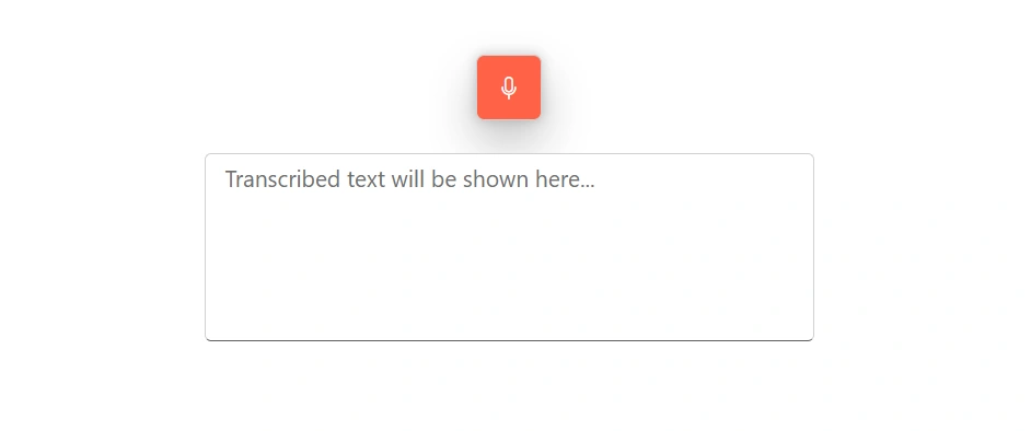
Customization using CSS class
You can use the CssClass property to customize the appearance of the SpeechToText component.
Below code sample demonstrates how to configure cssclass and customize the button.
@using Syncfusion.Blazor.Inputs

<div class="speechtext-container">
    <SfSpeechToText CssClass="customSpeechBtn" @bind-Transcript="@transcript"></SfSpeechToText>
    <SfTextArea RowCount="5" ColumnCount="50" @bind-Value="@transcript" ResizeMode="Resize.None" Placeholder="Transcribed text will be shown here..."></SfTextArea>
</div>

@code {
    string transcript = "";
}

<style>
    .speechtext-container {
        margin: 50px auto;
        gap: 20px;
        display: flex;
        flex-direction: column;
        align-items: center;
    }

    .e-speech-to-text.customSpeechBtn {
        background-color: #ff6347;
        color: #fff;
        border-radius: 5px;
    }

    .e-speech-to-text.customSpeechBtn:hover,
    .e-speech-to-text.customSpeechBtn:focus {
        background-color: #ff4500;
    }
</style>