Styles in Blazor SpeedDial Component
25 Jun 20266 minutes to read
This section describes the different ways to style the SpeedDial component and configure its icons, text, states, and appearance.
SpeedDial button
Customize the icon and text of the Blazor SpeedDial component using the OpenIconCss, CloseIconCss, and Content properties. Icon classes (e-icons) are provided by the selected theme.
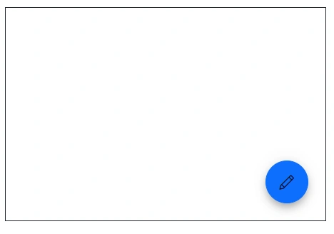
SpeedDial with Icon
Use the OpenIconCss and CloseIconCss properties to show icons in the speed dial button. To provide additional context, show a tooltip on hover by setting the title attribute.
@using Syncfusion.Blazor.Buttons

<SfSpeedDial OpenIconCss="e-icons e-edit" CloseIconCss="e-icons e-close">
    <SpeedDialItems>
        <SpeedDialItem IconCss="e-icons e-cut"/>
        <SpeedDialItem IconCss="e-icons e-copy"/>
        <SpeedDialItem IconCss="e-icons e-paste"/>
    </SpeedDialItems>
</SfSpeedDial>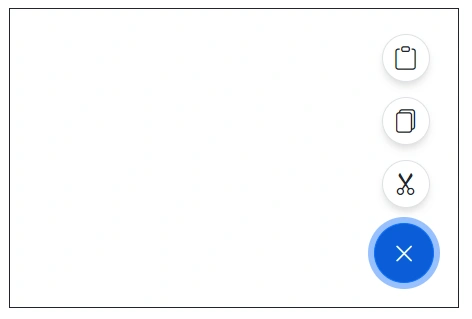
SpeedDial with Text
Show text only in the SpeedDial button by setting the Content property without specifying icon properties.
@using Syncfusion.Blazor.Buttons

<SfSpeedDial Content="Edit">
    <SpeedDialItems>
        <SpeedDialItem IconCss="e-icons e-cut"/>
        <SpeedDialItem IconCss="e-icons e-copy"/>
        <SpeedDialItem IconCss="e-icons e-paste"/>
    </SpeedDialItems>
</SfSpeedDial>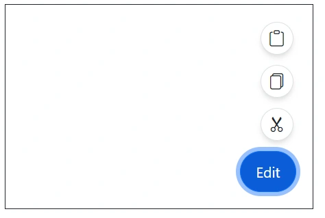
SpeedDial with Icon and Text
Show both an icon and text in the Blazor SpeedDial button by setting the OpenIconCss, CloseIconCss, and Content properties together.
@using Syncfusion.Blazor.Buttons

<SfSpeedDial Content="Edit" OpenIconCss="e-icons e-edit" CloseIconCss="e-icons e-close">
    <SpeedDialItems>
        <SpeedDialItem IconCss="e-icons e-cut"/>
        <SpeedDialItem IconCss="e-icons e-copy"/>
        <SpeedDialItem IconCss="e-icons e-paste"/>
    </SpeedDialItems>
</SfSpeedDial>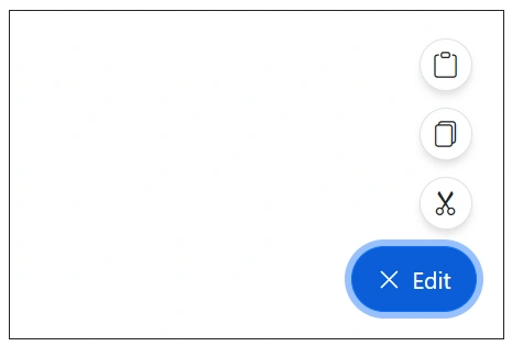
Disabled
Enable or disable the Speed Dial component using the Disabled property. When disabled, the floating action button and its interactions are unavailable.
@using Syncfusion.Blazor.Buttons

<SfSpeedDial Disabled=true Content="Edit">
    <SpeedDialItems>
        <SpeedDialItem IconCss="e-icons e-cut"/>
        <SpeedDialItem IconCss="e-icons e-copy"/>
        <SpeedDialItem IconCss="e-icons e-paste"/>
    </SpeedDialItems>
</SfSpeedDial>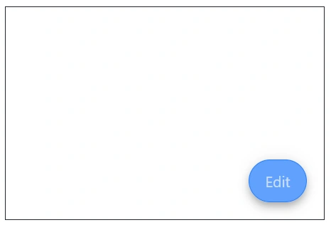
CssClass
Apply predefined visual styles using the CssClass property. Assign one of the following CSS classes to change the appearance.
| CssClass | Description |
|---|---|
| e-primary | Used to represent a primary action. |
| e-outline | Used to render the button with an outline appearance. |
| e-info | Used to represent an informative action. |
| e-success | Used to represent a positive action. |
| e-warning | Used to represent an action with caution. |
| e-danger | Used to represent a negative action. |
@using Syncfusion.Blazor.Buttons

<SfSpeedDial CssClass="e-warning" Content="Edit">
    <SpeedDialItems>
        <SpeedDialItem IconCss="e-icons e-cut"/>
        <SpeedDialItem IconCss="e-icons e-copy"/>
        <SpeedDialItem IconCss="e-icons e-paste"/>
    </SpeedDialItems>
</SfSpeedDial>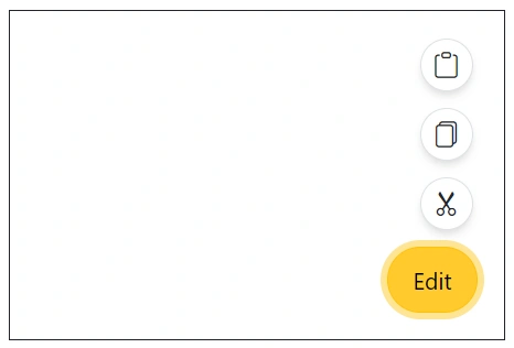
Visible
Control the visibility of the Speed Dial component using the Visible property. Set it to false to render the component in a hidden state.
@using Syncfusion.Blazor.Buttons

<SfSpeedDial Visible=false Content="Edit">
    <SpeedDialItems>
        <SpeedDialItem IconCss="e-icons e-cut"/>
        <SpeedDialItem IconCss="e-icons e-copy"/>
        <SpeedDialItem IconCss="e-icons e-paste"/>
    </SpeedDialItems>
</SfSpeedDial>
Tooltip
Show a tooltip on hover to provide additional details by setting the Title property for speed dial items. Tooltips are especially useful when using icon-only items.
@using Syncfusion.Blazor.Buttons

<SfSpeedDial Content="Edit">
    <SpeedDialItems>
        <SpeedDialItem Title="Cut" IconCss="e-icons e-cut"/>
        <SpeedDialItem Title="Copy" IconCss="e-icons e-copy"/>
        <SpeedDialItem Title="Paste" IconCss="e-icons e-paste"/>
    </SpeedDialItems>
</SfSpeedDial>
Opens on hover
Use the OpensOnHover property to open action items on hover. By default, action items open on click.
@using Syncfusion.Blazor.Buttons

<SfSpeedDial OpensOnHover=true Content="Edit">
    <SpeedDialItems>
        <SpeedDialItem IconCss="e-icons e-cut"/>
        <SpeedDialItem IconCss="e-icons e-copy"/>
        <SpeedDialItem IconCss="e-icons e-paste"/>
    </SpeedDialItems>
</SfSpeedDial>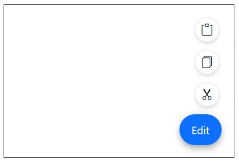
Customized icon
Use the CssClass property to customize the appearance of the SZpeedDial component in its default state. Below example below demonstrates the cssClass property usage in speedDial.
@using Syncfusion.Blazor.Buttons
<div id="target" style="min-height:200px; position:relative; width:300px; border:1px solid;">
<SfSpeedDial Target="#target" OpenIconCss="e-icons e-edit" CloseIconCss="e-icons e-close" CssClass="custom-css">
    <SpeedDialItems>
        <SpeedDialItem IconCss="e-icons e-cut"/>
        <SpeedDialItem IconCss="e-icons e-copy"/>
        <SpeedDialItem IconCss="e-icons e-paste"/>
    </SpeedDialItems>
</SfSpeedDial>
</div>
<style>
    .custom-css .e-btn-icon {
        color: black;
    }
</style>