Template in Blazor SpeedDial Component
25 Jun 20262 minutes to read
This section describes the available templates in the SpeedDial component and their usage for customizing item content and the popup container.
Item template
Use the ItemTemplate to define custom content for each SpeedDialItem. Define the template as child content of the ItemTemplate tag directive.
@using Syncfusion.Blazor.Buttons

<SfSpeedDial Content="Edit" OpenIconCss="e-icons e-edit" Position="FabPosition.BottomRight">
    <ChildContent>
        <SpeedDialItems>
            <SpeedDialItem Text="Cut" IconCss="e-icons e-cut" />
            <SpeedDialItem Text="Copy" IconCss="e-icons e-copy" />
            <SpeedDialItem Text="Paste" IconCss="e-icons e-paste" />
        </SpeedDialItems>
    </ChildContent>
    <ItemTemplate>
        <div class="itemlist">
            <span class="@context.IconCss" style="padding:3px"></span>
            <span class="text" style="padding:0 5px">@context.Text</span>
        </div>
    </ItemTemplate>
</SfSpeedDial>

<style>
    .e-speeddial-li .itemlist {
        display: inherit;
        width: 100%;
        border: 1px solid transparent;
        align-items: center;
        padding: 5px;
        border-radius: 500px;
        background-color: rgba(104, 99, 104, 0.1);
        box-shadow: 0 0 4px grey;
    }
</style>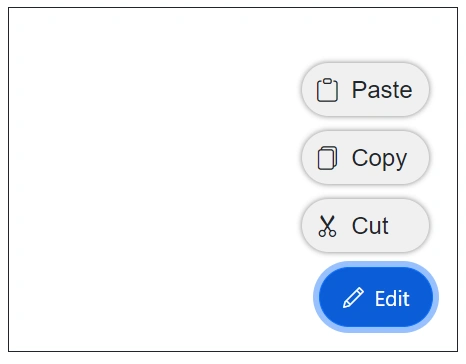
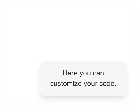
Popup template
Use the PopupTemplate to define custom content for the popup of the SpeedDial component. Define the template as child content of the PopupTemplate tag directive to render any custom layout or UI inside the popup.
@using Syncfusion.Blazor.Buttons

<SfSpeedDial CssClass="popupSpeedDial" Content="FeedBack">
    <PopupTemplate>
        <div class="speeddial-form">
            <p>Here you can customize your code.</p>
        </div>
    </PopupTemplate>
</SfSpeedDial>

<style>
    .speeddial-form {
        width: 200px;
        height: 80px;
        text-align: center;
        border-radius: 15px;
        box-shadow: rgb(0 0 0 / 10%) 0px 10px 15px -3px, rgb(0 0 0 / 5%) 0px 4px 6px -2px;
        background: #f5f5f5;
        padding: 15px;
    }
</style>