Customize the Spinner in Blazor Spinner Component
25 Jun 20266 minutes to read
The Spinner component can be customized when initializing or after rendering it.
Customize when initializing the Spinner component
Provided support to change the default Spinner appearance when initializing Spinner component using the following properties.
- CssClass
- Label
- Type
- Size
CssClass
Add the customized Class name to a Spinner root element to customize the Blazor Spinner component UI styles. The following code explains how to initialize a Spinner with the custom class name in the Blazor Razor page.
@using Syncfusion.Blazor.Buttons
@using Syncfusion.Blazor.Spinner
<div>
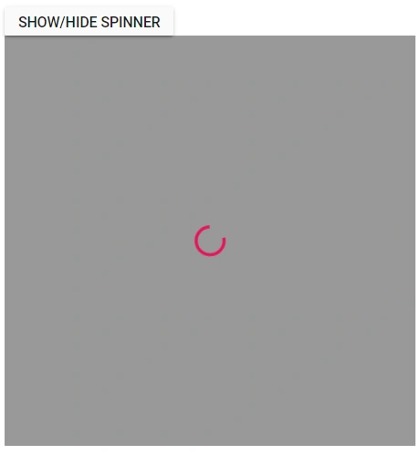
<SfButton @onclick="@ClickHandler">Show/Hide Spinner</SfButton>
<div id="container">
<SfSpinner @bind-Visible="@VisibleProperty" CssClass="e-customClass">
</SfSpinner>
</div>
</div>
@code{
private bool VisibleProperty { get; set; } = false;
private async Task ClickHandler()
{
this.VisibleProperty = true;
await Task.Delay(2000);
this.VisibleProperty = false;
}
}
<style>
.e-spinner-pane.e-customClass .e-spinner-inner .e-spin-material {
stroke: #808080;
}
</style>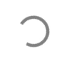
Modal Spinner
A modal spinner can be initialized by adding the class e-spin-overlay to the CssClass property of the spinner.
@using Syncfusion.Blazor.Buttons
@using Syncfusion.Blazor.Spinner

<SfButton @onclick="@ClickHandler">Show/Hide Spinner</SfButton>

<div id="container">
    <SfSpinner @bind-Visible="@VisibleProperty" CssClass="e-spin-overlay" />
</div>

<style>
    #container {
        position: relative;
        height: 550px;
    }
</style>

@code{
    private bool VisibleProperty { get; set; } = false;

    private async Task ClickHandler()
    {
        this.VisibleProperty = true;
        await Task.Delay(10000);
        this.VisibleProperty = false;
    }
}
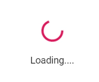
Label
Add the customize label text in Blazor Spinner component at the bottom.
The following code explains how to set the Label on Spinner in Blazor Razor page.
@using Syncfusion.Blazor.Buttons
@using Syncfusion.Blazor.Spinner

<div>
    <SfButton @onclick="@ClickHandler">Show/Hide Spinner</SfButton>

    <div id="container">
        <SfSpinner @bind-Visible="@VisibleProperty" Label="Loading....">
        </SfSpinner>
    </div>
</div>

@code{
    private bool VisibleProperty { get; set; } = false;

    private async Task ClickHandler()
    {
        this.VisibleProperty = true;
        await Task.Delay(2000);
        this.VisibleProperty = false;
    }
}
Type
By default, the Type is None where the Blazor Spinner is loaded based on the theme used in the application. The type can also be customized and shown on Spinner using the Type property. The available types are:
- None
- Material
- Fabric
- Bootstrap
- HighContrast
- Bootstrap4
The following code explains how to use the Type property when initializing Spinner in Blazor Razor page.
@using Syncfusion.Blazor.Buttons
@using Syncfusion.Blazor.Spinner

<div>
    <SfButton @onclick="@ClickHandler">Show/Hide Spinner</SfButton>

    <div id="container">
        <SfSpinner @bind-Visible="@VisibleProperty" Type="@SpinnerType.Bootstrap">
        </SfSpinner>
    </div>
</div>

@code{
    private bool VisibleProperty { get; set; } = false;

    private async Task ClickHandler()
    {
        this.VisibleProperty = true;
        await Task.Delay(2000);
        this.VisibleProperty = false;
    }
}
Size
By default, the Spinner size is 30px. The size of the Spinner can be changed based on the application using the Size property.
The following code explains how to use the Size property when initializing Spinner in Blazor Razor page.
@using Syncfusion.Blazor.Buttons
@using Syncfusion.Blazor.Spinner

<div>
    <SfButton @onclick="@ClickHandler">Show/Hide Spinner</SfButton>

    <div id="container">
        <SfSpinner @bind-Visible="@VisibleProperty" Size="50">
        </SfSpinner>
    </div>
</div>

@code{
    private bool VisibleProperty { get; set; } = false;

    private async Task ClickHandler()
    {
        this.VisibleProperty = true;
        await Task.Delay(2000);
        this.VisibleProperty = false;
    }
}
Customize after creating the Spinner component
The Spinner component can be customized dynamically after initialize the Spinner component by using the following properties:
- Type
- CssClass
Type
The type of the Spinner can dynamically be changed using the Type property.
The following code explains how to use the Type property after creating the Spinner in Blazor Razor page.
@using Syncfusion.Blazor.Buttons
@using Syncfusion.Blazor.Spinner

<div>
    <SfButton @onclick="@ClickHandler">Show/Hide Spinner</SfButton>
    <SfButton @onclick="@ChangeType">Change Type</SfButton>

    <div id="container">
        <SfSpinner @bind-Visible="@VisibleProperty" Type="@SpinnerType">
        </SfSpinner>
    </div>
</div>

@code{
    private SpinnerType SpinnerType = SpinnerType.Fabric;
    private bool VisibleProperty { get; set; } = false;

    private async Task ClickHandler()
    {
        this.VisibleProperty = true;
        await Task.Delay(2000);
        this.VisibleProperty = false;
    }

    private async Task ChangeType()
    {
        SpinnerType = SpinnerType.Material;
    }
}
CssClass
Add the custom class name to Spinner after creating the Spinner component.
The following code explains how to dynamically add the CssClass property after creating the Spinner in Blazor Razor page.
@using Syncfusion.Blazor.Buttons
@using Syncfusion.Blazor.Spinner

<div>
    <SfButton @onclick="@ClickHandler">Show/Hide Spinner</SfButton>
    <SfButton @onclick="@ChangeClass">Change CSS Class</SfButton>

    <div id="container">
        <SfSpinner @bind-Visible="@VisibleProperty" CssClass="@CssClassName">
        </SfSpinner>
    </div>
</div>

@code{
    private string CssClassName { get; set; } = "";
    private bool VisibleProperty { get; set; } = false;

    private async Task ClickHandler()
    {
        this.VisibleProperty = true;
        await Task.Delay(2000);
        this.VisibleProperty = false;
    }

    private async Task ChangeClass()
    {
        this.CssClassName = "e-customClass";
        StateHasChanged();
    }
}

<style>
    .e-spinner-pane.e-customClass .e-spinner-inner .e-spin-material {
        stroke: #808080;
    }
</style>