Pane Sizing in Blazor Splitter Component
29 Jun 20266 minutes to read
Splitter allows to provide pane sizes either in Pixel or Percentage formats.
Auto size panes
The splitter’s panes are adjusted automatically during resizing if the size is not specified externally to panes, because the panes are designed based on flex layout by default. When you add/remove or show/hide the panes, the panes are auto aligned within its container.
using Syncfusion.Blazor.Layouts

<SfSplitter Height="200px" Width="600px">
    <SplitterPanes>
        <SplitterPane>
            <ContentTemplate>
                <div>
                    <div class="content">
                        <h3 class="h3">Grid </h3>
                        The ASP.NET DataGrid control, or DataTable is a feature-rich control used to display data in a tabular format.
                    </div>
                </div>
            </ContentTemplate>
        </SplitterPane>
        <SplitterPane>
            <ContentTemplate>
                <div>
                    <div class="content">
                        <h3 class="h3">Schedule </h3>
                        The ASP.NET Scheduler, a.k.a. event calendar, facilitates almost all calendar features, thus allowing users to manage their time efficiently
                    </div>
                </div>
            </ContentTemplate>
        </SplitterPane>
        <SplitterPane>
            <ContentTemplate>
                <div>
                    <div class="content">
                        <h3 class="h3">Chart </h3>
                        ASP.NET charts, a well-crafted easy-to-use charting package, is used to add beautiful charts in web and mobile applications
                    </div>
                </div>
            </ContentTemplate>
        </SplitterPane>
    </SplitterPanes>
</SfSplitter>

<style>
    .content {
        padding: 10px;
    }
</style>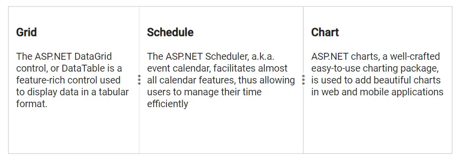
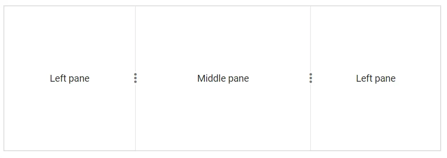
Fixed pane
The split panes can be rendered with fixed size in both Horizontal and Vertical mode. Even if a fixed size is provided to all the panes, the last pane is considered as a flexible pane.
@using Syncfusion.Blazor.Layouts

<SfSplitter Height="200px" Width="600px">
    <SplitterPanes>
        <SplitterPane Size="200px">
            <ContentTemplate>
                <div> Left pane </div>
            </ContentTemplate>
        </SplitterPane>
        <SplitterPane Size="200px">
            <ContentTemplate>
                <div> Middle pane </div>
            </ContentTemplate>
        </SplitterPane>
        <SplitterPane Size="200px">
            <ContentTemplate>
                <div> Right pane </div>
            </ContentTemplate>
        </SplitterPane>
    </SplitterPanes>
</SfSplitter>

<style>
    .e-pane {
        text-align: center;
        align-items: center;
        display: grid;
    }
</style>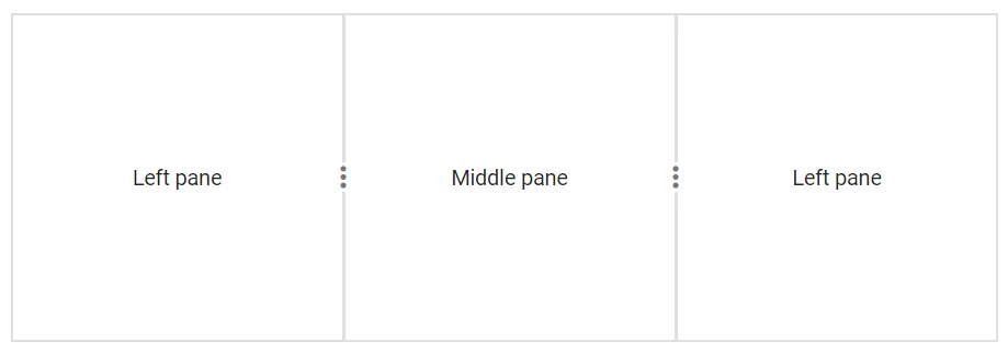
Splitter pane Size in Percentage.
@using Syncfusion.Blazor.Layouts

<SfSplitter Height="200px" Width="600px">
    <SplitterPanes>
        <SplitterPane Size="30%">
            <ContentTemplate>
                <div> Left pane </div>
            </ContentTemplate>
        </SplitterPane>
        <SplitterPane Size="40%">
            <ContentTemplate>
                <div> Middle pane </div>
            </ContentTemplate>
        </SplitterPane>
        <SplitterPane Size="30%">
            <ContentTemplate>
                <div> Right pane </div>
            </ContentTemplate>
        </SplitterPane>
    </SplitterPanes>
</SfSplitter>