Style and Appearance in Blazor Tabs
27 Aug 20262 minutes to read
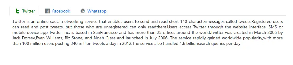
The following CSS classes can be used to customize the appearance of the Blazor Tabs control.
Customizing the Blazor Tabs
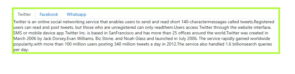
Use the following CSS to customize the Blazor Tabs.
.e-tab {
    border: 5px solid rgb(173, 255, 47);
}
Customizing the Tab header items
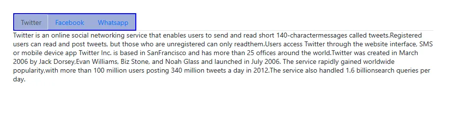
Use the following CSS to customize the header items of the Blazor Tabs.
.e-tab .e-tab-header .e-toolbar-items {
    background: #9faed8;
    border: 2px solid blue;
}
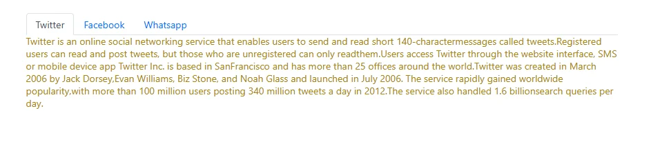
Use the following CSS to customize the content items of the Tab.
.e-tab .e-content .e-item {
    color: #a78515;
    font-size: 14px;
}
Customizing the Tab header
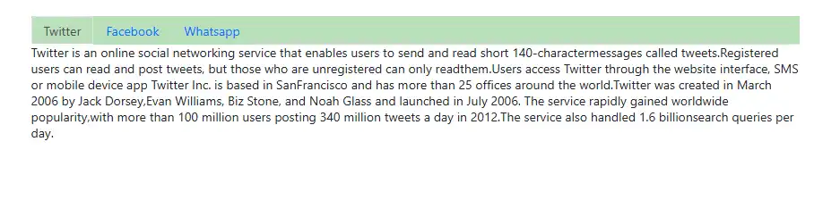
Use the following CSS to customize the header of the Tab control.
.e-tab .e-tab-header {
    background: #badfba !important;
}
Customizing the Tab header icon
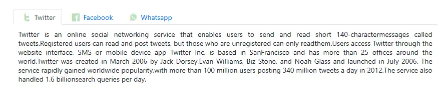
Use the following CSS to customize the header item icon of the Tab control.
.e-tab .e-tab-header .e-toolbar-item .e-tab-icon {
    color: #badfba !important;
}
Customizing the Tab content
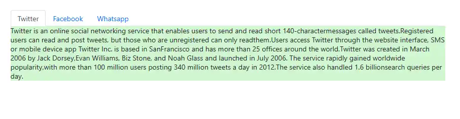
Use the following CSS to customize the content of the Tab control.
.e-tab .e-content {
    background: #d1f6d1 !important;
}
Customizing the hover state of the Tab
Hover state of Tab items
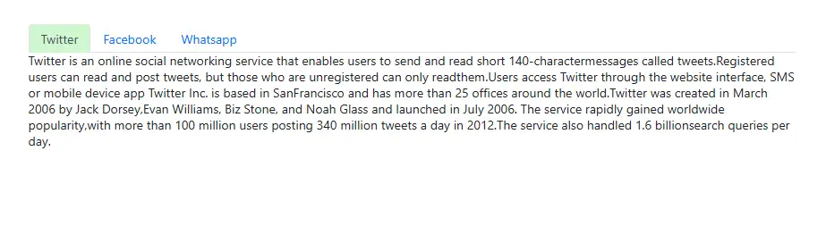
Use the following CSS to customize a tab item when hovering.
.e-tab .e-tab-header .e-toolbar-item .e-tab-wrap:hover {
    background: #d1f6d1 !important;
}
Hover state of the popup icon
Use the following CSS to customize the popup icon when hovering.
.e-tab .e-tab-header .e-hor-nav .e-popup-up-icon:hover,
.e-tab .e-tab-header .e-hor-nav .e-popup-down-icon:hover {
    background: #d1f6d1 !important;
}
Customizing the selected item of the Tab
Use the following CSS to customize the selected tab item.
.e-tab .e-tab-header .e-toolbar-item.e-active {
    background: #d1f4d1;
}
Use the following CSS to customize the selected tab item text and icon.
.e-tab .e-tab-header .e-toolbar-item.e-active .e-tab-text,
.e-tab .e-tab-header .e-toolbar-item.e-active .e-tab-icon {
    color: green !important;
}