Sizing in Blazor TextArea Component
25 Jun 20269 minutes to read
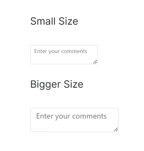
The size of the TextArea can be adjusted by applying the following classes:
| Property | Description |
|---|---|
| Small | Add the e-small class to render a smaller TextArea. |
| Bigger | Add the e-bigger class to render a larger TextArea. |
Applying these classes helps align the TextArea with the overall density and visual scale of the application’s design.
<div id='container'>
    <div class='wrap'>
        <div id="input-container">
            <h4> Small Size </h4>
            <div class="e-small">
                <SfTextArea Placeholder="Enter your comments"></SfTextArea>
            </div>
            <h4> Bigger Size </h4>
            <div class="e-bigger">
                <SfTextArea Placeholder="Enter your comments"></SfTextArea>
            </div>
        </div>
    </div>
</div>
#loader {
color: #008cff;
font-family: 'Helvetica Neue','calibiri';
font-size: 14px;
height: 40px;
left: 45%;
position: absolute;
top: 45%;
width: 30%;
}
.wrap {
box-sizing: border-box;
margin: 0 auto;
padding: 20px 10px;
width: 340px;
}
.e-input-group-icon:before {
font-family: e-icons;
}
#input-container .e-input-group { /* csslint allow: adjoining-classes */
margin: 30px 0;
}
#input-container .e-float-input { /* csslint allow: adjoining-classes */
margin: 30px 0;
}
Filled and outline mode
The Filled and Outline modes can be enabled in the TextArea component by adding the e-outline or e-filled class to the CssClass API.
By adding these classes, users can choose between a filled or outline appearance for the TextArea control, aligning with the design aesthetics of their application. Please find the demo link here.
<SfTextArea Placeholder='Enter your comments' CssClass= "e-filled" ></SfTextArea>
<SfTextArea Placeholder='Enter your comments' CssClass= "e-outline" ></SfTextArea>
Note: Filled and outline appearances are available only with the Material and Material3 themes.
Custom styling with CssClass property
Use CssClass to apply custom CSS classes to the TextArea wrapper. This approach scopes styles (color, padding, margins, borders, etc.) to specific instances while preserving built-in theme behavior.
<SfTextArea Placeholder='Enter your comments' CssClass="custom-textarea" ></SfTextArea>Setting the disabled state
Disable the TextArea using the Disabled property. When set to true, the TextArea is non-interactive. For an example, see the TextArea API demo.
<SfTextArea Placeholder='Enter your comments' Disabled="true" ></SfTextArea>Set the ReadOnly property
Make the TextArea read-only using the ReadOnly property. When set to true, users cannot edit the content while it remains focusable. For an example, see the TextArea API demo.
<SfTextArea Placeholder='Enter your comments' ReadOnly="true" ></SfTextArea>Set the rounded corner
Render the TextArea with rounded corners by adding the e-corner class to the input’s parent element. This style applies to the boxed input wrapper.
This rounded corner is visible only in the box model input component.
<SfTextArea Placeholder='Enter your comments' CssClass="e-corner"></SfTextArea>.e-input-group.e-corner {
border-radius: 4px;
}
Static Clear Button
Display a static clear button by adding the e-static-clear class and enabling ShowClearButton. The clear button remains visible at all times for quick content clearing. See the TextArea API demo for a working sample.
<SfTextArea Placeholder='Enter your comments' CssClass="e-static-clear" ShowClearButton="true" ></SfTextArea>Customize the TextArea background color and text color
Override default wrapper styles to customize background color, text color, and border color. Target the appropriate wrapper classes to ensure a consistent appearance across themes. When changing colors, maintain sufficient contrast and preserve visible focus indicators for accessibility.
<div id='container'>
    <div class='wrap'>
        <div id="input-container">
            <SfTextArea Placeholder="Enter your comments" ></SfTextArea>
        </div>
    </div>
</div>
#loader {
color: #008cff;
font-family: 'Helvetica Neue','calibiri';
font-size: 14px;
height: 40px;
left: 45%;
position: absolute;
top: 45%;
width: 30%;
}
.wrap {
box-sizing: border-box;
margin: 0 auto;
padding: 20px 10px;
width: 340px;
}
/* To change the background-color and text-color for textarea */
.e-input-group,
.e-input-group.e-multi-line-input { /* csslint allow: adjoining-classes */
background : lightgray;
color: green;
}
/* To change the border-color of the textarea */
.e-input-group:not(.e-success):not(.e-warning):not(.e-error):not(.e-float-icon-left),
.e-input-group:hover:not(.e-success):not(.e-warning):not(.e-error):not(.e-float-icon-left) { /* csslint allow: adjoining-classes */
border-color: #0800ff;
}Change the floating label color
Customize floating label color for success and warning validation states by applying the following CSS. Avoid relying on color alone for state indication; include text or icons where appropriate.
    /* For Success state */
    .e-float-input.e-success textarea ~ label.e-float-text,
    .e-float-input.e-success textarea:focus ~ label.e-float-text,
    .e-float-input.e-success textarea:valid ~ label.e-float-text {
      color: #22b24b;
    }

    /* For Warning state */
    .e-float-input.e-warning textarea ~ label.e-float-text,
    .e-float-input.e-warning textarea:focus ~ label.e-float-text,
    .e-float-input.e-warning textarea:valid ~ label.e-float-text {
      color: #ffca1c;
}<div id='container'>
<div class='wrap'>
<div id="input-container">
<div>
<SfTextArea id="default1" Placeholder="Success" CssClass="e-success" FloatLabelType="@FloatLabelType.Auto"></SfTextArea>
</div>
<div>
<SfTextArea id="default2" Placeholder ="Warning" CssClass="e-warning" FloatLabelType="@FloatLabelType.Auto"></SfTextArea>
</div>
</div>
</div>
</div>#loader {
color: #008cff;
font-family: 'Helvetica Neue','calibiri';
font-size: 14px;
height: 40px;
left: 45%;
position: absolute;
top: 45%;
width: 30%;
}
.wrap {
box-sizing: border-box;
margin: 0 auto;
padding: 20px 10px;
width: 340px;
}
/* For Success state */
#input-container .e-float-input.e-success textarea ~ label.e-float-text,
#input-container .e-float-input.e-success textarea:focus ~ label.e-float-text,
#input-container .e-float-input.e-success textarea:valid ~ label.e-float-text {
color: #22b24b;
}
/* For Warning state */
#input-container .e-float-input.e-warning textarea ~ label.e-float-text,
#input-container .e-float-input.e-warning textarea:focus ~ label.e-float-text,
#input-container .e-float-input.e-warning textarea:valid ~ label.e-float-text {
color: red;
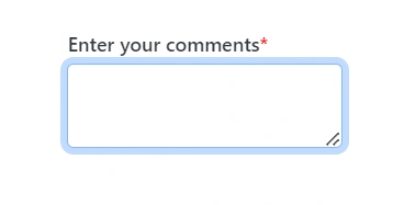
}Adding mandatory asterisk to placeholder
Add a mandatory asterisk (*) to the floating label using CSS to append a symbol after the label text.
/* To add asterick to float label in textarea */
.e-float-input.e-control-wrapper .e-float-text::after {
  content: '*'; /* Add asterisk after the placeholder */
  color: red; /* Customize asterisk color */
}<div id='container'>
<div class='wrap'>
<div id="input-container">
<SfTextArea id="default" Placeholder="Enter your comments" FloatLabelType="@FloatLabelType.Auto"></SfTextArea>
</div>
</div>
</div>#loader {
color: #008cff;
font-family: 'Helvetica Neue','calibiri';
font-size: 14px;
height: 40px;
left: 45%;
position: absolute;
top: 45%;
width: 30%;
}
.wrap {
box-sizing: border-box;
margin: 0 auto;
padding: 20px 10px;
width: 340px;
}
/* To add asterick to float label in textarea */
.e-float-input.e-control-wrapper .e-float-text::after {
content: '*';
color: red;
}