Groups in Blazor TextBox Component
1 Jul 20266 minutes to read
This section demonstrates how to enhance the TextBox component by combining multiple features such as icons, floating labels, clear buttons, and multiline input. These combinations create rich, user-friendly input experiences that improve usability and visual appeal. Each configuration uses specific APIs to achieve the desired functionality.
TextBox
A basic TextBox component provides a simple text input field.
@using Syncfusion.Blazor.Inputs

<SfTextBox Placeholder="Enter your name"></SfTextBox>
Floating label
Enable floating labels by setting the FloatLabelType API. Floating labels move above the input field when focused or filled, providing a clean interface that saves vertical space.
@using Syncfusion.Blazor.Inputs

<SfTextBox Placeholder="Enter your name" FloatLabelType="@FloatLabelType.Auto"></SfTextBox>
The following sections demonstrate how to add icons to the TextBox for enhanced visual context and user interaction.
TextBox with icon and floating label
Add icons to the TextBox to provide visual context or indicate the input purpose. The AddIconAsync method appends or prepends icons to the input field. The position argument (append or prepend) determines whether the icon appears as a suffix or prefix. When invoking AddIconAsync inside lifecycle events such as Created, ensure the method is awaited within an asynchronous handler to maintain proper component initialization.
@using Syncfusion.Blazor.Inputs

<div style="margin: 150px auto; width: 50%">
    <label style="display: block; margin-bottom: 10px; font-weight: 600;">TextBox with icon</label>
    <div style="margin-bottom: 20px;">
        <SfTextBox @ref="TextBoxDateObj" Placeholder="Enter date" Created="@OnCreateDate"></SfTextBox>
    </div>
    <div style="margin-bottom: 30px;">
        <SfTextBox @ref="TextBoxSearchObj" Placeholder="Search here" Created="@OnCreateSearch"></SfTextBox>
    </div>

    <label style="display: block; margin-top: 30px; margin-bottom: 10px; font-weight: 600;">Floating TextBox with icon</label>
    <div style="margin-bottom: 20px;">
        <SfTextBox @ref="FloatTextBoxDateObj" Placeholder="Enter date" FloatLabelType="@FloatLabelType.Auto" Created="@OnFloatCreateDate"></SfTextBox>
    </div>
    <div>
        <SfTextBox @ref="FloatTextBoxSearchObj" Placeholder="Search here" FloatLabelType="@FloatLabelType.Auto" Created="@OnFloatCreateSearch"></SfTextBox>
    </div>
</div>

@code{
    SfTextBox TextBoxDateObj;
    SfTextBox TextBoxSearchObj;
    SfTextBox FloatTextBoxDateObj;
    SfTextBox FloatTextBoxSearchObj;

    public void OnCreateDate()
    {
        this.TextBoxDateObj.AddIconAsync("append", "e-date-icon");
    }
    public void OnCreateSearch()
    {
        this.TextBoxSearchObj.AddIconAsync("prepend", "e-icons e-search");
    }
    public void OnFloatCreateDate()
    {
        this.FloatTextBoxDateObj.AddIconAsync("append", "e-date-icon");
    }
    public void OnFloatCreateSearch()
    {
        this.FloatTextBoxSearchObj.AddIconAsync("prepend", "e-icons e-search");
    }
}
Binding events to icons
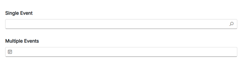
Attach event handlers to icons by passing event attributes as a parameter to the AddIconAsync method. This enables interactive icons that respond to user actions such as clicks or mouse events. Multiple event handlers can be associated with a single icon by providing a dictionary of event names and their corresponding callbacks. Ensure callbacks are created using EventCallback to maintain component lifecycle integrity and proper event propagation.
@using Syncfusion.Blazor.Inputs

<div style="margin: 150px auto; width: 50%">
    <label style="display: block; margin-bottom: 10px; font-weight: 600;">Single Event</label>
    <div style="margin-bottom: 30px;">
        <SfTextBox @ref="@TextBoxSearchObj" Created="@OnCreateSearch"></SfTextBox>
    </div>

    <label style="display: block; margin-bottom: 10px; font-weight: 600;">Multiple Events</label>
    <div style="margin-bottom: 20px;">
        <SfTextBox @ref="@TextBoxDateObj" Created="@OnCreateDate"></SfTextBox>
    </div>
</div>

@code {

    SfTextBox TextBoxSearchObj;
    SfTextBox TextBoxDateObj;

    public async Task OnCreateSearch()
    {
        // Event creation with event handler
        var Click = EventCallback.Factory.Create<Microsoft.AspNetCore.Components.Web.MouseEventArgs>(this, SearchClick);
        await TextBoxSearchObj.AddIconAsync("append", "e-icons e-search", new Dictionary<string, object>() { { "onclick", Click } });
    }

    public void SearchClick()
    {
        // Icon Click event triggered
    }

    public async Task OnCreateDate()
    {
        // Event creation with event handler
        var MouseDown = EventCallback.Factory.Create<Microsoft.AspNetCore.Components.Web.MouseEventArgs>(this, DateMouseDown);
        var MouseUp = EventCallback.Factory.Create<Microsoft.AspNetCore.Components.Web.MouseEventArgs>(this, DateMouseUp);
        await TextBoxDateObj.AddIconAsync("prepend", "e-date-icon", new Dictionary<string, object>() { { "onmouseup", MouseUp }, { "onmousedown", MouseDown } });
    }

    public void DateMouseDown()
    {
        // Icon mouse down event triggered
    }
    public void DateMouseUp()
    {
        // Icon mouse up event triggered
    }
}
TextBox with clear button and floating label
Add a clear button to allow users to quickly remove the current input value. The clear button appears only when the TextBox contains text, providing a convenient way to reset the field. Enable the ShowClearButton API to display the clear icon. This feature can be combined with FloatLabelType to maintain the floating label behavior while offering the clear functionality.
@using Syncfusion.Blazor.Inputs

<div style="margin: 150px auto; width: 50%">
    <label style="display: block; margin-bottom: 10px; font-weight: 600;">TextBox with clear button</label>
    <div style="margin-bottom: 30px;">
        <SfTextBox Placeholder="Brand" Value="Syncfusion" ShowClearButton="true"></SfTextBox>
    </div>

    <label style="display: block; margin-bottom: 10px; font-weight: 600;">Floating TextBox with clear button</label>
    <div style="margin-bottom: 20px;">
        <SfTextBox Placeholder="Brand" Value="Syncfusion" ShowClearButton="true" FloatLabelType="@FloatLabelType.Auto"></SfTextBox>
    </div>
</div>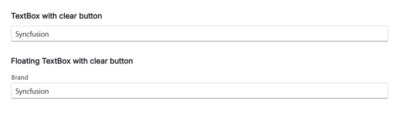
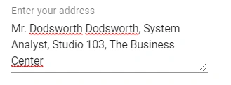
Multiline input with floating label
Enable Multiline to transform the TextBox into a multi-line text editor, ideal for longer text input such as comments, descriptions, or messages. This feature can be combined with FloatLabelType to maintain the floating label behavior, ensuring consistent styling across single-line and multi-line inputs.
@using Syncfusion.Blazor.Inputs

<SfTextBox Placeholder="Enter text" Multiline="true" FloatLabelType="@FloatLabelType.Auto"></SfTextBox>