Create a Custom Component with Tooltip Validation Using Blazor TextBox
25 Jun 20265 minutes to read
Custom component allows to reuse the defined components in a razor page anywhere in the application by using the file name of the razor page as HTML tag. For more information refer here
Defining Blazor TextBox component
The TextBox is defined in a Razor component along with the required parameters and event bindings. The following code is placed in a Razor file named CustomTextBox.
@using System.Linq.Expressions;
@using Syncfusion.Blazor.Inputs

<SfTextBox Value="@Value" FloatLabelType="FloatLabelType.Never" HtmlAttributes="@(new Dictionary<string, object> { { "maxlength", MaxLength }, {"minlength", MinLength}, {"rows", Multiline ? 3 : 1} })"
           ID="@ID" Multiline="@Multiline" ValueChanged="ValueChanged"  ValueExpression="@ValueExpression" Placeholder="@Placeholder" Readonly="@Readonly" @ref="Box" ValidateOnInput="true" Width="200px">
    <ValidationMessage For="@ValidationMessage">
    </ValidationMessage>
</SfTextBox>

@code{

    private string _value;
    [Parameter]
    public string Value
    {
        get => _value;
        set
        {
            if (!EqualityComparer<string>.Default.Equals(value, _value))
            {
                _value = value;
                ValueChanged.InvokeAsync(value);
            }
        }
    }

    [Parameter]
    public Expression<Func<string>> ValueExpression { get; set; }


    [Parameter]
    public EventCallback<string> ValueChanged { get; set; }

    private SfTextBox Box { get; set; }

    private FieldIdentifier Field { get; set; }

    [CascadingParameter]
    public EditContext EditContext { get; set; } = default!;

    [Parameter]
    public string ID { get; set; }

    [Parameter]
    public int MaxLength { get; set; }

    [Parameter]
    public int MinLength { get; set; }

    [Parameter]
    public bool Multiline { get; set; }

    [Parameter]
    public string Placeholder { get; set; }

    [Parameter]
    public bool Readonly { get; set; }

    [Parameter]
    public Expression<Func<string>> ValidationMessage { get; set; }

    protected override void OnInitialized()
    {
        Field = EditContext.Field("Text");
        EditContext.OnValidationStateChanged += HandleValidationStateChanged;
    }

    private void HandleValidationStateChanged(object sender, ValidationStateChangedEventArgs e)
    {
        StateHasChanged();
        bool _invalid = EditContext.GetValidationMessages(Field).Any();
        Box?.UpdateParentClass("", "");
        StateHasChanged();
    }

}
TIPS
In the above component, parameters and events can be implemented in the same file using the
@codeblock or in a partial class.
NOTE
For full EditForm integration, a custom input component must expose
Value,ValueChanged(EventCallback), and `ValueExpression` parameters. This allows the form to track value changes and perform validation. To surface the validation message inside the component, include a `ValidationMessage` element targeting the same field expression used for `ValueExpression`.
Adding the custom TextBox component in the EditForm
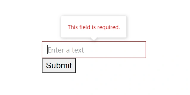
An EditForm with a bound model is declared in the main Razor page. Inside the form, add DataAnnotationsValidator to enable attribute-based validation and use the CustomTextBox wrapped with an SfTooltip to show error text in a tooltip. The CustomTextBox binds to the model’s Text property, which contains data annotation attributes. For details on the tooltip component, see the getting started guide for Syncfusion Blazor Tooltip.
@page "/"
@using System.ComponentModel.DataAnnotations;
@using Syncfusion.Blazor.Popups

<EditForm Model="@_Records" OnValidSubmit="HandleSubmit">
    <DataAnnotationsValidator />
    <SfTooltip CloseDelay="0" OnOpen="ToolTipOpen" OpenDelay="0" OpensOn="Hover" Position="Position.TopCenter" Target="#text" WindowCollision="true">
        <CustomTextBox @bind-Value="@(_Records.Text)" ID="text" MaxLength="50" MinLength="1" Multiline="false" Placeholder="Enter a text" Readonly="false"
                                    ValidationMessage="@(() => _Records.Text)" @bind-Value:event="ValueChanged"></CustomTextBox>
        <TooltipTemplates>
            <Content>
                <ValidationMessage For="@(() => _Records.Text)"></ValidationMessage>
            </Content>
        </TooltipTemplates>
    </SfTooltip>
    <button>Submit</button>
</EditForm>

@code {
    private ModalData _Records = new();

    protected override void OnInitialized()
    {
        base.OnInitialized();
    }

    private static void ToolTipOpen(TooltipEventArgs args)
    {
        args.Cancel = !args.HasText;
    }

    private void HandleSubmit()
    {

    }

    public class ModalData
	{
		[Required(ErrorMessage = "This field is required."),
		 StringLength(100, MinimumLength = 2, ErrorMessage = "Length should be between 2 and 100 characters.")]
		public string Text { get; set; }
	}

}
The SfTooltip wraps the CustomTextBox, and the Target is set to the id of an element within the custom component so that the tooltip anchors to that input. Place ValidationMessage inside the TooltipTemplates to display validation errors within the tooltip for the same bound property.
TIPS
To avoid empty tooltips, conditionally show the tooltip only when there is validation content (for example, by checking text content in the
OnOpenevent). Also ensure errors are conveyed to all users: do not rely on color or tooltip alone; consider settingaria-invalid="true"on the input and keeping aValidationMessagevisible for screen readers.