Validation in Blazor TextBox Component
25 Jun 20261 minute to read
The TextBox supports three types of validation styles, namely error, warning, and success. These are visual states only and do not implement validation logic. Apply the corresponding classes—.e-error, .e-warning, or .e-success—to the component’s wrapper (added via the CssClass property) to change the appearance based on validation outcome. For more information, see the CssClass API reference.
@using Syncfusion.Blazor.Inputs

<label>Success</label>
<SfTextBox Placeholder="Enter your address" CssClass="e-success" ></SfTextBox>

<label>Error</label>
<SfTextBox Placeholder="Enter your address" CssClass="e-error"></SfTextBox>

<label>Warning</label>
<SfTextBox Placeholder="Enter your address" CssClass="e-warning"></SfTextBox>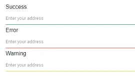
Limit no of character count
Limit the number of characters by setting the maxlength attribute using the HtmlAttributes property. This enforces a client-side input limit and complements (but does not replace) server-side or model validation.
@using Syncfusion.Blazor.Inputs
<SfTextBox Placeholder='First Name' HtmlAttributes="@htmlattribute"></SfTextBox>
@code {
   Dictionary<string, object> htmlattribute = new Dictionary<string, object>()
    {
           { "maxlength", "10" },
    };
}
TextBox supports to set the attributes directly also.
@using Syncfusion.Blazor.Inputs
<SfTextBox Placeholder='First Name' maxlength="10"></SfTextBox>