How can I help you?
Customization in Blazor Timeline Component
27 Apr 202615 minutes to read
Customize the Timeline item’s dot size, connectors, dot borders, and dot outer space to personalize its appearance. This section details various methods for styling the items.
Connector Styling
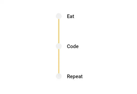
Common Styling
Define styles applicable to all Timeline item connectors. The CSS selector .e-timeline-item.e-connector::after targets the pseudo-element representing the connector line for each item.
@using Syncfusion.Blazor.Layouts

<div class="container" style="height: 250px">
    <SfTimeline CssClass="custom-connector">
        <TimelineItems>
            @foreach (var item in timelineItems)
            {
                <TimelineItem>
                    <Content>
                        @item.Content
                    </Content>
                </TimelineItem>
            }
        </TimelineItems>
    </SfTimeline>
</div>

<style>
    .custom-connector .e-timeline-item.e-connector::after {
        border-color: #f7c867;
        border-width: 1.4px;
    }
</style>

@code {

    public class TimelineItemModel
    {
        public string Content { get; set; }
    }
    private List<TimelineItemModel> timelineItems = new List<TimelineItemModel>()
    {
       new TimelineItemModel() { Content = "Eat" },
        new TimelineItemModel() { Content = "Code" },
        new TimelineItemModel() { Content = "Repeat" },
    };
}
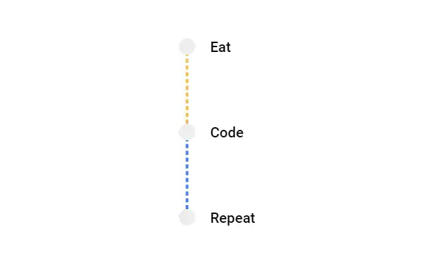
Individual Styling
Apply unique styles to individual connectors to differentiate specific items within the Timeline.
@using Syncfusion.Blazor.Layouts

<div class="container" style="height: 250px">
    <SfTimeline CssClass="custom-connector">
        <TimelineItems>
            @foreach (var item in timelineItems)
            {
                <TimelineItem CssClass=@item.CssClass>
                    <Content>
                        @item.Content
                    </Content>
                </TimelineItem>
            }
        </TimelineItems>
    </SfTimeline>
</div>

<style>
    .custom-connector .state-initial.e-connector::after {
        border: 1.5px #f8c050 dashed;
    }

    .custom-connector .state-intermediate.e-connector::after {
        border: 1.5px #4d85f5 dashed;
    }
</style>

@code {

    public class TimelineItemModel
    {
        public string Content { get; set; }
        public string CssClass { get; set; }
    }
    private List<TimelineItemModel> timelineItems = new List<TimelineItemModel>()
    {
       new TimelineItemModel() { Content = "Eat", CssClass = "state-initial" },
        new TimelineItemModel() { Content = "Code", CssClass = "state-intermediate" },
        new TimelineItemModel() { Content = "Repeat" },
    };
}
Dot Styling
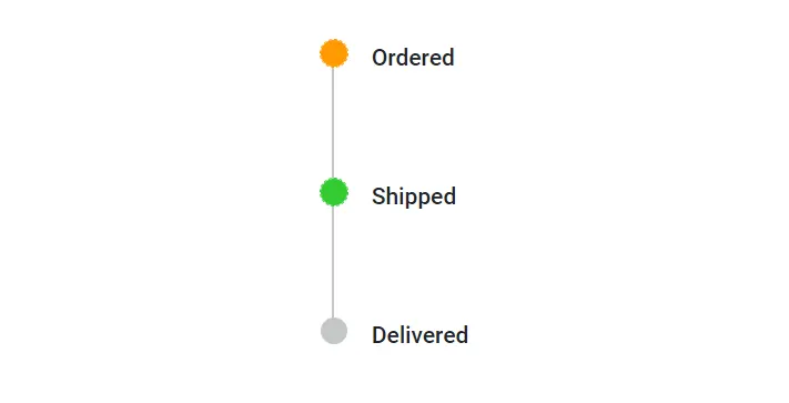
Dot Color
Modify the color of the dots to highlight specific Timeline items. The .e-dot class targets the circular indicator for each item.
@using Syncfusion.Blazor.Layouts

<div class="container">
    <SfTimeline CssClass="dot-color">
        <TimelineItems>
            @foreach (var item in timelineItems)
            {
                <TimelineItem CssClass=@item.CssClass>
                    <Content>
                        @item.Content
                    </Content>
                </TimelineItem>
            }
        </TimelineItems>
    </SfTimeline>
</div>

<style>
    .dot-color .state-completed .e-dot {
        background: #ff9900;
        outline: 1px dashed #ff9900;
        border-color: #ff9900;
    }

    .dot-color .state-progress .e-dot {
        background: #33cc33;
        outline: 1px dashed #33cc33;
        border-color: #33cc33;
    }

    .container {
        height: 250px;
    }
</style>

@code {

    public class TimelineItemModel
    {
        public string Content { get; set; }
        public string CssClass { get; set; }
    }
    private List<TimelineItemModel> timelineItems = new List<TimelineItemModel>()
    {
       new TimelineItemModel() { Content = "Ordered", CssClass = "state-completed" },
        new TimelineItemModel() { Content = "Shipped", CssClass = "state-progress" },
        new TimelineItemModel() { Content = "Delivered" },
    };
}
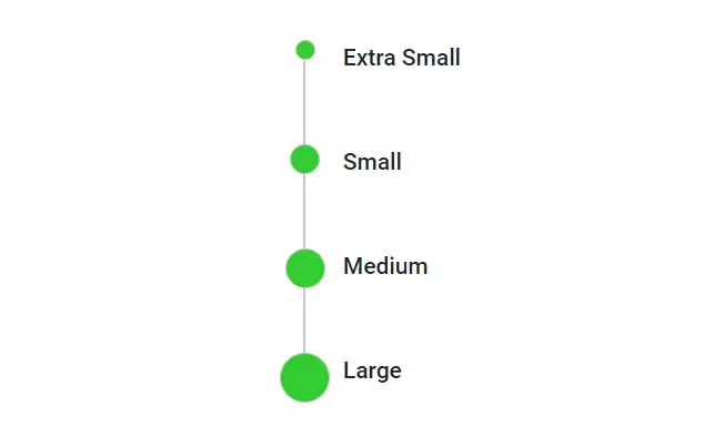
Dot Size
Adjust the dot size using the --dot-size CSS variable, making it larger or smaller. This variable primarily controls the dimensions of the e-dot element.
@using Syncfusion.Blazor.Layouts

<div class="container">
    <SfTimeline CssClass="dot-size">
        <TimelineItems>
            @foreach (var item in timelineItems)
            {
                <TimelineItem CssClass=@item.CssClass>
                    <Content>
                        @item.Content
                    </Content>
                </TimelineItem>
            }
        </TimelineItems>
    </SfTimeline>
</div>

<style>
    .dot-size .e-dot {
        background: #33cc33;
    }
    .dot-size .x-small .e-dot {
        --dot-size: 12px;
    }
    .dot-size .small .e-dot {
        --dot-size: 18px;
    }
    .dot-size .medium .e-dot {
        --dot-size: 24px;
    }
    .dot-size .large .e-dot {
        --dot-size: 30px;
    }
    .container {
        height: 250px;
    }
</style>

@code {

    public class TimelineItemModel
    {
        public string Content { get; set; }
        public string CssClass { get; set; }
    }
    private List<TimelineItemModel> timelineItems = new List<TimelineItemModel>()
    {
       new TimelineItemModel() { Content = "Extra Small", CssClass = "x-small" },
        new TimelineItemModel() { Content = "Small", CssClass = "small" },
        new TimelineItemModel() { Content = "Medium", CssClass = "medium" },
        new TimelineItemModel() { Content = "Large", CssClass = "large" }
    };
}
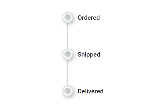
Dot Shadow
Add shadow effects to Timeline dots for visual engagement using the --dot-outer-space and --dot-border CSS variables. These variables define the spacing and border around the dot, contributing to the shadow effect.
@using Syncfusion.Blazor.Layouts

<div class="container">
    <SfTimeline CssClass="dot-shadow">
        <TimelineItems>
            @foreach (var item in timelineItems)
            {
                <TimelineItem>
                    <Content>
                        @item.Content
                    </Content>
                </TimelineItem>
            }
        </TimelineItems>
    </SfTimeline>
</div>

<style>
    .dot-shadow .e-dot {
        --dot-outer-space: 3px;
        --dot-border: 3px;
        --dot-size: 20px;
        outline-color: #dee2e6;
        border-color: #fff;
        box-shadow: 3px 3px 10px rgba(0, 0, 0, 0.5), 2px -2px 4px rgba(255, 255, 255, 0.5) inset;
    }
    .container {
        height: 250px;
    }
</style>

@code {

    public class TimelineItemModel
    {
        public string Content { get; set; }
    }
    private List<TimelineItemModel> timelineItems = new List<TimelineItemModel>()
    {
       new TimelineItemModel() { Content = "Ordered" },
        new TimelineItemModel() { Content = "Shipped" },
        new TimelineItemModel() { Content = "Delivered" },
    };
}
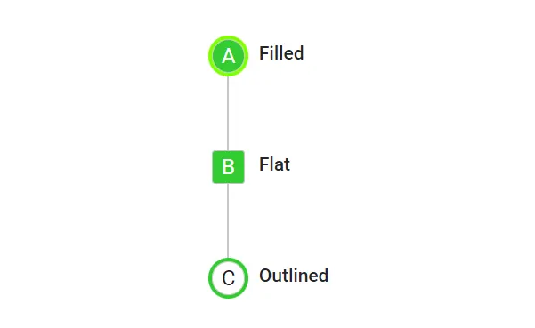
Dot Variant
Achieve desired dot variants by customizing the border, outline, and background colors of Timeline dots. This example demonstrates using pseudo-elements with content for visual differentiation, combined with styling of --dot-size, --dot-radius, and background/outline colors.
@using Syncfusion.Blazor.Layouts

<div class="container">
    <SfTimeline CssClass="dot-variant">
        <TimelineItems>
            @foreach (var item in timelineItems)
            {
                <TimelineItem CssClass=@item.CssClass>
                    <Content>
                        @item.Content
                    </Content>
                </TimelineItem>
            }
        </TimelineItems>
    </SfTimeline>
</div>

<style>
    .dot-variant .dot-filled .e-dot::before {
        content: 'A';
        color: #fff;
    }
    .dot-variant .dot-flat .e-dot::before {
        content: 'B';
        color: #fff;
    }
    .dot-variant .dot-outlined .e-dot::before {
        content: 'C';
    }
    .dot-variant .dot-filled .e-dot {
        background: #33cc33;
        --dot-outer-space: 3px;
        outline-color: #81ff05;
        --dot-size: 25px;
    }
    .dot-variant .dot-flat .e-dot {
        background: #33cc33;
        --dot-size: 25px;
        --dot-radius: 10%;
    }
    .dot-variant .dot-outlined .e-dot {
        outline-color: #33cc33;
        --dot-outer-space: 3px;
        background-color: unset;
        --dot-size: 25px;
    }
    .container {
        height: 250px;
    }
</style>

@code {

    public class TimelineItemModel
    {
        public string Content { get; set; }
        public string CssClass { get; set; }
    }
    private List<TimelineItemModel> timelineItems = new List<TimelineItemModel>()
    {
        new TimelineItemModel() { Content = "Filled", CssClass = "dot-filled" },
        new TimelineItemModel() { Content = "Flat", CssClass = "dot-flat" },
        new TimelineItemModel() { Content = "Outlined", CssClass = "dot-outlined" },
    };
}
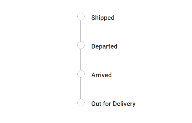
Dot Outline
Adding the e-outline class to the Timeline’s CssClass property enables dots to have a distinct outline style, visually emphasizing each item.
@using Syncfusion.Blazor.Layouts

<div class="container">
    <SfTimeline CssClass="e-outline">
        <TimelineItems>
            @foreach (var item in timelineItems)
            {
                <TimelineItem>
                    <Content>
                        @item.Content
                    </Content>
                </TimelineItem>
            }
        </TimelineItems>
    </SfTimeline>
</div>

<style>
    .container {
        height: 250px;
    }
</style>

@code {

    public class TimelineItemModel
    {
        public string Content { get; set; }
    }
    private List<TimelineItemModel> timelineItems = new List<TimelineItemModel>()
    {
        new TimelineItemModel() { Content = "Shipped" },
        new TimelineItemModel() { Content = "Departed" },
        new TimelineItemModel() { Content = "Arrived" },
        new TimelineItemModel() { Content = "Out for Delivery" }
    };
}