How can I help you?
Items in Blazor Timeline Component
27 Apr 202613 minutes to read
Timeline items are added using the TimelineItem tag directive. Each item can be configured with options such as Content, OppositeContent, DotCss, Disabled and CssClass.
Adding Content
Define the item’s content using the Content tag directive as a child to the TimelineItem directive.
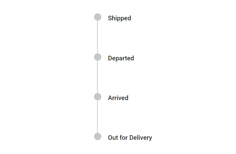
String Content
Define string content for the Timeline items.
@using Syncfusion.Blazor.Layouts

<div class="container" style="height: 350px">
    <SfTimeline>
        <TimelineItems>
            @foreach (var item in timelineItems)
            {
                <TimelineItem>
                    <Content> @item.Content </Content>
                </TimelineItem>
            }
        </TimelineItems>
    </SfTimeline>
</div>

@code {
    public class TimelineItemModel
    {
        public string Content { get; set; }
    }
    private List<TimelineItemModel> timelineItems = new List<TimelineItemModel>()
    {
        new TimelineItemModel() { Content = "Shipped" },
        new TimelineItemModel() { Content = "Departed" },
        new TimelineItemModel() { Content = "Arrived" },
        new TimelineItemModel() { Content = "Out for Delivery" }
    };
}
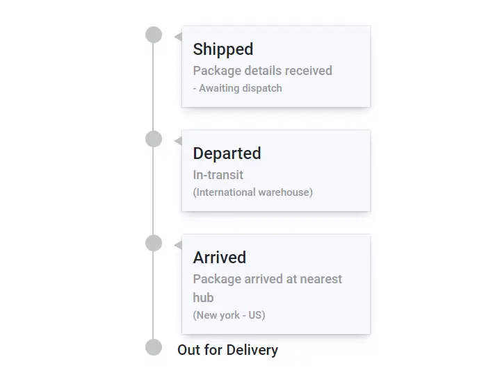
Template Content
Specify template content for items within the Content tag directive.
@using Syncfusion.Blazor.Layouts

<div class="container" style="height: 400px">
    <SfTimeline>
        <ChildContent>
            <TimelineItems>
                @foreach (var item in timelineItems)
                {
                    <TimelineItem>
                        <Content>
                            <div class="content-container">
                                <div class="title">
                                    @item.Title
                                </div>
                                <div class="description">
                                    @item.Description
                                </div>
                                <div class="info">
                                    @item.Info
                                </div>
                            </div>
                        </Content>
                    </TimelineItem>
                }
                <TimelineItem>
                    <Content> Out for Delivery </Content>
                </TimelineItem>
            </TimelineItems>
        </ChildContent>
    </SfTimeline>
</div>

<style>
    .content-container {
        position: relative;
        width: 180px;
        padding: 10px;
        margin-left: 5px;
        box-shadow: rgba(9, 30, 66, 0.25) 0px 4px 8px -2px, rgba(9, 30, 66, 0.08) 0px 0px 0px 1px;
        background-color: ghostwhite;
    }

    .content-container::before {
        content: '';
        position: absolute;
        left: -8px;
        transform: translateY(-50%);
        width: 0;
        height: 0;
        border-top: 5px solid transparent;
        border-bottom: 5px solid transparent;
        border-right: 8px solid silver;
    }

    .content-container .title {
        font-size: 16px;
    }

    .content-container .description {
        color: #999999;
        font-size: 12px;
    }

    .content-container .info {
        color: #999999;
        font-size: 10px;
    }
</style>

@code {
    public class TimelineItemModel
    {
        public string Title { get; set; }
        public string Description{ get; set; }
        public string Info { get; set; }
    }
    private List<TimelineItemModel> timelineItems = new List<TimelineItemModel>()
    {
        new TimelineItemModel() { Title = "Shipped", Description = "Package details received", Info = "- Awaiting dispatch" },
        new TimelineItemModel() { Title = "Departed", Description = "In-transit", Info = "(International warehouse)" },
        new TimelineItemModel() { Title = "Arrived", Description = "Package arrived at nearest hub", Info = "(New york - US)" },
    };
}
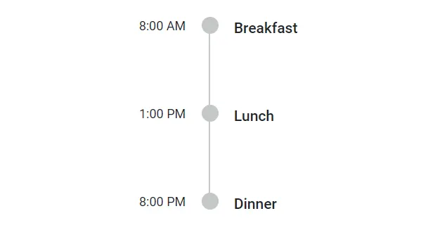
Adding Opposite Content
Additional information can be added to each Timeline item using the OppositeContent tag directive as a child to TimelineItem. This content is positioned opposite to the item’s main Content. Similar to the Content property, string and template contents can be defined for OppositeContent.
@using Syncfusion.Blazor.Layouts

<div class="container" style="height: 250px">
    <SfTimeline>
        <TimelineItems>
            @foreach (var item in timelineItems)
            {
                <TimelineItem>
                    <Content>
                        @item.Content
                    </Content>
                    <OppositeContent>
                        @item.OppositeContent
                    </OppositeContent>
                </TimelineItem>
            }
        </TimelineItems>
    </SfTimeline>
</div>

@code {
    public class TimelineItemModel
    {
        public string Content { get; set; }
        public string OppositeContent { get; set; }
    }
    private List<TimelineItemModel> timelineItems = new List<TimelineItemModel>()
    {
        new TimelineItemModel() { Content = "Breakfast", OppositeContent = "8:00 AM" },
        new TimelineItemModel() { Content = "Lunch", OppositeContent = "1:00 PM" },
        new TimelineItemModel() { Content = "Dinner", OppositeContent = "8:00 PM" },
    };
}
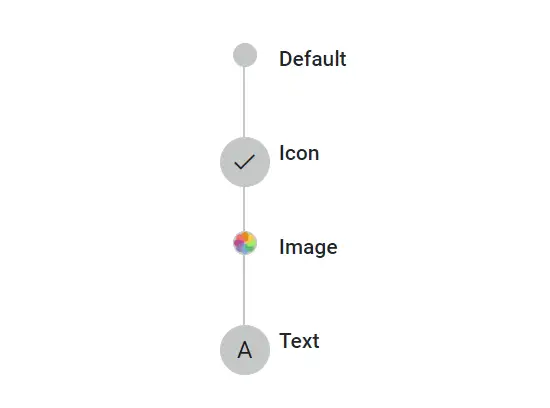
Dot Item
The DotCss property allows defining a CSS class to set icons, background colors, or images, personalizing the appearance of dots associated with each Timeline item.
Adding Icons
Define a CSS class to display an icon for each item using the DotCss property.
Adding Images
Include images for Timeline items using the DotCss property by setting the CSS background-image property.
Adding Text
Display text for Timeline items using the DotCss property by adding text to the CSS content property.
@using Syncfusion.Blazor.Layouts

<div class="container" style="height: 250px">
    <SfTimeline>
        <TimelineItems>
            @foreach (var item in timelineItems)
            {
                <TimelineItem DotCss=@item.DotCss>
                    <Content>
                        @item.Content
                    </Content>
                </TimelineItem>
            }
        </TimelineItems>
    </SfTimeline>
</div>

<style>
    .e-dot.custom-image {
        background-image: url('./dot-image.png');
    }

    .e-dot.custom-text::before {
        content: 'A';
    }
</style>

@code {

    public class TimelineItemModel
    {
        public string Content { get; set; }
        public string DotCss { get; set; }
    }
    private List<TimelineItemModel> timelineItems = new List<TimelineItemModel>()
    {
        new TimelineItemModel() { Content = "Default" },
        new TimelineItemModel() { Content = "Icon", DotCss = "e-icons e-check" },
        new TimelineItemModel() { Content = "Image", DotCss = "custom-image" },
        new TimelineItemModel() { Content = "Text", DotCss = "custom-text" },
    };
}
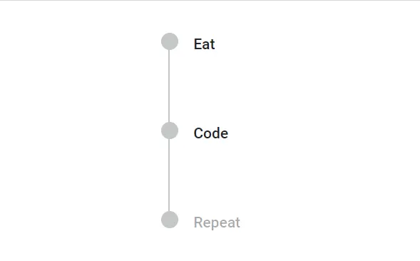
Disabling Items
Use the Disabled property to disable an item. When set to true, the item becomes disabled. By default, its value is false.
@using Syncfusion.Blazor.Layouts

<div class="container" style="height: 250px">
    <SfTimeline>
        <TimelineItems>
            @foreach (var item in timelineItems)
            {
                <TimelineItem Disabled=@item.Disabled>
                    <Content>
                        @item.Content
                    </Content>
                </TimelineItem>
            }
        </TimelineItems>
    </SfTimeline>
</div>

@code {

    public class TimelineItemModel
    {
        public string Content { get; set; }
        public bool Disabled { get; set; }
    }
    private List<TimelineItemModel> timelineItems = new List<TimelineItemModel>()
    {
        new TimelineItemModel() { Content = "Eat" },
        new TimelineItemModel() { Content = "Code" },
        new TimelineItemModel() { Content = "Repeat", Disabled = true },
    };
}
CSS Class
Customize the appearance of a Timeline item by specifying a custom CSS class using the CssClass property.