Template in Blazor Timeline component
8 Jul 20266 minutes to read
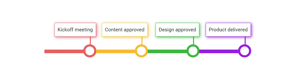
The Timeline component allows customization of each item’s appearance using the Template tag directive. This enables modification of dot items, templated contents, progress bar styling, and more.
The Template context receives the following information:
| Type | Purpose |
|---|---|
Item |
Indicates the current data of the Timeline item. |
ItemIndex |
Indicates the current index of the Timeline item. |
@using Syncfusion.Blazor.Layouts

<div class="container" style="height: 150px; width: 600px;">
    <SfTimeline Orientation=TimelineOrientation.Horizontal CssClass="custom-timeline">
        <ChildContent>
            <TimelineItems>
                @foreach (var item in timelineItems)
                {
                    <TimelineItem>
                        <Content>
                            @item.Content
                        </Content>
                    </TimelineItem>
                }
            </TimelineItems>
        </ChildContent>
        <Template>
            <div class="@("template-container" + " " + "item-" + context.ItemIndex)">
                <div class="content-container">
                    <div class="timeline-content"> @context.Item.Content(context) </div>
                </div>
                <div class="content-connector"></div>
                <div class="progress-line">
                    <span class="indicator"></span>
                </div>
            </div>
        </Template>
    </SfTimeline>
</div>

<style>

    .container *{
        box-sizing: unset;
    }
    .custom-timeline .e-timeline-item.e-item-template {
        align-items: flex-end;
    }

    .custom-timeline .e-timeline-items {
        justify-content: center;
    }

    .template-container .content-connector {
        position: absolute;
        left: 88%;
        width: 3px;
        height: 28px;
    }

    .template-container .content-container {
        padding: 8px;
        border-width: 1px;
        border-style: solid;
    }

    .content-container .timeline-content {
        font-size: 14px;
    }

    /* Color customizations - Progress line, connector line, dot border */
    .item-0 .progress-line, .item-0 .content-connector {
        background-color: rgb(233, 93, 93);
    }

    .item-1 .progress-line, .item-1 .content-connector {
        background-color: rgba(247, 179, 22, 0.907);
    }

    .item-2 .progress-line, .item-2 .content-connector {
        background-color: rgb(60, 184, 60);
    }

    .item-3 .progress-line, .item-3 .content-connector {
        background-color: rgb(153, 29, 230);
    }

    .item-0 .progress-line .indicator, .item-0 .content-container {
        border-color: rgb(233, 93, 93);
    }

    .item-1 .progress-line .indicator, .item-1 .content-container {
        border-color: rgba(247, 179, 22, 0.907);
    }

    .item-2 .progress-line .indicator, .item-2 .content-container {
        border-color: rgb(60, 184, 60);
    }

    .item-3 .progress-line .indicator, .item-3 .content-container {
        border-color: rgb(153, 29, 230);
    }

    .item-0 .content-container {
        box-shadow: 2px 2px 8px rgb(233, 93, 93);
    }

    .item-1 .content-container {
        box-shadow: 2px 2px 8px rgba(247, 179, 22, 0.907);
    }

    .item-2 .content-container {
        box-shadow: 2px 2px 8px rgb(60, 184, 60);
    }

    .item-3 .content-container {
        box-shadow: 2px 2px 8px rgb(153, 29, 230);
    }

    /* START --- Customizing Dot and progress line */
    .custom-timeline .template-container .indicator {
        position: absolute;
        width: 25px;
        height: 25px;
        border-radius: 50%;
        background-color: #fff;
        border-width: 6px;
        border-style: solid;
        left: 88%;
        transform: translate(-50%, -40%);
        cursor: pointer;
    }

    .progress-line {
        position: absolute;
        height: 10px;
        width: 100%;
        left: 0;
        top: 50%;
    }
    /* END --- Customizing Icon and progress line */
</style>

@code {

    public class TimelineItemModel
    {
        public string Content { get; set; }
    }
    private List<TimelineItemModel> timelineItems = new List<TimelineItemModel>()
    {
        new TimelineItemModel() { Content = "Kickoff meeting" },
        new TimelineItemModel() { Content = "Content approved" },
        new TimelineItemModel() { Content = "Design approved" },
        new TimelineItemModel() { Content = "Product delivered" }
    };
}