How to customize CSS in Blazor TimePicker
14 Aug 20263 minutes to read
TimePicker allows you to customize the text box and popup list appearance to suit the application by using the CssClass property.
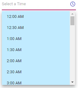
The following code demonstrates customization of text appearance in a text box, popup button, and popup list along with hover and active state by using the e-custom-style class. The following table lists the available classes for customizing the TimePicker component:
| Class Name | Description |
|---|---|
| e-time-wrapper | Applied to the TimePicker wrapper element. |
| e-timepicker | Applied to the input element and the TimePicker popup element. |
| e-time-wrapper.e-timepicker | Applied to the input element only. |
| e-input-group-icon.e-time-icon | Applied to the popup button. |
| e-float-text | Applied to the floating label text element. |
| e-popup | Applied to the popup element. |
| e-timepicker.e-popup | Applied to the TimePicker popup element only. |
| e-list-parent | Applied to the popup UL element. |
| e-timepicker.e-list-parent | Applied to the TimePicker popup UL element only. |
| e-list-item | Applied to the LI elements. |
| e-hover | Applied to the list item when hovered. |
| e-active | Applied to the active list item. |
@using Syncfusion.Blazor.Calendars

<SfTimePicker TValue="DateTime?" CssClass="e-custom-style" Placeholder="Select a Time"></SfTimePicker>

<style>
     /*customize the input element text color*/
    .e-time-wrapper.e-custom-style .e-input.e-timepicker {
        display: block;
        color: blue;
    }

    /*customize the floating label and popup button text color*/
    .e-time-wrapper.e-custom-style .e-float-text.e-label-bottom,
    .e-time-wrapper.e-custom-style .e-input-group-icon.e-time-icon.e-icons {
        color: blue;
    }

    /*customize the input element text selection*/
    .e-time-wrapper.e-custom-style.e-input-group::before,
    .e-time-wrapper.e-custom-style.e-input-group::after,
    .e-time-wrapper.e-custom-style.e-input-group .e-timepicker::selection {
        background: blue;
    }


    .e-timepicker.e-popup.e-custom-style .e-list-parent.e-ul,
    .e-timepicker.e-popup.e-custom-style .e-list-parent.e-ul .e-list-item {
        background-color: #c0ebff;
    }

        /*customize the list item hover color*/
    .e-timepicker.e-popup.e-custom-style .e-list-parent.e-ul .e-list-item.e-hover,
    .e-timepicker.e-popup.e-custom-style .e-list-parent.e-ul .e-list-item.e-active.e-hover {
        background-color: blue;
        color: #fff;
    }

        /*customize the active element text color*/
    .e-timepicker.e-popup.e-custom-style .e-list-parent.e-ul .e-list-item.e-active {
        color: #333;
        background-color: #fff;
    }
</style>