Mask Support in Blazor TimePicker
14 Aug 20262 minutes to read
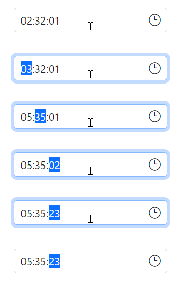
The masking feature lets users enter a time in the format specified by the Format property, which helps ensure the value is entered correctly and makes the expected input format clear at a glance. Use the EnableMask property on the TimePicker component to enable or disable the masking functionality. When enabled, the input field is rendered with a mask that matches the configured time format pattern.
@using Syncfusion.Blazor.Calendars

<SfTimePicker TValue="DateTime?" EnableMask="true" Format="hh:mm:ss" StrictMode=true @bind-Value="@Value">
    <TimePickerMaskPlaceholder Hour="hour" Minute="minute" Second="second"></TimePickerMaskPlaceholder>
</SfTimePicker>


@code {
    public DateTime? Value { get; set; } = new DateTime(2022, 12, 11, 11, 30, 00);
}
MaskPlaceholder
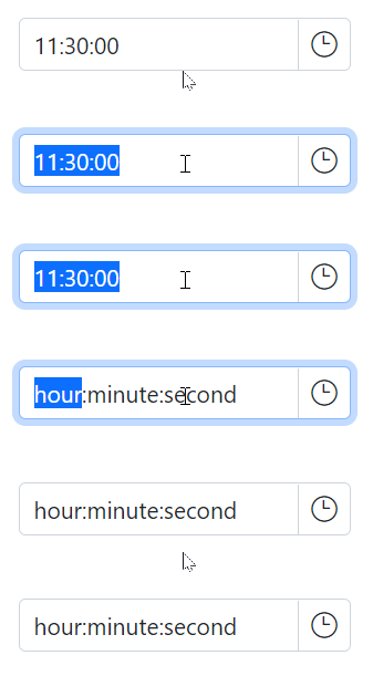
The TimePickerMaskPlaceholder directive lets you set custom placeholder text for each segment of the time format in a TimePicker component, providing users with additional context about the expected input. To use the directive, add it to the component’s configuration together with the EnableMask property.
The TimePickerMaskPlaceholder class has the following properties:
-
Hour : Specifies the placeholder character for the hour (
hh) segment of the time value. -
Minute : Specifies the placeholder character for the minute (
mm) segment of the time value. -
Second : Specifies the placeholder character for the second (
ss) segment of the time value.
By default, the TimePicker component uses placeholder text from the current culture’s resources file for each segment of the time format. To override this with custom placeholder text, use the TimePickerMaskPlaceholder directive and its properties.
@using Syncfusion.Blazor.Calendars

<SfTimePicker TValue="DateTime?" EnableMask="true" Format="hh:mm:ss" StrictMode=true @bind-Value="@Value">
    <TimePickerMaskPlaceholder Hour="hour" Minute="minute" Second="second"></TimePickerMaskPlaceholder>
</SfTimePicker>


@code {
    public DateTime? Value { get; set; } = new DateTime(2022, 12, 11, 11, 30, 00);
}
If you do not specify custom placeholder text for any segment of the time format, the component uses the default placeholder text from the current culture’s resources file for the unspecified segments.