How to customize switch appearance in Blazor Toggle Switch Button
27 Aug 20263 minutes to read
The appearance of the Blazor Toggle Switch Button component can be customized using the CSS rules. Define your own CSS rules according to your requirement and assign the class name to the CssClass property.
Customize Toggle Switch Button bar and handle
The Blazor Toggle Switch Button bar and handle can be customized as per requirement using CSS rules. The Blazor Toggle Switch Button bar and handle are customized using the CssClass property. In the following sample, the border-radius CSS property for the e-switch-inner and e-switch-handle elements is changed from rounded corners to square corners.
For this customization, refer the
fabric.cssfile. This could be found from our CDN link.
@using Syncfusion.Blazor.Buttons

<SfSwitch CssClass="square" @bind-Checked="isSquareChecked"></SfSwitch><br />
<SfSwitch CssClass="custom-switch" @bind-Checked="isCustomChecked"></SfSwitch><br />
<SfSwitch CssClass="handle-text" @bind-Checked="isHandleChecked"></SfSwitch>

@code {
    private bool isSquareChecked = true;
    private bool isCustomChecked = false;
    private bool isHandleChecked = false;
}

<style>
/* Square Switch */
.e-switch-wrapper.square .e-switch-inner,
.e-switch-wrapper.square .e-switch-handle {
  border-radius: 0;
}

/* Customize Handle and Bar Switch */
.e-switch-wrapper.custom-switch {
  width: 50px;
  height: 24px;
}

.e-switch-wrapper.custom-switch .e-switch-handle {
  width: 20px;
  height: 16px;
}

.e-switch-wrapper.custom-switch .e-switch-inner,
.e-switch-wrapper.custom-switch .e-switch-handle {
  border-radius: 0;
}

.e-switch-wrapper.custom-switch .e-switch-handle.e-switch-active {
  left: 42px;
}

/* Customize Handle and Bar Switch */
.e-switch-wrapper.handle-text {
  width: 58px;
  height: 24px;
}

.e-switch-wrapper.handle-text .e-switch-handle {
  width: 26px;
  height: 20px;
  left: 2px;
  background-color: #fff;
}

.e-switch-wrapper.handle-text .e-switch-inner,
.e-switch-wrapper.handle-text .e-switch-handle {
  border-radius: 0;
}

.e-switch-wrapper.handle-text .e-switch-handle.e-switch-active {
  left: 46px;
}

.e-switch-wrapper.handle-text .e-switch-inner.e-switch-active,
.e-switch-wrapper.handle-text:hover .e-switch-inner.e-switch-active .e-switch-on {
  background-color: #4d841d;
  border-color: #4d841d;
}

.e-switch-wrapper.handle-text .e-switch-inner,
.e-switch-wrapper.handle-text .e-switch-off {
  background-color: #e3165b;
  border-color: #e3165b;
}

.e-switch-wrapper.handle-text .e-switch-inner:after,
.e-switch-wrapper.handle-text .e-switch-inner:before {
  font-size: 10px;
  position: absolute;
  line-height: 21px;
  font-family: "Helvetica", sans-serif;
  z-index: 1;
  height: 100%;
  transition: all 200ms cubic-bezier(0.445, 0.05, 0.55, 0.95);
}

.e-switch-wrapper.handle-text .e-switch-inner:before {
  content: "OFF";
  color: #e3165b;
  left: 3px;
}

.e-switch-wrapper.handle-text .e-switch-inner:after {
  content: "ON";
  right: 5px;
  color: #fff;
}

.e-switch-wrapper.handle-text .e-switch-inner.e-switch-active:before {
  color: #fff;
}

.e-switch-wrapper.handle-text .e-switch-inner.e-switch-active:after {
  color: #4d841d;
}

.e-switch-wrapper.handle-text:not(.e-switch-disabled):hover .e-switch-handle:not(.e-switch-active) {
  background-color: #fff;
}
</style>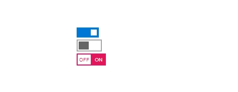
Color the Toggle Switch Button
Blazor Toggle Switch Button colors can be customized as per the requirement using CSS rules. The Blazor Toggle Switch Button bar and handle colors are customized using the CssClass property. In the following sample, the e-switch-inner and e-switch-off elements’ background and border colors were changed from the default colors.
For this customization you need to refer the
bootstrap.cssfile. This could be found from our CDN link.
@using Syncfusion.Blazor.Buttons

<SfSwitch CssClass="bar-color"  @bind-Checked="isBarCheked"></SfSwitch><br />
<SfSwitch CssClass="handle-color"  @bind-Checked="isHandleChecked"></SfSwitch><br />
<SfSwitch CssClass="custom-iOS"  @bind-Checked="isCustomChecked"></SfSwitch>

@code {
  private bool isBarCheked = false;
  private bool isHandleChecked = true;
  private bool isCustomChecked = true;

}
<style>
/* Custom color Switch */
.e-switch-wrapper.bar-color .e-switch-inner.e-switch-active,
.e-switch-wrapper.bar-color:hover .e-switch-inner.e-switch-active .e-switch-on {
  background-color: #4d841d;
  border-color: #4d841d;
}

.e-switch-wrapper.bar-color .e-switch-inner,
.e-switch-wrapper.bar-color .e-switch-off {
  background-color: #e3165b;
  border-color: #e3165b;
}

.e-switch-wrapper.bar-color .e-switch-handle {
  background-color: #fff;
}

/* handle color Switch */
.e-switch-wrapper.handle-color .e-switch-handle {
  background-color: #e3165b;
}

.e-switch-wrapper.handle-color .e-switch-handle.e-switch-active {
  background-color: #4d841d
}

.e-switch-wrapper.handle-color .e-switch-inner.e-switch-active,
.e-switch-wrapper.handle-color:hover .e-switch-inner.e-switch-active .e-switch-on {
  background-color: #fff;
  border-color: #ccc;
}

.e-switch-wrapper.handle-color .e-switch-inner,
.e-switch-wrapper.handle-color .e-switch-off {
  background-color: #fff;
  border-color: #ccc;
}

/* iOS Switch */
.e-switch-wrapper.custom-iOS .e-switch-inner.e-switch-active,
.e-switch-wrapper.custom-iOS:hover .e-switch-inner.e-switch-active .e-switch-on {
  background-color: #3df865;
  border-color: #3df665;
}

.e-switch-wrapper.custom-iOS {
  width: 42px;
  height: 24px;
}

.e-switch-wrapper.custom-iOS .e-switch-handle {
  width: 20px;
  height: 20px;
}

.e-switch-wrapper.custom-iOS .e-switch-handle.e-switch-active {
  margin-left: -22px;
}
</style>