How can I help you?
Content in Blazor Tooltip Component
21 Feb 202511 minutes to read
The Blazor Tooltip component allows you to display additional information when users hover over or interact with elements on your web page. Here’s how you can explore and implement various content within your Tooltip to enhance its functionality and appearance.
Simple Text Content
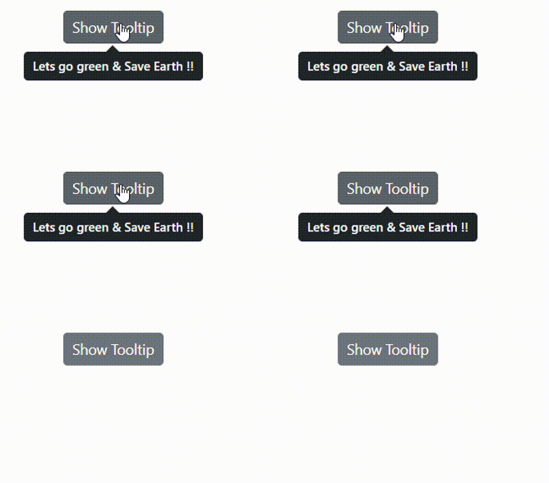
The simplest way to use a Tooltip is with a string of text using the Content property. A text or a piece of information assigned to the Tooltip’s Content property will be displayed as the main text stream of the Tooltip.
@using Syncfusion.Blazor.Popups
@using Syncfusion.Blazor.Buttons

<SfTooltip ID="Tooltip" Target="#btn" Content="@Content">
    <SfButton ID="btn" Content="Show Tooltip"></SfButton>
</SfTooltip>

@code
{
    string Content = "Lets go green & Save Earth !!";
}
This displays a simple text message when users hover over the button.

Using the Title Attribute
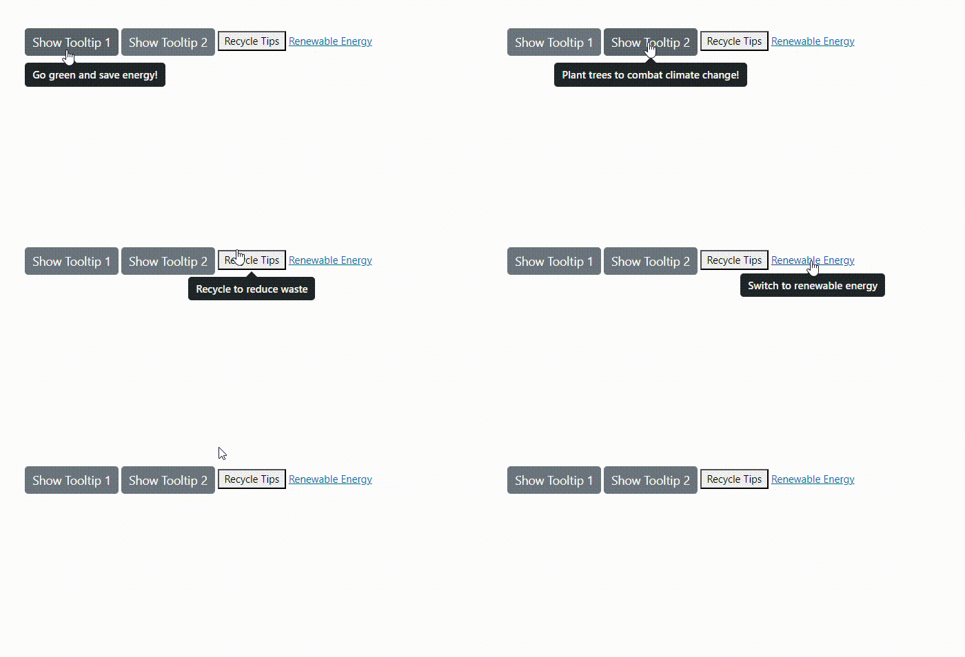
You can also use the title attribute of the target element as the Tooltip content. By using the Target property which allows the Tooltip to use the title attribute of the target element as its content.
@using Syncfusion.Blazor.Buttons
@using Syncfusion.Blazor.Popups

<SfTooltip ID="Tooltip" Target="#container [title]">
    <!-- Elements with title attributes -->
    <div id="container">
        <SfButton ID="btn1" Content="Show Tooltip 1" title="Go green and save energy!"></SfButton>
        <SfButton ID="btn2" Content="Show Tooltip 2" title="Plant trees to combat climate change!"></SfButton>
        <button title="Recycle to reduce waste">Recycle Tips</button>
        <a href="#" title="Switch to renewable energy">Renewable Energy</a>
    </div>
</SfTooltip>
This approach is useful when you want to enhance existing HTML title attributes with a more stylish Tooltip.

Using Template
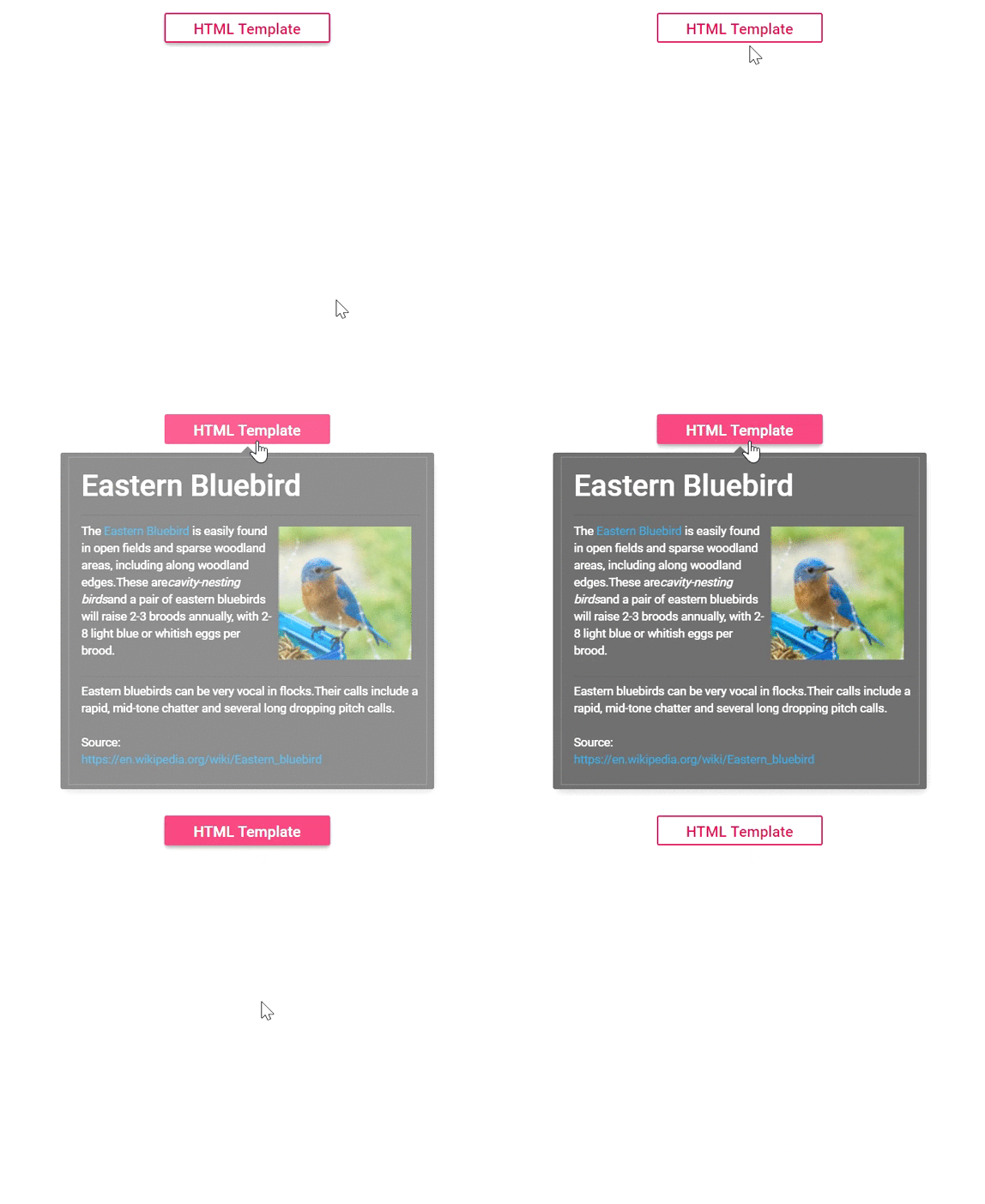
The Tooltip’s Template property enables you to completely customize the layout and incorporate custom elements into the Tooltip. You can insert any content or HTML elements as Tooltip content by specifying them within the ContentTemplate property of the Tooltip component. Additionally, the ContentTemplate property supports the RenderFragment type, enabling dynamic and interactive content within the Tooltip.
Check out the following code example to see how to include an HTML template inside the Tooltip.
@using Syncfusion.Blazor.Buttons;
@using Syncfusion.Blazor.Popups;
<SfTooltip CssClass="e-tooltip-css" OpensOn="Click" Target="#btn">
    <ContentTemplate>
        <div id='democontent' class='democontent'>
            <div class='info'>
                <h3 style='margin-top:10px'>Eastern Bluebird <hr style='margin-top:10px'></h3>
                <div style='margin-top: -10px'>
                    <div style='float:left;width:57%'>
                        The
                            <a href='https://en.wikipedia.org/wiki/Eastern_bluebird' target='blank'> Eastern Bluebird
                            </a>
                                is easily found in open fields and sparse woodland areas, including along woodland edges.These are
                            <i>
                                cavity-nesting birds
                            </i>
                        and a pair of eastern bluebirds will raise 2-3 broods annually, with 2-8 light blue or whitish eggs per brood.
                    </div>
                    <div id='bird' style='float:right;width:42%'>
                        <img src='https://blazor.syncfusion.com/demos/_content/blazor_webapp_common_net8/images/tooltip/bird.png' width='125' height='125' />
                    </div>
                </div>
                <div style='margin-top:160px'>
                    <hr>
                    <p style='margin-top:-11px'> Eastern bluebirds can be very vocal in flocks.Their calls include a rapid,  mid-tone chatter and several long dropping pitch calls.
                    </p>
                </div>
                    <p>Source:<br />
                        <a href='https://en.wikipedia.org/wiki/Eastern_bluebird' target='_blank'>https://en.wikipedia.org/wiki/Eastern_bluebird</a>
                    </p>
            </div>
        </div>
    </ContentTemplate>
    <ChildContent>
        <SfButton ID="btn" CssClass="e-outline text" IsPrimary="true" Content="HTML Template"></SfButton>
    </ChildContent>
</SfTooltip>
<style>
    .e-tooltip-css {
        filter: drop-shadow(2px 5px 5px rgba(0, 0, 0, 0.25));
    }
    .text {
        text-transform: capitalize;
        width: 155px;
    }
    .democontent {
        border: 0.5px solid grey;
    }
    #bird {
        padding-top: 4px;
    }
    .info a {
        color: #2FA1E3;
    }
    .info {
        padding-left: 12px;
        padding-right: 5px;
    }
</style>
Dynamic Content with RenderFragment
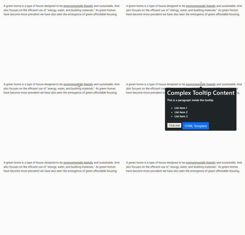
The SfTooltip is used to display dynamic content generated using a RenderFragment. The ContentTemplateproperty allows you to render this dynamic content within the tooltip. A RenderFragment in Blazor enables you to dynamically define and render UI content, including Blazor components, HTML, and interactive logic.
@using Syncfusion.Blazor.Buttons
@using Syncfusion.Blazor.Popups

<SfTooltip ID="tooltip" Target="#target">
    <ContentTemplate>
        <div>
            @(TooltipContent())
        </div>
    </ContentTemplate>
    <ChildContent>
        <div id='container'>
            <p>
                A green home is a type of house designed to be
                <a id="target">
                    <u>environmentally friendly</u>
                </a> and sustainable. And also focuses on the efficient use of "energy, water, and building materials." As green homes
                have become more prevalent we have also seen the emergence of green affordable housing.
            </p>
        </div>
    </ChildContent>
</SfTooltip>

@code {
    private RenderFragment TooltipContent()
        {
            return@<div>
                <h3>Complex Tooltip Content</h3>
                <p>This is a paragraph inside the tooltip.</p>
                <ul>
                    <li>List item 1</li>
                    <li>List item 2</li>
                    <li>List item 3</li>
                </ul>
                <button @onclick="@(() => Console.WriteLine("Button in Tooltip clicked!"))">
                    Click me!
                </button>
                <SfButton ID="btn" IsPrimary="true" Content="HTML Template"></SfButton>
            </div>;
        }
}
This approach gives you full control over the Tooltip’s content, allowing for interactive elements and dynamic data.

Rendering HTML content using MarkupString
By default, the Tooltip can show any kind of formatted content. To improve its layout or create a custom visual element, utilize the ContentTemplate property to establish the desired structure. You can also use @(MarkupString) to dynamically render HTML content.
@using Syncfusion.Blazor.Popups

<SfTooltip ID="tooltip" Target="#target">
    <ContentTemplate>
        <div>
            @((MarkupString)Content)
        </div>
    </ContentTemplate>
    <ChildContent>
        <div id='container'>
            <p>
                A green home is a type of house designed to be
                <a id="target">
                    <u>environmentally friendly</u>
                </a> and sustainable. And also focuses on the efficient use of "energy, water, and building materials." As green homes
                have become more prevalent we have also seen the emergence of green affordable housing.
            </p>
        </div>
    </ChildContent>
</SfTooltip>

@code
{
    string Content = "<div><b>Environmentally friendly</b> or environment-friendly, (also referred to as eco-friendly, nature-friendly, and green) are marketing and sustainability terms referring to goods and services, laws, guidelines and policies that inflict reduced, minimal, or no harm upon ecosystems or the environment.</div>";
}
This is useful when you need to render HTML content that’s stored as a string, perhaps from a database or API.

By using these different content options, you can create Tooltips that range from simple text hints to rich, interactive information displays, enhancing the user experience of your Blazor application.