Customization in Blazor Tooltip Component
25 Jun 20265 minutes to read
The Tooltip can be customized by using the CssClass property, which accepts custom CSS class names that defines the specific user-defined styles and themes to be applied on the Tooltip element.
Tip pointer customization
Styling the tip pointer’s size, background, and border colors can be done using the CssClass property, as given below.
@using Syncfusion.Blazor.Popups
@using Syncfusion.Blazor.Buttons

<SfTooltip Target="#target" CssClass="customtip" Content="@Content">
    <SfButton ID="target" Content="Show Tooltip"></SfButton>
</SfTooltip>

@code
{
    string Content = "Tooltip arrow customized";
}

<style>
    #target {
        background-color: #cfd8dc;
        border: 3px solid #eceff1;
        box-sizing: border-box;
        margin: 80px auto;
        padding: 20px 0;
        width: 200px;
        text-align: center;
        color: #424242;
        font-size: 20px;
        user-select: none;
    }

    .customtip.e-tooltip-wrap {
        padding: 4px;
    }

    .customtip.e-tooltip-wrap .e-arrow-tip.e-tip-bottom,
    .customtip.e-tooltip-wrap .e-arrow-tip.e-tip-top,
    .customtip.e-tooltip-wrap .e-arrow-tip.e-tip-left,
    .customtip.e-tooltip-wrap .e-arrow-tip.e-tip-right {
        height: 20px;
        width: 12px;
    }

    .customtip.e-tooltip-wrap .e-arrow-tip-outer.e-tip-bottom {
        border-left: 6px solid transparent;
        border-right: 6px solid transparent;
        border-top: 20px solid #616161;
    }

    .customtip.e-tooltip-wrap .e-arrow-tip-outer.e-tip-top {
        border-bottom: 20px solid #616161;
        border-left: 6px solid transparent;
        border-right: 6px solid transparent;
    }

    .customtip.e-tooltip-wrap .e-arrow-tip-outer.e-tip-left {
        border-bottom: 6px solid transparent;
        border-right: 20px solid #616161;
        border-top: 6px solid transparent;
    }

    .customtip.e-tooltip-wrap .e-arrow-tip-outer.e-tip-right {
        border-bottom: 6px solid transparent;
        border-left: 20px solid #616161;
        border-top: 6px solid transparent;
    }
</style>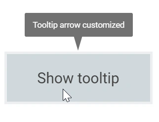
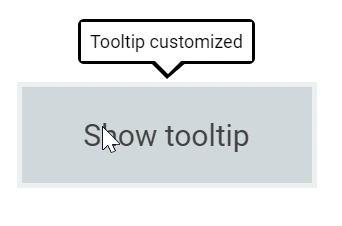
Tooltip customization
The complete look and feel of the Tooltip can be customized by changing it’s background color, opacity, content font, etc.
@using Syncfusion.Blazor.Popups
@using Syncfusion.Blazor.Buttons


<SfTooltip Target="#target" CssClass="customtooltip" Content="@Content">
    <SfButton ID="target" Content="Show Tooltip"></SfButton>
</SfTooltip>

@code
{
    string Content="Tooltip customized";
}

<style>
    #target {
        background-color: #ececec;
        border: 1px solid #c8c8c8;
        box-sizing: border-box;
        margin: 70px auto;
        padding: 20px;
        width: 200px;
    }

    .customtooltip.e-tooltip-wrap .e-tip-content {
        line-height: 20px;
    }

    .customtooltip.e-tooltip-wrap .e-arrow-tip.e-tip-bottom {
        height: 12px;
        left: 50%;
        top: 100%;
        width: 24px;
    }

    .customtooltip.e-tooltip-wrap .e-arrow-tip.e-tip-top {
        height: 12px;
        left: 50%;
        top: -9px;
        width: 24px;
    }

    .customtooltip.e-tooltip-wrap .e-arrow-tip.e-tip-left {
        height: 24px;
        left: -9px;
        top: 48%;
        width: 12px;
    }

    .customtooltip.e-tooltip-wrap .e-arrow-tip.e-tip-right {
        height: 24px;
        left: 100%;
        top: 50%;
        width: 12px;
    }

    .customtooltip.e-tooltip-wrap {
        border-radius: 4px;
        opacity: 1;
    }

    .customtooltip.e-tooltip-wrap.e-popup {
        background-color: #fff;
        border: 2px solid #000;
    }

    .customtooltip.e-tooltip-wrap .e-tip-content {
        color: #000;
        font-size: 12px;
    }

    .customtooltip.e-tooltip-wrap .e-arrow-tip-outer.e-tip-bottom {
        border-left: 12px solid transparent;
        border-right: 14px solid transparent;
        border-top: 12px solid #000;
    }

    .customtooltip.e-tooltip-wrap .e-arrow-tip-outer.e-tip-top {
        border-bottom: 12px solid #000;
        border-left: 12px solid transparent;
        border-right: 12px solid transparent;
    }

    .customtooltip.e-tooltip-wrap .e-arrow-tip-outer.e-tip-left {
        border-bottom: 12px solid transparent;
        border-right: 12px solid #000;
        border-top: 12px solid transparent;
    }

    .customtooltip.e-tooltip-wrap .e-arrow-tip-outer.e-tip-right {
        border-bottom: 12px solid transparent;
        border-left: 12px solid #000;
        border-top: 12px solid transparent;
    }

    .customtooltip.e-tooltip-wrap .e-arrow-tip-inner.e-tip-bottom {
        color: #fff;
        font-size: 25.9px;
    }
</style>