Position in Blazor Tooltip Component
25 Jun 20262 minutes to read
Tooltips can be attached to 12 static locations around the target. On initializing the Tooltip, set the Position property with any one of the following values:
TopLeftTopCenterTopRightBottomLeftBottomCenterBottomRightLeftTopLeftCenterLeftBottomRightTopRightCenterRightBottom
NOTE
By default, Tooltip is placed at the TopCenter of the target element.
@using Syncfusion.Blazor.Popups
@using Syncfusion.Blazor.Buttons

<SfTooltip Target="#target" Content="@Content" Position="Position.RightCenter">
    <SfButton ID="target" Content="Show Tooltip"></SfButton>
</SfTooltip>

@code
{
    string Content = "Tooltip Content";
}
Mouse trailing
Tooltips can be positioned relative to the mouse pointer. This behavior can be enabled or disabled by using the MouseTrail property. By default, it is set to false.
@using Syncfusion.Blazor.Popups
@using Syncfusion.Blazor.Buttons

<SfTooltip MouseTrail=true Content="@Content" Target="#target">
    <SfButton ID="target" Content="Show Tooltip"></SfButton>
</SfTooltip>

@code
{
    string Content="Tooltip Content";
}

<style>
    #target {
        background-color: #ececec;
        border: 1px solid #c8c8c8;
        box-sizing: border-box;
        margin: 80px auto;
        padding: 20px;
        width: 200px;
    }
</style>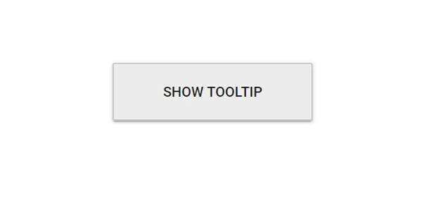
NOTE
When mouse trailing option is enabled, the tip pointer position gets auto adjusted based on the target, and other position values like start, end, and middle are not applied (to prevent the pointer from moving out of target).
Setting offset values
Offset values are set to specify the distance between the target and Tooltip element. OffsetX and OffsetY properties are used to specify the offset left and top values.
-
OffsetXspecifies the distance between the target and Tooltip element in X axis. -
OffsetYspecifies the distance between the target and Tooltip element in Y axis.
@using Syncfusion.Blazor.Popups
@using Syncfusion.Blazor.Buttons

<SfTooltip Target="#target" ShowTipPointer="false" MouseTrail="true" Content="@Content" OffsetX="30" OffsetY="30">
    <SfButton ID="target" Content="Show Tooltip"></SfButton>
</SfTooltip>

@code
{
    string Content="Tooltip Content";
}

<style>
    #target {
        background-color: #ececec;
        border: 1px solid #c8c8c8;
        box-sizing: border-box;
        margin: 80px auto;
        padding: 20px;
        width: 200px;
    }
</style>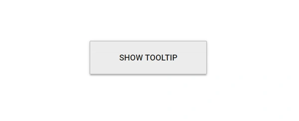
NOTE
By default, collision is handled automatically and therefore when collision is detected the Tooltip fits horizontally and flips vertically.
Change collision target to viewport when setting Target
You can set the WindowCollision property to change collision target to viewport instead of parent of Tooltip element.
@using Syncfusion.Blazor.Popups
@using Syncfusion.Blazor.Buttons
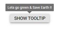
<SfTooltip ID="Tooltip" Target="#btn" Content="@content" Position="Position.TopCenter" WindowCollision="true">
<SfButton ID="btn" Content="Show Tooltip"></SfButton>
</SfTooltip>
@code
{
string content = "Lets go green & Save Earth !!";
}
NOTE