How can I help you?
Target
3 Jul 20251 minute to read
The Target property specifies the target selector where the Tooltip needs to be displayed. It enables Tooltip activation on specific DOM elements based on user interactions like hover or focus.
<SfTooltip Content="Let's go green to save the planet!!" Target="#btn" >
 <SfButton ID="btn" Content="Show Tooltip"></SfButton>
</SfTooltip>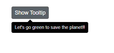
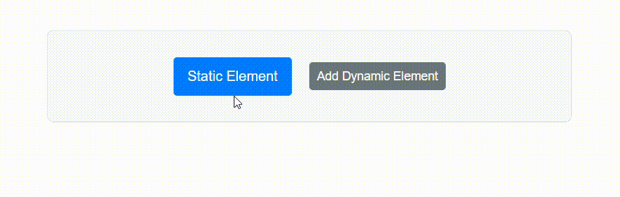
Displaying Tooltip for dynamically created target element
The Tooltip component can be configured to display Tooltips for elements that are added to the DOM after the initial page load. This behavior is useful in applications where target is rendered dynamically, such as in response to user actions, API calls, or conditional logic.
Set the TargetContainer property using a CSS selector that defines the container in which Tooltip target elements will be automatically display Tooltips. All elements inside this container that match the Target selector will automatically show Tooltips, including those added after the component is rendered—no extra setup needed.
@using Syncfusion.Blazor.Popups
@using Syncfusion.Blazor.Buttons

<SfTooltip ID="BasicTooltip" Target="[title]" TargetContainer=".tooltip-container">
</SfTooltip>
<div class="tooltip-container">
        <span title="Static tooltip">Static Element</span>
        <SfButton @onclick="AddElement">Add Dynamic Element<SfButton>
        @if (ShowElement)
        {
            <span title="Dynamic tooltip">Dynamic Element</span>
        }
</div>

@code {
    private bool ShowElement = false;

    private void AddElement()
    {
        ShowElement = true;
    }
}
The TargetContainer property enables automatic Tooltip registration for newly added elements, enhancing dynamic content interactivity.