Tooltip in Blazor TreeMap Component
30 Jun 20264 minutes to read
Tooltip is used to display details about the items in the TreeMap. When space constraints prevents from displaying the information using Data Labels, the tooltip comes in handy.
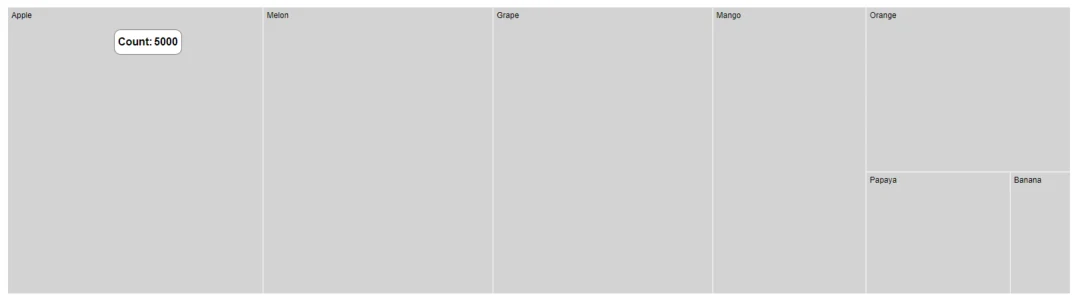
Default tooltip
The tooltip is not visible by default, to make it visible, set the Visible property in the TreeMapTooltipSettings to true.
@using Syncfusion.Blazor.TreeMap

<SfTreeMap WeightValuePath="Count" TValue="Fruit" DataSource="Fruits">
    <TreeMapLeafItemSettings LabelPath="Name"></TreeMapLeafItemSettings>
    <TreeMapTooltipSettings Visible=true></TreeMapTooltipSettings>
</SfTreeMap>

@code {
    public class Fruit
    {
        public string Name { get; set; }
        public int Count { get; set; }
    };
    public List<Fruit> Fruits = new List<Fruit> {
        new Fruit { Name="Apple", Count=5000 },
        new Fruit { Name="Mango", Count=3000 },
        new Fruit { Name="Orange", Count=2300 },
        new Fruit { Name="Banana", Count=500 },
        new Fruit { Name="Grape", Count=4300 },
        new Fruit { Name="Papaya", Count=1200 },
        new Fruit { Name="Melon", Count=4500 }
    };
}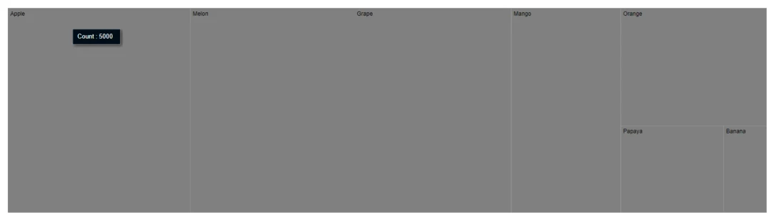
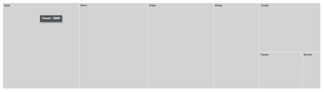
Customization
Customize the TreeMap tooltip using the following properties.
- Fill - Specifies the color of the tooltip.
- Opacity - Specifies the opacity of the tooltip.
- TreeMapTooltipBorder - Specifies the tooltip border color and width.
- TreeMapTooltipTextStyle - Specifies the tooltip font family, style, weight, color and size.
@using Syncfusion.Blazor.TreeMap

<SfTreeMap WeightValuePath="Count" TValue="Fruit" DataSource="Fruits">
    <TreeMapLeafItemSettings LabelPath="Name" Fill="lightgray" Gap="2"></TreeMapLeafItemSettings>
    <TreeMapTooltipSettings Visible=true>
        <TreeMapTooltipTextStyle FontStyle="italic" FontWeight="bold" Size="15">
        </TreeMapTooltipTextStyle>
    </TreeMapTooltipSettings>
</SfTreeMap>
NOTE
Refer to the code block to know about the property value of Fruits.
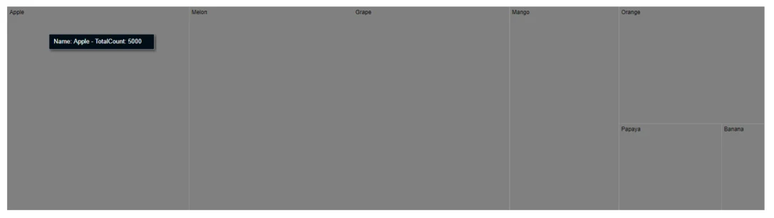
Formatting tooltip content
The tooltip content is displayed by default based on the WeightValuePath. In addition, to show more information in the tooltip, use the Format property and define properties from the data source as following.
@using Syncfusion.Blazor.TreeMap

<SfTreeMap WeightValuePath="Count" TValue="Fruit" DataSource="Fruits">
    <TreeMapLeafItemSettings LabelPath="Name"></TreeMapLeafItemSettings>
    <TreeMapTooltipSettings Visible=true Format="Name: ${Name} - TotalCount: ${Count}"></TreeMapTooltipSettings>
</SfTreeMap>
NOTE
Refer to the code block to know about the property value of Fruits.
Tooltip template
Tooltip can be rendered as a custom component using the TooltipTemplate property in the TreeMapTooltipSettings which accepts one or more UI elements as an input, that can be rendered as a part of the tooltip rendering.
@using Syncfusion.Blazor.TreeMap

<SfTreeMap WeightValuePath="Count" TValue="Fruit" DataSource="Fruits">
    <TreeMapLeafItemSettings LabelPath="Name" Fill="lightgray" Gap="2"></TreeMapLeafItemSettings>
    <TreeMapTooltipSettings Visible=true Opacity="0.8">
        <TooltipTemplate>
            @{
                var data = (context as Fruit);
                <table style="width:100%; background-color: #ffffff; border-spacing: 0px; border-collapse:separate; border: 1px solid grey; border-radius:10px; padding-top: 5px; padding-bottom:5px">
                    <tr>
                        <td style="font-weight:bold; color:black; padding-left: 5px;">Count:</td>
                        <td style="font-weight:bold; color:black; padding-right: 5px;">@data.Count</td>
                    </tr>
                </table>
            }
        </TooltipTemplate>
    </TreeMapTooltipSettings>
</SfTreeMap>
NOTE
Refer to the code block to know about the property value of Fruits.