Toolbar items in Blazor AI AssistView component
10 Jul 202624 minutes to read
You can render the AI AssistView toolbar items by using the AssistViewToolbarItem, PromptToolbarItem, ResponseToolbarItem & AssistViewFooterToolbar tag directives.
Configure footer toolbar
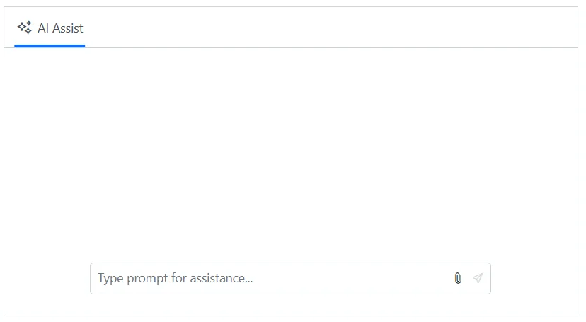
By default, the footer toolbar renders the send, if attachment is enabled the attachment item will also be rendered which allows users to send the prompt text or attach files as needed.
In the following example, AI AssistView component rendered with footer toolbar items such as send and attachment icons.
@using Syncfusion.Blazor.InteractiveChat

<div class="aiassist-container" style="height: 350px; width: 650px;">
    <SfAIAssistView AttachmentSettings="attachmentSettings" PromptRequested="PromptRequest"></SfAIAssistView>
</div>

@code {
    private AssistViewAttachmentSettings attachmentSettings = new AssistViewAttachmentSettings()
    {
        Enable = true,
        SaveUrl = "https://blazor.syncfusion.com/services/production/api/FileUploader/Save",
        RemoveUrl = "https://blazor.syncfusion.com/services/production/api/FileUploader/Remove"
    };
    private async Task PromptRequest(AssistViewPromptRequestedEventArgs args)
    {
        await Task.Delay(1000);
        var defaultResponse = "For real-time prompt processing, connect the AI AssistView component to your preferred AI service, such as OpenAI or Azure Cognitive Services. Ensure you obtain the necessary API credentials to authenticate and enable seamless integration.";
        args.Response = defaultResponse;
    }
}
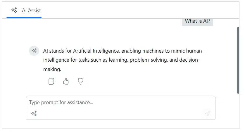
Toolbar positioning
You can use the ToolbarPosition property to customize footer toolbar position. It has two modes such as Inline, and Bottom. By default, the ToolbarPosition is Inline.
By setting ToolbarPosition as Bottom, footer items will be rendered at the bottom with a dedicated footer area .
@using Syncfusion.Blazor.InteractiveChat

<div class="aiassist-container" style="height: 350px; width: 650px;">
    <button id="toolbarBtn" class="e-btn" @onclick="UpdateToolbarPosition">UpdateToolbarPosition</button>
    <SfAIAssistView PromptRequested="PromptRequest" Prompts="@prompts">
        <AssistViewFooterToolbar ToolbarPosition="@toolbarPosition">
            <AssistViewFooterToolbarItem></AssistViewFooterToolbarItem>
        </AssistViewFooterToolbar>
    </SfAIAssistView>
</div>

@code {
    private ToolbarPosition toolbarPosition = ToolbarPosition.Bottom;
    private List<AssistViewPrompt> prompts = new List<AssistViewPrompt>()
    {
        new AssistViewPrompt() { Prompt = "What is AI?", Response = "<div>AI stands for Artificial Intelligence, enabling machines to mimic human intelligence for tasks such as learning, problem-solving, and decision-making.</div>" }
    };
    private async Task PromptRequest(AssistViewPromptRequestedEventArgs args)
    {
        await Task.Delay(1000);
        var defaultResponse = "For real-time prompt processing, connect the AI AssistView component to your preferred AI service, such as OpenAI or Azure Cognitive Services. Ensure you obtain the necessary API credentials to authenticate and enable seamless integration.";
        args.Response = defaultResponse;
    }
    private void UpdateToolbarPosition()
    {
        toolbarPosition = toolbarPosition == ToolbarPosition.Bottom ? ToolbarPosition.Inline : ToolbarPosition.Bottom;
    }
}

<style>
    #toolbarBtn {
        margin-bottom: 10px;
    }
</style>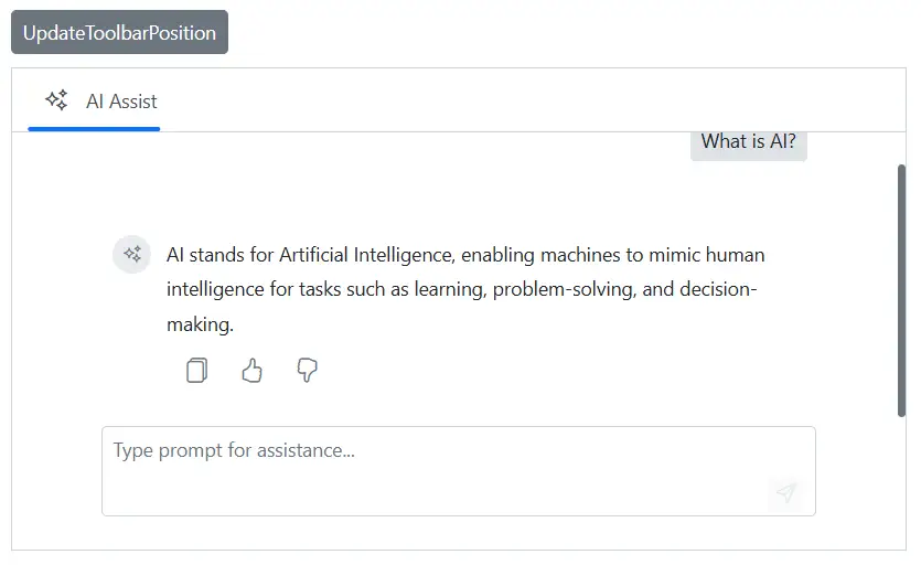
Adding custom items
You can use the AssistViewFooterToolbarItem tag directive within the AssistViewFooterToolbar to add custom items for the footer toolbar in the AI AssistView.
To know more about the items, please refer to the Items section.
@using Syncfusion.Blazor.InteractiveChat
@using Syncfusion.Blazor.Navigations

<div class="aiassist-container" style="height: 350px; width: 650px;">
    <SfAIAssistView PromptRequested="PromptRequest" Prompts="@prompts">
        <AssistViewFooterToolbar ToolbarPosition="ToolbarPosition.Bottom">
            <AssistViewFooterToolbarItem IconCss="e-icons e-assistview-icon" Align="ItemAlign.Left"></AssistViewFooterToolbarItem>
        </AssistViewFooterToolbar>
    </SfAIAssistView>
</div>

@code {
    private List<AssistViewPrompt> prompts = new List<AssistViewPrompt>()
    {
        new AssistViewPrompt() { Prompt = "What is AI?", Response = "<div>AI stands for Artificial Intelligence, enabling machines to mimic human intelligence for tasks such as learning, problem-solving, and decision-making.</div>" }
    };
    private async Task PromptRequest(AssistViewPromptRequestedEventArgs args)
    {
        await Task.Delay(1000);
        var defaultResponse = "For real-time prompt processing, connect the AI AssistView component to your preferred AI service, such as OpenAI or Azure Cognitive Services. Ensure you obtain the necessary API credentials to authenticate and enable seamless integration.";
        args.Response = defaultResponse;
    }
}
Item click
The ItemClick event is triggered when the footer toolbar item is clicked.
@using Syncfusion.Blazor.InteractiveChat

<div class="aiassist-container" style="height: 350px; width: 650px;">
    <SfAIAssistView PromptRequested="PromptRequest" Prompts="@prompts">
        <AssistViewFooterToolbar ItemClick="FooterToolbarItemClicked">
        </AssistViewFooterToolbar>
    </SfAIAssistView>
</div>

@code {
    private void FooterToolbarItemClicked(AssistViewToolbarItemClickedEventArgs args)
    {
        // Your required action here
    }
    private List<AssistViewPrompt> prompts = new List<AssistViewPrompt>()
    {
        new AssistViewPrompt() { Prompt = "What is AI?", Response = "<div>AI stands for Artificial Intelligence, enabling machines to mimic human intelligence for tasks such as learning, problem-solving, and decision-making.</div>" }
    };
    private async Task PromptRequest(AssistViewPromptRequestedEventArgs args)
    {
        await Task.Delay(1000);
        var defaultResponse = "For real-time prompt processing, connect the AI AssistView component to your preferred AI service, such as OpenAI or Azure Cognitive Services. Ensure you obtain the necessary API credentials to authenticate and enable seamless integration.";
        args.Response = defaultResponse;
    }
}
Adding header toolbar items
The AI AssistView component allows you to add header toolbar items using the AssistViewToolbarItem tag directive within the AssistViewToolbar.
Items
Items can be constructed with the following built-in command types or item template.
Adding iconCss
You can customize the toolbar icons by using the IconCss property.
@using Syncfusion.Blazor.InteractiveChat
@using Syncfusion.Blazor.Navigations

<div class="aiassist-container" style="height: 350px; width: 650px;">
    <SfAIAssistView PromptRequested="@PromptRequest">
        <AssistViewToolbar>
            <AssistViewToolbarItem Type="ItemType.Spacer"></AssistViewToolbarItem>
            <AssistViewToolbarItem IconCss="e-icons e-refresh"></AssistViewToolbarItem>
        </AssistViewToolbar>
    </SfAIAssistView>
</div>

@code {
    private async Task PromptRequest(AssistViewPromptRequestedEventArgs args)
    {
        await Task.Delay(1000);
        var defaultResponse = "For real-time prompt processing, connect the AI AssistView component to your preferred AI service, such as OpenAI or Azure Cognitive Services. Ensure you obtain the necessary API credentials to authenticate and enable seamless integration.";
        args.Response = defaultResponse;
    }
}
Setting item type
You can change the toolbar item type by using the Type property. The Type supports three types of items such as Button, Separator, Spacer and Input. By default, the type is Button.
In the following example, toolbar item type is set as Button.
@using Syncfusion.Blazor.InteractiveChat
@using Syncfusion.Blazor.Navigations


<div class="aiassist-container" style="height: 350px; width: 650px;">
    <SfAIAssistView PromptRequested="@PromptRequest">
        <AssistViewToolbar>
            <AssistViewToolbarItem Type="ItemType.Spacer"></AssistViewToolbarItem>
            <AssistViewToolbarItem Type="ItemType.Button" IconCss="e-icons e-refresh"></AssistViewToolbarItem>
        </AssistViewToolbar>
    </SfAIAssistView>
</div>

@code {
    private async Task PromptRequest(AssistViewPromptRequestedEventArgs args)
    {
        await Task.Delay(1000);
        var defaultResponse = "For real-time prompt processing, connect the AI AssistView component to your preferred AI service, such as OpenAI or Azure Cognitive Services. Ensure you obtain the necessary API credentials to authenticate and enable seamless integration.";
        args.Response = defaultResponse;
    }
}
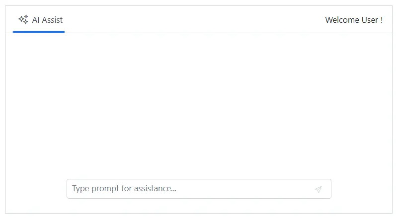
Setting text
You can use the Text property to set the text for the toolbar item.
@using Syncfusion.Blazor.InteractiveChat
@using Syncfusion.Blazor.Navigations

<div class="aiassist-container" style="height: 350px; width: 650px;">
    <SfAIAssistView PromptRequested="@PromptRequest">
        <AssistViewToolbar>
            <AssistViewToolbarItem Type="ItemType.Spacer"></AssistViewToolbarItem>
            <AssistViewToolbarItem Text="Welcome User !"></AssistViewToolbarItem>
        </AssistViewToolbar>
    </SfAIAssistView>
</div>

@code {
    private async Task PromptRequest(AssistViewPromptRequestedEventArgs args)
    {
        await Task.Delay(1000);
        var defaultResponse = "For real-time prompt processing, connect the AI AssistView component to your preferred AI service, such as OpenAI or Azure Cognitive Services. Ensure you obtain the necessary API credentials to authenticate and enable seamless integration.";
        args.Response = defaultResponse;
    }
}
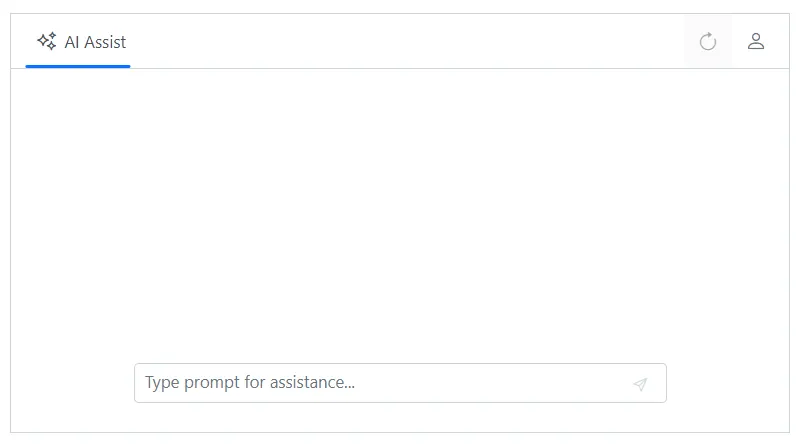
Show or hide toolbar item
You can use the Visible property to specify whether to show or hide the toolbar item. By default, its value is true.
@using Syncfusion.Blazor.InteractiveChat
@using Syncfusion.Blazor.Navigations

<div class="aiassist-container" style="height: 350px; width: 650px;">
    <SfAIAssistView PromptRequested="@PromptRequest">
        <AssistViewToolbar>
            <AssistViewToolbarItem Type="ItemType.Spacer"></AssistViewToolbarItem>
            <AssistViewToolbarItem Type="ItemType.Button" IconCss="e-icons e-refresh" Visible=false></AssistViewToolbarItem>
            <AssistViewToolbarItem Type="ItemType.Button" IconCss="e-icons e-user"></AssistViewToolbarItem>
        </AssistViewToolbar>
    </SfAIAssistView>
</div>

@code {
    private async Task PromptRequest(AssistViewPromptRequestedEventArgs args)
    {
        await Task.Delay(1000);
        var defaultResponse = "For real-time prompt processing, connect the AI AssistView component to your preferred AI service, such as OpenAI or Azure Cognitive Services. Ensure you obtain the necessary API credentials to authenticate and enable seamless integration.";
        args.Response = defaultResponse;
    }
}
Setting disabled
You can use the Disabled property to disable the toolbar item. By default, its value is false.
@using Syncfusion.Blazor.InteractiveChat
@using Syncfusion.Blazor.Navigations

<div class="aiassist-container" style="height: 350px; width: 650px;">
    <SfAIAssistView PromptRequested="@PromptRequest">
        <AssistViewToolbar>
            <AssistViewToolbarItem Type="ItemType.Spacer"></AssistViewToolbarItem>
            <AssistViewToolbarItem Type="ItemType.Button" IconCss="e-icons e-refresh" Disabled=true></AssistViewToolbarItem>
            <AssistViewToolbarItem Type="ItemType.Button" IconCss="e-icons e-user"></AssistViewToolbarItem>
        </AssistViewToolbar>
    </SfAIAssistView>
</div>

@code {
    private async Task PromptRequest(AssistViewPromptRequestedEventArgs args)
    {
        await Task.Delay(1000);
        var defaultResponse = "For real-time prompt processing, connect the AI AssistView component to your preferred AI service, such as OpenAI or Azure Cognitive Services. Ensure you obtain the necessary API credentials to authenticate and enable seamless integration.";
        args.Response = defaultResponse;
    }
}
Setting tooltip text
You can use the Tooltip property to specify the tooltip text to be displayed on hovering the toolbar item.
@using Syncfusion.Blazor.InteractiveChat
@using Syncfusion.Blazor.Navigations

<div class="aiassist-container" style="height: 350px; width: 650px;">
    <SfAIAssistView PromptRequested="@PromptRequest">
        <AssistViewToolbar>
            <AssistViewToolbarItem Type="ItemType.Spacer"></AssistViewToolbarItem>
            <AssistViewToolbarItem Type="ItemType.Button" IconCss="e-icons e-refresh" Tooltip="Refresh"></AssistViewToolbarItem>
        </AssistViewToolbar>
    </SfAIAssistView>
</div>

@code {
    private async Task PromptRequest(AssistViewPromptRequestedEventArgs args)
    {
        await Task.Delay(1000);
        var defaultResponse = "For real-time prompt processing, connect the AI AssistView component to your preferred AI service, such as OpenAI or Azure Cognitive Services. Ensure you obtain the necessary API credentials to authenticate and enable seamless integration.";
        args.Response = defaultResponse;
    }
}
Setting cssClass
You can use the CssClass property to customize the toolbar item.
@using Syncfusion.Blazor.InteractiveChat
@using Syncfusion.Blazor.Navigations

<div class="aiassist-container" style="height: 350px; width: 650px;">
    <SfAIAssistView PromptRequested="@PromptRequest">
        <AssistViewToolbar>
            <AssistViewToolbarItem Type="ItemType.Spacer"></AssistViewToolbarItem>
            <AssistViewToolbarItem Type="ItemType.Button" IconCss="e-icons e-user" CssClass="custom-btn"></AssistViewToolbarItem>
        </AssistViewToolbar>
    </SfAIAssistView>
</div>

@code {
    private async Task PromptRequest(AssistViewPromptRequestedEventArgs args)
    {
        await Task.Delay(1000);
        var defaultResponse = "For real-time prompt processing, connect the AI AssistView component to your preferred AI service, such as OpenAI or Azure Cognitive Services. Ensure you obtain the necessary API credentials to authenticate and enable seamless integration.";
        args.Response = defaultResponse;
    }
}
<style>
    .custom-btn .e-user::before {
        color: blue;
        font-size: 15px;
    }

    .custom-btn.e-toolbar-item button.e-tbar-btn {
        border: 1px solid #dcdcdc;
    }
</style>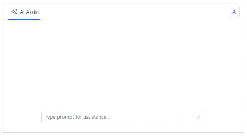
Enabling tab key navigation in toolbar
You can use the TabIndex property of a Toolbar item to enable tab key navigation for the item. By default, the user can switch between items using the arrow keys, but the TabIndex property allows you to switch between items using the Tab and Shift+Tab keys as well.
To use the TabIndex property, set it for each Toolbar item which you want to enable tab key navigation. The TabIndex property should be set to a positive integer value. A value of 0 or a negative value will disable tab key navigation for the item.
For example, to enable tab key navigation for two Toolbar items you can use the following code:
@using Syncfusion.Blazor.InteractiveChat
@using Syncfusion.Blazor.Navigations

<div class="aiassist-container" style="height: 350px; width: 650px;">
    <SfAIAssistView>
        <AssistViewToolbar>
            <AssistViewToolbarItem Text="Item 1" TabIndex="1"></AssistViewToolbarItem>
            <AssistViewToolbarItem Text="Item 2" TabIndex="2"></AssistViewToolbarItem>
        </AssistViewToolbar>
    </SfAIAssistView>
</div>
With the above code, the user can switch between the two Toolbar items using the Tab and Shift+Tab keys, in addition to using the arrow keys. The items will be navigated in the order specified by the TabIndex values.
If you set the TabIndex value to 0 for all Toolbar items, tab key navigation will be based on the element order rather than the TabIndex values. For example:
@using Syncfusion.Blazor.InteractiveChat
@using Syncfusion.Blazor.Navigations

<div class="aiassist-container" style="height: 350px; width: 650px;">
    <SfAIAssistView>
        <AssistViewToolbar>
            <AssistViewToolbarItem Text="Item 1" TabIndex="0"></AssistViewToolbarItem>
            <AssistViewToolbarItem Text="Item 2" TabIndex="0"></AssistViewToolbarItem>
        </AssistViewToolbar>
    </SfAIAssistView>
</div>
Setting template
You can use the Template tag directive to add custom toolbar item in the AI AssistView component. Template property can be given as the HTML element or RenderFragment.
@using Syncfusion.Blazor.InteractiveChat
@using Syncfusion.Blazor.Navigations
@using Syncfusion.Blazor.SplitButtons

<div class="aiassist-container" style="height: 350px; width: 650px;">
    <SfAIAssistView PromptRequested="@PromptRequest">
        <AssistViewToolbar>
            <AssistViewToolbarItem Type="ItemType.Spacer"></AssistViewToolbarItem>
            <AssistViewToolbarItem Type="ItemType.Input">
                <Template>
                    <SfDropDownButton Content="English" CssClass="custom-dropdown" IconCss="e-icons e-translate">
                        <DropDownMenuItems>
                            <DropDownMenuItem Text="हिंदी"></DropDownMenuItem>
                            <DropDownMenuItem Text="தமிழ்"></DropDownMenuItem>
                            <DropDownMenuItem Text="తెలుగు"></DropDownMenuItem>
                        </DropDownMenuItems>
                    </SfDropDownButton>
                </Template>
            </AssistViewToolbarItem>
        </AssistViewToolbar>
    </SfAIAssistView>
</div>

@code {
    private async Task PromptRequest(AssistViewPromptRequestedEventArgs args)
    {
        await Task.Delay(1000);
        var defaultResponse = "For real-time prompt processing, connect the AI AssistView component to your preferred AI service, such as OpenAI or Azure Cognitive Services. Ensure you obtain the necessary API credentials to authenticate and enable seamless integration.";
        args.Response = defaultResponse;
    }
}
<style>
    .custom-dropdown.e-dropdown-popup ul {
        min-width: 100px;
    }
</style>
Item clicked
You can define ItemClicked event in the AssistViewToolbar tag directive which will be triggered when the header toolbar item is clicked.
@using Syncfusion.Blazor.InteractiveChat
@using Syncfusion.Blazor.Navigations
<div class="aiassist-container" style="height: 350px; width: 650px;">
<SfAIAssistView PromptRequested="@PromptRequest">
<AssistViewToolbar ItemClicked="ToolbarItemClicked">
<AssistViewToolbarItem Type="ItemType.Button" IconCss="e-icons e-refresh"></AssistViewToolbarItem>
</AssistViewToolbar>
</SfAIAssistView>
</div>
@code {
private async Task PromptRequest(AssistViewPromptRequestedEventArgs args)
{
await Task.Delay(1000);
var defaultResponse = "For real-time prompt processing, connect the AI AssistView component to your preferred AI service, such as OpenAI or Azure Cognitive Services. Ensure you obtain the necessary API credentials to authenticate and enable seamless integration.";
args.Response = defaultResponse;
}
private void ToolbarItemClicked(AssistViewToolbarItemClickedEventArgs args)
{
// Your required action here
}
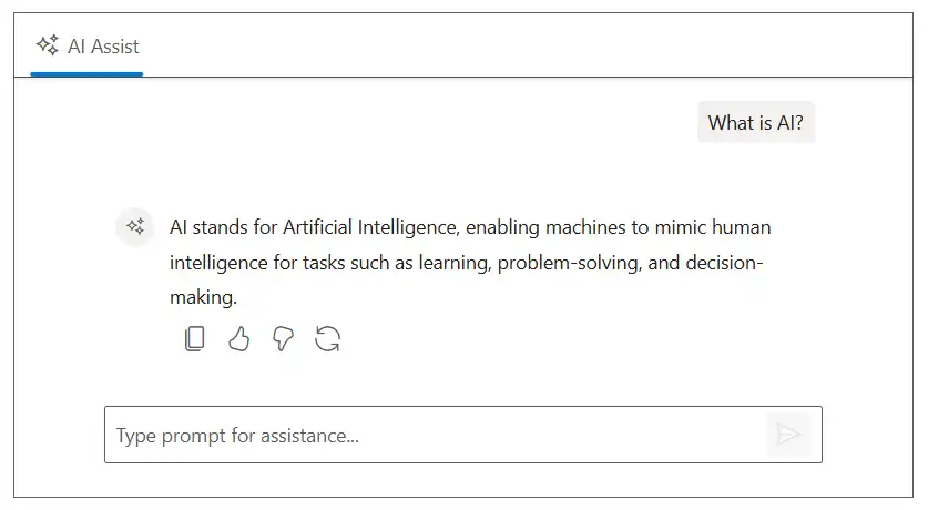
}Built-in toolbar items
Prompt
By default, the prompt toolbar renders the built-in items such as edit and copy items. These allow users to edit the prompt text or copy as needed.
In the following example, AI AssistView component rendered with built-in toolbar items such as edit and copy items.
@using Syncfusion.Blazor.InteractiveChat

<div class="aiassist-container" style="height: 350px; width: 650px;">
    <SfAIAssistView Prompts="@prompts" PromptRequested="@PromptRequest"></SfAIAssistView>
</div>

@code {
    private List<AssistViewPrompt> prompts = new List<AssistViewPrompt>()
    {
        new AssistViewPrompt() { Prompt = "What is AI?", Response = "<div>AI stands for Artificial Intelligence, enabling machines to mimic human intelligence for tasks such as learning, problem-solving, and decision-making.</div>" }
    };
    private async Task PromptRequest(AssistViewPromptRequestedEventArgs args)
    {
        await Task.Delay(1000);
        var promptData = prompts.FirstOrDefault(prompt => prompt.Prompt == args.Prompt);
        var defaultResponse = "For real-time prompt processing, connect the AI AssistView component to your preferred AI service, such as OpenAI or Azure Cognitive Services. Ensure you obtain the necessary API credentials to authenticate and enable seamless integration.";
        args.Response = string.IsNullOrEmpty(promptData.Response) ? defaultResponse : promptData.Response;
    }
}
Setting width
You can use the Width property using PromptToolbar tag directive to set the width of the prompt toolbar in the AI AssistView.
@using Syncfusion.Blazor.InteractiveChat

<div class="aiassist-container" style="height: 350px; width: 650px;">
    <SfAIAssistView PromptRequested="@PromptRequest" Prompts="@prompts">
        <PromptToolbar Width="100px"></PromptToolbar>
    </SfAIAssistView>
</div>

@code {
    private List<AssistViewPrompt> prompts = new List<AssistViewPrompt>()
    {
        new AssistViewPrompt() { Prompt = "What is AI?", Response = "<div>AI stands for Artificial Intelligence, enabling machines to mimic human intelligence for tasks such as learning, problem-solving, and decision-making.</div>" }
    };
    private async Task PromptRequest(AssistViewPromptRequestedEventArgs args)
    {
        await Task.Delay(1000);
        var promptData = prompts.FirstOrDefault(prompt => prompt.Prompt == args.Prompt);
        var defaultResponse = "For real-time prompt processing, connect the AI AssistView component to your preferred AI service, such as OpenAI or Azure Cognitive Services. Ensure you obtain the necessary API credentials to authenticate and enable seamless integration.";
        args.Response = string.IsNullOrEmpty(promptData.Response) ? defaultResponse : promptData.Response;
    }
}
Item clicked
You can define ItemClicked event in the PromptToolbar tag directive which will be triggered when the prompt toolbar item is clicked.
@using Syncfusion.Blazor.InteractiveChat

<div class="aiassist-container" style="height: 350px; width: 650px;">
    <SfAIAssistView PromptRequested="@PromptRequest" Prompts="@prompts">
        <PromptToolbar ItemClicked="ToolbarItemClicked"></PromptToolbar>
    </SfAIAssistView>
</div>

@code {
    private List<AssistViewPrompt> prompts = new List<AssistViewPrompt>()
    {
        new AssistViewPrompt() { Prompt = "What is AI?", Response = "<div>AI stands for Artificial Intelligence, enabling machines to mimic human intelligence for tasks such as learning, problem-solving, and decision-making.</div>" }
    };
    private async Task PromptRequest(AssistViewPromptRequestedEventArgs args)
    {
        await Task.Delay(1000);
        var promptData = prompts.FirstOrDefault(prompt => prompt.Prompt == args.Prompt);
        var defaultResponse = "For real-time prompt processing, connect the AI AssistView component to your preferred AI service, such as OpenAI or Azure Cognitive Services. Ensure you obtain the necessary API credentials to authenticate and enable seamless integration.";
        args.Response = string.IsNullOrEmpty(promptData.Response) ? defaultResponse : promptData.Response;
    }
    private void ToolbarItemClicked(AssistViewToolbarItemClickedEventArgs args)
    {
        // Your required action here
    }
}
Response
By default, the response toolbar renders the built-in items like copy, like, and dislike items to perform response copy and perform rating actions.
In the following example, AI AssistView renders with built-in toolbar items.
@using Syncfusion.Blazor.InteractiveChat

<div class="aiassist-container" style="height: 350px; width: 650px;">
    <SfAIAssistView Prompts="@prompts" PromptRequested="@PromptRequest"></SfAIAssistView>
</div>

@code {
    private List<AssistViewPrompt> prompts = new List<AssistViewPrompt>()
    {
        new AssistViewPrompt() { Prompt = "What is AI?", Response = "<div>AI stands for Artificial Intelligence, enabling machines to mimic human intelligence for tasks such as learning, problem-solving, and decision-making.</div>" }
    };
    private async Task PromptRequest(AssistViewPromptRequestedEventArgs args)
    {
        await Task.Delay(1000);
        var promptData = prompts.FirstOrDefault(prompt => prompt.Prompt == args.Prompt);
        var defaultResponse = "For real-time prompt processing, connect the AI AssistView component to your preferred AI service, such as OpenAI or Azure Cognitive Services. Ensure you obtain the necessary API credentials to authenticate and enable seamless integration.";
        args.Response = string.IsNullOrEmpty(promptData.Response) ? defaultResponse : promptData.Response;
    }
}
Setting width
You can use the Width property using ResponseToolbar tag directive to set the width of the response toolbar in the AI AssistView.
@using Syncfusion.Blazor.InteractiveChat

<div class="aiassist-container" style="height: 350px; width: 650px;">
    <SfAIAssistView PromptRequested="@PromptRequest" Prompts="@prompts">
        <ResponseToolbar Width="200px"></ResponseToolbar>
    </SfAIAssistView>
</div>

@code {
    private List<AssistViewPrompt> prompts = new List<AssistViewPrompt>()
    {
        new AssistViewPrompt() { Prompt = "What is AI?", Response = "<div>AI stands for Artificial Intelligence, enabling machines to mimic human intelligence for tasks such as learning, problem-solving, and decision-making.</div>" }
    };
    private async Task PromptRequest(AssistViewPromptRequestedEventArgs args)
    {
        await Task.Delay(1000);
        var promptData = prompts.FirstOrDefault(prompt => prompt.Prompt == args.Prompt);
        var defaultResponse = "For real-time prompt processing, connect the AI AssistView component to your preferred AI service, such as OpenAI or Azure Cognitive Services. Ensure you obtain the necessary API credentials to authenticate and enable seamless integration.";
        args.Response = string.IsNullOrEmpty(promptData.Response) ? defaultResponse : promptData.Response;
    }
}
Regenerate responses
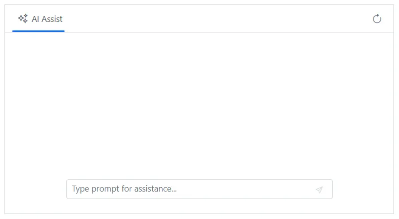
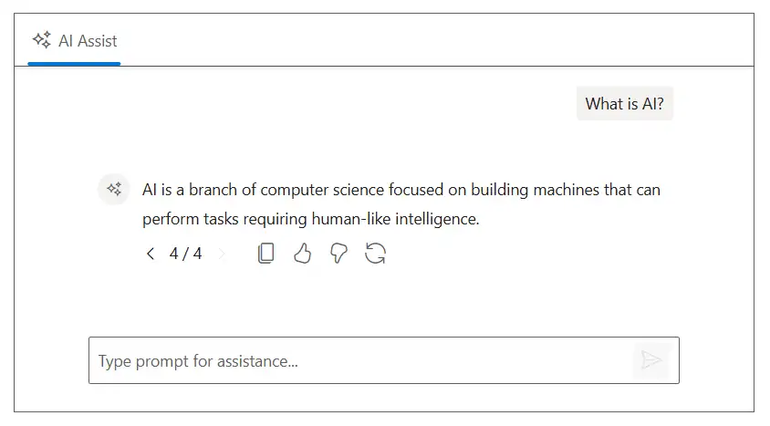
The AI AssistView allows users to regenerate responses to request a new response for the same prompt. The navigation buttons with previous and next buttons are rendered along with a response index indicator (e.g., 1 / 3) allowing users to navigate between all regenerated responses for the prompt.
The navigation UI appears automatically once more than one response is available for a prompt either regenerated or preloaded using the
RegeneratedResponsesproperty in the Prompts collection.
Adding regenerate item
You can enable the regenerate button by adding the e-assist-regenerate icon to the ResponseToolbarItem tag directive within the ResponseToolbar.
Adding regenerated response
When regenerated, it triggers the PromptRequested event with the existing prompt, enabling you to call your preferred AI service again and update the response using the Response property of the event args.
In the following example, AI AssistView component rendered with the built-in regenerate toolbar item in the response toolbar.
@using Syncfusion.Blazor.InteractiveChat

<div class="aiassist-container" style="height: 350px; width: 650px;">
    <SfAIAssistView Prompts="@prompts" PromptRequested="@PromptRequest">
        <ResponseToolbar>
            <ResponseToolbarItem IconCss="e-icons e-assist-copy" Tooltip="Copy"></ResponseToolbarItem>
            <ResponseToolbarItem IconCss="e-icons e-assist-like" Tooltip="Like"></ResponseToolbarItem>
            <ResponseToolbarItem IconCss="e-icons e-assist-dislike" Tooltip="Need Improvement"></ResponseToolbarItem>
            <ResponseToolbarItem IconCss="e-icons e-assist-regenerate" Tooltip="Regenerate"></ResponseToolbarItem>
        </ResponseToolbar>
    </SfAIAssistView>
</div>

@code {
    private List<AssistViewPrompt> prompts = new List<AssistViewPrompt>()
    {
        new AssistViewPrompt() { Prompt = "What is AI?", Response = "AI stands for Artificial Intelligence, enabling machines to mimic human intelligence for tasks such as learning, problem-solving, and decision-making." }
    };
    private List<string> regenerateResponses = new List<string>()
    {
        "AI, or Artificial Intelligence, refers to the simulation of human intelligence in machines programmed to think and learn like humans.",
        "Artificial Intelligence is the development of computer systems capable of performing tasks that typically require human intelligence.",
        "AI is a branch of computer science focused on building machines that can perform tasks requiring human-like intelligence."
    };
    private async Task PromptRequest(AssistViewPromptRequestedEventArgs args)
    {
        await Task.Delay(1000);
        var isRegenerate = prompts.Any(p => p.Prompt == args.Prompt);
        args.Response = isRegenerate
            ? regenerateResponses[new Random().Next(regenerateResponses.Count)]
            : "For real-time prompt processing, connect the AI AssistView component to your preferred AI service, such as OpenAI or Azure Cognitive Services. Ensure you obtain the necessary API credentials to authenticate and enable seamless integration.";
    }
}
Pre-loading regenerated responses
You can use the RegeneratedResponses property in the Prompts collection to pre-load multiple responses for a prompt at the initial render, without requiring the user to trigger the regenerate action. Users can navigate between the pre-loaded responses using the previous and next buttons in the response navigation UI.
In the following example, the RegeneratedResponses property is used to pre-load multiple responses for a prompt.
@using Syncfusion.Blazor.InteractiveChat

<div class="aiassist-container" style="height: 350px; width: 650px;">
    <SfAIAssistView Prompts="@prompts" PromptRequested="@PromptRequest">
        <ResponseToolbar>
            <ResponseToolbarItem IconCss="e-icons e-assist-copy" Tooltip="Copy"></ResponseToolbarItem>
            <ResponseToolbarItem IconCss="e-icons e-assist-like" Tooltip="Like"></ResponseToolbarItem>
            <ResponseToolbarItem IconCss="e-icons e-assist-dislike" Tooltip="Need Improvement"></ResponseToolbarItem>
            <ResponseToolbarItem IconCss="e-icons e-assist-regenerate" Tooltip="Regenerate"></ResponseToolbarItem>
        </ResponseToolbar>
    </SfAIAssistView>
</div>

@code {
    private List<AssistViewPrompt> prompts = new List<AssistViewPrompt>()
    {
        new AssistViewPrompt()
        {
            Prompt = "What is AI?",
            Response = "AI stands for Artificial Intelligence, enabling machines to mimic human intelligence for tasks such as learning, problem-solving, and decision-making.",
            RegeneratedResponses = new List<string>()
            {
                "AI, or Artificial Intelligence, refers to the simulation of human intelligence in machines programmed to think and learn like humans.",
                "Artificial Intelligence is the development of computer systems capable of performing tasks that typically require human intelligence.",
                "AI is a branch of computer science focused on building machines that can perform tasks requiring human-like intelligence."
            }
        }
    };
    private async Task PromptRequest(AssistViewPromptRequestedEventArgs args)
    {
        await Task.Delay(1000);
        args.Response = "For real-time prompt processing, connect the AI AssistView component to your preferred AI service, such as OpenAI or Azure Cognitive Services. Ensure you obtain the necessary API credentials to authenticate and enable seamless integration.";
    }
}
Item clicked
You can define ItemClicked event in the ResponseToolbar tag directive which will be triggered when the response toolbar item is clicked.
@using Syncfusion.Blazor.InteractiveChat

<div class="aiassist-container" style="height: 350px; width: 650px;">
    <SfAIAssistView PromptRequested="@PromptRequest" Prompts="@prompts">
        <ResponseToolbar ItemClicked="ToolbarItemClicked"></ResponseToolbar>
    </SfAIAssistView>
</div>

@code {
    private List<AssistViewPrompt> prompts = new List<AssistViewPrompt>()
    {
        new AssistViewPrompt() { Prompt = "What is AI?", Response = "<div>AI stands for Artificial Intelligence, enabling machines to mimic human intelligence for tasks such as learning, problem-solving, and decision-making.</div>" }
    };
    private async Task PromptRequest(AssistViewPromptRequestedEventArgs args)
    {
        await Task.Delay(1000);
        var promptData = prompts.FirstOrDefault(prompt => prompt.Prompt == args.Prompt);
        var defaultResponse = "For real-time prompt processing, connect the AI AssistView component to your preferred AI service, such as OpenAI or Azure Cognitive Services. Ensure you obtain the necessary API credentials to authenticate and enable seamless integration.";
        args.Response = string.IsNullOrEmpty(promptData.Response) ? defaultResponse : promptData.Response;
    }
    private void ToolbarItemClicked(AssistViewToolbarItemClickedEventArgs args)
    {
        // Your required action here
    }
}
Adding custom toolbar items
You can also add custom toolbar items in the AI AssistView by using the AssistViewToolbarItem, PromptToolbarItem & ResponseToolbarItem tag directives.
Prompt
You can use the PromptToolbarItem tag directive within the PromptToolbar to add custom items for the prompt toolbar in the AI AssistView.
To know more about the items, please refer to the Items section.
@using Syncfusion.Blazor.InteractiveChat

<div class="aiassist-container" style="height: 350px; width: 650px;">
    <SfAIAssistView PromptRequested="@PromptRequest" Prompts="@prompts">
        <PromptToolbar>
            <PromptToolbarItem IconCss="e-icons e-edit"></PromptToolbarItem>
        </PromptToolbar>
    </SfAIAssistView>
</div>

@code {
    private List<AssistViewPrompt> prompts = new List<AssistViewPrompt>()
    {
        new AssistViewPrompt() { Prompt = "What is AI?", Response = "<div>AI stands for Artificial Intelligence, enabling machines to mimic human intelligence for tasks such as learning, problem-solving, and decision-making.</div>" }
    };
    private async Task PromptRequest(AssistViewPromptRequestedEventArgs args)
    {
        await Task.Delay(1000);
        var promptData = prompts.FirstOrDefault(prompt => prompt.Prompt == args.Prompt);
        var defaultResponse = "For real-time prompt processing, connect the AI AssistView component to your preferred AI service, such as OpenAI or Azure Cognitive Services. Ensure you obtain the necessary API credentials to authenticate and enable seamless integration.";
        args.Response = string.IsNullOrEmpty(promptData.Response) ? defaultResponse : promptData.Response;
    }
}
Response
You can use the ResponseToolbarItem tag directive within the ResponseToolbar to add custom response toolbar in the AI AssistView.
To know more about the items, please refer to the Items section.
@using Syncfusion.Blazor.InteractiveChat

<div class="aiassist-container" style="height: 350px; width: 650px;">
    <SfAIAssistView PromptRequested="@PromptRequest" Prompts="@prompts">
        <ResponseToolbar>
            <ResponseToolbarItem IconCss="e-icons e-download"></ResponseToolbarItem>
            <ResponseToolbarItem IconCss="e-icons e-refresh"></ResponseToolbarItem>
            <ResponseToolbarItem IconCss="e-icons e-assist-like"></ResponseToolbarItem>
            <ResponseToolbarItem IconCss="e-icons e-assist-dislike"></ResponseToolbarItem>
        </ResponseToolbar>
    </SfAIAssistView>
</div>

@code {
    private List<AssistViewPrompt> prompts = new List<AssistViewPrompt>()
    {
        new AssistViewPrompt() { Prompt = "What is AI?", Response = "<div>AI stands for Artificial Intelligence, enabling machines to mimic human intelligence for tasks such as learning, problem-solving, and decision-making.</div>" }
    };
    private async Task PromptRequest(AssistViewPromptRequestedEventArgs args)
    {
        await Task.Delay(1000);
        var promptData = prompts.FirstOrDefault(prompt => prompt.Prompt == args.Prompt);
        var defaultResponse = "For real-time prompt processing, connect the AI AssistView component to your preferred AI service, such as OpenAI or Azure Cognitive Services. Ensure you obtain the necessary API credentials to authenticate and enable seamless integration.";
        args.Response = string.IsNullOrEmpty(promptData.Response) ? defaultResponse : promptData.Response;
    }
}
Item clicked
The itemClicked event is triggered when a custom toolbar item is clicked. This event applies to both prompt and response toolbar items.