Blazor Icons Library Usage and Customization
24 Jun 20267 minutes to read
The Syncfusion® Blazor library provides a set of base64-formatted font icons used across Blazor components. Icons can be used via the SfIcon component or the e-icons CSS class.
Watch a quick-start video for the Blazor Icon component:
Prerequisites
Before using the Blazor Icon component, set up your Blazor application by following the Blazor Getting Started guide.
Next, install the Syncfusion.Blazor.Buttons NuGet package using the following command.
Install-Package Syncfusion.Blazor.Buttons -Version 34.1.29dotnet add package Syncfusion.Blazor.Buttons --version 34.1.29For the complete list of available packages, refer to the Blazor NuGet packages.
Icon component
The Blazor Icon component provides support for rendering predefined Blazor icons or custom font icons.
The following code example shows how to render built-in Blazor Icons from predefined IconName options by using the Name property in the SfIcon tag.
@using Syncfusion.Blazor.Buttons

<SfIcon Name="IconName.Cut"></SfIcon>
<SfIcon Name="IconName.Copy"></SfIcon>
<SfIcon Name="IconName.Paste"></SfIcon>
<SfIcon Name="IconName.Bold"></SfIcon>
<SfIcon Name="IconName.Underline"></SfIcon>
<SfIcon Name="IconName.Italic"></SfIcon>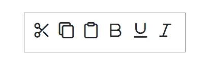
Icon size
The font size of the Icon can be changed using the Size property. The default size is Medium.
- When the
Sizeproperty is set toIconSize.Small, the font size will be8px. - When the
Sizeproperty is set toIconSize.Medium, the font size will be16px. - When the
Sizeproperty is set toIconSize.Large, the font size will be24px.
@using Syncfusion.Blazor.Buttons

<p>Smaller icons</p>
<SfIcon Name="IconName.Cut" Size="IconSize.Small"></SfIcon>
<SfIcon Name="IconName.Copy" Size="IconSize.Small"></SfIcon>
<SfIcon Name="IconName.Paste" Size="IconSize.Small"></SfIcon>
<SfIcon Name="IconName.Bold" Size="IconSize.Small"></SfIcon>
<SfIcon Name="IconName.Underline" Size="IconSize.Small"></SfIcon>
<SfIcon Name="IconName.Italic" Size="IconSize.Small"></SfIcon>

<p>Medium icons</p>
<SfIcon Name="IconName.Cut" Size="IconSize.Medium"></SfIcon>
<SfIcon Name="IconName.Copy" Size="IconSize.Medium"></SfIcon>
<SfIcon Name="IconName.Paste" Size="IconSize.Medium"></SfIcon>
<SfIcon Name="IconName.Bold" Size="IconSize.Medium"></SfIcon>
<SfIcon Name="IconName.Underline" Size="IconSize.Medium"></SfIcon>
<SfIcon Name="IconName.Italic" Size="IconSize.Medium"></SfIcon>

<p>Larger icons</p>
<SfIcon Name="IconName.Cut" Size="IconSize.Large"></SfIcon>
<SfIcon Name="IconName.Copy" Size="IconSize.Large"></SfIcon>
<SfIcon Name="IconName.Paste" Size="IconSize.Large"></SfIcon>
<SfIcon Name="IconName.Bold" Size="IconSize.Large"></SfIcon>
<SfIcon Name="IconName.Underline" Size="IconSize.Large"></SfIcon>
<SfIcon Name="IconName.Italic" Size="IconSize.Large"></SfIcon>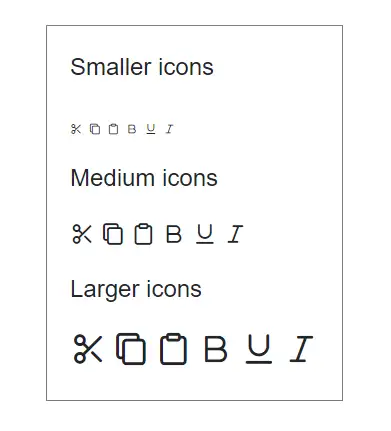
NOTE
The Size property is applicable only when defining the icon using the Name property. Otherwise, use the IconCss property to customize the icon.
Display tooltips for Icons
The Title property is used to set the title attribute for the icon, which improves accessibility with screen readers and shows a tooltip on mouseover. The following code example displays tooltip text for appropriate icons.
@using Syncfusion.Blazor.Buttons

<SfIcon Name="IconName.Upload" Title="Upload"></SfIcon>
<SfIcon Name="IconName.Download" Title="Download"></SfIcon>
<SfIcon Name="IconName.Undo" Title="Undo"></SfIcon>
<SfIcon Name="IconName.Redo" Title="Redo"></SfIcon>
<SfIcon Name="IconName.AlignTop" Title="AlignTop"></SfIcon>
<SfIcon Name="IconName.AlignBottom" Title="AlignBottom"></SfIcon>
<SfIcon Name="IconName.AlignMiddle" Title="AlignMiddle"></SfIcon>
Customize Icon appearance
The SfIcon component supports customizing color and size by overriding the e-icons class.
The following code example demonstrates custom font-size and color for Icons.
@using Syncfusion.Blazor.Buttons

<SfIcon Name="IconName.AlignLeft"></SfIcon>
<SfIcon Name="IconName.AlignRight"></SfIcon>
<SfIcon Name="IconName.AlignCenter"></SfIcon>
<SfIcon Name="IconName.Justify"></SfIcon>
<SfIcon Name="IconName.DecreaseIndent"></SfIcon>
<SfIcon Name="IconName.IncreaseIndent"></SfIcon>

<style>
    .e-icons{
        color: #ff0000;
        font-size: 26px !important;
    }
</style>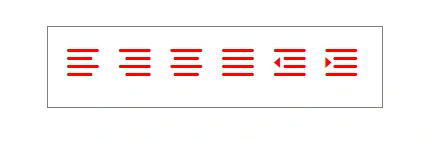
Integrate third-party Icons
The SfIcon component supports rendering custom font icons using the IconCss property. To render custom font icons, define the required font CSS that provides the font name, font size, and content for the icon.
The following code explains how to render open-iconic icons using the IconCss property.
-
For Blazor Web Apps, add the stylesheet reference to the
<head>section of~/Components/App.razor. -
For Blazor WebAssembly standalone apps, add the stylesheet reference to the
<head>section of~/wwwroot/index.html.
<head>
    ...
    <link href="https://cdnjs.cloudflare.com/ajax/libs/open-iconic/1.1.1/font/css/open-iconic-bootstrap.min.css" rel="stylesheet">
</head>@using Syncfusion.Blazor.Buttons
<SfIcon IconCss="oi oi-list-rich"></SfIcon>
<SfIcon IconCss="oi oi-account-login"></SfIcon>
<SfIcon IconCss="oi oi-account-logout"></SfIcon>
<SfIcon IconCss="oi oi-action-redo"></SfIcon>
<SfIcon IconCss="oi oi-action-undo"></SfIcon>
<SfIcon IconCss="oi oi-clock"></SfIcon>
<SfIcon IconCss="oi oi-audio"></SfIcon>
<SfIcon IconCss="oi oi-bluetooth"></SfIcon>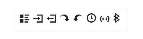
Create custom Icons with Syncfusion Metro Studio
Syncfusion Metro Studio is a desktop tool for creating and customizing icon fonts for applications. It includes more than 7,000 flat and wireframe icon templates that you can modify to fit your design needs. You can also customize existing icons and export them in multiple formats, including SVG.
After exporting the icon font, use the IconCss property of the SfIcon component to display the custom icon in your application.
For more information, refer to the Metro Studio documentation.
Style Icons with inline attributes
You can customize the icon element by applying HTML attributes directly to the SfIcon component. To reuse the same attribute values across multiple icons, use the @attributes Razor directive.
The following example demonstrates how to customize the Icon font size using the @attributes directive.
@using Syncfusion.Blazor.Buttons

<SfIcon Name="IconName.Cut" @attributes="customAttribute"></SfIcon>
<SfIcon Name="IconName.Copy" @attributes="customAttribute"></SfIcon>
<SfIcon Name="IconName.Paste" @attributes="customAttribute"></SfIcon>

@code{
   Dictionary<string, object> customAttribute = new Dictionary<string, object>()
   {
       { "style", "font-size: 30px" }
   };
}
Integrate Icons with the Button component
The built-in Blazor icons can be integrated with other Blazor components without defining the <SfIcon> tag. To use Blazor icons, add the e-icons class that contains the font-family and common properties of the font icons. Add the icon class with the corresponding icon name from the available icons with the e- prefix.
The following example shows how to integrate icons with the Blazor Button component by defining the icon class in the IconCss property of the button.
@using Syncfusion.Blazor.Buttons

<SfButton IconCss="e-icons e-chevron-down-fill" Content="Show dropdown" IconPosition="IconPosition.Right"></SfButton>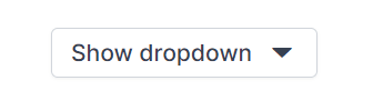
Use Icons in an HTML element
Built-in Blazor icons can be rendered directly in an HTML element by adding the e-icons class (font family and common properties) and the available icon class with the e- prefix.
The following code example explains the direct rendering of the Blazor search icon in a span element.
<span class="e-icons e-search"></span>Icons list
The complete pack of Blazor icons is listed in the following table. The corresponding icon content can be found in the content section.