Animations and Transitions with Blazor Carousel Component
29 Jun 202619 minutes to read
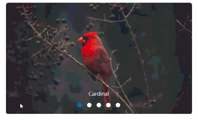
Animations
Fade animation
In Carousel, two built-in animations are provided for slide transitions. You can disable animation using the AnimationEffect property. By default, Slide animation is applied for the transition between slides.
The following demo depicts the example for Fade animation,
@using Syncfusion.Blazor.Navigations

<div class="control-container">
    <SfCarousel AnimationEffect="CarouselAnimationEffect.Fade">
        <CarouselItem>
            <figure class="img-container"><img src="https://ej2.syncfusion.com/products/images/carousel/cardinal.png" alt="cardinal" style="height:100%;width:100%;" /><figcaption class="img-caption">Cardinal</figcaption></figure>
        </CarouselItem>
        <CarouselItem>
            <figure class="img-container"><img src="https://ej2.syncfusion.com/products/images/carousel/hunei.png" alt="kingfisher" style="height:100%;width:100%;" /><figcaption class="img-caption">Kingfisher</figcaption></figure>
        </CarouselItem>
        <CarouselItem>
            <figure class="img-container"><img src="https://ej2.syncfusion.com/products/images/carousel/costa-rica.png" alt="keel-billed-toucan" style="height:100%;width:100%;" /><figcaption class="img-caption">Keel-billed-toucan</figcaption></figure>
        </CarouselItem>
        <CarouselItem>
            <figure class="img-container"><img src="https://ej2.syncfusion.com/products/images/carousel/kaohsiung.png" alt="yellow-warbler" style="height:100%;width:100%;" /><figcaption class="img-caption">Yellow-warbler</figcaption></figure>
        </CarouselItem>
        <CarouselItem>
           <figure class="img-container"><img src="https://ej2.syncfusion.com/products/images/carousel/bee-eater.png" alt="bee-eater" style="height:100%;width:100%;" /><figcaption class="img-caption">Bee-eater</figcaption></figure>
        </CarouselItem>
    </SfCarousel>
</div>

<style>
    .control-container {
        height: 300px;
        margin: 0 auto;
        width: 500px;
    }

    .img-container {
        height: 100%;
        margin: 0;
    }

    .img-caption {
        color: #fff;
        font-size: 1rem;
        position: absolute;
        bottom: 3rem;
        width: 100%;
        text-align: center;
    }

</style>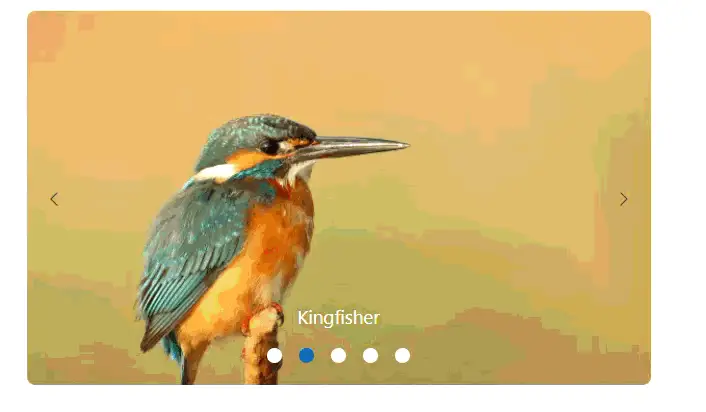
Custom animation
In Carousel, you can use customized animation effects for slide transitions using the Custom option of the AnimationEffect property and apply custom animation css via CssClass property.
The following demo depicts the example for parallax custom animation
@using Syncfusion.Blazor.Navigations

<div class="control-container">
    <SfCarousel AnimationEffect="CarouselAnimationEffect.Custom" CssClass="parallax">
        <CarouselItem>
            <figure class="img-container"><img src="https://ej2.syncfusion.com/products/images/carousel/cardinal.png" alt="cardinal" style="height:100%;width:100%;" /><figcaption class="img-caption">Cardinal</figcaption></figure>
        </CarouselItem>
        <CarouselItem>
            <figure class="img-container"><img src="https://ej2.syncfusion.com/products/images/carousel/hunei.png" alt="kingfisher" style="height:100%;width:100%;" /><figcaption class="img-caption">Kingfisher</figcaption></figure>
        </CarouselItem>
        <CarouselItem>
            <figure class="img-container"><img src="https://ej2.syncfusion.com/products/images/carousel/costa-rica.png" alt="keel-billed-toucan" style="height:100%;width:100%;" /><figcaption class="img-caption">Keel-billed-toucan</figcaption></figure>
        </CarouselItem>
        <CarouselItem>
            <figure class="img-container"><img src="https://ej2.syncfusion.com/products/images/carousel/kaohsiung.png" alt="yellow-warbler" style="height:100%;width:100%;" /><figcaption class="img-caption">Yellow-warbler</figcaption></figure>
        </CarouselItem>
        <CarouselItem>
           <figure class="img-container"><img src="https://ej2.syncfusion.com/products/images/carousel/bee-eater.png" alt="bee-eater" style="height:100%;width:100%;" /><figcaption class="img-caption">Bee-eater</figcaption></figure>
        </CarouselItem>
    </SfCarousel>
</div>

<style>
    .control-container {
        height: 300px;
        margin: 0 auto;
        width: 500px;
    }

    .img-container {
        height: 100%;
        margin: 0;
    }

    .img-caption {
        color: #fff;
        font-size: 1rem;
        position: absolute;
        bottom: 3rem;
        width: 100%;
        text-align: center;
    }

    /* Parallax animation */
    .parallax .e-carousel-item {
        transition: transform 1s ease-in-out;
    }

    .parallax .e-carousel-item.e-next {
        animation: ParallaxIn 1s ease-in-out;
    }

    .parallax .e-carousel-item.e-prev {
        animation: ParallaxOut 1s ease-in-out;
    }

    @@keyframes ParallaxIn {
        from {
         opacity: 0;
        transform: scale(0) translateY(100%);
        }

        to {
            opacity: 1;
            transform: scale(1) translateY(0);
        }
    }

    @@keyframes ParallaxOut {
        from {
            opacity: 1;
            transform: scale(1) translateY(0);
        }

        to {
            opacity: 0;
            transform: scale(0) translateY(-100%);
        }
    }

</style>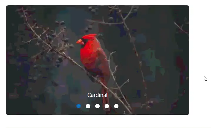
Intervals between slides
Using the items property, you can set different intervals for each item to transition between slides. The default interval is 5000 ms (5 seconds). The following example depicts the code for setting the different intervals between each item.
@using Syncfusion.Blazor.Navigations

<div class="control-container">
    <SfCarousel>
        <CarouselItem Interval="2000">
            <div class="slide-content">Slide 1</div>
        </CarouselItem>
        <CarouselItem Interval="4000">
            <div class="slide-content">Slide 2</div>
        </CarouselItem>
        <CarouselItem>
            <div class="slide-content">Slide 3</div>
        </CarouselItem>
        <CarouselItem Interval="6000">
            <div class="slide-content">Slide 4</div>
        </CarouselItem>
        <CarouselItem Interval="8000">
            <div class="slide-content">Slide 5</div>
        </CarouselItem>
    </SfCarousel>
</div>

<style>
    .control-container {
        background-color: #adb5bd;
        height: 300px;
        margin: 0 auto;
        width: 500px;
    }

    .e-carousel .slide-content {
        align-items: center;
        display: flex;
        font-size: 1.25rem;
        height: 100%;
        justify-content: center;
    }
</style>NOTE
Interval property can accept value in terms of milliseconds.
Auto play slides
In the carousel, all slides transitions are performed continuously after the specified or default intervals. You can enable or disable the auto slide transition using the AutoPlay property. The following example depicts the code to disable the auto slide transitions.
@using Syncfusion.Blazor.Navigations

<div class="control-container">
    <SfCarousel AutoPlay="false">
        <CarouselItem>
            <div class="slide-content">Slide 1</div>
        </CarouselItem>
        <CarouselItem>
            <div class="slide-content">Slide 2</div>
        </CarouselItem>
        <CarouselItem>
            <div class="slide-content">Slide 3</div>
        </CarouselItem>
        <CarouselItem>
            <div class="slide-content">Slide 4</div>
        </CarouselItem>
        <CarouselItem>
            <div class="slide-content">Slide 5</div>
        </CarouselItem>
    </SfCarousel>
</div>

<style>
    .control-container {
        background-color: #adb5bd;
        height: 300px;
        margin: 0 auto;
        width: 500px;
    }

    .e-carousel .slide-content {
        align-items: center;
        display: flex;
        font-size: 1.25rem;
        height: 100%;
        justify-content: center;
    }
</style>Pause on hover
By default, Slide transitions are paused when hovering the mouse pointer over the Carousel element. You can enable or disable this functionality using the PauseOnHover property.
The following example depicts the code to play the slides when hovering the mouse pointer over the Carousel element.
@using Syncfusion.Blazor.Navigations

<div class="control-container">
    <SfCarousel  PauseOnHover="false">
        <CarouselItem>
            <div class="slide-content">Slide 1</div>
        </CarouselItem>
        <CarouselItem>
            <div class="slide-content">Slide 2</div>
        </CarouselItem>
        <CarouselItem>
            <div class="slide-content">Slide 3</div>
        </CarouselItem>
        <CarouselItem>
            <div class="slide-content">Slide 4</div>
        </CarouselItem>
        <CarouselItem>
            <div class="slide-content">Slide 5</div>
        </CarouselItem>
    </SfCarousel>
</div>

<style>
    .control-container {
        background-color: #adb5bd;
        height: 300px;
        margin: 0 auto;
        width: 500px;
    }

    .e-carousel .slide-content {
        align-items: center;
        display: flex;
        font-size: 1.25rem;
        height: 100%;
        justify-content: center;
    }
</style>Looping slides
In the carousel, slides transitions are repeated continuously when you reach the last slide by default. You can enable or disable the infinite slide transition using the Loop property. The following example depicts the code to disable the infinite slide transitions.
@using Syncfusion.Blazor.Navigations

<div class="control-container">
    <SfCarousel Loop="false">
        <CarouselItem>
            <div class="slide-content">Slide 1</div>
        </CarouselItem>
        <CarouselItem>
            <div class="slide-content">Slide 2</div>
        </CarouselItem>
        <CarouselItem>
            <div class="slide-content">Slide 3</div>
        </CarouselItem>
        <CarouselItem>
            <div class="slide-content">Slide 4</div>
        </CarouselItem>
        <CarouselItem>
            <div class="slide-content">Slide 5</div>
        </CarouselItem>
    </SfCarousel>
</div>

<style>
    .control-container {
        background-color: #adb5bd;
        height: 300px;
        margin: 0 auto;
        width: 500px;
    }

    .e-carousel .slide-content {
        align-items: center;
        display: flex;
        font-size: 1.25rem;
        height: 100%;
        justify-content: center;
    }
</style>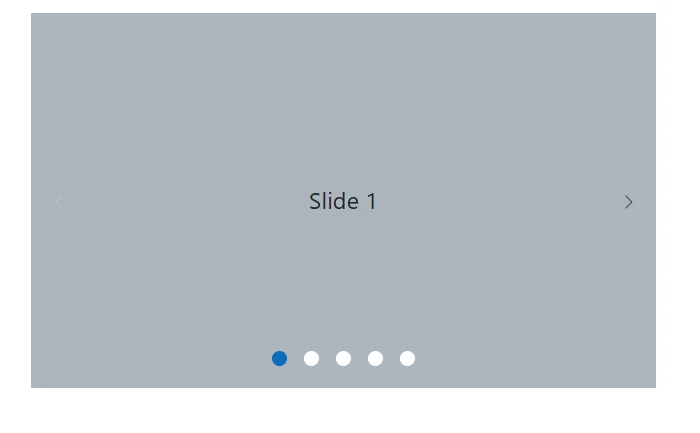
Slide changing events
Using the SlideItemChanged events of the Carousel component, you can perform sample end customization while the carousel items are switched.
The following demo depicts the example for carousel events,
@using Syncfusion.Blazor.Navigations

<div class="control-container">
    <SfCarousel SelectedIndexChanged="OnSelectedIndexChanged">
        <CarouselItem>
            <div class="slide-content">Slide 1</div>
        </CarouselItem>
        <CarouselItem>
            <div class="slide-content">Slide 2</div>
        </CarouselItem>
        <CarouselItem>
            <div class="slide-content">Slide 3</div>
        </CarouselItem>
        <CarouselItem>
            <div class="slide-content">Slide 4</div>
        </CarouselItem>
        <CarouselItem>
            <div class="slide-content">Slide 5</div>
        </CarouselItem>
    </SfCarousel>
</div>

@code {
    void OnSelectedIndexChanged(int index)
    {
        Console.WriteLine(index);
    }
}

<style>
    .control-container {
        background-color: #adb5bd;
        height: 300px;
        margin: 0 auto;
        width: 500px;
    }

    .e-carousel .slide-content {
        align-items: center;
        display: flex;
        font-size: 1.25rem;
        height: 100%;
        justify-content: center;
    }
</style>Disable touch swiping
In the carousel, you can able to perform swipe the carousel slides using touch actions by default. You can enable or disable the swipe action using the EnableTouchSwipe property. The following example depicts the code to disable the swipe action for the slide.
@using Syncfusion.Blazor.Navigations

<div class="control-container">
    <SfCarousel EnableTouchSwipe="false">
        <CarouselItem>
            <div class="slide-content">Slide 1</div>
        </CarouselItem>
        <CarouselItem>
            <div class="slide-content">Slide 2</div>
        </CarouselItem>
        <CarouselItem>
            <div class="slide-content">Slide 3</div>
        </CarouselItem>
        <CarouselItem>
            <div class="slide-content">Slide 4</div>
        </CarouselItem>
        <CarouselItem>
            <div class="slide-content">Slide 5</div>
        </CarouselItem>
    </SfCarousel>
</div>

<style>
    .control-container {
        background-color: #adb5bd;
        height: 300px;
        margin: 0 auto;
        width: 500px;
    }

    .e-carousel .slide-content {
        align-items: center;
        display: flex;
        font-size: 1.25rem;
        height: 100%;
        justify-content: center;
    }
</style>Swipe modes
In the carousel, the SwipeMode property allows specifying whether the slide transition should occur while performing swiping via touch or mouse. The slide swiping is enabled or disabled using the bitwise operator.
The following are the different swipe modes available in the carousel:
-
CarouselSwipeMode.Touch- Allows the user to slide the slides using touch actions. -
CarouselSwipeMode.Mouse- Allows the user to slide the slides using mouse actions. -
CarouselSwipeMode.Touch & CarouselSwipeMode.Mouse- Allows the user to slide the slides using both touch and mouse actions. -
~CarouselSwipeMode.Touch & ~CarouselSwipeMode.Mouse- Disables both touch and mouse actions.
@using Syncfusion.Blazor.Navigations

<div class="control-container">
    <SfCarousel SwipeMode="CarouselSwipeMode.Mouse & CarouselSwipeMode.Touch">
        <CarouselItem>
            <figure class="img-container"><img src="https://ej2.syncfusion.com/products/images/carousel/cardinal.png" alt="cardinal" style="height:100%;width:100%;" /><figcaption class="img-caption">Cardinal</figcaption></figure>
        </CarouselItem>
        <CarouselItem>
            <figure class="img-container"><img src="https://ej2.syncfusion.com/products/images/carousel/hunei.png" alt="kingfisher" style="height:100%;width:100%;" /><figcaption class="img-caption">Kingfisher</figcaption></figure>
        </CarouselItem>
        <CarouselItem>
            <figure class="img-container"><img src="https://ej2.syncfusion.com/products/images/carousel/costa-rica.png" alt="keel-billed-toucan" style="height:100%;width:100%;" /><figcaption class="img-caption">Keel-billed-toucan</figcaption></figure>
        </CarouselItem>
        <CarouselItem>
            <figure class="img-container"><img src="https://ej2.syncfusion.com/products/images/carousel/kaohsiung.png" alt="yellow-warbler" style="height:100%;width:100%;" /><figcaption class="img-caption">Yellow-warbler</figcaption></figure>
        </CarouselItem>
        <CarouselItem>
           <figure class="img-container"><img src="https://ej2.syncfusion.com/products/images/carousel/bee-eater.png" alt="bee-eater" style="height:100%;width:100%;" /><figcaption class="img-caption">Bee-eater</figcaption></figure>
        </CarouselItem>
    </SfCarousel>
</div>

<style>
    .control-container {
        height: 300px;
        margin: 0 auto;
        width: 500px;
    }

    .img-container {
        height: 100%;
        margin: 0;
    }

    .img-caption {
        color: #fff;
        font-size: 1rem;
        position: absolute;
        bottom: 3rem;
        width: 100%;
        text-align: center;
    }

</style>