Populating Items with Blazor Carousel Component
24 Jun 202611 minutes to read
Populating items using carousel item
When rendering the Carousel component using items binding, you can assign templates for each item separately or assign a common template to each item. You can also customize the slide transition interval for each item separately. The following example code depicts the functionality as item property binding.
@using Syncfusion.Blazor.Navigations

<div class="control-container">
    <SfCarousel>
        <CarouselItem>
            <div class="slide-content">Slide 1</div>
        </CarouselItem>
        <CarouselItem>
            <div class="slide-content">Slide 2</div>
        </CarouselItem>
        <CarouselItem>
            <div class="slide-content">Slide 3</div>
        </CarouselItem>
        <CarouselItem>
            <div class="slide-content">Slide 4</div>
        </CarouselItem>
        <CarouselItem>
            <div class="slide-content">Slide 5</div>
        </CarouselItem>
    </SfCarousel>
</div>

<style>
    .control-container {
        background-color: #adb5bd;
        height: 300px;
        margin: 0 auto;
        width: 500px;
    }

    .e-carousel .slide-content {
        align-items: center;
        display: flex;
        font-size: 1.25rem;
        height: 100%;
        justify-content: center;
    }
</style>Selection
The Carousel items will be populated from the first index of the Carousel items and can be customized using the following ways,
- Select an item using the property.
- Select an item using the method.
Select an item using the property
Using the SelectedIndex property of the Carousel component, you can set the slide to be populated at the time of initial rendering else you can switch to the particular slide item.
@using Syncfusion.Blazor.Navigations

<div class="control-container">
    <SfCarousel @bind-SelectedIndex="@CurrentIndex">
        <CarouselItem>
            <div class="slide-content">Slide 1</div>
        </CarouselItem>
        <CarouselItem>
            <div class="slide-content">Slide 2</div>
        </CarouselItem>
        <CarouselItem>
            <div class="slide-content">Slide 3</div>
        </CarouselItem>
        <CarouselItem>
            <div class="slide-content">Slide 4</div>
        </CarouselItem>
        <CarouselItem>
            <div class="slide-content">Slide 5</div>
        </CarouselItem>
    </SfCarousel>
</div>

@code {
    int CurrentIndex = 2;
}

<style>
    .control-container {
        background-color: #adb5bd;
        height: 300px;
        margin: 0 auto;
        width: 500px;
    }

    .e-carousel .slide-content {
        align-items: center;
        display: flex;
        font-size: 1.25rem;
        height: 100%;
        justify-content: center;
    }
</style>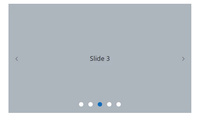
Select an item using the method
Using the PreviousAsync or NextAsync public method of the Carousel component, you can switch the current populating slide to a previous or next slide.
@using Syncfusion.Blazor.Buttons
@using Syncfusion.Blazor.Navigations

<div class="container">
    <div class="row control-container">
        <SfCarousel @ref="@CarouselRef" @bind-SelectedIndex="@CurrentIndex" ButtonsVisibility="CarouselButtonVisibility.Hidden">
            <CarouselItem>
                <div class="slide-content">Slide 1</div>
            </CarouselItem>
            <CarouselItem>
                <div class="slide-content">Slide 2</div>
            </CarouselItem>
            <CarouselItem>
                <div class="slide-content">Slide 3</div>
            </CarouselItem>
            <CarouselItem>
                <div class="slide-content">Slide 4</div>
            </CarouselItem>
            <CarouselItem>
                <div class="slide-content">Slide 5</div>
            </CarouselItem>
        </SfCarousel>
    </div>
    <div class="row justify-content-center">
        <SfButton CssClass="w-auto" @onclick="@(()=>OnNavigationClick(CarouselSlideDirection.Previous))">Previous</SfButton>
        <SfButton CssClass="w-auto" @onclick="@(()=>OnNavigationClick(CarouselSlideDirection.Next))">Next</SfButton>
    </div>
</div>

@code {
    SfCarousel CarouselRef;
    int CurrentIndex = 2;

    async Task OnNavigationClick(CarouselSlideDirection slideDirection)
    {
        if (slideDirection == CarouselSlideDirection.Previous)
        {
            await CarouselRef.PreviousAsync();
        }
        else
        {
            await CarouselRef.NextAsync();
        }
    }
}

<style>
    .control-container {
        background-color: #adb5bd;
        height: 300px;
        margin: 0 auto;
        width: 500px;
    }

    .e-carousel .slide-content {
        align-items: center;
        display: flex;
        font-size: 1.25rem;
        height: 100%;
        justify-content: center;
    }
</style>Partial visible slides
The Carousel component supports to show one complete slide and a partial view of adjacent (previous and next) slides at the same time. You can enable or disable the partial slides using the partialVisible property.
@using Syncfusion.Blazor.Navigations

<div class="control-container">
    <SfCarousel PartialVisible=true>
        <CarouselItem>
            <figure class="img-container"><img src="https://ej2.syncfusion.com/products/images/carousel/cardinal.png" alt="cardinal" style="height:100%;width:100%;" /><figcaption class="img-caption">Cardinal</figcaption></figure>
        </CarouselItem>
        <CarouselItem>
            <figure class="img-container"><img src="https://ej2.syncfusion.com/products/images/carousel/hunei.png" alt="kingfisher" style="height:100%;width:100%;" /><figcaption class="img-caption">Kingfisher</figcaption></figure>
        </CarouselItem>
        <CarouselItem>
            <figure class="img-container"><img src="https://ej2.syncfusion.com/products/images/carousel/costa-rica.png" alt="keel-billed-toucan" style="height:100%;width:100%;" /><figcaption class="img-caption">Keel-billed-toucan</figcaption></figure>
        </CarouselItem>
        <CarouselItem>
            <figure class="img-container"><img src="https://ej2.syncfusion.com/products/images/carousel/kaohsiung.png" alt="yellow-warbler" style="height:100%;width:100%;" /><figcaption class="img-caption">Yellow-warbler</figcaption></figure>
        </CarouselItem>
        <CarouselItem>
           <figure class="img-container"><img src="https://ej2.syncfusion.com/products/images/carousel/bee-eater.png" alt="bee-eater" style="height:100%;width:100%;" /><figcaption class="img-caption">Bee-eater</figcaption></figure>
        </CarouselItem>
    </SfCarousel>
</div>

<style>
    .control-container {
        margin: 0 auto 2em;
        max-width: 800px;
        height: 300px;
    }

    .img-container {
        margin: 0 10px;
        width: 100%;
        height: 100%;
    }

    .img-caption {
        bottom: 4em;
        color: #fff;
        font-size: 12pt;
        height: 2em;
        position: relative;
        padding: 0.3em 1em;
        text-align: center;
        width: 100%;
    }

</style>
NOTE
Slide animation only applicable if the
partialVisibleis enabled.
The last slide will be displayed as a partial slide at the initial rendering when the loop and partialVisible properties are enabled.
The previous slide is not displayed at the initial rendering when the loop is disabled.
The following example code depicts the functionality of partialVisible and without loop functionalities.
@using Syncfusion.Blazor.Navigations

<div class="control-container">
    <SfCarousel PartialVisible="true" Loop="false">
        <CarouselItem>
            <figure class="img-container"><img src="https://ej2.syncfusion.com/products/images/carousel/cardinal.png" alt="cardinal" style="height:100%;width:100%;" /><figcaption class="img-caption">Cardinal</figcaption></figure>
        </CarouselItem>
        <CarouselItem>
            <figure class="img-container"><img src="https://ej2.syncfusion.com/products/images/carousel/hunei.png" alt="kingfisher" style="height:100%;width:100%;" /><figcaption class="img-caption">Kingfisher</figcaption></figure>
        </CarouselItem>
        <CarouselItem>
            <figure class="img-container"><img src="https://ej2.syncfusion.com/products/images/carousel/costa-rica.png" alt="keel-billed-toucan" style="height:100%;width:100%;" /><figcaption class="img-caption">Keel-billed-toucan</figcaption></figure>
        </CarouselItem>
        <CarouselItem>
            <figure class="img-container"><img src="https://ej2.syncfusion.com/products/images/carousel/kaohsiung.png" alt="yellow-warbler" style="height:100%;width:100%;" /><figcaption class="img-caption">Yellow-warbler</figcaption></figure>
        </CarouselItem>
        <CarouselItem>
           <figure class="img-container"><img src="https://ej2.syncfusion.com/products/images/carousel/bee-eater.png" alt="bee-eater" style="height:100%;width:100%;" /><figcaption class="img-caption">Bee-eater</figcaption></figure>
        </CarouselItem>
    </SfCarousel>
</div>

<style>
    .control-container {
        margin: 0 auto 2em;
        max-width: 800px;
        height: 300px;
    }

    .img-container {
        margin: 0 10px;
        width: 100%;
        height: 100%;
    }

    .img-caption {
        bottom: 4em;
        color: #fff;
        font-size: 12pt;
        height: 2em;
        position: relative;
        padding: 0.3em 1em;
        text-align: center;
        width: 100%;
    }

</style>