Blazor Charts Series Label
11 Aug 20269 minutes to read
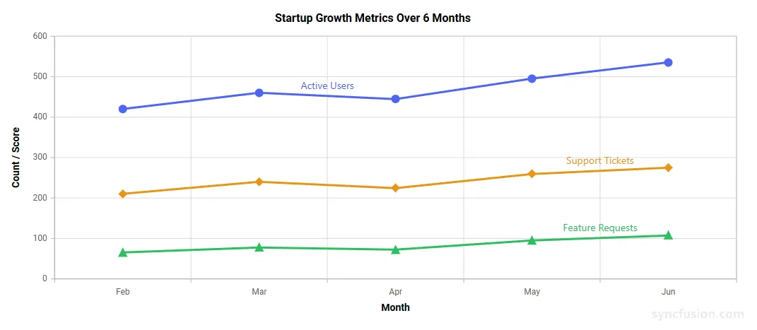
The series label feature displays the name of each series directly within the chart area. This improves readability by helping users identify series inline and reduces reliance on the legend.
This feature is especially useful in multi-series visualizations and exported charts, where quick in-chart identification is important.Series labels can be enabled and customized using the SeriesLabelSettings property.
NOTE
Supported Series Types: Series labels are available for Line, Area, Scatter, Column, Bar, Polar Line, and Radar Line chart types.
Enable series labels
To display series labels, set the Visible property of SeriesLabelSettings to true for the required series.
@using Syncfusion.Blazor.Charts

<SfChart Title="Startup Growth Metrics Over 6 Months" Width="100%" Height="450px">
<ChartLegendSettings Visible="false" />
    <ChartPrimaryXAxis ValueType="Syncfusion.Blazor.Charts.ValueType.Category" Title="Month">
    </ChartPrimaryXAxis>
    <ChartPrimaryYAxis Title="Count / Score">
    </ChartPrimaryYAxis>
    <ChartSeriesCollection>
        <ChartSeries DataSource="@ActiveUsersData" Name="Active Users" XName="Month" YName="Value" Type="ChartSeriesType.Line" Width="3" Fill="#4F65F1">
            <ChartMarker Visible="true" Width="10" Height="10" IsFilled="true" Shape="ChartShape.Circle" />
            <SeriesLabelSettings Visible="true"> </SeriesLabelSettings>
        </ChartSeries>
    <ChartSeries DataSource="@SupportTicketsData" Name="Support Tickets" XName="Month" YName="Value" Type="ChartSeriesType.Line" Width="3" Fill="#E6951A">
            <ChartMarker Visible="true" Width="10" Height="10" IsFilled="true" Shape="ChartShape.Diamond" />
            <SeriesLabelSettings Visible="true"> </SeriesLabelSettings>
        </ChartSeries>
    <ChartSeries DataSource="@FeatureRequestsData" Name="Feature Requests" XName="Month" YName="Value" Type="ChartSeriesType.Line" Width="3" Fill="#2DBE60">
            <ChartMarker Visible="true" Width="10" Height="10" IsFilled="true" Shape="ChartShape.Triangle" />
            <SeriesLabelSettings Visible="true"> </SeriesLabelSettings>
        </ChartSeries>
    </ChartSeriesCollection>
</SfChart>

@code {
    public class MetricData
    {
        public string Month { get; set; }
        public double Value { get; set; }
    }

    public List<MetricData> ActiveUsersData = new()
    {
        new MetricData { Month = "Feb", Value = 420 },
        new MetricData { Month = "Mar", Value = 460 },
        new MetricData { Month = "Apr", Value = 445 },
        new MetricData { Month = "May", Value = 495 },
        new MetricData { Month = "Jun", Value = 535 }
    };

    public List<MetricData> SupportTicketsData = new()
    {
        new MetricData { Month = "Feb", Value = 210 },
        new MetricData { Month = "Mar", Value = 240 },
        new MetricData { Month = "Apr", Value = 225 },
        new MetricData { Month = "May", Value = 260 },
        new MetricData { Month = "Jun", Value = 275 }
    };

    public List<MetricData> FeatureRequestsData = new()
    {
        new MetricData { Month = "Feb", Value = 65 },
        new MetricData { Month = "Mar", Value = 78 },
        new MetricData { Month = "Apr", Value = 72 },
        new MetricData { Month = "May", Value = 95 },
        new MetricData { Month = "Jun", Value = 108 }
    };
}
Customization
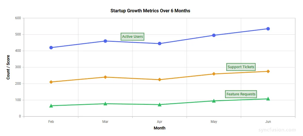
You can customize the appearance of the series label using the following properties.
SeriesLabelSettings Properties
Configure the main series label appearance:
In the SeriesLabelSettings:
-
Visible: Enables or disables the display of series labels. Set totrueto display the label for the corresponding series. -
Text: Specifies the custom text to be displayed in the series label. If this property is not set, the label displays the corresponding series name by default. -
Background: Specifies the background color of the series label. This helps the label stand out clearly within the chart area. -
Opacity: Specifies the transparency level of the series label. The accepted range is from 0 to 1, where 0 represents full transparency and 1 represents full opacity. For example, setOpacity="0.5"for 50% transparency. -
ShowOverlapText: Determines whether overlapping series labels should be displayed. This is useful when labels overlap because the corresponding series are positioned close to one another.
In the SeriesLabelBorder:
-
Color: Specifies the border color of the series label. This can be used to visually separate the label from the chart background. -
Width: Specifies the width of the border around the series label. A higher value makes the border more visible.
In the SeriesLabelFont:
-
Size: Specifies the font size of the label text. -
Color: Specifies the font color of the label text. -
FontFamily: Specifies the font family of the label text. -
FontWeight: Specifies the font weight of the label text. Valid values includenormal,bold,600,700, etc. (CSS font-weight format).
@using Syncfusion.Blazor.Charts

<SfChart Title="Startup Growth Metrics Over 6 Months" Width="100%" Height="450px">
<ChartLegendSettings Visible="false" />
    <ChartPrimaryXAxis ValueType="Syncfusion.Blazor.Charts.ValueType.Category" Title="Month">
    </ChartPrimaryXAxis>
    <ChartPrimaryYAxis Title="Count / Score">
    </ChartPrimaryYAxis>
    <ChartSeriesCollection>
        <ChartSeries DataSource="@ActiveUsersData" Name="Active Users" XName="Month" YName="Value" Type="ChartSeriesType.Line" Width="3" Fill="#4F65F1">
            <ChartMarker Visible="true" Width="10" Height="10" IsFilled="true" Shape="ChartShape.Circle" />
        <SeriesLabelSettings Visible="true" Background="#DCE8DC" Opacity="1">
            <SeriesLabelFont Size="13px" FontFamily="Segoe UI" FontWeight="600" Color="#2E7D32" />
            <SeriesLabelBorder Width="2" Color="#4A9652" />
        </SeriesLabelSettings>
        </ChartSeries>
        <ChartSeries DataSource="@SupportTicketsData" Name="Support Tickets" XName="Month" YName="Value" Type="ChartSeriesType.Line" Width="3" Fill="#E6951A">
            <ChartMarker Visible="true" Width="10" Height="10" IsFilled="true" Shape="ChartShape.Diamond" />
        <SeriesLabelSettings Visible="true" Background="#DCE8DC" Opacity="1">
            <SeriesLabelFont Size="13px" FontFamily="Segoe UI" FontWeight="600" Color="#2E7D32" />
            <SeriesLabelBorder Width="2" Color="#4A9652" />
        </SeriesLabelSettings>
        </ChartSeries>
        <ChartSeries DataSource="@FeatureRequestsData" Name="Feature Requests" XName="Month" YName="Value" Type="ChartSeriesType.Line" Width="3" Fill="#2DBE60">
            <ChartMarker Visible="true" Width="10" Height="10" IsFilled="true" Shape="ChartShape.Triangle" />
        <SeriesLabelSettings Visible="true" Background="#DCE8DC" Opacity="1">
            <SeriesLabelFont Size="13px" FontFamily="Segoe UI" FontWeight="600" Color="#2E7D32" />
            <SeriesLabelBorder Width="2" Color="#4A9652" />
        </SeriesLabelSettings>
        </ChartSeries>
    </ChartSeriesCollection>
</SfChart>

@code {
    public class MetricData
    {
        public string Month { get; set; }
        public double Value { get; set; }
    }

    public List<MetricData> ActiveUsersData = new()
    {
        new MetricData { Month = "Feb", Value = 420 },
        new MetricData { Month = "Mar", Value = 460 },
        new MetricData { Month = "Apr", Value = 445 },
        new MetricData { Month = "May", Value = 495 },
        new MetricData { Month = "Jun", Value = 535 }
    };

    public List<MetricData> SupportTicketsData = new()
    {
        new MetricData { Month = "Feb", Value = 210 },
        new MetricData { Month = "Mar", Value = 240 },
        new MetricData { Month = "Apr", Value = 225 },
        new MetricData { Month = "May", Value = 260 },
        new MetricData { Month = "Jun", Value = 275 }
    };

    public List<MetricData> FeatureRequestsData = new()
    {
        new MetricData { Month = "Feb", Value = 65 },
        new MetricData { Month = "Mar", Value = 78 },
        new MetricData { Month = "Apr", Value = 72 },
        new MetricData { Month = "May", Value = 95 },
        new MetricData { Month = "Jun", Value = 108 }
    };
}
See also
NOTE
Refer to the Blazor Charts feature tour page to explore the available chart features. You can also check the Blazor Chart Example to learn how chart types are used to visualize data trends over equal intervals.