Customize Color Picker in Blazor Color Picker Component
24 Jun 20264 minutes to read
Custom palette
By default, the palette renders with a set of predefined colors. To load custom colors, set the PresetColors property. To further customize palette tiles (for example, to add a class for styling), use the OnTileRender event.
@using Syncfusion.Blazor.Inputs

<div id="preview" style="@styleValue"></div>
<h4>Select a color</h4>
<SfColorPicker Mode="ColorPickerMode.Palette" CssClass="circle-palette" ModeSwitcher="false" Inline="true" ShowButtons="false" Columns="4" PresetColors="@customColors" ValueChange="OnChange"></SfColorPicker>

@code {
    private string styleValue = "background-color: #008000";
    private void OnChange(ColorPickerEventArgs args)
    {
        styleValue = "background-color: " + args.CurrentValue.Hex;
    }
    private Dictionary<string, string[]> customColors = new Dictionary<string, string[]> {
        { "Custom", new string[] { "#ef9a9a", "#e57373", "#ef5350", "#f44336", "#f48fb1", "#f06292",
                    "#ec407a", "#e91e63", "#ce93d8", "#ba68c8", "#ab47bc", "#9c27b0", "#b39ddb","#9575cd",
                    "#7e57c2", "#673AB7", "#9FA8DA", "#7986CB", "#5C6BC0", "#3F51B5", "#90CAF9", "#64B5F6",
                    "#42A5F5","#2196F3", "#81D4FA", "#4FC3F7", "#29B6F6", "#03A9F4", "#80DEEA", "#4DD0E1",
                    "#26C6DA", "#00BCD4", "#80CBC4", "#4DB6AC", "#26A69A", "#009688","#A5D6A7", "#81C784",
                    "#66BB6A", "#4CAF50", "#C5E1A5", "#AED581", "#9CCC65", "#8BC34A", "#E6EE9C","#DCE775",
                    "#D4E157", "#CDDC39" }
        }
   };
}

<style>
    #preview {
        height: 50px;
        width: 50%;
    }
    .circle-palette .e-container {
        background-color: transparent;
        border-color: transparent;
        box-shadow: none;
    }
    .circle-palette .e-container .e-custom-palette.e-palette-group {
        height: 182px;
    }
    .circle-palette .e-container .e-palette .e-tile {
        border: 0;
        color: #fff;
        height: 36px;
        font-size: 18px;
        width: 36px;
        line-height: 36px;
        border-radius: 50%;
        margin: 2px 5px;
        font-family: "e-icons";
        font-style: normal;
        font-variant: normal;
        font-weight: normal;
        text-transform: none;
    }
    .circle-palette .e-container .e-palette .e-tile.e-selected::before {
        content: '\e933';
    }
    .circle-palette .e-container .e-palette .e-tile.e-selected {
        outline: none;
    }
</style>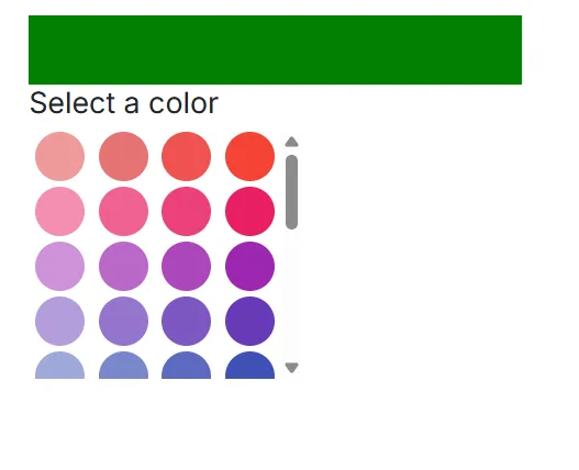
Hide input area from picker
By default, the input area is rendered in the Color Picker. To hide the input area, add the built-in class e-hide-value via the CssClass property. This hides the input field visually while retaining core picker functionality.
In the following sample, the Color Picker is rendered without the input area.
@using Syncfusion.Blazor.Inputs

<h4>Choose a color</h4>
<SfColorPicker ModeSwitcher="false" CssClass="e-hide-value"></SfColorPicker>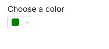
Custom handle
Customize the Color Picker handle shape and UI with CSS. In this example, the handle is replaced with an SVG icon encoded as a data URL. Similar techniques can be used to style the handle to match application branding. For broad compatibility, verify styles across themes and consider contrast and focus visibility.
The following sample shows the customized Color Picker handle.
@using Syncfusion.Blazor.Inputs

<SfColorPicker Value="#344aae" CssClass="e-custom-picker" ModeSwitcher="false"></SfColorPicker>

<style>
    .e-color-picker-tooltip.e-popup.e-popup-open {
        display: none;
    }
    .e-custom-picker .e-container .e-handler {
        background: transparent url('data:image/svg+xml;base64,PD94bWwgdmVyc2lvbj0iMS4wIiBlbmNvZGluZz0idXRmLTgiPz4KPCEtLSBHZW5lcmF0b3I6IEFkb2JlIElsbHVzdHJhdG9yIDIyLjEuMCwgU1ZHIEV4cG9ydCBQbHVnLUluIC4gU1ZHIFZlcnNpb246IDYuMDAgQnVpbGQgMCkgIC0tPgo8c3ZnIHZlcnNpb249IjEuMSIgaWQ9IkxheWVyXzEiIHhtbG5zPSJodHRwOi8vd3d3LnczLm9yZy8yMDAwL3N2ZyIgeG1sbnM6eGxpbms9Imh0dHA6Ly93d3cudzMub3JnLzE5OTkveGxpbmsiIHg9IjBweCIgeT0iMHB4IgoJIHZpZXdCb3g9IjAgMCAxNiAxNiIgc3R5bGU9ImVuYWJsZS1iYWNrZ3JvdW5kOm5ldyAwIDAgMTYgMTY7IiB4bWw6c3BhY2U9InByZXNlcnZlIj4KPHN0eWxlIHR5cGU9InRleHQvY3NzIj4KCS5zdDB7ZmlsbDojRkZGRkZGO30KPC9zdHlsZT4KPGc+Cgk8cG9seWdvbiBjbGFzcz0ic3QwIiBwb2ludHM9IjE2LDYgMTAsNiAxMCwwIDYsMCA2LDYgMCw2IDAsMTAgNiwxMCA2LDE2IDEwLDE2IDEwLDEwIDE2LDEwIAkiLz4KPC9nPgo8cGF0aCBkPSJNMTAsNlYwSDZ2NkgwdjRoNnY2aDR2LTZoNlY2SDEweiBNMTUsOUg5djZIN1Y5SDFWN2g2VjFoMnY2aDZWOXoiLz4KPC9zdmc+Cg==');
        font-size: 16px;
        height: 16px;
        line-height: 16px;
        margin-left: -8px;
        margin-top: -8px;
        border: none;
        box-shadow: none;
        width: 16px;
    }
</style>