Icons and Navigation in Blazor Context Menu
27 Aug 20262 minutes to read
Icons
The Blazor Context Menu item has an icon/image in it to provide a visual representation of the action. To place the icon on a menu item, set the IconCss property to e-icons with the required icon CSS. By default, the icon is positioned to the left side of the menu item. In the following sample, the icons for Cut, Copy and Paste menu items are added using the IconCss property.
@using Syncfusion.Blazor.Navigations

<div id="target">Right click/Touch hold to open the ContextMenu </div>
<SfContextMenu Target="#target" TValue="MenuItem">
    <MenuItems>
        <MenuItem Text="Cut" IconCss="e-icons e-cut"></MenuItem>
        <MenuItem Text="Copy" IconCss="e-icons e-copy"></MenuItem>
        <MenuItem Text="Paste" IconCss="e-icons e-paste"></MenuItem>
    </MenuItems>
</SfContextMenu>

<style>
    #target {
        border: 1px dashed;
        height: 150px;
        padding: 10px;
        position: relative;
        text-align: justify;
        color: gray;
        user-select: none;
    }
    .e-cut::before {
        content: '\e279';
    }
    .e-copy::before {
        content: '\e280';
    }
    .e-paste::before {
        content: '\e601';
    }
</style>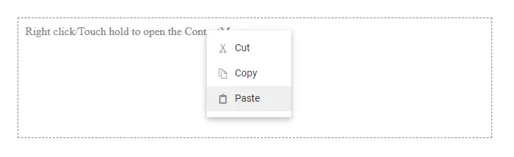
The Context Menu provides a set of icons that can be loaded by applying
e-iconsclass name to the element.
You can also use third party icons on the Context Menu using theIconCssproperty.
Navigation
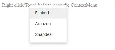
Navigation in the ContextMenu is used to navigate to another web page when a menu item is clicked. This can be achieved by providing a link to the menu item using the Url property. In the following sample, navigation URLs for Flipkart, Amazon, and Snapdeal menu items are added using the Url property.
@using Syncfusion.Blazor.Navigations

<div id="target">Right click/Touch hold to open the ContextMenu </div>
<SfContextMenu Target="#target" TValue="MenuItem">
    <MenuItems>
        <MenuItem Text="Flipkart" Url="https://www.flipkart.com"></MenuItem>
        <MenuItem Text="Amazon" Url="https://www.amazon.com"></MenuItem>
        <MenuItem Text="Snapdeal" Url="https://www.snapdeal.com"></MenuItem>
    </MenuItems>
</SfContextMenu>

<style>
    #target {
        border: 1px dashed;
        height: 150px;
        padding: 10px;
        position: relative;
        text-align: justify;
        color: gray;
        user-select: none;
    }
</style>
For security reasons, external domains are not supported/loaded within the preview samples.