Style and Appearance in Blazor Data Grid
7 Aug 202624 minutes to read
The Blazor Data Grid provides comprehensive styling and appearance customization capabilities to align grid designs with application requirements. Built-in themes enable rapid implementation, CSS customization allows visual element adjustment, and theme-based styling creates consistent user experiences.
Built-in themes
The Data Grid component provides multiple themes aligned with industry-standard design systems, available in both light and dark variants. Available themes include:
| Theme | Style Sheet Name |
|---|---|
| Tailwind 3.4 | tailwind3.css / tailwind3.scss |
| Tailwind 3.4 Dark | tailwind3-dark.css / tailwind3-dark.scss |
| Bootstrap 5.3 | bootstrap5.3.css / bootstrap5.3.scss |
| Bootstrap 5.3 Dark | bootstrap5.3-dark.css / bootstrap5.3-dark.scss |
| Fluent 2 | fluent2.css / fluent2.scss |
| Fluent 2 Dark | fluent2-dark.css / fluent2-dark.scss |
| Material 3 | material3.css / material3.scss |
| Material 3 Dark | material3-dark.css / material3-dark.scss |
| Bootstrap 5 | bootstrap5.css / bootstrap5.scss |
| Bootstrap 5 Dark | bootstrap5-dark.css / bootstrap5-dark.scss |
| Fluent | fluent.css / fluent.scss |
| Fluent Dark | fluent-dark.css / fluent-dark.scss |
| Google’s Material | material.css / material.scss |
| Google’s Material Dark | material-dark.css / material-dark.scss |
| Tailwind CSS | tailwind.css / tailwind.scss |
| Tailwind Dark CSS | tailwind-dark.css / tailwind-dark.scss |
| Microsoft Office Fabric | fabric.css / fabric.scss |
| Microsoft Office Fabric Dark | fabric-dark.css / fabric-dark.scss |
| High Contrast | highcontrast.css / highcontrast.scss |
Size modes
The Data Grid component provides two size modes designed for different interaction contexts and device types:
- Normal mode (default) — Standard sizing configured for mouse and keyboard interactions.
-
Touch mode (bigger) — Enlarged elements with increased padding, font sizes, and touch targets for touch-based interaction and improved accessibility. Apply the
e-biggerCSS class to the<body>element to enable this mode.
@using Syncfusion.Blazor.Grids
@using Syncfusion.Blazor.Buttons

<SfButton Content="@buttonContent" OnClick="ChangeMode"></SfButton>

<div class="@(isBiggerMode ? "e-bigger" : "")">
    <SfGrid @ref="Grid" DataSource="@Orders" Height="315" AllowPaging="true">
        <GridSelectionSettings Type="Syncfusion.Blazor.Grids.SelectionType.Multiple"></GridSelectionSettings>
        <GridPageSettings PageSize="8"></GridPageSettings>
        <GridColumns>
            <GridColumn Field=@nameof(OrderData.OrderID) HeaderText="Order ID" TextAlign="TextAlign.Right" Width="140"></GridColumn>
            <GridColumn Field=@nameof(OrderData.CustomerID) HeaderText="Customer Name" Width="120"></GridColumn>
            <GridColumn Field=@nameof(OrderData.Freight) HeaderText="Freight" Format="C2" TextAlign="TextAlign.Right" Width="100"></GridColumn>
            <GridColumn Field=@nameof(OrderData.ShipCity) HeaderText="Ship City" Width="100"></GridColumn>
        </GridColumns>
    </SfGrid>
</div>

@code
{
    private SfGrid<OrderData> Grid;
    private List<OrderData> Orders { get; set; }
    private string buttonContent = "Normal Mode";
    private bool isBiggerMode = false;

    protected override void OnInitialized()
    {
        Orders = OrderData.GetAllRecords();
    }

    private void ChangeMode()
    {
        isBiggerMode = !isBiggerMode;
        buttonContent = isBiggerMode ? "Touch Mode" : "Normal Mode";
    }
}
internal sealed class OrderData
{
private static readonly List<OrderData> Data = new();
public OrderData(int orderId, string customerId, double freight, string shipCity)
{
OrderID = orderId;
CustomerID = customerId;
Freight = freight;
ShipCity = shipCity;
}
internal static List<OrderData> GetAllRecords()
{
if (Data.Count == 0)
{
Data.Add(new OrderData(10248, "VINET", 32.38, "Reims"));
Data.Add(new OrderData(10249, "TOMSP", 11.61, "Münster"));
Data.Add(new OrderData(10250, "HANAR", 65.83, "Rio de Janeiro"));
Data.Add(new OrderData(10251, "VICTE", 41.34, "Lyon"));
Data.Add(new OrderData(10252, "SUPRD", 51.30, "Charleroi"));
Data.Add(new OrderData(10253, "CHOPS", 58.17, "Bern"));
Data.Add(new OrderData(10254, "RICSU", 22.98, "Genève"));
Data.Add(new OrderData(10255, "WELLI", 13.97, "San Cristóbal"));
Data.Add(new OrderData(10256, "HILAA", 81.91, "Graz"));
}
return Data;
}
public int OrderID { get; set; }
public string CustomerID { get; set; }
public double Freight { get; set; }
public string ShipCity { get; set; }
}Theme customization
The Blazor Data Grid provides flexible theme customization options to align control appearance with application design requirements. Built-in themes can be customized by overriding default CSS variables or by creating completely customized themes using Syncfusion Theme Studio.
Default CSS override
The Blazor Data Grid themes use CSS variables with the unified –sf naming convention. This ensures visual consistency, straightforward customization, and global updates. Centralized variables allow quick adjustments to colors, backgrounds, and borders across the grid.
Material 3 theme color variables
The Material 3 theme applies scalable CSS custom properties to maintain consistency within the Blazor Data Grid. Variables are designed for straightforward theming and responsive behavior.
| Name | Purpose |
|---|---|
--e-font-name |
Specifies the default font family applied across the DataGrid |
--color-sf-surface |
Controls base surface styling for UI elements |
--color-sf-on-surface |
Defines text appearance on surface elements |
--color-sf-primary-container |
Applies background styling for active or highlighted row states |
--color-sf-outline-variant |
Defines border and separator styling |
Bootstrap 5.3 theme color variables
The Bootstrap 5.3 theme extends Bootstrap’s framework with CSS custom properties for the Data Grid.
| Name | Purpose |
|---|---|
--e-font-name |
Specifies the default font family used across the DataGrid |
--color-sf-content-bg-color-alt1 |
Controls the background of the DataGrid header |
--color-sf-content-bg-color |
Controls the background of the DataGrid content |
--color-sf-table-bg-color-hover |
Defines the background styling for selected rows during hover interaction |
--color-sf-content-bg-color-hover |
Defines background behavior when primary elements are hovered |
--color-sf-primary |
Defines the main theme styling used across components |
--color-sf-primary-light |
Provides a softer variation of the primary theme for backgrounds |
--color-sf-border-light |
Specifies styling for light borders and separators |
Tailwind 3 theme color variables
The Tailwind 3 theme uses utility-first CSS custom properties to deliver a flexible, modern design system.
| Name | Purpose |
|---|---|
--e-font-name |
Specifies the default font family used across the UI |
--color-sf-content-bg-color |
Controls the main background of the application area |
--color-sf-table-bg-color-hover |
Defines background behavior during hover interaction |
--color-sf-content-bg-color-hover |
Defines the background color for pager during hover interaction |
--color-sf-primary |
Defines the main theme color used across components |
--color-sf-border-light |
Defines the border color used across the component |
Fluent 2 theme color variables
The Fluent 2 theme leverages modern CSS custom properties to provide a clean and consistent design aligned with Fluent UI principles.
| Name | Purpose |
|---|---|
--e-font-name |
Specifies the default font family used across the DataGrid |
--color-sf-content-bg-color-alt1 |
Controls the main background of the DataGrid |
--color-sf-table-bg-color-hover |
Defines the background styling for selected rows during hover interaction |
--color-sf-content-bg-color-hover |
Defines background behavior when primary elements are hovered |
--color-sf-primary |
Defines the main theme styling used across components |
--color-sf-border-light |
Specifies styling for light borders and separators |
--color-sf-border-alt |
Defines alternate border styling for DataGrid elements |
@using Syncfusion.Blazor.Grids

<SfGrid @ref="Grid" DataSource="@Orders" Height="315" AllowPaging="true">
    <GridSelectionSettings Type="SelectionType.Multiple"></GridSelectionSettings>
    <GridPageSettings PageSize="8"></GridPageSettings>
    <GridColumns>
        <GridColumn Field=@nameof(OrderData.OrderID) HeaderText="Order ID" TextAlign="TextAlign.Right" Width="140"></GridColumn>
        <GridColumn Field=@nameof(OrderData.CustomerID) HeaderText="Customer Name" Width="120"></GridColumn>
        <GridColumn Field=@nameof(OrderData.Freight) HeaderText="Freight" Format="C2" TextAlign="TextAlign.Right" Width="100"></GridColumn>
        <GridColumn Field=@nameof(OrderData.ShipCity) HeaderText="Ship City" Width="100"></GridColumn>
    </GridColumns>
</SfGrid>

<style>
    :root {
        /* fluent 2 */
        --e-font-name: 'Verdana';
        --color-sf-content-bg-color-alt1: rgba(240, 253, 244);
        --color-sf-table-bg-color-hover: rgba(70, 100, 20, 0.05);
        --color-sf-border-alt: rgba(34, 197, 94);
        --color-sf-content-bg-color-hover: rgba(70, 100, 20, 0.05);
        --color-sf-primary: rgba(34, 197, 94);
        --color-sf-border-light: rgba(34, 197, 94);
    }
</style>

@code {
    private SfGrid<OrderData> Grid;
    private List<OrderData> Orders { get; set; }

    protected override void OnInitialized()
    {
        Orders = OrderData.GetAllRecords();
    }
}
internal sealed class OrderData
{
private static readonly List<OrderData> Data = new();
public OrderData(int orderId, string customerId, double freight, string shipCity)
{
OrderID = orderId;
CustomerID = customerId;
Freight = freight;
ShipCity = shipCity;
}
internal static List<OrderData> GetAllRecords()
{
if (Data.Count == 0)
{
Data.Add(new OrderData(10248, "VINET", 32.38, "Reims"));
Data.Add(new OrderData(10249, "TOMSP", 11.61, "Münster"));
Data.Add(new OrderData(10250, "HANAR", 65.83, "Rio de Janeiro"));
Data.Add(new OrderData(10251, "VICTE", 41.34, "Lyon"));
Data.Add(new OrderData(10252, "SUPRD", 51.30, "Charleroi"));
Data.Add(new OrderData(10253, "CHOPS", 58.17, "Bern"));
Data.Add(new OrderData(10254, "RICSU", 22.98, "Genève"));
Data.Add(new OrderData(10255, "WELLI", 13.97, "San Cristóbal"));
Data.Add(new OrderData(10256, "HILAA", 81.91, "Graz"));
}
return Data;
}
public int OrderID { get; set; }
public string CustomerID { get; set; }
public double Freight { get; set; }
public string ShipCity { get; set; }
}Customize the DataGrid root element
The .e-grid class styles the root container of the Blazor DataGrid. Apply CSS to modify its appearance:
.e-grid {
    font-family: cursive;
}
Properties such as f font-family,background-color, and spacing-related styles can be adjusted to align with the grid design.
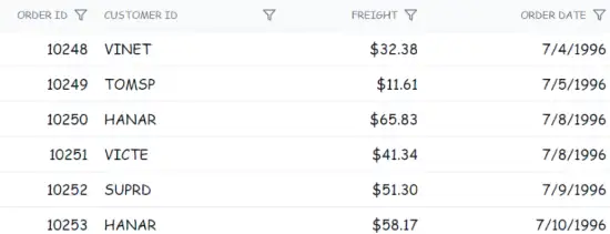
This customization applies a cursive font to the grid content. Additional styling can be applied to rows, alternate rows, selected rows, and hover states. Avoid using !important for hover styles in production environments. Instead, increase selector specificity to maintain consistent styling control.
@using Syncfusion.Blazor.Grids

<SfGrid @ref="Grid" DataSource="@Orders" Height="315" AllowPaging="true">
    <GridSelectionSettings Type="SelectionType.Multiple"></GridSelectionSettings>
    <GridPageSettings PageSize="8"></GridPageSettings>
    <GridColumns>
        <GridColumn Field=@nameof(OrderData.OrderID) HeaderText="Order ID" TextAlign="TextAlign.Right" Width="140"></GridColumn>
        <GridColumn Field=@nameof(OrderData.CustomerID) HeaderText="Customer Name" Width="120"></GridColumn>
        <GridColumn Field=@nameof(OrderData.Freight) HeaderText="Freight" Format="C2" TextAlign="TextAlign.Right" Width="100"></GridColumn>
        <GridColumn Field=@nameof(OrderData.ShipCity) HeaderText="Ship City" Width="100"></GridColumn>
    </GridColumns>
</SfGrid>

<style>
    .e-grid {
        font-family: cursive;
        /* Optional: set a base background for the grid area */
        /* background-color: #fafafa; */
    }

    /* Prefer specificity over !important for hover */
    .e-grid .e-content .e-row:hover .e-rowcell {
        background-color: rgb(204, 229, 255);
    }

    .e-grid .e-rowcell.e-selectionbackground {
        background-color: rgb(230, 230, 250);
    }

    .e-grid .e-row.e-altrow {
        background-color: rgb(150, 212, 212);
    }

    .e-grid .e-row {
        background-color: rgb(180, 180, 180);
    }

    /* Optional: keyboard focus visibility */
    .e-grid .e-row:focus-visible .e-rowcell {
        outline: 2px solid #005a9e;
        outline-offset: -2px;
    }
</style>

@code {
    private SfGrid<OrderData> Grid;
    private List<OrderData> Orders { get; set; }

    protected override void OnInitialized()
    {
        Orders = OrderData.GetAllRecords();
    }
}
internal sealed class OrderData
{
private static readonly List<OrderData> Data = new();
public OrderData(int orderId, string customerId, double freight, string shipCity)
{
OrderID = orderId;
CustomerID = customerId;
Freight = freight;
ShipCity = shipCity;
}
internal static List<OrderData> GetAllRecords()
{
if (Data.Count == 0)
{
Data.Add(new OrderData(10248, "VINET", 32.38, "Reims"));
Data.Add(new OrderData(10249, "TOMSP", 11.61, "Münster"));
Data.Add(new OrderData(10250, "HANAR", 65.83, "Rio de Janeiro"));
Data.Add(new OrderData(10251, "VICTE", 41.34, "Lyon"));
Data.Add(new OrderData(10252, "SUPRD", 51.30, "Charleroi"));
Data.Add(new OrderData(10253, "CHOPS", 58.17, "Bern"));
Data.Add(new OrderData(10254, "RICSU", 22.98, "Genève"));
Data.Add(new OrderData(10255, "WELLI", 13.97, "San Cristóbal"));
Data.Add(new OrderData(10256, "HILAA", 81.91, "Graz"));
}
return Data;
}
public int OrderID { get; set; }
public string CustomerID { get; set; }
public double Freight { get; set; }
public string ShipCity { get; set; }
}Customize alternate rows with frozen columns
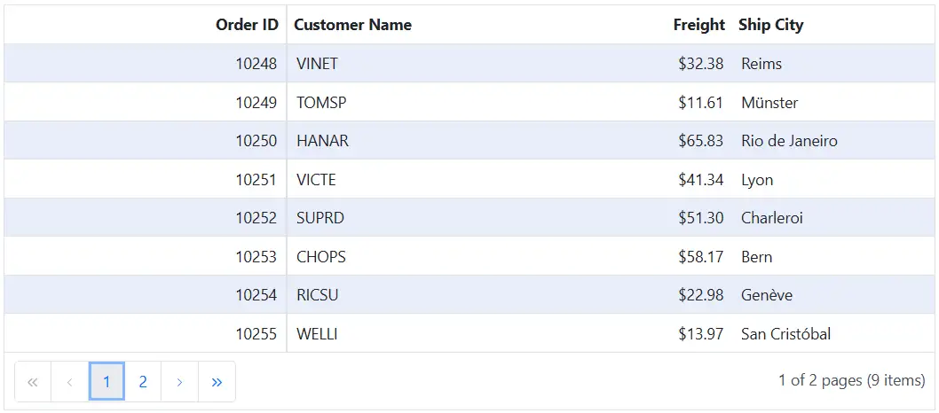
The .e-altrow .e-rowcell selector styles cells in alternate rows when Frozen columns are enabled in the Blazor DataGrid.
.e-grid .e-altrow .e-rowcell {
    background-color: #E8EEFA;
}
Adjust properties like background-color,font-family, and border to maintain consistent styling across frozen and movable sections.
@using Syncfusion.Blazor.Grids

<SfGrid @ref="Grid" DataSource="@Orders" Height="315" AllowPaging="true">
    <GridPageSettings PageSize="8"></GridPageSettings>
    <GridColumns>
        <GridColumn Field=@nameof(OrderData.OrderID) HeaderText="Order ID" IsFrozen="true" TextAlign="TextAlign.Right" Width="140"></GridColumn>
        <GridColumn Field=@nameof(OrderData.CustomerID) HeaderText="Customer Name" Width="120"></GridColumn>
        <GridColumn Field=@nameof(OrderData.Freight) HeaderText="Freight" Format="C2" TextAlign="TextAlign.Right" Width="100"></GridColumn>
        <GridColumn Field=@nameof(OrderData.ShipCity) HeaderText="Ship City" Width="100"></GridColumn>
    </GridColumns>
</SfGrid>

<style>
    /* Applies to alt rows across frozen and movable sections */
    .e-grid .e-altrow .e-rowcell {
        background-color: #E8EEFA;
    }
</style>

@code {
    private SfGrid<OrderData> Grid;
    private List<OrderData> Orders { get; set; }

    protected override void OnInitialized()
    {
        Orders = OrderData.GetAllRecords();
    }
}
internal sealed class OrderData
{
private static readonly List<OrderData> Data = new();
public OrderData(int orderId, string customerId, double freight, string shipCity)
{
OrderID = orderId;
CustomerID = customerId;
Freight = freight;
ShipCity = shipCity;
}
internal static List<OrderData> GetAllRecords()
{
if (Data.Count == 0)
{
Data.Add(new OrderData(10248, "VINET", 32.38, "Reims"));
Data.Add(new OrderData(10249, "TOMSP", 11.61, "Münster"));
Data.Add(new OrderData(10250, "HANAR", 65.83, "Rio de Janeiro"));
Data.Add(new OrderData(10251, "VICTE", 41.34, "Lyon"));
Data.Add(new OrderData(10252, "SUPRD", 51.30, "Charleroi"));
Data.Add(new OrderData(10253, "CHOPS", 58.17, "Bern"));
Data.Add(new OrderData(10254, "RICSU", 22.98, "Genève"));
Data.Add(new OrderData(10255, "WELLI", 13.97, "San Cristóbal"));
Data.Add(new OrderData(10256, "HILAA", 81.91, "Graz"));
}
return Data;
}
public int OrderID { get; set; }
public string CustomerID { get; set; }
public double Freight { get; set; }
public string ShipCity { get; set; }
}Customize the color of grid lines
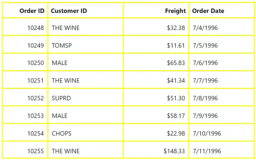
The Blazor DataGrid allows customization of grid lines to match application design requirements. Apply CSS to structural elements such as header cells, row cells, and the grid container to control color, thickness, and border style.
The GridLines property defines border visibility and supports options for Horizontal, Vertical, Both, or None.
    /* Customize the color of Grid lines */
    .e-grid .e-gridheader, .e-grid .e-headercell, .e-grid .e-rowcell, .e-grid {
        border-color: yellow;
        border-style: solid;
        border-width: 2px;
    }
@using Syncfusion.Blazor.Grids

<SfGrid DataSource="@Orders" Height="315" GridLines="GridLine.Both">
    <GridColumns>
        <GridColumn Field=@nameof(OrderData.OrderID) HeaderText="Order ID" TextAlign="TextAlign.Right" Width="90"></GridColumn>
        <GridColumn Field=@nameof(OrderData.CustomerID) HeaderText="Customer ID" Width="150"></GridColumn>
        <GridColumn Field=@nameof(OrderData.Freight) HeaderText="Freight" TextAlign="TextAlign.Right" Format="C2" Width="130"></GridColumn>
        <GridColumn Field=@nameof(OrderData.OrderDate) HeaderText="Order Date" Format="d" Type="ColumnType.Date" Width="130"></GridColumn>
    </GridColumns>
</SfGrid>

<style>
    /* Customize the color and thickness of grid lines */
    .e-grid .e-gridheader,
    .e-grid .e-headercell,
    .e-grid .e-rowcell,
    .e-grid {
        border-color: yellow;
        border-style: solid;
        border-width: 2px;
    }

    /* Optional: ensure header divider lines are visible */
    .e-grid .e-headercell {
        border-right-width: 2px;
    }
</style>

@code {
    private List<OrderData> Orders { get; set; }

    protected override void OnInitialized()
    {
        Orders = OrderData.GetAllRecords();
    }
}
internal sealed class OrderData
{
private static readonly List<OrderData> Data = new();
public OrderData(int orderId, string customerId, double freight, DateTime orderDate)
{
OrderID = orderId;
CustomerID = customerId;
Freight = freight;
OrderDate = orderDate;
}
internal static List<OrderData> GetAllRecords()
{
if (Data.Count == 0)
{
Data.Add(new OrderData(10248, "VINET", 32.38, new DateTime(1996, 7, 4)));
Data.Add(new OrderData(10249, "TOMSP", 11.61, new DateTime(1996, 7, 5)));
Data.Add(new OrderData(10250, "HANAR", 65.83, new DateTime(1996, 7, 6)));
Data.Add(new OrderData(10251, "VINET", 41.34, new DateTime(1996, 7, 7)));
Data.Add(new OrderData(10252, "SUPRD", 51.30, new DateTime(1996, 7, 8)));
Data.Add(new OrderData(10253, "HANAR", 58.17, new DateTime(1996, 7, 9)));
Data.Add(new OrderData(10254, "CHOPS", 22.98, new DateTime(1996, 7, 10)));
Data.Add(new OrderData(10255, "VINET", 148.33, new DateTime(1996, 7, 11)));
Data.Add(new OrderData(10256, "HANAR", 13.97, new DateTime(1996, 7, 12)));
}
return Data;
}
public int OrderID { get; set; }
public string CustomerID { get; set; }
public double Freight { get; set; }
public DateTime OrderDate { get; set; }
}Using Theme Studio
Syncfusion Theme Studio provides a unified approach to create custom themes for all controls, including the Blazor Data Grid. This advanced method defines a comprehensive set of styles to achieve consistent appearance across the application.
- Navigate to the Syncfusion® Theme Studio.
- Select the Grid control from the left panel.
- Customize colors, typography, spacing, and other visual tokens.
- Download the generated CSS file and integrate it into the Blazor project’s site stylesheet or theme bundle.