How can I help you?
Grouping customization in Blazor DataGrid
22 Jun 20268 minutes to read
The appearance of grouping elements in the Blazor DataGrid can be customized using CSS. Styling options are available for different parts of the grouping interface:
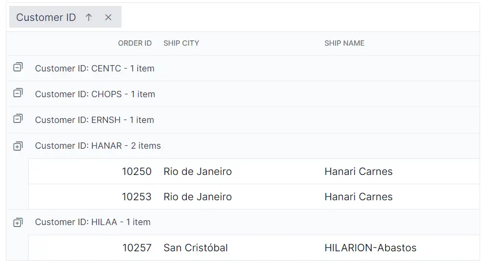
- Group header container and text: Displays grouped column names and allows drag-and-drop grouping actions.
- Expand and collapse icons: Controls used to toggle visibility of grouped rows.
- Group caption row: Shows summary information for each group, such as group key and item count.
- Grouping indent cell: Adds visual indentation to grouped rows to indicate hierarchy.
Customize the group header
The .e-groupdroparea class styles the group header area in the Blazor DataGrid. Use CSS to adjust its appearance:
.e-grid .e-groupdroparea {
    background-color: #132f49;
}
Properties like background-color, padding, border, and font can be changed to fit the grid layout design.
Customize the expand and collapse icons
The .e-icon-gdownarrow and .e-icon-grightarrow classes define the expand and collapse icons in grouped rows. Apply CSS to modify their look:
.e-grid .e-icon-gdownarrow::before {
    content: '\e7c9';
}

.e-grid .e-icon-grightarrow::before {
    content: '\e80f';
}
Modify the content, color, or size to align with custom icon sets. Confirm that the appropriate icon font family is available so glyphs render correctly. Refer to the Syncfusion icons documentation to choose glyphs for your theme.
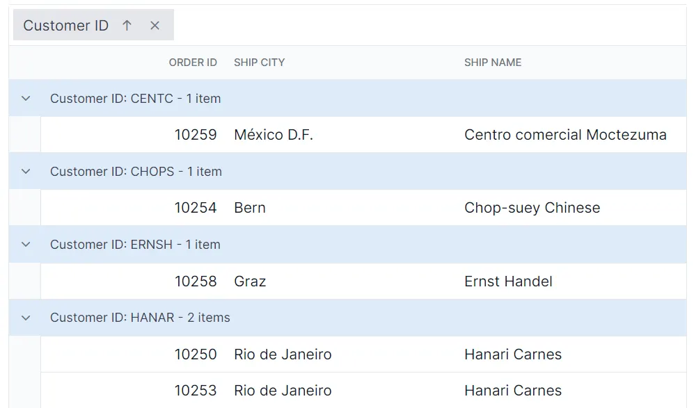
Customize the group caption row
The .e-groupcaption class styles the caption row, and .e-recordplusexpand and .e-recordpluscollapse classes style the record-level expand and collapse indicators:
.e-grid .e-groupcaption {
    background-color: #deecf9;
}

.e-grid .e-recordplusexpand,
.e-grid .e-recordpluscollapse {
    background-color: #deecf9;
}
Adjust properties such as background-color, padding, border, and font to maintain consistency with the rest of the grid.
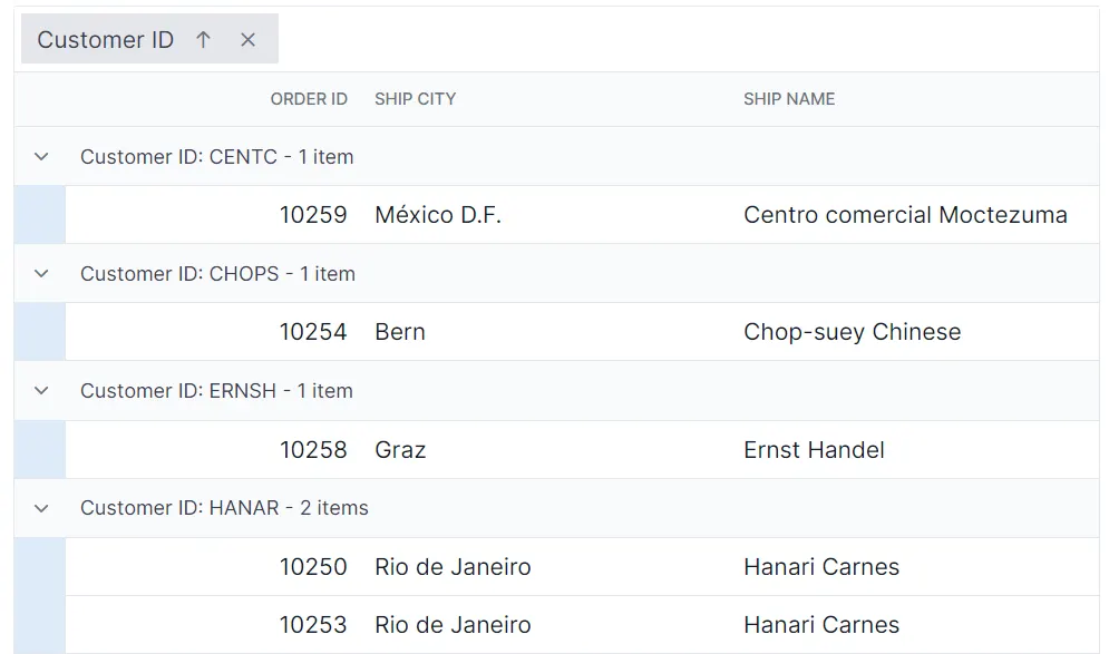
Customize the grouping indent cell
The .e-indentcell class styles the indent cell used in grouped rows. Apply CSS to change its appearance:
.e-grid .e-indentcell {
    background-color: #deecf9;
}
Modify properties such as background-color, padding, and border to match the overall layout and maintain consistency.
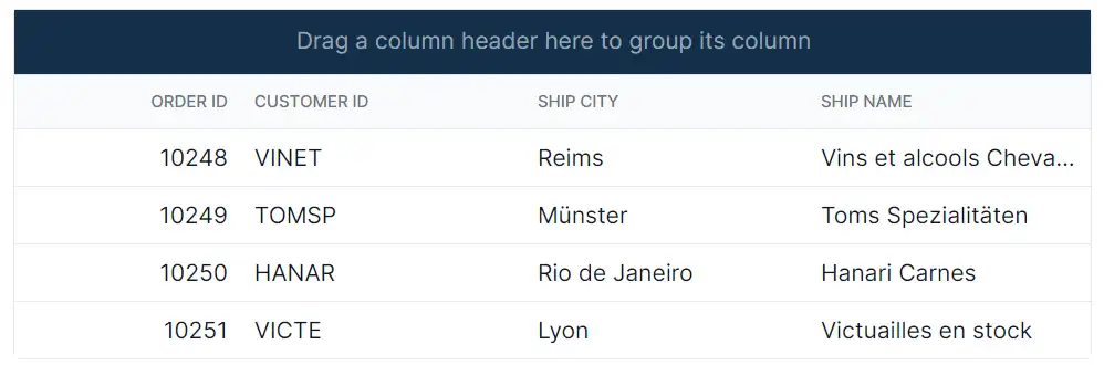
@using Syncfusion.Blazor.Grids

<SfGrid DataSource="@Orders"
        Height="315"
        AllowGrouping="true"
        AllowPaging="true">
    <GridPageSettings PageSize="8"></GridPageSettings>
    <GridGroupSettings Columns="@InitialColumns"></GridGroupSettings>
    <GridColumns>
        <GridColumn Field=@nameof(OrderData.OrderID) HeaderText="Order ID" TextAlign="TextAlign.Right" Width="140"></GridColumn>
        <GridColumn Field=@nameof(OrderData.CustomerID) HeaderText="Customer ID" Width="120"></GridColumn>
        <GridColumn Field=@nameof(OrderData.ShipCity) HeaderText="Ship City" Width="100"></GridColumn>
        <GridColumn Field=@nameof(OrderData.ShipName) HeaderText="Ship Name" Width="100"></GridColumn>
    </GridColumns>
</SfGrid>

<style>
    .e-grid .e-groupdroparea {
        background-color: #132f49;
        color: #ffffff;
    }

    .e-grid .e-icon-gdownarrow::before,
    .e-grid .e-icon-grightarrow::before {
        font-family: 'e-icons' !important;
        font-weight: normal;
    }

    .e-grid .e-icon-gdownarrow::before {
        content: '\e7c9';
    }

    .e-grid .e-icon-grightarrow::before {
        content: '\e80f';
    }

    .e-grid .e-groupcaption {
        background-color: #deecf9;
    }

    .e-grid .e-recordplusexpand,
    .e-grid .e-recordpluscollapse {
        background-color: #deecf9;
    }

    .e-grid .e-indentcell {
        background-color: #deecf9;
    }

    /* Optional: maintain visible focus on group caption rows */
    .e-grid .e-groupcaption:focus-visible {
        outline: 2px solid #005a9e;
        outline-offset: -2px;
    }
</style>

@code {
    private List<OrderData> Orders { get; set; }
    private readonly string[] InitialColumns = { "CustomerID" };

    protected override void OnInitialized()
    {
        Orders = OrderData.GetAllRecords();
    }
}
internal sealed class OrderData
{
private static readonly List<OrderData> Data = new();
public OrderData(int orderID, string customerID, string shipCity, string shipName)
{
OrderID = orderID;
CustomerID = customerID;
ShipCity = shipCity;
ShipName = shipName;
}
internal static List<OrderData> GetAllRecords()
{
if (Data.Count == 0)
{
Data.Add(new OrderData(10248, "VINET", "Reims", "Vins et alcools Chevalier"));
Data.Add(new OrderData(10249, "TOMSP", "Münster", "Toms Spezialitäten"));
Data.Add(new OrderData(10250, "HANAR", "Rio de Janeiro", "Hanari Carnes"));
Data.Add(new OrderData(10251, "VICTE", "Lyon", "Victuailles en stock"));
Data.Add(new OrderData(10252, "SUPRD", "Charleroi", "Suprêmes délices"));
Data.Add(new OrderData(10253, "HANAR", "Rio de Janeiro", "Hanari Carnes"));
Data.Add(new OrderData(10254, "CHOPS", "Bern", "Chop-suey Chinese"));
Data.Add(new OrderData(10255, "RICSU", "Genève", "Richter Supermarkt"));
Data.Add(new OrderData(10256, "WELLI", "Resende", "Wellington Import Export"));
Data.Add(new OrderData(10257, "HILAA", "San Cristóbal", "Hila Alimentos"));
Data.Add(new OrderData(10258, "ERNSH", "Graz", "Ernst Handel"));
Data.Add(new OrderData(10259, "CENTC", "México D.F.", "Centro comercial"));
Data.Add(new OrderData(10260, "OTTIK", "Köln", "Ottilies Käseladen"));
Data.Add(new OrderData(10261, "QUEDE", "Rio de Janeiro", "Que delícia"));
Data.Add(new OrderData(10262, "RATTC", "Albuquerque", "Rattlesnake Canyon Grocery"));
}
return Data;
}
public int OrderID { get; set; }
public string CustomerID { get; set; }
public string ShipCity { get; set; }
public string ShipName { get; set; }
}