How can I help you?
Start and Depth View in Blazor DatePicker Component
17 Nov 20231 minute to read
The DatePicker has the following predefined views that provides a flexible way to navigate back and forth to select the date:
| View | Description |
|---|---|
| Month (default) | Displays the days in a month. |
| Year | Displays the months in a year. |
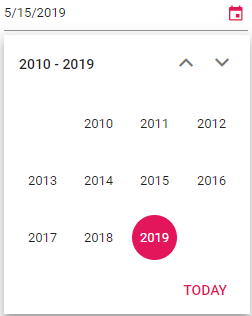
| Decade | Displays the years in a decade. |
Start view
You can use the Start property to define the initial rendering view.
The following example demonstrates how to create a DatePicker with Decade as initial rendering view.
@using Syncfusion.Blazor.Calendars

<SfDatePicker TValue="DateTime?" Value='@DateValue' Placeholder='Select a date' Start='CalendarView.Decade'></SfDatePicker>

@code {
    public DateTime? DateValue {get;set;} = DateTime.Now;
}
Depth view
Define the Depth property to control the view navigation.
Always the Depth view has to be smaller than the Start view, otherwise the view restriction will be not restricted.
The following example demonstrates how to create a DatePicker that allows users to select a month.
@using Syncfusion.Blazor.Calendars

<SfDatePicker TValue="DateTime?" Value='@DateValue' Placeholder='choose a date' Start='CalendarView.Decade' Depth='CalendarView.Year'></SfDatePicker>

@code {
    public DateTime? DateValue { get; set; } = DateTime.Now;
}
NOTE
To learn more about Calendar views, refer to the Calendar’s Calendar Views section.