How can I help you?
Scroll Settings in Diagram Component
3 Feb 202616 minutes to read
The diagram can be scrolled using vertical and horizontal scrollbars. In addition to the scrollbars, the mouse wheel can be used to scroll the diagram. The Diagram’s ScrollSettings allows to read the current scroll status, current zoom and zoom factor values.
How to Get Current Scroll Status
Scroll settings allows to read the scroll status, CurrentZoom with a set of properties. To explore those properties, see Scroll Settings.
- CurrentZoom: Specifies the current zoom level of the diagram page.
- MinZoom: Specifies the minimum zooming level of the diagram page.
- MaxZoom: Specifies the maximum zooming level of the diagram page.
- HorizontalOffset: Specifies the horizontal origin or left side origin of the view port of the diagram page.
- VerticalOffset: Specifies the vertical origin or top side of the view port of the diagram page.
How to Define Scroll Status
Diagram allows to pan the diagram before loading so that any desired region of a large diagram can be viewed. Programmatically pan the diagram with the HorizontalOffset and VerticalOffset properties of scroll settings. The following code illustrates how to pan the diagram programmatically.
In the following example, the vertical scroll bar is scrolled down by 50 pixels and the horizontal scroll bar is scrolled to right by 100 pixels.
@using Syncfusion.Blazor.Diagram

<SfDiagramComponent Height="600px">
    @* Sets the ScrollSettings for the diagram *@
    <ScrollSettings HorizontalOffset="100" VerticalOffset="50">
    </ScrollSettings>
</SfDiagramComponent>A complete working sample can be downloaded from GitHub
How to Update Scroll Status
Programmatically change the scroll offsets at runtime by using the external button click. The following code illustrates how to change the scroll offsets at runtime.
@using Syncfusion.Blazor.Diagram
@using Syncfusion.Blazor.Buttons

<SfButton Content="UpdateScrollValues" OnClick="@UpdateScrollValues" />
<SfDiagramComponent Height="600px">
    @* Sets the ScrollSettings for the diagram *@
    <ScrollSettings HorizontalOffset="@_horizontalOffset" VerticalOffset="@_verticalOffset">
    </ScrollSettings>
</SfDiagramComponent>

@code {
    private double _horizontalOffset { get; set; } = 100;
    private double _verticalOffset { get; set; } = 100;

    private void UpdateScrollValues()
    {
        //Update scroll settings.
        _verticalOffset = 400;
        _horizontalOffset = 200;
    }
}A complete working sample can be downloaded from GitHub
How to Handle the Scroll Changed Event
The Diagram control provides the following event for scroll settings.
| Event Name | Event Type | Description |
|---|---|---|
| ScrollChanged | ScrollChangedEventArgs | Triggered when scrollbar is updated |
@using Syncfusion.Blazor.Diagram
@using Syncfusion.Blazor.Buttons

<SfButton Content="UpdateScrollValues" OnClick="@UpdateScrollValues" />
<SfDiagramComponent Height="600px" ScrollChanged="ScrollChanged">
    @* Sets the ScrollSettings for the diagram *@
    <ScrollSettings HorizontalOffset="@_horizontalOffset" VerticalOffset="@_verticalOffset">
    </ScrollSettings>
</SfDiagramComponent>

@code{
    private double _horizontalOffset { get; set; } = 100;
    private double _verticalOffset { get; set; } = 100;

    private void UpdateScrollValues()
    {
        //Update the scroll settings.
        _verticalOffset = 400;
        _horizontalOffset = 200;
    }

    private void ScrollChanged(ScrollChangedEventArgs args)
    {

    }

}How to Enable or Disable Auto Scroll
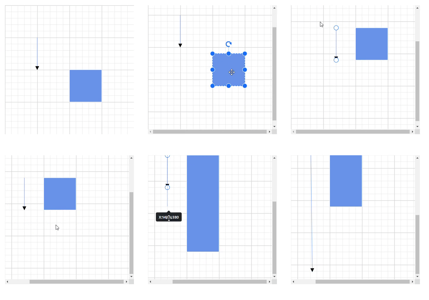
Autoscroll feature automatically scrolls the Diagram whenever the Node or Connector is moved beyond the boundary of the diagram. So that, it is always visible during dragging, resizing, and multiple selection operations. Autoscroll is automatically triggered when any one of the following is done towards the edges of the Diagram:
- Node dragging, resizing
- Connector dragging and end thumb dragging
- Rubber band selection
The auto-scroll behavior in the diagram can be enabled or disabled by using the EnableAutoScroll property of the diagram. The following code example illustrates enabling or disabling the auto-scroll support for nodes.
@using Syncfusion.Blazor.Diagram
<SfDiagramComponent Height="400px" Width="400px" Nodes="@_nodes" Connectors="@_connectors">
    @* Sets the ScrollSettings for the diagram *@
    <ScrollSettings EnableAutoScroll=true @bind-ScrollLimit="@_scrollLimit">
    </ScrollSettings>
</SfDiagramComponent>
@code
{
    ScrollLimitMode _scrollLimit { get; set; } = ScrollLimitMode.Infinity;
    //Defines diagram's node collection.
    DiagramObjectCollection<Node> _nodes;
    //Defines diagram's connector collection.
    DiagramObjectCollection<Connector> _connectors = new DiagramObjectCollection<Connector>();

    protected override void OnInitialized()
    {
        _nodes = new DiagramObjectCollection<Node>();
        // A node is created and stored in the nodes collection.
        Node node = new Node()
        {
            ID = "node1",
            // Position of the node.
            OffsetX = 250,
            OffsetY = 250,
            // Size of the node.
            Width = 100,
            Height = 100,
            Style = new ShapeStyle()
            {
                Fill = "#6495ED",
                StrokeColor = "white"
            }
        };
        // Add node.
        _nodes.Add(node);
        Connector connector = new Connector()
        {
            ID = "connector1",
            // Set the source and target point of the connector.
            SourcePoint = new DiagramPoint() { X = 100, Y = 100 },
            TargetPoint = new DiagramPoint() { X = 100, Y = 200 },
            // Type of the connector segments.
            Type = ConnectorSegmentType.Straight,
            Style = new ShapeStyle()
            {
                StrokeColor = "#6495ED",
                StrokeWidth = 1
            },
        };
        _connectors.Add(connector);
    }
}The auto-scrolling region is limited using ScrollLimit property of the ScrollSettings class.Please refer ScrollLimit page for more details about ScrollLimit.
OnAutoScrollChange is raised when auto-scroll (scrollbars) is changed; for more information, see OnAutoScrollChange page for more details about OnAutoScrollChange.
 |
You can download a complete working sample from GitHub
How to Set Auto Scroll Padding
The AutoScrollPadding is used to specify the maximum distance between the object and the diagram’s edge that will trigger auto-scrolling. When auto-scrolling is enabled, the diagram viewport will automatically scroll in the direction of the mouse movement when the user drags a node or connector to the edge of the viewport. The padding to start the auto-scrolling at the edge can be controlled by setting AutoScrollPadding property.
NOTE
The default value is 20 pixels.
The following example illustrates how to set auto scroll padding.
@using Syncfusion.Blazor.Diagram
<SfDiagramComponent Height="600px" Width="600px" Nodes="@_nodes">
    @* Sets the ScrollSettings for the diagram *@
    <ScrollSettings EnableAutoScroll=true AutoScrollPadding="@_autoScrollBorder">
    </ScrollSettings>
</SfDiagramComponent>
@code
{
    private DiagramObjectCollection<Node> _nodes;
    private DiagramMargin _autoScrollBorder = new DiagramMargin() { Left = 30, Right = 30, Top = 30, Bottom = 30 };
    protected override void OnInitialized()
    {
        _nodes = new DiagramObjectCollection<Node>();
        // A node is created and stored in the nodes collection.
        Node node = new Node()
        {
            ID = "node1",
            // Position of the node.
            OffsetX = 250,
            OffsetY = 250,
            // Size of the node.
            Width = 100,
            Height = 100,
            Style = new ShapeStyle()
            {
                Fill = "#6495ED",
                StrokeColor = "white"
            }
        };
        // Add node.
        _nodes.Add(node);
    }
}A complete working sample can be downloaded from GitHub
How to Limit Scrolling Area
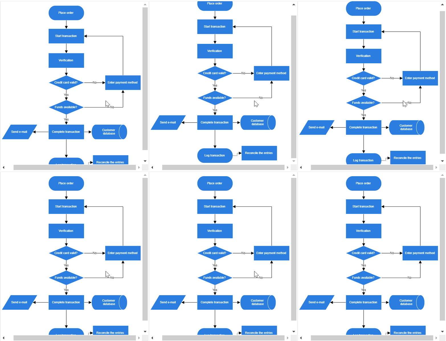
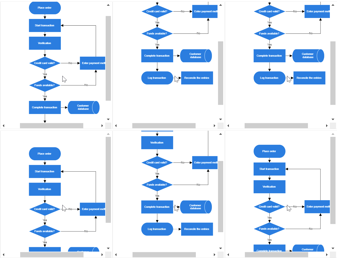
The scroll limit allows to define the scrollable region of the diagram while scrolling the page with the mouse. The ScrollLimit property of scroll settings helps to limit the scrolling area. It includes the following options:
- Infinity: Allows to scroll in any directions without being restricted.
- Diagram: Allows to scroll within the diagram content.
- Limited: Allows to scroll within a specified area.
The default operation is Diagram.
The following example illustrates how to specify the scroll limit.
@using Syncfusion.Blazor.Diagram

<SfDiagramComponent Height="600px">
    @* Sets the ScrollLimit of scroll settings *@
     <ScrollSettings @bind-ScrollLimit="@_scrollLimit" ></ScrollSettings>
</SfDiagramComponent>

@code{
    private ScrollLimitMode _scrollLimit { get; set; } = ScrollLimitMode.Infinity;
}A complete working sample can be downloaded from GitHub
To explore about the options , refer ScrollLimitMode.
| ScrollLimit | Output |
|---|---|
| Diagram |  |
| Infinity |  |
How to Set Scroll Padding
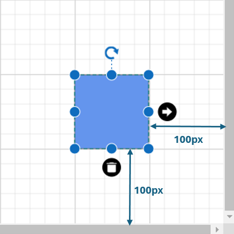
The ScrollPadding property in the scroll settings allows you to extend the scrollable region based on the ScrollLimit, when an element is interacted with at the edges of the viewport. It defines the maximum distance between the object and the edge of the diagram area, ensuring smoother navigation and interaction. This behavior enhances the user experience, particularly in large diagrams where users may need to move or extend elements across different sections of the canvas.
NOTE
The default value is 0 pixels.
The following example illustrates how to sets scroll padding.
@using Syncfusion.Blazor.Diagram
<SfDiagramComponent Height="600px" Width="600px" Nodes="@_nodes">
    @* Sets the ScrollSettings for the diagram *@
    <ScrollSettings ScrollPadding="@_scrollBorder">
    </ScrollSettings>
</SfDiagramComponent>
@code
{
    private DiagramMargin _scrollBorder = new DiagramMargin() { Left = 100, Right = 100, Top = 100, Bottom = 100 };
    private DiagramObjectCollection<Node> _nodes;
    protected override void OnInitialized()
    {
        _nodes = new DiagramObjectCollection<Node>();
        // A node is created and stored in the nodes collection.
        Node node = new Node()
        {
            ID = "node1",
            // Position of the node.
            OffsetX = 250,
            OffsetY = 250,
            // Size of the node.
            Width = 100,
            Height = 100,
            Style = new ShapeStyle()
            {
                Fill = "#6495ED",
                StrokeColor = "white"
            }
        };
        // Add node.
        _nodes.Add(node);
    }
}
A complete working sample can be downloaded from GitHub

How to Restrict Scrollable Area
Scrolling beyond any particular rectangular area can be restricted using the ScrollableArea property of scroll settings. To restrict scrolling beyond any custom region, set ScrollLimit as “limited.” The following code example illustrates how to customize the scrollable area.
@using Syncfusion.Blazor.Diagram
<SfDiagramComponent Width="70%" Height="300px" Nodes="@_nodes">
    <ScrollSettings  ScrollableArea="@_scrollableArea" ScrollLimit="ScrollLimitMode.Limited">
    </ScrollSettings>
</SfDiagramComponent>
@code
{
    private DiagramRect _scrollableArea = new DiagramRect() { X = 0, Y = 0, Width = 500, Height = 500 };
    private DiagramObjectCollection<Node> _nodes;
    protected override void OnInitialized()
    {
        _nodes = new DiagramObjectCollection<Node>();
        Node node = new Node()
        {
            ID = "node1",
            // Position of the node.
            OffsetX = 300,
            OffsetY = 50,
            // Size of the node.
            Width = 100,
            Height = 100,
            Style = new ShapeStyle()
            {
                Fill = "#6495ED",
                StrokeColor = "white"
            }
        };
        // Add node.
        _nodes.Add(node);
    }
}A complete working sample can be downloaded from GitHub
How to Handle Scroll Settings Property Changes Using Callback Methods
- CurrentZoomChanged : Specifies the callback to be triggered when the current zoom value changes.
- HorizontalOffsetChanged : Specifies the callback to be triggered when the horizontal offset changes.
- VerticalOffsetChanged : Specifies the callback to be triggered when the vertical offset changes.
- MaxZoomChanged : Specifies the callback to trigger when the maximum zoom changes.
- MinZoomChanged : Specifies the callback to trigger when the minimum zoom changes.
- ScrollableAreaChanged : Specifies the callback to trigger when the scrollable area changes.
- ScrollLimitChanged : Specifies the callback to trigger when the scroll limit changes.
@using Syncfusion.Blazor.Diagram

<SfDiagramComponent Height="600px">
    @* Sets the ScrollLimit of scroll settings *@
     <ScrollSettings CurrentZoomChanged="OnCurrentZoomChanged"></ScrollSettings>
</SfDiagramComponent>

@code
{
    private void OnCurrentZoomChanged()
    {
        // Enter your code
    }
}