Toolbar types in Blazor Rich Text Editor
30 Jun 202618 minutes to read
The Rich Text Editor toolbar provides a collection of tools such as Bold, Italic, and text alignment buttons used to format the content.
You can customize the toolbar configurations by using the RichTextEditorToolbarSettings.Type property. The types of toolbar are:
- Expand
- MultiRow
- Scrollable
- Popup
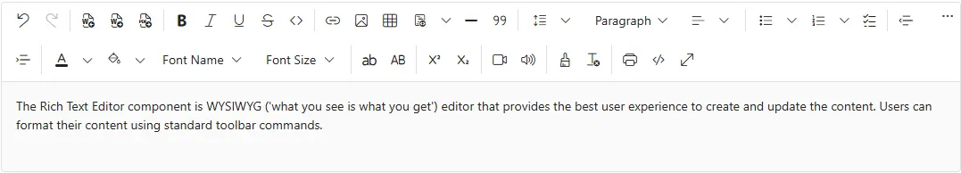
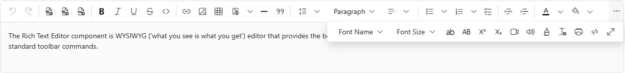
Expand toolbar
The Expand toolbar hides overflowing items in the next line using the property. By clicking the expand arrow, you can view the overflowing toolbar items. The default mode of toolbar is Expand.
@using Syncfusion.Blazor.RichTextEditor

<SfRichTextEditor>
    <RichTextEditorToolbarSettings Items="@Tools" Type="ToolbarType.Expand" />
    <p>The Rich Text Editor component is WYSIWYG ('what you see is what you get') editor that provides the best user experience to create and update the content. Users can format their content using standard toolbar commands.</p>
</SfRichTextEditor>

@code{
    private List<ToolbarItemModel> Tools = new List<ToolbarItemModel>()
    {
        new ToolbarItemModel() { Command = ToolbarCommand.Undo },
        new ToolbarItemModel() { Command = ToolbarCommand.Redo },
        new ToolbarItemModel() { Command = ToolbarCommand.Separator },
        new ToolbarItemModel() { Command = ToolbarCommand.ImportWord },
        new ToolbarItemModel() { Command = ToolbarCommand.ExportWord },
        new ToolbarItemModel() { Command = ToolbarCommand.ExportPdf },
        new ToolbarItemModel() { Command = ToolbarCommand.Separator },
        new ToolbarItemModel() { Command = ToolbarCommand.Bold },
        new ToolbarItemModel() { Command = ToolbarCommand.Italic },
        new ToolbarItemModel() { Command = ToolbarCommand.Underline },
        new ToolbarItemModel() { Command = ToolbarCommand.StrikeThrough },
        new ToolbarItemModel() { Command = ToolbarCommand.InlineCode },
        new ToolbarItemModel() { Command = ToolbarCommand.Separator},
        new ToolbarItemModel() { Command = ToolbarCommand.CreateLink },
        new ToolbarItemModel() { Command = ToolbarCommand.Image },
        new ToolbarItemModel() { Command = ToolbarCommand.CreateTable },
        new ToolbarItemModel() { Command = ToolbarCommand.CodeBlock },
        new ToolbarItemModel() { Command = ToolbarCommand.HorizontalLine },
        new ToolbarItemModel() { Command = ToolbarCommand.Blockquote },
        new ToolbarItemModel() { Command = ToolbarCommand.Separator },
        new ToolbarItemModel() { Command = ToolbarCommand.LineHeight },
        new ToolbarItemModel() { Command = ToolbarCommand.Formats },
        new ToolbarItemModel() { Command = ToolbarCommand.Alignments },
        new ToolbarItemModel() { Command = ToolbarCommand.Separator },
        new ToolbarItemModel() { Command = ToolbarCommand.BulletFormatList },
        new ToolbarItemModel() { Command = ToolbarCommand.NumberFormatList },
        new ToolbarItemModel() { Command = ToolbarCommand.Checklist },
        new ToolbarItemModel() { Command = ToolbarCommand.Separator },
        new ToolbarItemModel() { Command = ToolbarCommand.Outdent },
        new ToolbarItemModel() { Command = ToolbarCommand.Indent },
        new ToolbarItemModel() { Command = ToolbarCommand.Separator },
        new ToolbarItemModel() { Command = ToolbarCommand.FontColor },
        new ToolbarItemModel() { Command = ToolbarCommand.BackgroundColor },
        new ToolbarItemModel() { Command = ToolbarCommand.FontName },
        new ToolbarItemModel() { Command = ToolbarCommand.FontSize },
        new ToolbarItemModel() { Command = ToolbarCommand.Separator },
        new ToolbarItemModel() { Command = ToolbarCommand.LowerCase },
        new ToolbarItemModel() { Command = ToolbarCommand.UpperCase },
        new ToolbarItemModel() { Command = ToolbarCommand.Separator },
        new ToolbarItemModel() { Command = ToolbarCommand.SuperScript },
        new ToolbarItemModel() { Command = ToolbarCommand.SubScript },
        new ToolbarItemModel() { Command = ToolbarCommand.Separator},
        new ToolbarItemModel() { Command = ToolbarCommand.Video },
        new ToolbarItemModel() { Command = ToolbarCommand.Audio },
        new ToolbarItemModel() { Command = ToolbarCommand.Separator },
        new ToolbarItemModel() { Command = ToolbarCommand.FormatPainter },
        new ToolbarItemModel() { Command = ToolbarCommand.ClearFormat },
        new ToolbarItemModel() {Command = ToolbarCommand.Separator},
        new ToolbarItemModel() { Command = ToolbarCommand.Print },
        new ToolbarItemModel() { Command = ToolbarCommand.SourceCode },
        new ToolbarItemModel() { Command = ToolbarCommand.FullScreen }
    };
}
Multi-row toolbar
The MultiRow toolbar displays items in multiple rows, ensuring all items are always visible.
@using Syncfusion.Blazor.RichTextEditor

<SfRichTextEditor>
    <RichTextEditorToolbarSettings Items="@Tools" Type="ToolbarType.MultiRow" />
    <p>The Rich Text Editor component is WYSIWYG ('what you see is what you get') editor that provides the best user experience to create and update the content. Users can format their content using standard toolbar commands.</p>
</SfRichTextEditor>

@code{
    private List<ToolbarItemModel> Tools = new List<ToolbarItemModel>()
    {
        new ToolbarItemModel() { Command = ToolbarCommand.Undo },
        new ToolbarItemModel() { Command = ToolbarCommand.Redo },
        new ToolbarItemModel() { Command = ToolbarCommand.Separator },
        new ToolbarItemModel() { Command = ToolbarCommand.ImportWord },
        new ToolbarItemModel() { Command = ToolbarCommand.ExportWord },
        new ToolbarItemModel() { Command = ToolbarCommand.ExportPdf },
        new ToolbarItemModel() { Command = ToolbarCommand.Separator },
        new ToolbarItemModel() { Command = ToolbarCommand.Bold },
        new ToolbarItemModel() { Command = ToolbarCommand.Italic },
        new ToolbarItemModel() { Command = ToolbarCommand.Underline },
        new ToolbarItemModel() { Command = ToolbarCommand.StrikeThrough },
        new ToolbarItemModel() { Command = ToolbarCommand.InlineCode },
        new ToolbarItemModel() { Command = ToolbarCommand.Separator},
        new ToolbarItemModel() { Command = ToolbarCommand.CreateLink },
        new ToolbarItemModel() { Command = ToolbarCommand.Image },
        new ToolbarItemModel() { Command = ToolbarCommand.CreateTable },
        new ToolbarItemModel() { Command = ToolbarCommand.CodeBlock },
        new ToolbarItemModel() { Command = ToolbarCommand.HorizontalLine },
        new ToolbarItemModel() { Command = ToolbarCommand.Blockquote },
        new ToolbarItemModel() { Command = ToolbarCommand.Separator },
        new ToolbarItemModel() { Command = ToolbarCommand.LineHeight },
        new ToolbarItemModel() { Command = ToolbarCommand.Formats },
        new ToolbarItemModel() { Command = ToolbarCommand.Alignments },
        new ToolbarItemModel() { Command = ToolbarCommand.Separator },
        new ToolbarItemModel() { Command = ToolbarCommand.BulletFormatList },
        new ToolbarItemModel() { Command = ToolbarCommand.NumberFormatList },
        new ToolbarItemModel() { Command = ToolbarCommand.Checklist },
        new ToolbarItemModel() { Command = ToolbarCommand.Separator },
        new ToolbarItemModel() { Command = ToolbarCommand.Outdent },
        new ToolbarItemModel() { Command = ToolbarCommand.Indent },
        new ToolbarItemModel() { Command = ToolbarCommand.Separator },
        new ToolbarItemModel() { Command = ToolbarCommand.FontColor },
        new ToolbarItemModel() { Command = ToolbarCommand.BackgroundColor },
        new ToolbarItemModel() { Command = ToolbarCommand.FontName },
        new ToolbarItemModel() { Command = ToolbarCommand.FontSize },
        new ToolbarItemModel() { Command = ToolbarCommand.Separator },
        new ToolbarItemModel() { Command = ToolbarCommand.LowerCase },
        new ToolbarItemModel() { Command = ToolbarCommand.UpperCase },
        new ToolbarItemModel() { Command = ToolbarCommand.Separator },
        new ToolbarItemModel() { Command = ToolbarCommand.SuperScript },
        new ToolbarItemModel() { Command = ToolbarCommand.SubScript },
        new ToolbarItemModel() { Command = ToolbarCommand.Separator},
        new ToolbarItemModel() { Command = ToolbarCommand.Video },
        new ToolbarItemModel() { Command = ToolbarCommand.Audio },
        new ToolbarItemModel() { Command = ToolbarCommand.Separator },
        new ToolbarItemModel() { Command = ToolbarCommand.FormatPainter },
        new ToolbarItemModel() { Command = ToolbarCommand.ClearFormat },
        new ToolbarItemModel() {Command = ToolbarCommand.Separator},
        new ToolbarItemModel() { Command = ToolbarCommand.Print },
        new ToolbarItemModel() { Command = ToolbarCommand.SourceCode },
        new ToolbarItemModel() { Command = ToolbarCommand.FullScreen }
    };
}
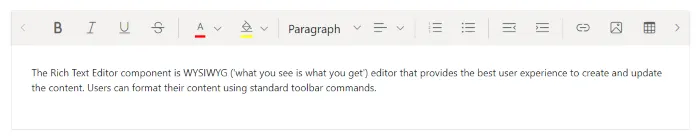
Scrollable toolbar
The Scrollable toolbar displays items in a single row with horizontal scrolling enabled.
@using Syncfusion.Blazor.RichTextEditor

<SfRichTextEditor>
    <RichTextEditorToolbarSettings Items="@Tools" Type="ToolbarType.Scrollable" />
    <p>The Rich Text Editor component is WYSIWYG ('what you see is what you get') editor that provides the best user experience to create and update the content. Users can format their content using standard toolbar commands.</p>
</SfRichTextEditor>

@code{
    private List<ToolbarItemModel> Tools = new List<ToolbarItemModel>()
    {
        new ToolbarItemModel() { Command = ToolbarCommand.Undo },
        new ToolbarItemModel() { Command = ToolbarCommand.Redo },
        new ToolbarItemModel() { Command = ToolbarCommand.Separator },
        new ToolbarItemModel() { Command = ToolbarCommand.ImportWord },
        new ToolbarItemModel() { Command = ToolbarCommand.ExportWord },
        new ToolbarItemModel() { Command = ToolbarCommand.ExportPdf },
        new ToolbarItemModel() { Command = ToolbarCommand.Separator },
        new ToolbarItemModel() { Command = ToolbarCommand.Bold },
        new ToolbarItemModel() { Command = ToolbarCommand.Italic },
        new ToolbarItemModel() { Command = ToolbarCommand.Underline },
        new ToolbarItemModel() { Command = ToolbarCommand.StrikeThrough },
        new ToolbarItemModel() { Command = ToolbarCommand.InlineCode },
        new ToolbarItemModel() { Command = ToolbarCommand.Separator},
        new ToolbarItemModel() { Command = ToolbarCommand.CreateLink },
        new ToolbarItemModel() { Command = ToolbarCommand.Image },
        new ToolbarItemModel() { Command = ToolbarCommand.CreateTable },
        new ToolbarItemModel() { Command = ToolbarCommand.CodeBlock },
        new ToolbarItemModel() { Command = ToolbarCommand.HorizontalLine },
        new ToolbarItemModel() { Command = ToolbarCommand.Blockquote },
        new ToolbarItemModel() { Command = ToolbarCommand.Separator },
        new ToolbarItemModel() { Command = ToolbarCommand.LineHeight },
        new ToolbarItemModel() { Command = ToolbarCommand.Formats },
        new ToolbarItemModel() { Command = ToolbarCommand.Alignments },
        new ToolbarItemModel() { Command = ToolbarCommand.Separator },
        new ToolbarItemModel() { Command = ToolbarCommand.BulletFormatList },
        new ToolbarItemModel() { Command = ToolbarCommand.NumberFormatList },
        new ToolbarItemModel() { Command = ToolbarCommand.Checklist },
        new ToolbarItemModel() { Command = ToolbarCommand.Separator },
        new ToolbarItemModel() { Command = ToolbarCommand.Outdent },
        new ToolbarItemModel() { Command = ToolbarCommand.Indent },
        new ToolbarItemModel() { Command = ToolbarCommand.Separator },
        new ToolbarItemModel() { Command = ToolbarCommand.FontColor },
        new ToolbarItemModel() { Command = ToolbarCommand.BackgroundColor },
        new ToolbarItemModel() { Command = ToolbarCommand.FontName },
        new ToolbarItemModel() { Command = ToolbarCommand.FontSize },
        new ToolbarItemModel() { Command = ToolbarCommand.Separator },
        new ToolbarItemModel() { Command = ToolbarCommand.LowerCase },
        new ToolbarItemModel() { Command = ToolbarCommand.UpperCase },
        new ToolbarItemModel() { Command = ToolbarCommand.Separator },
        new ToolbarItemModel() { Command = ToolbarCommand.SuperScript },
        new ToolbarItemModel() { Command = ToolbarCommand.SubScript },
        new ToolbarItemModel() { Command = ToolbarCommand.Separator},
        new ToolbarItemModel() { Command = ToolbarCommand.Video },
        new ToolbarItemModel() { Command = ToolbarCommand.Audio },
        new ToolbarItemModel() { Command = ToolbarCommand.Separator },
        new ToolbarItemModel() { Command = ToolbarCommand.FormatPainter },
        new ToolbarItemModel() { Command = ToolbarCommand.ClearFormat },
        new ToolbarItemModel() {Command = ToolbarCommand.Separator},
        new ToolbarItemModel() { Command = ToolbarCommand.Print },
        new ToolbarItemModel() { Command = ToolbarCommand.SourceCode },
        new ToolbarItemModel() { Command = ToolbarCommand.FullScreen }
    };
}
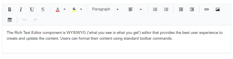
Popup toolbar
The Popup toolbar property displays items in a popup container, ideal for limited space or smaller screens.
@using Syncfusion.Blazor.RichTextEditor

<SfRichTextEditor>
    <RichTextEditorToolbarSettings Items="@Tools" Type="ToolbarType.Popup" />
    <p>The Rich Text Editor component is WYSIWYG ('what you see is what you get') editor that provides the best user experience to create and update the content. Users can format their content using standard toolbar commands.</p>
</SfRichTextEditor>

@code{
    private List<ToolbarItemModel> Tools = new List<ToolbarItemModel>()
    {
        new ToolbarItemModel() { Command = ToolbarCommand.Undo },
        new ToolbarItemModel() { Command = ToolbarCommand.Redo },
        new ToolbarItemModel() { Command = ToolbarCommand.Separator },
        new ToolbarItemModel() { Command = ToolbarCommand.ImportWord },
        new ToolbarItemModel() { Command = ToolbarCommand.ExportWord },
        new ToolbarItemModel() { Command = ToolbarCommand.ExportPdf },
        new ToolbarItemModel() { Command = ToolbarCommand.Separator },
        new ToolbarItemModel() { Command = ToolbarCommand.Bold },
        new ToolbarItemModel() { Command = ToolbarCommand.Italic },
        new ToolbarItemModel() { Command = ToolbarCommand.Underline },
        new ToolbarItemModel() { Command = ToolbarCommand.StrikeThrough },
        new ToolbarItemModel() { Command = ToolbarCommand.InlineCode },
        new ToolbarItemModel() { Command = ToolbarCommand.Separator},
        new ToolbarItemModel() { Command = ToolbarCommand.CreateLink },
        new ToolbarItemModel() { Command = ToolbarCommand.Image },
        new ToolbarItemModel() { Command = ToolbarCommand.CreateTable },
        new ToolbarItemModel() { Command = ToolbarCommand.CodeBlock },
        new ToolbarItemModel() { Command = ToolbarCommand.HorizontalLine },
        new ToolbarItemModel() { Command = ToolbarCommand.Blockquote },
        new ToolbarItemModel() { Command = ToolbarCommand.Separator },
        new ToolbarItemModel() { Command = ToolbarCommand.LineHeight },
        new ToolbarItemModel() { Command = ToolbarCommand.Formats },
        new ToolbarItemModel() { Command = ToolbarCommand.Alignments },
        new ToolbarItemModel() { Command = ToolbarCommand.Separator },
        new ToolbarItemModel() { Command = ToolbarCommand.BulletFormatList },
        new ToolbarItemModel() { Command = ToolbarCommand.NumberFormatList },
        new ToolbarItemModel() { Command = ToolbarCommand.Checklist },
        new ToolbarItemModel() { Command = ToolbarCommand.Separator },
        new ToolbarItemModel() { Command = ToolbarCommand.Outdent },
        new ToolbarItemModel() { Command = ToolbarCommand.Indent },
        new ToolbarItemModel() { Command = ToolbarCommand.Separator },
        new ToolbarItemModel() { Command = ToolbarCommand.FontColor },
        new ToolbarItemModel() { Command = ToolbarCommand.BackgroundColor },
        new ToolbarItemModel() { Command = ToolbarCommand.FontName },
        new ToolbarItemModel() { Command = ToolbarCommand.FontSize },
        new ToolbarItemModel() { Command = ToolbarCommand.Separator },
        new ToolbarItemModel() { Command = ToolbarCommand.LowerCase },
        new ToolbarItemModel() { Command = ToolbarCommand.UpperCase },
        new ToolbarItemModel() { Command = ToolbarCommand.Separator },
        new ToolbarItemModel() { Command = ToolbarCommand.SuperScript },
        new ToolbarItemModel() { Command = ToolbarCommand.SubScript },
        new ToolbarItemModel() { Command = ToolbarCommand.Separator},
        new ToolbarItemModel() { Command = ToolbarCommand.Video },
        new ToolbarItemModel() { Command = ToolbarCommand.Audio },
        new ToolbarItemModel() { Command = ToolbarCommand.Separator },
        new ToolbarItemModel() { Command = ToolbarCommand.FormatPainter },
        new ToolbarItemModel() { Command = ToolbarCommand.ClearFormat },
        new ToolbarItemModel() {Command = ToolbarCommand.Separator},
        new ToolbarItemModel() { Command = ToolbarCommand.Print },
        new ToolbarItemModel() { Command = ToolbarCommand.SourceCode },
        new ToolbarItemModel() { Command = ToolbarCommand.FullScreen }
    };
}
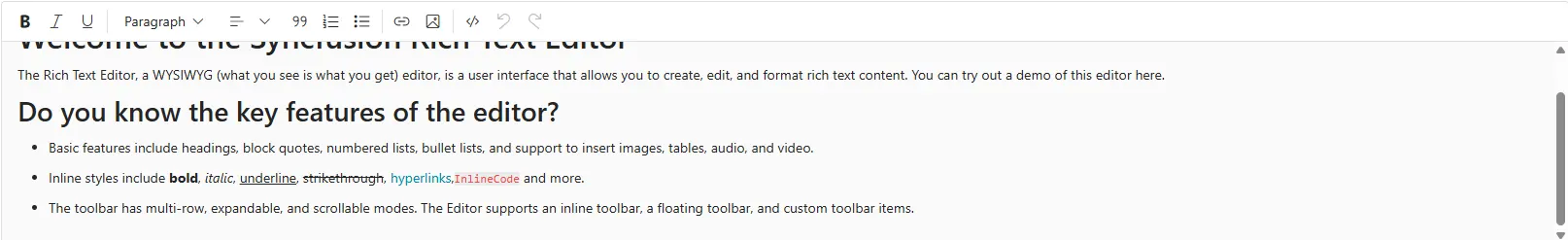
Configuring a Floating toolbar
By default, toolbar is float at the top of the Rich Text Editor on scrolling. It can be customized by specifying the offset of the floating toolbar from documents top position using FloatingToolbarOffset.
You can enable or disable the floating toolbar using RichTextEditorToolbarSettings.EnableFloating property.
@using Syncfusion.Blazor.RichTextEditor

<SfRichTextEditor Height="250px">
    <RichTextEditorToolbarSettings EnableFloating="true" />
    <h2>Welcome to the Rich Text Editor</h2><p>The Rich Text Editor, a WYSIWYG (what you see is what you get) editor, is a user interface that allows you to create, edit, and format rich text content. You can try out a demo of this editor here.</p><h3>Do you know the key features of the editor?</h3>
    <ul><li>Basic features include headings, block quotes, numbered lists, bullet lists, and support to insert images, tables, audio, and video.</li> <li>Inline styles include <b>bold</b>, <em>italic</em>, <span style="text-decoration: underline">underline</span>, <span style="text-decoration: line-through">strikethrough</span>, <a class="e-rte-anchor" href="https://blazor.syncfusion.com/demos/rich-text-editor/overview?theme=material3" title="https://blazor.syncfusion.com/demos/rich-text-editor/overview?theme=material3" aria-label="Open in new window">hyperlinks</a>,<code>InlineCode</code> and more.</li> <li>The toolbar has multi-row, expandable, and scrollable modes. The Editor supports an inline toolbar, a floating toolbar, and custom toolbar items.</li></ul>
</SfRichTextEditor>