Display Modes in Blazor Speed Dial Component
25 Jun 20261 minute to read
The action items in the Blazor Speed Dial can be displayed in Linear or Radial modes by setting the Mode property. By default, Speed Dial items are displayed in Linear mode.
Linear display mode
In Linear display mode, Speed Dial action items are displayed in a list-like layout either horizontally or vertically, based on the direction.
Direction
You can open the action items to the left, right, up, or down side of the Speed Dial button by setting Direction property. The default value is Auto where the action items are displayed based on the Position
of the Speed Dial.
The Linear directions of Speed Dial are as follows:
- Left - Action items are displayed on the left side of the button.
- Right - Action items are displayed on the right side of the button.
- Up - Action items are displayed above the button.
- Down - Action items are displayed below the button.
- Auto - The direction is automatically calculated based on the Speed Dial
Position(for example, if positioned at the bottom-right, items open upward).
@using Syncfusion.Blazor.Buttons

<SfSpeedDial Mode="SpeedDialMode.Linear" Direction="LinearDirection.Left" OpenIconCss="e-icons e-edit">
    <SpeedDialItems>
        <SpeedDialItem IconCss="e-icons e-cut"/>
        <SpeedDialItem IconCss="e-icons e-copy"/>
        <SpeedDialItem IconCss="e-icons e-paste"/>
    </SpeedDialItems>
</SfSpeedDial>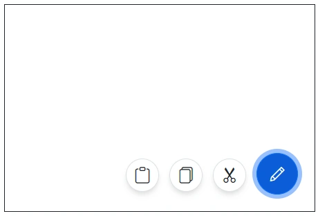
Radial display mode (Radial Menu)
In Radial mode, Speed Dial action items are displayed in a circular pattern similar to a radial menu. For more details about Radial mode, see the getting started guide here.