Items in Blazor Speed Dial
27 Aug 20264 minutes to read
Add action items to the Blazor Speed Dial via the SpeedDialItem tag directive. Items can display text, icons, or both, and support being disabled, tooltips, animation, and templating.
| Fields | Type | Description |
|---|---|---|
| Text | string |
Defines the text content of the SpeedDialItem. |
| IconCss | string |
Defines one or more CSS classes to include an icon or image in a speed dial item. |
| Disabled | bool |
When true, the SpeedDialItem is disabled and cannot be interacted with. |
| Id | string |
Defines a unique value for the SpeedDialItem that can be used to identify the item in event arguments. |
| Title | string |
Defines the title of the SpeedDialItem to display a tooltip. |
Icons in SpeedDial items
Customize the icon and text of speed dial action items using the IconCss and Text properties.
Icon only
Show only an icon in SpeedDial items by setting the IconCss property. To provide additional details, display a tooltip on hover or focus by setting the Title property.
@using Syncfusion.Blazor.Buttons

<SfSpeedDial OpenIconCss="e-icons e-edit" CloseIconCss="e-icons e-close">
    <SpeedDialItems>
        <SpeedDialItem Title="Cut" IconCss="e-icons e-cut"/>
        <SpeedDialItem Title="Copy" IconCss="e-icons e-copy"/>
        <SpeedDialItem Title="Paste" IconCss="e-icons e-paste"/>
    </SpeedDialItems>
</SfSpeedDial>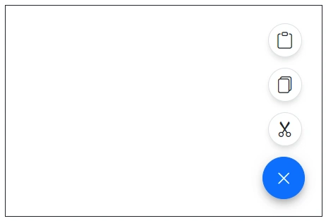
Text only
Show only text in SpeedDial items by setting the Text property.
@using Syncfusion.Blazor.Buttons

<SfSpeedDial Content="Edit">
    <SpeedDialItems>
        <SpeedDialItem Text="Cut"/>
        <SpeedDialItem Text="Copy"/>
        <SpeedDialItem Text="Paste"/>
    </SpeedDialItems>
</SfSpeedDial>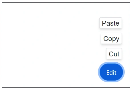
Icon with text
Show an icon along with text in SpeedDial items by setting both the IconCss and Text properties.
@using Syncfusion.Blazor.Buttons

<SfSpeedDial OpenIconCss="e-icons e-edit" CloseIconCss="e-icons e-close" Content="Edit">
    <SpeedDialItems>
        <SpeedDialItem Text="Cut" IconCss="e-icons e-cut"/>
        <SpeedDialItem Text="Copy" IconCss="e-icons e-copy"/>
        <SpeedDialItem Text="Paste" IconCss="e-icons e-paste"/>
    </SpeedDialItems>
</SfSpeedDial>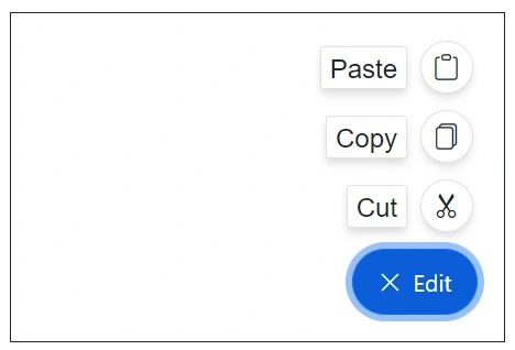
Disabled
Disable SpeedDial items by setting the Disabled property to true.
@using Syncfusion.Blazor.Buttons

<SfSpeedDial Content="Edit">
    <SpeedDialItems>
        <SpeedDialItem Text="Cut" Disabled="true"/>
        <SpeedDialItem Text="Copy"/>
        <SpeedDialItem Text="Paste"/>
    </SpeedDialItems>
</SfSpeedDial>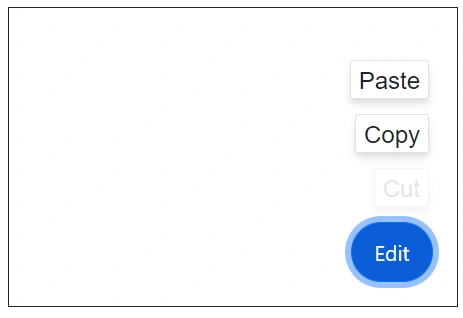
Animation
The Blazor Speed Dial items can be animated during the opening and closing of the popup action items. You can customize the animation’s Effect, Delay, and Duration by setting the SpeedDialAnimationSettings tag directive. By default, Blazor Speed Dial animates with a Fade effect and supports all SpeedDialAnimationEffect values.
Below example demonstrates the Blazor Speed Dial items with applied Zoom effect.
@using Syncfusion.Blazor.Buttons

<SfSpeedDial OpenIconCss="e-icons e-edit" CloseIconCss="e-icons e-close" Content="Edit">
    <SpeedDialItems>
        <SpeedDialItem Text="Cut" IconCss="e-icons e-cut"/>
        <SpeedDialItem Text="Copy" IconCss="e-icons e-copy"/>
        <SpeedDialItem Text="Paste" IconCss="e-icons e-paste"/>
    </SpeedDialItems>
    <SpeedDialAnimationSettings Effect="SpeedDialAnimationEffect.Zoom"></SpeedDialAnimationSettings>
</SfSpeedDial>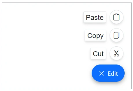
Template
The Blazor Speed Dial supports customizing both the action items and the popup container using the ItemTemplate and PopupTemplate tag directives. For more details about templates, check the guidance here.
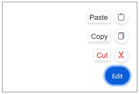
HTML attribute
Blazor Speed Dial items support adding custom HTML attributes via the HtmlAttributes property to customize items. Add them as inline attributes or use the @attributes directive.
The following example shows SpeedDial items with HTML attributes.
@using Syncfusion.Blazor.Buttons

<SfSpeedDial Content="Edit">
    <SpeedDialItems>
        <SpeedDialItem Text="Cut" IconCss="e-icons e-cut" style="color:red;"></SpeedDialItem>
        <SpeedDialItem Text="Copy" IconCss="e-icons e-copy"></SpeedDialItem>
        <SpeedDialItem Text="Paste" IconCss="e-icons e-paste"></SpeedDialItem>
    </SpeedDialItems>
</SfSpeedDial>