How can I help you?
Expand and Collapse in Blazor Splitter Component
27 Apr 202611 minutes to read
Collapsible panes
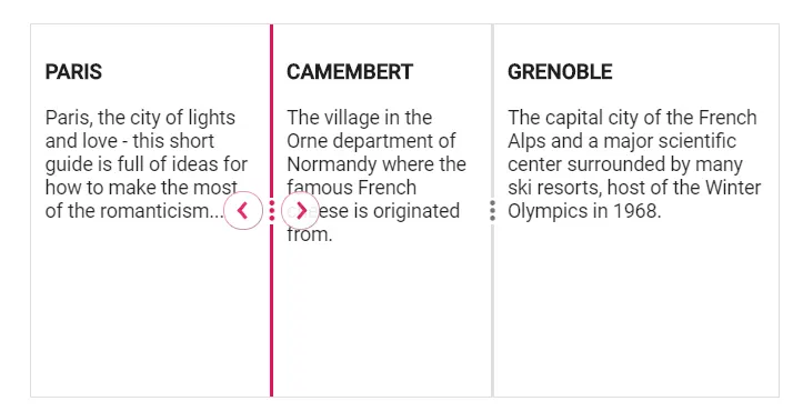
The Splitter panes can be configured with built-in expand and collapse functionalities. By default, the collapsible behavior is disabled. Enable the Collapsible behavior in the SplitterPane property to show or hide the expand or collapse icons in the panes. The panes can be dynamically expanded and collapsed by the corresponding icons.
The following code shows how to enable collapsible behavior.
@using Syncfusion.Blazor.Layouts

<SfSplitter Height="200px" Width="600px" SeparatorSize=2>
    <SplitterPanes>
        <SplitterPane Collapsible="true">
            <ContentTemplate>
                <div>
                    <div class="content">
                        <h3 class="h3">PARIS </h3>
                        Paris, the city of lights and love - this short guide is full of ideas for how to make the most of the romanticism...
                    </div>
                </div>
            </ContentTemplate>
        </SplitterPane>
        <SplitterPane Collapsible="true">
            <ContentTemplate>
                <div>
                    <div class="content">
                        <h3 class="h3">CAMEMBERT </h3>
                        The village in the Orne department of Normandy where the famous French cheese is originated from.
                    </div>
                </div>
            </ContentTemplate>
        </SplitterPane>
        <SplitterPane Collapsible="true">
            <ContentTemplate>
                <div>
                    <div class="content">
                        <h3 class="h3">GRENOBLE </h3>
                        The capital city of the French Alps and a major scientific center surrounded by many ski resorts, host of the Winter Olympics in 1968.
                    </div>
                </div>
            </ContentTemplate>
        </SplitterPane>
    </SplitterPanes>
</SfSplitter>

<style>
    .content {
        padding: 10px;
    }
</style>
Programmatically control the expand and collapse action
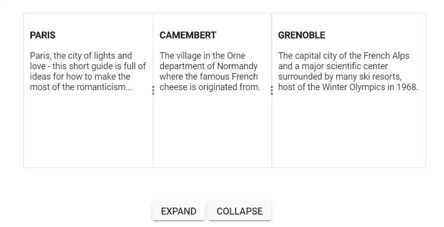
The Splitter provides public method to control the expand and collapse behavior programmatically using the Expand and Collapse methods.
@using Syncfusion.Blazor.Layouts
@using Syncfusion.Blazor.Buttons

<SfSplitter @ref="SplitterObj" Height="200px" Width="600px" SeparatorSize=2>
    <SplitterPanes>
        <SplitterPane Collapsible="true">
            <ContentTemplate>
                <div>
                    <div class="content">
                        <h3 class="h3">PARIS </h3>
                        Paris, the city of lights and love - this short guide is full of ideas for how to make the most of the romanticism...
                    </div>
                </div>
            </ContentTemplate>
        </SplitterPane>
        <SplitterPane Collapsible="true">
            <ContentTemplate>
                <div>
                    <div class="content">
                        <h3 class="h3">CAMEMBERT </h3>
                        The village in the Orne department of Normandy where the famous French cheese is originated from.
                    </div>
                </div>
            </ContentTemplate>
        </SplitterPane>
        <SplitterPane Collapsible="true">
            <ContentTemplate>
                <div>
                    <div class="content">
                        <h3 class="h3">GRENOBLE </h3>
                        The capital city of the French Alps and a major scientific center surrounded by many ski resorts, host of the Winter Olympics in 1968.
                    </div>
                </div>
            </ContentTemplate>
        </SplitterPane>
    </SplitterPanes>
</SfSplitter>

<div id="button-container">
    <SfButton @onclick="@Expand"> Expand </SfButton>
    <SfButton @onclick="@Collapse"> Collapse </SfButton>
</div>

<style>
    .content {
        padding: 10px;
    }
    #button-container {
        display: flex;
        margin: 20px 22% 40px;
    }
</style>

@code {
    SfSplitter SplitterObj;

    private async Task Expand()
    {
        await this.SplitterObj.ExpandAsync(0);
    }

    private async Task Collapse()
    {
        await this.SplitterObj.CollapseAsync(0);
    }
}
Specify initial state to panes
Specific panes can be rendered with collapsed state on page load. Specify a Boolean value to the Collapsed property to control this behavior. The following code explains how to collapse panes on rendering (the second panes renders with collapsed state).
@using Syncfusion.Blazor.Layouts

<SfSplitter Height="200px" Width="600px" SeparatorSize=2>
    <SplitterPanes>
        <SplitterPane Collapsible="true">
            <ContentTemplate>
                <div>
                    <div class="content">
                        <h3 class="h3">PARIS </h3>
                        Paris, the city of lights and love - this short guide is full of ideas for how to make the most of the romanticism...
                    </div>
                </div>
            </ContentTemplate>
        </SplitterPane>
        <SplitterPane Collapsible="true" @bind-Collapsed="@collapsed">
            <ContentTemplate>
                <div>
                    <div class="content">
                        <h3 class="h3">CAMEMBERT </h3>
                        The village in the Orne department of Normandy where the famous French cheese is originated from.
                    </div>
                </div>
            </ContentTemplate>
        </SplitterPane>
        <SplitterPane Collapsible="true">
            <ContentTemplate>
                <div>
                    <div class="content">
                        <h3 class="h3">GRENOBLE </h3>
                        The capital city of the French Alps and a major scientific center surrounded by many ski resorts, host of the Winter Olympics in 1968.
                    </div>
                </div>
            </ContentTemplate>
        </SplitterPane>
    </SplitterPanes>
</SfSplitter>

<style>
    .content {
        padding: 10px;
    }
</style>

@code  {

    private bool collapsed { get; set; } = true;

}