Resize in Blazor Splitter Component
29 Jun 202611 minutes to read
By default, resizing will be enabled for split panes. Resizing gripper element will be added to the separator to make the resize easy.
NOTE
Horizontal splitter allows to resize in horizontal directions. Vertical splitter allows to resize in vertical directions.
While resizing, previous and next panes will adjust its dimensions automatically.
Min and Max validation
Splitter allows to set the minimum and maximum sizes for each pane. Resizing will not be occurred over the minimum and maximum values.
@using Syncfusion.Blazor.Layouts
<SfSplitter Height="200px" Width="600px" SeparatorSize=4>
<SplitterPanes>
<SplitterPane Size="200px" Min="20%" Max="40%">
<ContentTemplate>
<div>
<div class="content">
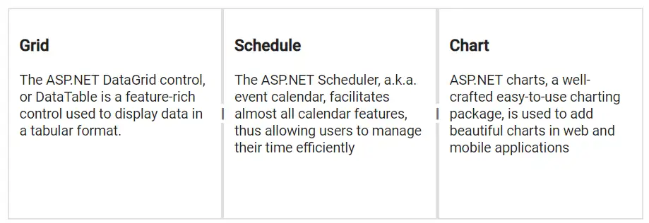
<h3 class="h3">Grid </h3>
The ASP.NET DataGrid control, or DataTable is a feature-rich control used to display data in a tabular format.
</div>
</div>
</ContentTemplate>
</SplitterPane>
<SplitterPane Size="200px" Min="30%" Max="60%">
<ContentTemplate>
<div>
<div class="content">
<h3 class="h3">Schedule </h3>
The ASP.NET Scheduler, a.k.a. event calendar, facilitates almost all calendar features, thus allowing users to manage their time efficiently
</div>
</div>
</ContentTemplate>
</SplitterPane>
<SplitterPane>
<ContentTemplate>
<div>
<div class="content">
<h3 class="h3">Chart </h3>
ASP.NET charts, a well-crafted easy-to-use charting package, is used to add beautiful charts in web and mobile applications
</div>
</div>
</ContentTemplate>
</SplitterPane>
</SplitterPanes>
</SfSplitter>
<style>
.content {
padding: 10px;
}
</style>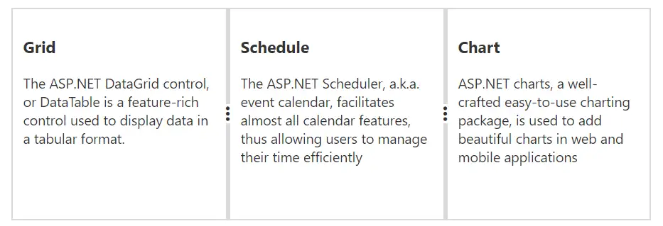
Prevent resizing
The resizing for the pane can be disabled by setting false to the Resizable API within SplitterPane.
NOTE
Splitter resizing will be enabled only when the target of the adjacent pane’s
Resizableapi should also be intruestate.
@using Syncfusion.Blazor.Layouts

<SfSplitter Height="200px" Width="600px" SeparatorSize=4>
    <SplitterPanes>
        <SplitterPane Size="200px" Min="20%" Max="40%" Resizable="false">
            <ContentTemplate>
                <div>
                    <div class="content">
                        <h3 class="h3">Grid </h3>
                        The ASP.NET DataGrid control, or DataTable is a feature-rich control used to display data in a tabular format.
                    </div>
                </div>
            </ContentTemplate>
        </SplitterPane>
        <SplitterPane Size="200px" Min="30%" Max="60%">
            <ContentTemplate>
                <div>
                    <div class="content">
                        <h3 class="h3">Schedule </h3>
                        The ASP.NET Scheduler, a.k.a. event calendar, facilitates almost all calendar features, thus allowing users to manage their time efficiently
                    </div>
                </div>
            </ContentTemplate>
        </SplitterPane>
        <SplitterPane>
            <ContentTemplate>
                <div>
                    <div class="content">
                        <h3 class="h3">Chart </h3>
                        ASP.NET charts, a well-crafted easy-to-use charting package, is used to add beautiful charts in web and mobile applications
                    </div>
                </div>
            </ContentTemplate>
        </SplitterPane>
    </SplitterPanes>
</SfSplitter>

<style>
    .content {
        padding: 10px;
    }
</style>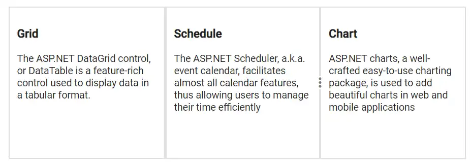
Refresh content on resizing
While resizing the panes, the pane contents can be refreshed by using either OnResizeStart, Resizing or OnResizeStop.
Customize the resize grip and cursor
The resize gripper icon and cursor can be customized in css level.
@using Syncfusion.Blazor.Layouts

<SfSplitter Height="200px" Width="600px" SeparatorSize=3>
    <SplitterPanes>
        <SplitterPane Size="200px" Min="20%" Max="40%">
            <ContentTemplate>
                <div>
                    <div class="content">
                        <h3 class="h3">Grid </h3>
                        The ASP.NET DataGrid control, or DataTable is a feature-rich control used to display data in a tabular format.
                    </div>
                </div>
            </ContentTemplate>
        </SplitterPane>
        <SplitterPane Size="200px" Min="30%" Max="60%">
            <ContentTemplate>
                <div>
                    <div class="content">
                        <h3 class="h3">Schedule </h3>
                        The ASP.NET Scheduler, a.k.a. event calendar, facilitates almost all calendar features, thus allowing users to manage their time efficiently
                    </div>
                </div>
            </ContentTemplate>
        </SplitterPane>
        <SplitterPane>
            <ContentTemplate>
                <div>
                    <div class="content">
                        <h3 class="h3">Chart </h3>
                        ASP.NET charts, a well-crafted easy-to-use charting package, is used to add beautiful charts in web and mobile applications
                    </div>
                </div>
            </ContentTemplate>
        </SplitterPane>
    </SplitterPanes>
</SfSplitter>

<style>
    .content {
        padding: 10px;
    }
    .e-splitter .e-split-bar .e-resize-handler:before {
      content: "\e934";
      font-family: 'e-icons';
      font-size: 11px;
      transform: rotate(90deg);
    }
    .e-splitter .e-split-bar.e-split-bar-horizontal.e-resizable-split-bar,
    .e-splitter .e-split-bar.e-split-bar-horizontal.e-resizable-split-bar::after {
        cursor: e-resize;
    }
</style>