Set Items Customization in Blazor Toolbar Component
8 Jul 20261 minute to read
The HtmlAttributes property of a Toolbar item sets HTML attributes (such as id, class, style, and role) for its associated elements.
When style attributes are added, if existing style attributes are present, the new ones will replace them. This behavior differs for the class attribute; new classes are added to the element without replacing existing ones.
Single or multiple CSS classes can be applied to Toolbar items using the ToolbarItem’s CssClass property.
@using Syncfusion.Blazor.Navigations
<SfToolbar Width="500">
<ToolbarItems>
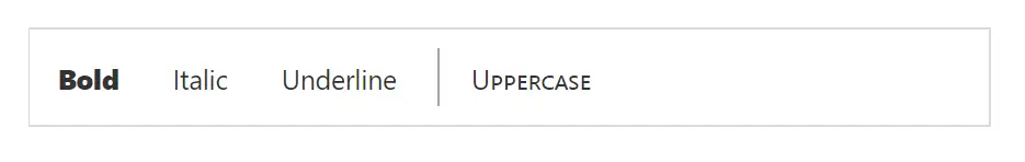
<ToolbarItem Text="Bold" Type="ItemType.Button" HtmlAttributes="@Item1"></ToolbarItem>
<ToolbarItem Text="Italic" Type="ItemType.Button"></ToolbarItem>
<ToolbarItem Type="ItemType.Button" Text="Underline"></ToolbarItem>
<ToolbarItem Type="ItemType.Separator"></ToolbarItem>
<ToolbarItem Text="Uppercase" CssClass="e-txt-casing"></ToolbarItem>
</ToolbarItems>
</SfToolbar>
@code {
Dictionary<string, object> Item1 = new Dictionary<string, object>()
{
{ "class" , "custom_bold" },
{ "id" , "itemId" }
};
}
<style>
.custom_bold .e-tbar-btn-text {
font-weight: 900;
}
.e-txt-casing .e-tbar-btn-text {
font-variant: small-caps;
}
</style>