Apply and Customize Blazor Themes
24 Jun 202624 minutes to read
The following themes are available in the Blazor components library.
Latest themes (Recommended)
| Theme family | Variants | Style sheet names |
|---|---|---|
| Tailwind 3.4 | Light, Dark |
tailwind3.css,tailwind3-dark.css
|
| Bootstrap 5.3 | Light, Dark |
bootstrap5.3.css,bootstrap5.3-dark.css
|
| Fluent 2 | Light, Dark |
fluent2.css,fluent2-dark.css
|
| Material 3 | Light, Dark |
material3.css,material3-dark.css
|
Legacy themes
| Theme family | Variants | Style sheet names |
|---|---|---|
| Bootstrap 5 | Light, Dark |
bootstrap5.css,bootstrap5-dark.css
|
| Bootstrap 4 | Light | bootstrap4.css |
| Bootstrap 3 | Light, Dark |
bootstrap.css,bootstrap-dark.css
|
| Google’s Material | Light, Dark |
material.css,material-dark.css
|
| Tailwind CSS | Light, Dark |
tailwind.css,tailwind-dark.css
|
| Fluent | Light, Dark |
fluent.css,fluent-dark.css
|
| Microsoft Office Fabric | Light, Dark |
fabric.css,fabric-dark.css
|
Accessibility theme
| Theme | Style sheet name | Notes |
|---|---|---|
| High Contrast | highcontrast.css |
Designed for accessibility-focused experiences |
NOTE
The
Bootstrap 3theme is based on Bootstrap v3. TheBootstrap 4theme is based on Bootstrap v4, specifically v4.3. It is compatible with Bootstrap v4.6 applications, as there are no significant differences between v4.3 and v4.6 that affect Blazor components.
Optimized CSS themes
Blazor themes are available in two variants to help optimize application performance.
Standard theme files
The default theme files (for example, <theme_name>.css) include styling for both normal and bigger size modes. This provides full UI flexibility but results in a larger file size.
Lite theme files
The optimized lite theme files (for example, <theme_name>-lite.css):
- Include styles only for normal size mode
- Omit bigger size mode styles
- Can reduce file size by about 30%, improving load times
When to use lite themes
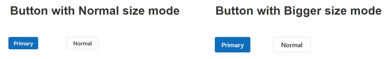
Use the lite theme variant when your application does not require bigger size mode. In those cases reference the -lite.css file instead of the standard theme file.
The following image compares the Blazor Button component in normal and bigger size modes:
The following table maps theme display names to their corresponding standard and optimized (lite) CSS filenames:
| Theme (display) | Standard filename | Lite filename |
|---|---|---|
| Fluent 2 | fluent2.css |
fluent2-lite.css |
| Fluent 2 Dark | fluent2-dark.css |
fluent2-dark-lite.css |
| Material 3 | material3.css |
material3-lite.css |
| Material 3 Dark | material3-dark.css |
material3-dark-lite.css |
| Bootstrap 5.3 | bootstrap5.3.css |
bootstrap5.3-lite.css |
| Bootstrap 5.3 Dark | bootstrap5.3-dark.css |
bootstrap5.3-dark-lite.css |
| Bootstrap 5 | bootstrap5.css |
bootstrap5-lite.css |
| Bootstrap 5 Dark | bootstrap5-dark.css |
bootstrap5-dark-lite.css |
| Bootstrap 4 | bootstrap4.css |
bootstrap4-lite.css |
| Bootstrap | bootstrap.css |
bootstrap-lite.css |
| Bootstrap Dark | bootstrap-dark.css |
bootstrap-dark-lite.css |
| Google’s Material | material.css |
material-lite.css |
| Google’s Material Dark | material-dark.css |
material-dark-lite.css |
| Tailwind | tailwind.css |
tailwind-lite.css |
| Tailwind Dark | tailwind-dark.css |
tailwind-dark-lite.css |
| Fluent | fluent.css |
fluent-lite.css |
| Fluent Dark | fluent-dark.css |
fluent-dark-lite.css |
| Microsoft Office Fabric | fabric.css |
fabric-lite.css |
| Microsoft Office Fabric Dark | fabric-dark.css |
fabric-dark-lite.css |
| High Contrast | highcontrast.css |
highcontrast-lite.css |
Theme reference methods in a Blazor application
You can reference Blazor themes using the following approaches:
- Static web assets - Reference CSS from local package assets.
- CDN - Reference CSS from the Syncfusion CDN.
- CRG - Generate resources only for the components used in the application.
- Theme Studio - Customize and generate themes for the components used in the application.
- NPM packages - Customize existing themes and bundle the styles with your application.
If you need to customize a theme or bundle it with other styles, use Static web assets or NPM packages instead of a CDN reference.
Static web assets
Enable static web assets usage
To use Blazor theme files from static web assets, ensure the app serves static files by calling UseStaticFiles in ~/Program.cs.
NOTE
For a Blazor Web App using Server, WebAssembly, or Auto interactive render modes, ensure that
UseStaticFiles()is configured in the server project. For a standalone Blazor WebAssembly app, no server-side middleware configuration is required.
Reference the theme stylesheet from static web assets
Blazor themes are provided as static web assets in the Syncfusion.Blazor.Themes and Syncfusion.Blazor NuGet Packages.
-
For Blazor Web App projects using Server, WebAssembly, or Auto interactive render modes, add the stylesheet to the
<head>section of~/Components/App.razor. -
For a Blazor WebAssembly standalone app, add the stylesheet to the
<head>section of~/wwwroot/index.html.
When using individual NuGet packages in your application, install the Syncfusion.Blazor.Themes NuGet package and reference the theme stylesheet as shown below:
<head>
    <link href="_content/Syncfusion.Blazor.Themes/fluent2.css" rel="stylesheet" />
</head>
To use the optimized (lite) variant that excludes bigger-size mode styles, reference the -lite file:
<head>
    <link href="_content/Syncfusion.Blazor.Themes/fluent2-lite.css" rel="stylesheet" />
</head>
When using Syncfusion.Blazor package, reference it from the styles path:
<head>
    <link href="_content/Syncfusion.Blazor/styles/fluent2.css" rel="stylesheet" />
</head>
To reference the optimized (lite) CSS files from the Syncfusion.Blazor NuGet package, use the following:
<head>
    <link href="_content/Syncfusion.Blazor/styles/fluent2-lite.css" rel="stylesheet" />
</head>
CDN reference
Instead of using a local resource on your server, you can reference the theme style sheets from a cloud CDN. CDN stands for Content Delivery Network. It is a network of servers distributed across different locations. CDNs are commonly used to deliver downloadable content such as software, images, videos, and streaming media.
Blazor Themes are available through the CDN. Ensure that the version in the URL matches the version of the Blazor package you are using.
<head>
    <link href="https://cdn.syncfusion.com/blazor/34.1.29/styles/fluent2.css" rel="stylesheet" />
</head>
To reference an optimized CSS file, use the following syntax:
<head>
    <link href="https://cdn.syncfusion.com/blazor/34.1.29/styles/<theme_name>-lite.css" rel="stylesheet" />
</head>| Theme Name | CDN Reference |
|---|---|
| Tailwind 3.4 |
|
| Tailwind 3.4 Dark |
|
| Bootstrap 5.3 |
|
| Bootstrap 5.3 Dark |
|
| Fluent 2 |
|
| Fluent 2 Dark |
|
| Material 3 |
|
| Material 3 Lite |
|
| Material 3 Dark |
|
| Material 3 Dark Lite |
|
| Bootstrap 5 |
|
| Bootstrap 5 Lite |
|
| Bootstrap 5 Dark |
|
| Bootstrap 5 Dark Lite |
|
| Bootstrap 4 |
|
| Bootstrap 4 Lite |
|
| Bootstrap 3 |
|
| Bootstrap 3 Lite |
|
| Bootstrap 3 Dark |
|
| Bootstrap 3 Dark Lite |
|
| Google's Material |
|
| Google's Material Lite |
|
| Google’s Material Dark |
|
| Google’s Material Dark Lite |
|
| Tailwind CSS |
|
| Tailwind CSS Lite |
|
| Tailwind CSS Dark |
|
| Tailwind CSS Dark Lite |
|
| Fluent |
|
| Fluent Lite |
|
| Fluent Dark |
|
| Fluent Dark Lite |
|
| Microsoft Office Fabric |
|
| Microsoft Office Fabric Lite |
|
| Microsoft Office Fabric Dark |
|
| Microsoft Office Fabric Dark Lite |
|
| High Contrast |
|
| High Contrast Lite |
|
LibMan
Library Manager (LibMan) is a client-side library acquisition tool that downloads popular libraries and frameworks from a file system or a CDN.
LibMan offers the following advantages,
- Only the library files you need are downloaded.
- Additional tooling, such as Node.js, npm, and WebPack, isn’t necessary to acquire a subset of files in a library.
- Files can be placed in a specific location without resorting to build tasks or manual file copying.
Client-side library dialog
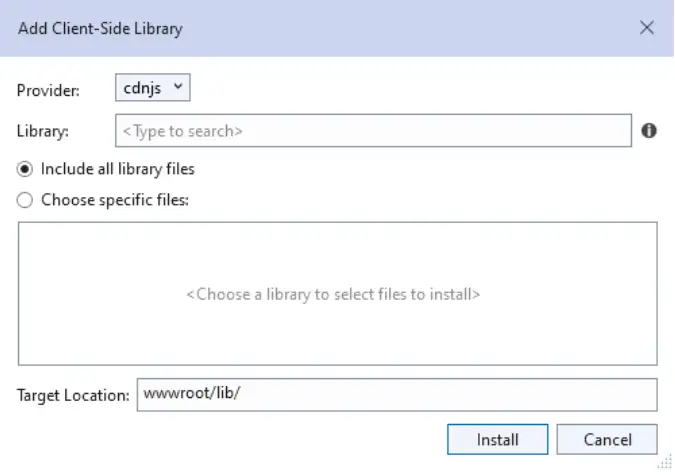
1.Right-click the project folder where the files should be added. Select Add -> Client-Side Library. Then Add Client-Side Library dialog appears like below.
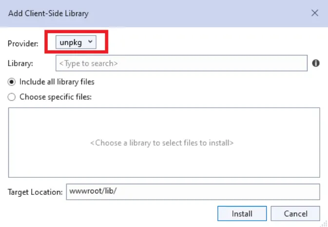
2.Select the unpkg in the provider dropdown to get the Blazor control themes.
3.You can refer the combined component styles by using @syncfusion/[email protected] in the library textbox.
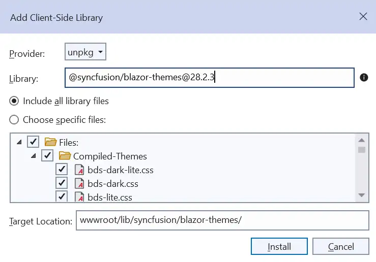
4.You can choose to select specific files or include all library files, as shown below.
For example, select specific files and choose the Bootstrap 5 theme in the dialog.
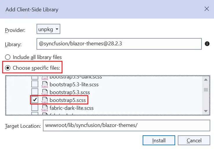
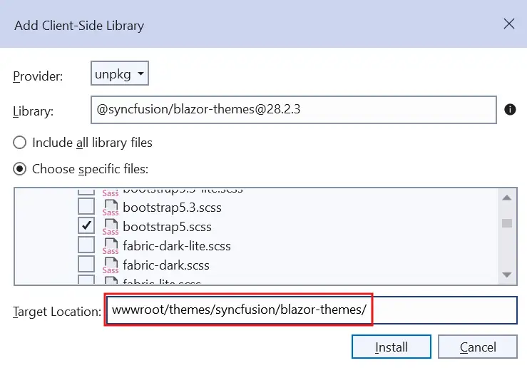
5.By using the target location textbox, you can specify the location of where files will be stored in the application.
For example, the default location wwwroot/lib/syncfusion/blazor-themes/ has been modified to wwwroot/themes/syncfusion/blazor-themes/.
6.Click the install button then libman.json file is added to the root application with the following content.
{
  "version": "1.0",
  "defaultProvider": "unpkg",
  "libraries": [
    {
      "library": "@syncfusion/[email protected]",
      "destination": "wwwroot/themes/syncfusion/blazor-themes/",
      "files": [
        "SCSS-Themes/bootstrap5.scss"
      ]
    }
  ]
}
NOTE
If you use individual component styles, you should install the styles of their dependent components as well. Refer to this to find the dependent components.
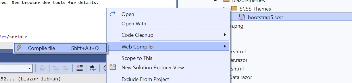
7.You can add the SCSS theme for Blazor applications through LibMan and compile it by using the Web Compiler 2022+ by following steps.
-
Open Visual Studio 2022 and click the Extensions in the toolbar.
-
Search the
Web Compiler 2022+in search box and download the extension.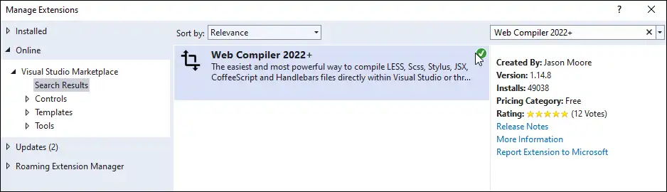
-
Right-click the
SCSSfile and click the Web Compiler to compile the file.
- The
compilerconfig.jsonfile is created by default as shown in the following code snippet.
[
  {
    "outputFile": "wwwroot/themes/syncfusion/blazor-themes/SCSS-Themes/bootstrap5.css",
    "inputFile": "wwwroot/themes/syncfusion/blazor-themes/SCSS-Themes/bootstrap5.scss"
  }
]- The
SCSSfile has been compiled to theCSSfile. Then, add the compiled CSS file to the<head>element of the Host page.
<head>
    ...
    <!-- Blazor components' styles -->
    <link href="~/themes/syncfusion/blazor-themes/scss-themes/bootstrap5.css" rel="stylesheet" />
</head>
8.Run the application and see the bootstrap5 themes downloaded from LibMan were applied.
NOTE
NPM package reference
The Blazor Themes NPM package contains SCSS files for all themes supported by Blazor components. These SCSS files customize theme variables using a web compiler. The package includes component wise SCSS files and overall components SCSS files.
You can add the SCSS theme for Blazor applications through NPM package and compile it by using the Web Compiler 2022+ by following steps.
-
Open Visual Studio 2022 and click the Extensions in the toolbar.
-
Search the
Web Compiler 2022+in search box and download the extension. -
Install the Blazor Themes NPM package using the below command.
npm install @syncfusion/blazor-themes -
Create a
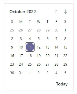
SCSSfile in the Static Web Assets folder (e.g., ~/wwwroot/styles/custom.scss). Next, define the theme variables to override and import the theme as shown in the following.In the following code, the primary theme variable color is changed. For all components:
  /* @use 'blazor-themes/SCSS-Themes/<Theme name>.scss'; */
  @use 'blazor-themes/SCSS-Themes/fluent.scss' with ( $primary: blue );
Output:
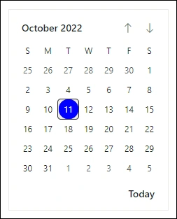
For the Calendar (individual) component:
  /* @use 'blazor-themes/SCSS-Themes/<Package name>/<Control name>/<Theme name>.scss'; */
  @use 'blazor-themes/SCSS-Themes/calendars/calendar/fluent.scss' with ( $primary: #666699 );
Output:
-
Then, Right-click the created
SCSSfile and click theWeb Compileroption to compile the file.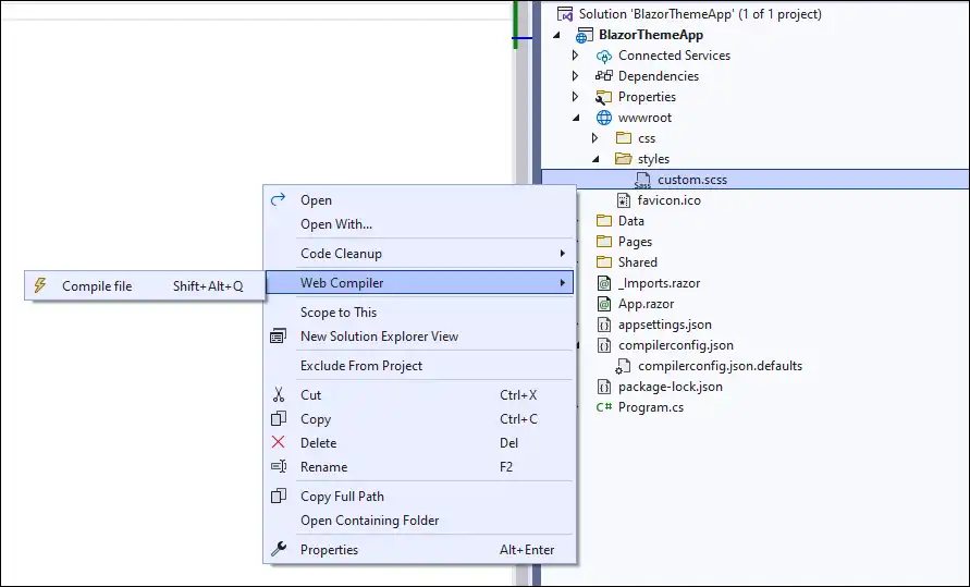
-
The
compilerconfig.jsonfile is created by default. Then, provide the location of the compiled CSS file and include a path incompilerconfig.jsonas shown in the following code snippet.[ { "outputFile": "wwwroot/styles/custom.css", "inputFile": "wwwroot/styles/custom.scss", "options": { "loadPaths": "node_modules/@syncfusion" } } ] -
The
SCSSfile has been compiled to theCSSfile. Then, add the compiled CSS file to the<head>element of the Host page.<head> ... ... <link href="styles/custom.css" rel="stylesheet" /> </head> -
Run the application to see the customized Fluent theme applied.
It is important to note that the Material 3 theme uses CSS variables. To override its variables, you should import the Material 3 theme’s SCSS file and then customize the Material 3 variables like this:
// Import the Material 3 theme
@use 'blazor-themes/SCSS-Themes/material3.scss';

// Override Material 3 variables
:root {
    // Customize the primary color
    --color-sf-primary: 26 26 192;
}
NOTE
If you come across the ‘Can’t find stylesheet to import’ error, ensure that you have installed the Blazor Themes NPM package in the project’s directory rather than the solution’s directory.
The following shows the importing theme path for the overall theme.
@use 'blazor-themes/SCSS-Themes/{THEME-NAME}.scss' as *;Below table lists the importing theme path for the individual components.
| Component | Importing theme path |
|---|---|
| Accordion | @use 'blazor-themes/SCSS-Themes/navigations/accordion/{THEME-NAME}.scss' |
| AppBar | @use 'blazor-themes/SCSS-Themes/navigations/appbar/{THEME-NAME}.scss' |
| AutoComplete | @use 'blazor-themes/SCSS-Themes/dropdowns/auto-complete/{THEME-NAME}.scss' |
| Avatar | @use 'blazor-themes/SCSS-Themes/layouts/avatar/{THEME-NAME}.scss' |
| Badge | @use 'blazor-themes/SCSS-Themes/notifications/badge/{THEME-NAME}.scss' |
| Barcode | @use 'blazor-themes/SCSS-Themes/barcode-generator/barcode/{THEME-NAME}.scss' |
| Breadcrumb | @use 'blazor-themes/SCSS-Themes/navigations/breadcrumb/{THEME-NAME}.scss' |
| Button | @use 'blazor-themes/SCSS-Themes/buttons/button/{THEME-NAME}.scss' |
| ButtonGroup | @use 'blazor-themes/SCSS-Themes/buttons/button/{THEME-NAME}.scss' |
| Calendar | @use 'blazor-themes/SCSS-Themes/calendars/calendar/{THEME-NAME}.scss' |
| Card | @use 'blazor-themes/SCSS-Themes/layouts/card/{THEME-NAME}.scss' |
| Carousel | @use 'blazor-themes/SCSS-Themes/navigations/carousel/{THEME-NAME}.scss' |
| CheckBox | @use 'blazor-themes/SCSS-Themes/buttons/check-box/{THEME-NAME}.scss' |
| Chip | @use 'blazor-themes/SCSS-Themes/buttons/chips/{THEME-NAME}.scss' |
| Color Picker | @use 'blazor-themes/SCSS-Themes/inputs/color-picker/{THEME-NAME}.scss' |
| ComboBox | @use 'blazor-themes/SCSS-Themes/dropdowns/combo-box/{THEME-NAME}.scss' |
| ContextMenu | @use 'blazor-themes/SCSS-Themes/navigations/context-menu/{THEME-NAME}.scss' |
| Dashboard Layout | @use 'blazor-themes/SCSS-Themes/layouts/dashboard-layout/{THEME-NAME}.scss' |
| DataGrid | @use 'blazor-themes/SCSS-Themes/grids/grid/{THEME-NAME}.scss' |
| DatePicker | @use 'blazor-themes/SCSS-Themes/calendars/datepicker/{THEME-NAME}.scss' |
| DateRange Picker | @use 'blazor-themes/SCSS-Themes/calendars/daterangepicker/{THEME-NAME}.scss' |
| DateTime Picker | @use 'blazor-themes/SCSS-Themes/calendars/datetimepicker/{THEME-NAME}.scss' |
| Diagram | @use 'blazor-themes/SCSS-Themes/diagrams/diagram/{THEME-NAME}.scss' |
| Dialog | @use 'blazor-themes/SCSS-Themes/popups/dialog/{THEME-NAME}.scss' |
| Predefined Dialogs | @use 'blazor-themes/SCSS-Themes/popups/dialog/{THEME-NAME}.scss' |
| Dropdown Menu | @use 'blazor-themes/SCSS-Themes/dropdowns/drop-down-list/{THEME-NAME}.scss' |
| Dropdown List | @use 'blazor-themes/SCSS-Themes/dropdowns/drop-down-list/{THEME-NAME}.scss' |
| FileManager | @use 'blazor-themes/SCSS-Themes/filemanager/file-manager/{THEME-NAME}.scss' |
| File Upload | @use 'blazor-themes/SCSS-Themes/inputs/uploader/{THEME-NAME}.scss' |
| Floating Action Button | @use 'blazor-themes/SCSS-Themes/buttons/floating-action-button/{THEME-NAME}.scss' |
| Gantt Chart | @use 'blazor-themes/SCSS-Themes/gantt/gantt/{THEME-NAME}.scss' |
| In-place Editor | @use 'blazor-themes/SCSS-Themes/inplace-editor/inplace-editor/{THEME-NAME}.scss' |
| Input Mask | @use 'blazor-themes/SCSS-Themes/inputs/input/{THEME-NAME}.scss' |
| Kanban | @use 'blazor-themes/SCSS-Themes/kanban/kanban/{THEME-NAME}.scss' |
| ListBox | @use 'blazor-themes/SCSS-Themes/dropdowns/list-box/{THEME-NAME}.scss' |
| ListView | @use 'blazor-themes/SCSS-Themes/lists/list-view/{THEME-NAME}.scss' |
| Menu Bar | @use 'blazor-themes/SCSS-Themes/navigations/menu/{THEME-NAME}.scss' |
| Message | @use 'blazor-themes/SCSS-Themes/notification/message/{THEME-NAME}.scss' |
| MultiSelect Dropdown | @use 'blazor-themes/SCSS-Themes/dropdowns/multi-select/{THEME-NAME}.scss' |
| Numeric TextBox | @use 'blazor-themes/SCSS-Themes/inputs/numerictextbox/{THEME-NAME}.scss' |
| Pager | @use 'blazor-themes/SCSS-Themes/navigations/pager/{THEME-NAME}.scss' |
| ImageEditor | @use 'blazor-themes/SCSS-Themes/image-editor/image-editor/{THEME-NAME}.scss' |
| Pivot Table | @use 'blazor-themes/SCSS-Themes/pivotview/pivotview/{THEME-NAME}.scss' |
| ProgressButton | @use 'blazor-themes/SCSS-Themes/splitbuttons/progress-button/{THEME-NAME}.scss' |
| QueryBuilder | @use 'blazor-themes/SCSS-Themes/querybuilder/query-builder/{THEME-NAME}.scss' |
| RadioButton | @use 'blazor-themes/SCSS-Themes/buttons/radio-button/{THEME-NAME}.scss' |
| Range Slider | @use 'blazor-themes/SCSS-Themes/inputs/slider/{THEME-NAME}.scss' |
| RichTextEditor | @use 'blazor-themes/SCSS-Themes/richtexteditor/rich-text-editor/{THEME-NAME}.scss' |
| Scheduler | @use 'blazor-themes/SCSS-Themes/schedule/schedule/{THEME-NAME}.scss' |
| Sidebar | @use 'blazor-themes/SCSS-Themes/navigations/sidebar/{THEME-NAME}.scss' |
| Signature | @use 'blazor-themes/SCSS-Themes/inputs/signature/{THEME-NAME}.scss' |
| Skeleton | @use 'blazor-themes/SCSS-Themes/notification/skeleton/{THEME-NAME}.scss' |
| Speed Dial | @use 'blazor-themes/SCSS-Themes/buttons/speed-dial/{THEME-NAME}.scss' |
| Spinner | @use 'blazor-themes/SCSS-Themes/popups/spinner/{THEME-NAME}.scss' |
| Tabs | @use 'blazor-themes/SCSS-Themes/navigations/tab/{THEME-NAME}.scss' |
| TextBox | @use 'blazor-themes/SCSS-Themes/inputs/textbox/{THEME-NAME}.scss' |
| TimePicker | @use 'blazor-themes/SCSS-Themes/calendars\timepicker/{THEME-NAME}.scss' |
| Toast | @use 'blazor-themes/SCSS-Themes/popups/toast/{THEME-NAME}.scss' |
| Toggle Switch Button | @use 'blazor-themes/SCSS-Themes/buttons/button/{THEME-NAME}.scss' |
| Toolbar | @use 'blazor-themes/SCSS-Themes/navigations/toolbar/{THEME-NAME}.scss' |
| Tooltip | @use 'blazor-themes/SCSS-Themes/popups/tooltip/{THEME-NAME}.scss' |
| TreeGrid | @use 'blazor-themes/SCSS-Themes/treegrid/treegrid/{THEME-NAME}.scss' |
| TreeView | @use 'blazor-themes/SCSS-Themes/navigations/treeview/{THEME-NAME}.scss' |
| Diagram(Classic) | @use 'blazor-themes/SCSS-Themes/diagrams/diagram/{THEME-NAME}.scss' |
Render Blazor components offline using Material and Tailwind themes
Material and Tailwind themes use the online Roboto font by default. If your application needs to work offline or in a local network without internet access, follow these steps to use offline fonts.
Download customized styles using Custom Resource Generator (CRG)
-
Download the minified styles for the required components from the CRG site. Learn more about CRG in the help documentation.
-
Unzip the downloaded file. It contains the styles of the selected components and an
import.jsonfile that stores the current settings.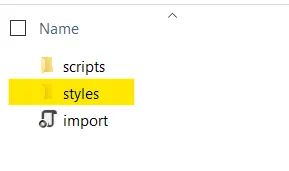
-
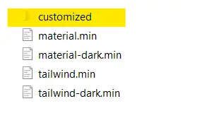
Navigate to the styles folder. For Material and Tailwind themes, you’ll find CSS files and a customized folder. The CSS files in the customized folder don’t contain online Google Font dependencies.
-
Open the customized folder, which contains CSS files without online dependencies.
-
Copy the files from the customized folder to your Blazor application’s
~/wwwrootfolder. -
Reference the custom styles in your Blazor application to render components without internet access.
- For Blazor Web App (using Server, WebAssembly, or Auto interactive render modes), add the reference in
~/Components/App.razor. - For Blazor WebAssembly Standalone App, add the reference in
~/wwwroot/index.html.
<head> .... <link href="material.min.css" rel="stylesheet" /> </head> - For Blazor Web App (using Server, WebAssembly, or Auto interactive render modes), add the reference in
Use customized styles from the Syncfusion.Blazor.Themes package and CDN
Starting from version v23.2.4, customized Material and Tailwind themes are available in the Syncfusion.Blazor.Themes package and via CDN.
Static web asset reference
<head>
    ....
    <link href="_content/Syncfusion.Blazor.Themes/customized/material.css" rel="stylesheet" />
</head>
CDN reference
<head>
    ....
    <link href="https://cdn.syncfusion.com/blazor/34.1.29/styles/customized/material.css" rel="stylesheet" />
</head>
See also
How to change background of browser based on Theme in Blazor?