Spline in Blazor Charts Component
18 Jun 202624 minutes to read
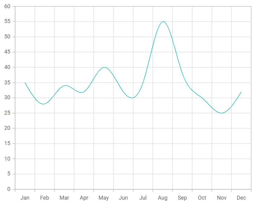
Spline
Spline Chart connects the data points with smooth curves. To render a Spline Chart series in your chart, define the series Type as Spline in your chart configuration. This indicates that the series should be represented as a smooth curve, connecting data points with a spline rather than straight lines.
@using Syncfusion.Blazor.Charts

<SfChart>
    <ChartPrimaryXAxis ValueType="Syncfusion.Blazor.Charts.ValueType.Category"></ChartPrimaryXAxis>
    <ChartSeriesCollection>
        <ChartSeries DataSource="@SalesDetails" XName="X" YName="Y" Type="Syncfusion.Blazor.Charts.ChartSeriesType.Spline">
        </ChartSeries>
    </ChartSeriesCollection>
</SfChart>

@code{
    public class ChartData
    {
        public string X { get; set; }
        public double Y { get; set; }
    }

    public List<ChartData> SalesDetails = new List<ChartData>
	{
        new ChartData { X= "Jan", Y= 35 },
        new ChartData { X= "Feb", Y= 28 },
        new ChartData { X= "Mar", Y= 34 },
        new ChartData { X= "Apr", Y= 32 },
        new ChartData { X= "May", Y= 40 },
        new ChartData { X= "Jun", Y= 32 },
        new ChartData { X= "Jul", Y= 35 },
        new ChartData { X= "Aug", Y= 55 },
        new ChartData { X= "Sep", Y= 38 },
        new ChartData { X= "Oct", Y= 30 },
        new ChartData { X= "Nov", Y= 25 },
        new ChartData { X= "Dec", Y= 32 }
    };
}
NOTE
Refer to the Blazor Spline Chart feature tour page to know about its other groundbreaking feature representations. Explore the Blazor Spline Chart Example to know how to connect the data points with smooth curves.
Binding data with series
You can bind data to the chart using the DataSource property within the series configuration. The DataSource value can be set using either SfDataManager property values or a list of business objects. More information on data binding can be found here. To display the data correctly, map the fields from the data to the chart series’ XName and YName properties.
@using Syncfusion.Blazor.Charts

<SfChart>
    <ChartPrimaryXAxis ValueType="Syncfusion.Blazor.Charts.ValueType.Category"></ChartPrimaryXAxis>
    <ChartSeriesCollection>
        <ChartSeries DataSource="@SalesDetails" XName="X" YName="Y" Type="Syncfusion.Blazor.Charts.ChartSeriesType.Spline">
        </ChartSeries>
    </ChartSeriesCollection>
</SfChart>

@code{
    public class ChartData
    {
        public string X { get; set;}
        public double Y {get; set;}
    }

    public List<ChartData> SalesDetails = new List<ChartData>
	{
        new ChartData { X= "Jan", Y= 35 },
        new ChartData { X= "Feb", Y= 28 },
        new ChartData { X= "Mar", Y= 34 },
        new ChartData { X= "Apr", Y= 32 },
        new ChartData { X= "May", Y= 40 },
        new ChartData { X= "Jun", Y= 32 },
        new ChartData { X= "Jul", Y= 35 },
        new ChartData { X= "Aug", Y= 55 },
        new ChartData { X= "Sep", Y= 38 },
        new ChartData { X= "Oct", Y= 30 },
        new ChartData { X= "Nov", Y= 25 },
        new ChartData { X= "Dec", Y= 32 }
    };
}Type of spline
To specify the type of Spline Chart, use SplineType property. The spline types are Clamped, Cardinal, Monotonic and Natural.
@using Syncfusion.Blazor.Charts

<SfChart>
    <ChartPrimaryXAxis ValueType="Syncfusion.Blazor.Charts.ValueType.Category"></ChartPrimaryXAxis>
    <ChartSeriesCollection>
        <ChartSeries DataSource="@SalesDetails" XName="X" YName="Y" Type="ChartSeriesType.Spline" SplineType="SplineType.Cardinal">
        </ChartSeries>
    </ChartSeriesCollection>
</SfChart>

@code {
    public class ChartData
    {
        public string X { get; set; }
        public double Y { get; set; }
    }

    public List<ChartData> SalesDetails = new List<ChartData>
    {
        new ChartData { X= "Jan", Y= -1 },
        new ChartData { X= "Feb", Y= -1 },
        new ChartData { X= "Mar", Y= 2 },
        new ChartData { X= "Apr", Y= 8  },
        new ChartData { X= "May", Y= 13  },
        new ChartData { X= "Jun", Y= 18  },
        new ChartData { X= "Jul", Y= 21  },
        new ChartData { X= "Aug", Y= 20  },
        new ChartData { X= "Sep", Y= 16  },
        new ChartData { X= "Oct", Y= 10  },
        new ChartData { X= "Nov", Y= 4  },
        new ChartData { X= "Dec", Y= 0 }
    };
}Series customization
The following properties can be used to customize the Spline series.
Fill
The Fill property determines the color applied to the series.
@using Syncfusion.Blazor.Charts

<SfChart>
    <ChartPrimaryXAxis ValueType="Syncfusion.Blazor.Charts.ValueType.Category"></ChartPrimaryXAxis>
    <ChartSeriesCollection>
        <ChartSeries DataSource="@SalesDetails" Fill="blue" XName="X" YName="Y" Type="ChartSeriesType.Spline">
        </ChartSeries>
    </ChartSeriesCollection>
</SfChart>

@code{
    public class ChartData
    {
        public string X { get; set;}
        public double Y {get; set;}
    }

    public List<ChartData> SalesDetails = new List<ChartData>
	{
        new ChartData { X= "Jan", Y= 35 },
        new ChartData { X= "Feb", Y= 28 },
        new ChartData { X= "Mar", Y= 34 },
        new ChartData { X= "Apr", Y= 32 },
        new ChartData { X= "May", Y= 40 },
        new ChartData { X= "Jun", Y= 32 },
        new ChartData { X= "Jul", Y= 35 },
        new ChartData { X= "Aug", Y= 55 },
        new ChartData { X= "Sep", Y= 38 },
        new ChartData { X= "Oct", Y= 30 },
        new ChartData { X= "Nov", Y= 25 },
        new ChartData { X= "Dec", Y= 32 }
    };
}The Fill property can be used to apply a gradient color to the spline series. By configuring this property with gradient values will create a visually appealing effect in which the color transitions smoothly from one shade to another.
@using Syncfusion.Blazor.Charts

<SfChart>
    <ChartPrimaryXAxis ValueType="Syncfusion.Blazor.Charts.ValueType.Category"></ChartPrimaryXAxis>
    <ChartSeriesCollection>
        <ChartSeries DataSource="@SalesDetails" Fill="url(#grad1)" XName="X" YName="Y" Type="ChartSeriesType.Spline">
        </ChartSeries>
    </ChartSeriesCollection>
</SfChart>

<svg style="height: 0">
   <defs>
       <linearGradient id="grad1" x1="0%" y1="0%" x2="0%" y2="100%">
           <stop offset="20%" style="stop-color:orange;stop-opacity:1" />
           <stop offset="100%" style="stop-color:black;stop-opacity:1" />
       </linearGradient>
   </defs>
</svg>

@code{
    public class ChartData
    {
        public string X { get; set;}
        public double Y {get; set;}
    }

    public List<ChartData> SalesDetails = new List<ChartData>
	{
        new ChartData { X= "Jan", Y= 35 },
        new ChartData { X= "Feb", Y= 28 },
        new ChartData { X= "Mar", Y= 34 },
        new ChartData { X= "Apr", Y= 32 },
        new ChartData { X= "May", Y= 40 },
        new ChartData { X= "Jun", Y= 32 },
        new ChartData { X= "Jul", Y= 35 },
        new ChartData { X= "Aug", Y= 55 },
        new ChartData { X= "Sep", Y= 38 },
        new ChartData { X= "Oct", Y= 30 },
        new ChartData { X= "Nov", Y= 25 },
        new ChartData { X= "Dec", Y= 32 }
    };
}Opacity
The Opacity property specifies the transparency level of the Fill. Adjusting this property allows you to control how opaque or transparent the fill color of the series appears.
@using Syncfusion.Blazor.Charts

<SfChart>
    <ChartPrimaryXAxis ValueType="Syncfusion.Blazor.Charts.ValueType.Category"></ChartPrimaryXAxis>
    <ChartSeriesCollection>
        <ChartSeries DataSource="@SalesDetails" Opacity="0.5" XName="X" YName="Y" Type="ChartSeriesType.Spline">
        </ChartSeries>
    </ChartSeriesCollection>
</SfChart>

@code{
    public class ChartData
    {
        public string X { get; set;}
        public double Y {get; set;}
    }

    public List<ChartData> SalesDetails = new List<ChartData>
	{
        new ChartData { X= "Jan", Y= 35 },
        new ChartData { X= "Feb", Y= 28 },
        new ChartData { X= "Mar", Y= 34 },
        new ChartData { X= "Apr", Y= 32 },
        new ChartData { X= "May", Y= 40 },
        new ChartData { X= "Jun", Y= 32 },
        new ChartData { X= "Jul", Y= 35 },
        new ChartData { X= "Aug", Y= 55 },
        new ChartData { X= "Sep", Y= 38 },
        new ChartData { X= "Oct", Y= 30 },
        new ChartData { X= "Nov", Y= 25 },
        new ChartData { X= "Dec", Y= 32 }
    };
}DashArray
The DashArray property determines the pattern of dashes and gaps in the series.
@using Syncfusion.Blazor.Charts

<SfChart>
    <ChartPrimaryXAxis ValueType="Syncfusion.Blazor.Charts.ValueType.Category"></ChartPrimaryXAxis>
    <ChartSeriesCollection>
        <ChartSeries DataSource="@SalesDetails" DashArray="5,5" XName="X" YName="Y" Type="ChartSeriesType.Spline">
        </ChartSeries>
    </ChartSeriesCollection>
</SfChart>

@code{
    public class ChartData
    {
        public string X { get; set;}
        public double Y {get; set;}
    }

    public List<ChartData> SalesDetails = new List<ChartData>
	{
        new ChartData { X= "Jan", Y= 35 },
        new ChartData { X= "Feb", Y= 28 },
        new ChartData { X= "Mar", Y= 34 },
        new ChartData { X= "Apr", Y= 32 },
        new ChartData { X= "May", Y= 40 },
        new ChartData { X= "Jun", Y= 32 },
        new ChartData { X= "Jul", Y= 35 },
        new ChartData { X= "Aug", Y= 55 },
        new ChartData { X= "Sep", Y= 38 },
        new ChartData { X= "Oct", Y= 30 },
        new ChartData { X= "Nov", Y= 25 },
        new ChartData { X= "Dec", Y= 32 }
    };
}Width
The Width property specifies the stroke width applied to the series.
@using Syncfusion.Blazor.Charts

<SfChart>
    <ChartPrimaryXAxis ValueType="Syncfusion.Blazor.Charts.ValueType.Category"></ChartPrimaryXAxis>
    <ChartSeriesCollection>
        <ChartSeries DataSource="@SalesDetails" Width="3" XName="X" YName="Y" Type="ChartSeriesType.Spline">
        </ChartSeries>
    </ChartSeriesCollection>
</SfChart>

@code{
    public class ChartData
    {
        public string X { get; set;}
        public double Y {get; set;}
    }

    public List<ChartData> SalesDetails = new List<ChartData>
	{
        new ChartData { X= "Jan", Y= 35 },
        new ChartData { X= "Feb", Y= 28 },
        new ChartData { X= "Mar", Y= 34 },
        new ChartData { X= "Apr", Y= 32 },
        new ChartData { X= "May", Y= 40 },
        new ChartData { X= "Jun", Y= 32 },
        new ChartData { X= "Jul", Y= 35 },
        new ChartData { X= "Aug", Y= 55 },
        new ChartData { X= "Sep", Y= 38 },
        new ChartData { X= "Oct", Y= 30 },
        new ChartData { X= "Nov", Y= 25 },
        new ChartData { X= "Dec", Y= 32 }
    };
}Empty points
Data points with null, double.NaN or undefined values are considered empty. Empty data points are ignored and not plotted on the chart.
Mode
Use the Mode property to define how empty or missing data points are handled in the series. The default mode for empty points is Gap.
@using Syncfusion.Blazor.Charts

<SfChart>
    <ChartPrimaryXAxis ValueType="Syncfusion.Blazor.Charts.ValueType.Category"></ChartPrimaryXAxis>
    <ChartSeriesCollection>
        <ChartSeries DataSource="@SalesDetails" XName="X" YName="Y" Type="ChartSeriesType.Spline">
            <ChartEmptyPointSettings Mode="EmptyPointMode.Zero"></ChartEmptyPointSettings>
        </ChartSeries>
    </ChartSeriesCollection>
</SfChart>

@code{
    public class ChartData
    {
        public string X { get; set;}
        public double Y {get; set;}
    }

    public List<ChartData> SalesDetails = new List<ChartData>
	{
        new ChartData { X= "Jan", Y= 35 },
        new ChartData { X= "Feb", Y= 28 },
        new ChartData { X= "Mar", Y= 34 },
        new ChartData { X= "Apr", Y= double.NaN },
        new ChartData { X= "May", Y= 40 },
        new ChartData { X= "Jun", Y= 32 },
        new ChartData { X= "Jul", Y= 35 },
        new ChartData { X= "Aug", Y= double.NaN },
        new ChartData { X= "Sep", Y= 38 },
        new ChartData { X= "Oct", Y= 30 },
        new ChartData { X= "Nov", Y= 25 },
        new ChartData { X= "Dec", Y= 32 }
    };
}Fill
Use the Fill property to customize the fill color of empty points in the series.
@using Syncfusion.Blazor.Charts

<SfChart>
    <ChartPrimaryXAxis ValueType="Syncfusion.Blazor.Charts.ValueType.Category"></ChartPrimaryXAxis>
    <ChartSeriesCollection>
        <ChartSeries DataSource="@SalesDetails" XName="X" YName="Y" Type="ChartSeriesType.Spline">
            <ChartEmptyPointSettings Fill="red" Mode="EmptyPointMode.Zero" />
            <ChartMarker Visible="true" Height="7" Width="7" IsFilled="true"></ChartMarker>
        </ChartSeries>
    </ChartSeriesCollection>
</SfChart>

@code{
    public class ChartData
    {
        public string X { get; set;}
        public double Y {get; set;}
    }

    public List<ChartData> SalesDetails = new List<ChartData>
	{
        new ChartData { X= "Jan", Y= 35 },
        new ChartData { X= "Feb", Y= 28 },
        new ChartData { X= "Mar", Y= 34 },
        new ChartData { X= "Apr", Y= double.NaN },
        new ChartData { X= "May", Y= 40 },
        new ChartData { X= "Jun", Y= 32 },
        new ChartData { X= "Jul", Y= 35 },
        new ChartData { X= "Aug", Y= double.NaN },
        new ChartData { X= "Sep", Y= 38 },
        new ChartData { X= "Oct", Y= 30 },
        new ChartData { X= "Nov", Y= 25 },
        new ChartData { X= "Dec", Y= 32 }
    };
}Use the Border property to customize the Width and Color of the border for empty points.
@using Syncfusion.Blazor.Charts

<SfChart>
    <ChartPrimaryXAxis ValueType="Syncfusion.Blazor.Charts.ValueType.Category"></ChartPrimaryXAxis>
    <ChartSeriesCollection>
        <ChartSeries DataSource="@SalesDetails" XName="X" YName="Y" Type="Syncfusion.Blazor.Charts.ChartSeriesType.Spline">
             <ChartEmptyPointSettings Fill="red" Mode="EmptyPointMode.Zero">
                <ChartEmptyPointBorder Color="green" Width="2"></ChartEmptyPointBorder>
            </ChartEmptyPointSettings>
            <ChartMarker Visible="true" Height="7" Width="7" IsFilled="true"></ChartMarker>
        </ChartSeries>
    </ChartSeriesCollection>
</SfChart>

@code{
    public class ChartData
    {
        public string X { get; set;}
        public double Y {get; set;}
    }

    public List<ChartData> SalesDetails = new List<ChartData>
	{
        new ChartData { X= "Jan", Y= 35 },
        new ChartData { X= "Feb", Y= 28 },
        new ChartData { X= "Mar", Y= 34 },
        new ChartData { X= "Apr", Y= double.NaN },
        new ChartData { X= "May", Y= 40 },
        new ChartData { X= "Jun", Y= 32 },
        new ChartData { X= "Jul", Y= 35 },
        new ChartData { X= "Aug", Y= double.NaN },
        new ChartData { X= "Sep", Y= 38 },
        new ChartData { X= "Oct", Y= 30 },
        new ChartData { X= "Nov", Y= 25 },
        new ChartData { X= "Dec", Y= 32 }
    };
}Events
Series render
The OnSeriesRender event allows you to customize series properties, such as Data, Fill, and Series, before they are rendered on the chart.
@using Syncfusion.Blazor.Charts

<SfChart>
    <ChartPrimaryXAxis ValueType="Syncfusion.Blazor.Charts.ValueType.Category"></ChartPrimaryXAxis>
    <ChartEvents OnSeriesRender="SeriesRender"></ChartEvents>
    <ChartSeriesCollection>
        <ChartSeries DataSource="@SalesDetails" XName="X" YName="Y" Type="ChartSeriesType.Spline">
        </ChartSeries>
    </ChartSeriesCollection>
</SfChart>

@code{
    public class ChartData
    {
        public string X { get; set;}
        public double Y {get; set;}
    }

    public void SeriesRender(SeriesRenderEventArgs args)
    {
        args.Fill = "#FF4081";
    }

    public List<ChartData> SalesDetails = new List<ChartData>
	{
        new ChartData { X= "Jan", Y= 35 },
        new ChartData { X= "Feb", Y= 28 },
        new ChartData { X= "Mar", Y= 34 },
        new ChartData { X= "Apr", Y= 32 },
        new ChartData { X= "May", Y= 40 },
        new ChartData { X= "Jun", Y= 32 },
        new ChartData { X= "Jul", Y= 35 },
        new ChartData { X= "Aug", Y= 55 },
        new ChartData { X= "Sep", Y= 38 },
        new ChartData { X= "Oct", Y= 30 },
        new ChartData { X= "Nov", Y= 25 },
        new ChartData { X= "Dec", Y= 32 }
    };
}Point render
The OnPointRender event allows you to customize each data point before it is rendered on the chart.
@using Syncfusion.Blazor.Charts

<SfChart>
    <ChartPrimaryXAxis ValueType="Syncfusion.Blazor.Charts.ValueType.Category"></ChartPrimaryXAxis>
   <ChartEvents OnPointRender="PointRender"></ChartEvents>
    <ChartSeriesCollection>
        <ChartSeries DataSource="@SalesDetails" XName="X" YName="Y" Type="ChartSeriesType.Spline">
            <ChartMarker Visible="true" Height="7" Width="7"></ChartMarker>
        </ChartSeries>
    </ChartSeriesCollection>
</SfChart>

@code{
    public class ChartData
    {
        public string X { get; set;}
        public double Y {get; set;}
    }

    public void PointRender(PointRenderEventArgs args)
    {
        args.Fill = (args.Point.Index % 2 != 0) ? "#ff6347" : "#009cb8";
    }

    public List<ChartData> SalesDetails = new List<ChartData>
	{
        new ChartData { X= "Jan", Y= 35 },
        new ChartData { X= "Feb", Y= 28 },
        new ChartData { X= "Mar", Y= 34 },
        new ChartData { X= "Apr", Y= 32 },
        new ChartData { X= "May", Y= 40 },
        new ChartData { X= "Jun", Y= 32 },
        new ChartData { X= "Jul", Y= 35 },
        new ChartData { X= "Aug", Y= 55 },
        new ChartData { X= "Sep", Y= 38 },
        new ChartData { X= "Oct", Y= 30 },
        new ChartData { X= "Nov", Y= 25 },
        new ChartData { X= "Dec", Y= 32 }
    };
}NOTE
Refer to the Blazor Charts feature tour page for its groundbreaking feature representations and also explore the Blazor Chart Example to know various chart types and how to represent time-dependent data, showing trends at equal intervals.