Tooltip in Blazor Charts Component
18 Jun 202619 minutes to read
When the mouse is moved over a point on the chart, the tooltip will provide information about that point.
A detailed walkthrough demonstrating how to add and customize tooltip in the chart is presented in the video below.
Enable tooltip
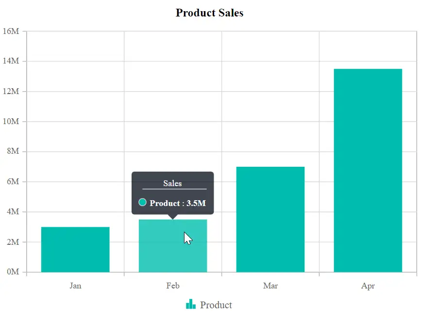
When space constraints prevent information from being displayed through data labels, tooltips provide an effective alternative. Tooltips can be enabled by setting the Enable property in ChartTooltipSettings to true.
@using Syncfusion.Blazor.Charts

<SfChart Title="Product Sales">
    <ChartPrimaryXAxis ValueType="Syncfusion.Blazor.Charts.ValueType.Category" />

    <ChartPrimaryYAxis LabelFormat="{value}M"  >

    </ChartPrimaryYAxis>

    <ChartTooltipSettings Enable="true"></ChartTooltipSettings>

    <ChartSeriesCollection>
        <ChartSeries DataSource="@SalesReports" Name="Text" XName="X" YName="Y" Type="ChartSeriesType.Column">
        </ChartSeries>
    </ChartSeriesCollection>
</SfChart>

@code{
    public class Data
    {
        public string X { get; set; }
        public double Y { get; set; }
        public string Text { get; set; }
    }

    public List<Data> SalesReports = new List<Data>
	{
       new Data{ X= "Jan", Y= 3, Text= "January" },
       new Data{ X= "Feb", Y= 3.5, Text= "February" },
       new Data{ X= "Mar", Y= 7, Text= "March" },
       new Data{ X= "Apr", Y= 13.5, Text= "April" }
    };
}
Tooltip format
By default, The tooltip displays x and y values of a data point. In addition, further information can be displayed in the tooltip. For example, the format $series.name $point.x displays series name and point x-value in the tooltip. The format can be specified using the Format property in ChartTooltipSettings.
@using Syncfusion.Blazor.Charts

<SfChart Title="Product Sales">
    <ChartPrimaryXAxis ValueType="Syncfusion.Blazor.Charts.ValueType.Category" />

    <ChartPrimaryYAxis LabelFormat="{value}M"></ChartPrimaryYAxis>

    <ChartTooltipSettings Enable="true" Header="Sales" Format="<b>${series.name} : ${point.y}</b>"></ChartTooltipSettings>

    <ChartSeriesCollection>
        <ChartSeries DataSource="@SalesReports" XName="X" YName="Y" Type="ChartSeriesType.Column">
        </ChartSeries>
    </ChartSeriesCollection>
</SfChart>

@code{
    public class Data
    {
        public string X { get; set; }
        public double Y { get; set; }
        public string Text { get; set; }
    }

    public List<Data> SalesReports = new List<Data>
	{
       new Data{ X= "Jan", Y= 3, Text= "January" },
       new Data{ X= "Feb", Y= 3.5, Text= "February" },
       new Data{ X= "Mar", Y= 7, Text= "March" },
       new Data{ X= "Apr", Y= 13.5, Text= "April" }
    };
}
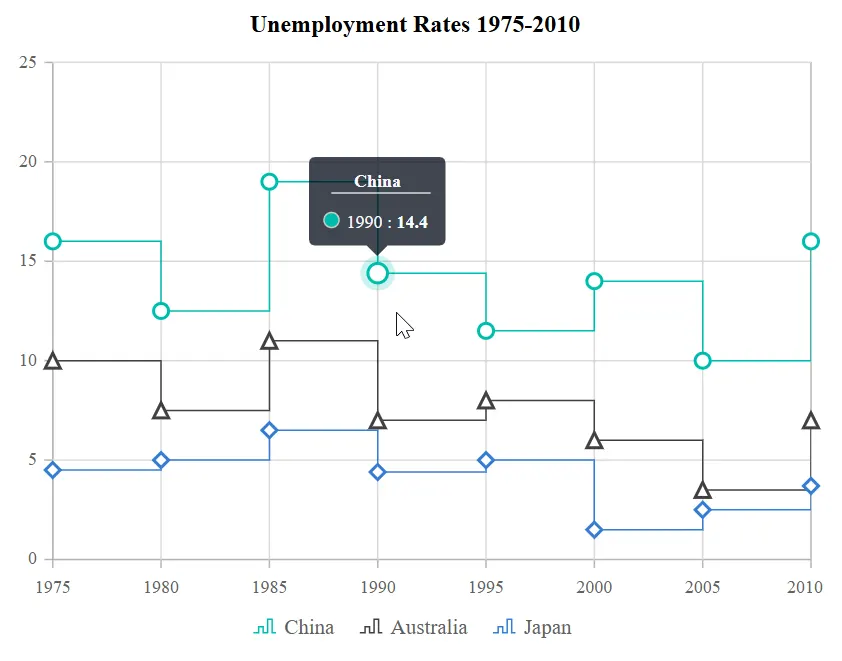
Tooltip template
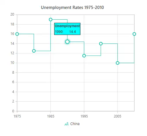
Any HTML elements can be displayed within the tooltip by using the Template property of the ChartTooltipSettings. You can use the data.X and data.Y as place holders in the HTML element to display x and y values of the corresponding data point.
@using Syncfusion.Blazor.Charts

<SfChart Title="Unemployment Rates 1975-2010">
    <ChartSeriesCollection>
        <ChartSeries DataSource="StepChartValues" Type="ChartSeriesType.StepLine" XName="Year" YName="YValue" Name="China">
            <ChartMarker Visible="true" Width="10" Height="10">
            </ChartMarker>
        </ChartSeries>
    </ChartSeriesCollection>
    <ChartTooltipSettings Enable="true">
        <Template>
            @{
                    var data = context as ChartTooltipInfo;
                    <div>
                        <table style="width:100%;  border: 1px solid black;">
                            <tr><th colspan="2" bgcolor="#00FFFF">Unemployment</th></tr>
                            <tr><td bgcolor="#00FFFF">@data.X:</td><td bgcolor="#00FFFF">@data.Y</td></tr>
                        </table>
                    </div>
                }
        </Template>
    </ChartTooltipSettings>
</SfChart>

@code{
    public List<StepChartData> StepChartValues = new List<StepChartData>
    {
        new StepChartData { Year = "1975", YValue = 16 },
        new StepChartData { Year = "1980", YValue = 12.5 },
        new StepChartData { Year = "1985", YValue = 19 },
        new StepChartData { Year = "1990", YValue = 14.4 },
        new StepChartData { Year = "1995", YValue = 11.5 },
        new StepChartData { Year = "2000", YValue = 14 },
        new StepChartData { Year = "2005", YValue = 10 },
        new StepChartData { Year = "2010", YValue = 16 }
    };

    public class StepChartData
    {
        public string Year { get; set; }
        public double YValue { get; set; }
    }
}
Shared Tooltip template
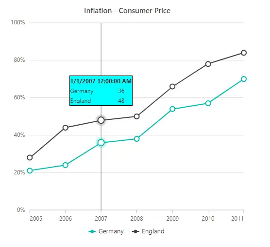
Any HTML elements can be displayed within the tooltip by using the Template property of the ChartTooltipSettings. You can use the data.X and data.Y as place holders in the HTML element to display x and y values of the corresponding data point. To show the tooltip for more than one series, enable the Shared property in ChartTooltipSettings
@using Syncfusion.Blazor.Charts

<SfChart>
    <ChartArea><ChartAreaBorder Width="0"></ChartAreaBorder></ChartArea>
    <ChartPrimaryXAxis ValueType="Syncfusion.Blazor.Charts.ValueType.DateTime" LabelFormat="yyyy" IntervalType="IntervalType.Years" EdgeLabelPlacement="EdgeLabelPlacement.Shift">
        <ChartAxisMajorGridLines Width="0"></ChartAxisMajorGridLines>
    </ChartPrimaryXAxis>
    <ChartPrimaryYAxis LabelFormat="{value}%" RangePadding="ChartRangePadding.None" Minimum="0" Maximum="100" Interval="20">
        <ChartAxisLineStyle Width="0"></ChartAxisLineStyle>
        <ChartAxisMajorTickLines Width="0"></ChartAxisMajorTickLines>
    </ChartPrimaryYAxis>
    <ChartTooltipSettings Enable="true" Shared="true">
        <Template>
            @{
                var data = context as List<ChartTooltipInfo>;
                <div>
                    <table style="width:100%;  border: 1px solid black;" class="table-borderless">
                        <tr>
                            <th colspan="2" bgcolor="#00FFFF">@data[0].X</th>
                        </tr>
                        <tr>
                            <td bgcolor="#00FFFF">Germany</td>
                            <td bgcolor="#00FFFF">@data[0].Y</td>
                        </tr>
                        <tr>
                            <td bgcolor="#00FFFF">England</td>
                            <td bgcolor="#00FFFF">@data[1].Y</td>
                        </tr>
                    </table>
                </div>
            }
        </Template>
    </ChartTooltipSettings>
    <ChartCrosshairSettings Enable="true" LineType="LineType.Vertical"></ChartCrosshairSettings>
    <ChartSeriesCollection>
        <ChartSeries DataSource="@ChartData" Name="Germany" XName="Period" Width="2"
                     Opacity="1" YName="ENG_InflationRate" Type="ChartSeriesType.Line">
            <ChartMarker Visible="true" Width="10" Height="10">
            </ChartMarker>
        </ChartSeries>
        <ChartSeries DataSource="@ChartData" Name="England" XName="Period" Width="2"
                     Opacity="1" YName="GER_InflationRate" Type="ChartSeriesType.Line">
            <ChartMarker Visible="true" Width="10" Height="10">
            </ChartMarker>
        </ChartSeries>
    </ChartSeriesCollection>
</SfChart>

@code {
    public List<LineChartData> ChartData = new List<LineChartData>
    {
        new LineChartData { Period = new DateTime(2005, 01, 01), ENG_InflationRate = 21, GER_InflationRate = 28 },
        new LineChartData { Period = new DateTime(2006, 01, 01), ENG_InflationRate = 24, GER_InflationRate = 44 },
        new LineChartData { Period = new DateTime(2007, 01, 01), ENG_InflationRate = 36, GER_InflationRate = 48 },
        new LineChartData { Period = new DateTime(2008, 01, 01), ENG_InflationRate = 38, GER_InflationRate = 50 },
        new LineChartData { Period = new DateTime(2009, 01, 01), ENG_InflationRate = 54, GER_InflationRate = 66 },
        new LineChartData { Period = new DateTime(2010, 01, 01), ENG_InflationRate = 57, GER_InflationRate = 78 },
        new LineChartData { Period = new DateTime(2011, 01, 01), ENG_InflationRate = 70, GER_InflationRate = 84 }
    };
    public class LineChartData
    {
        public DateTime Period { get; set; }
        public double ENG_InflationRate { get; set; }
        public double GER_InflationRate { get; set; }
    }
}
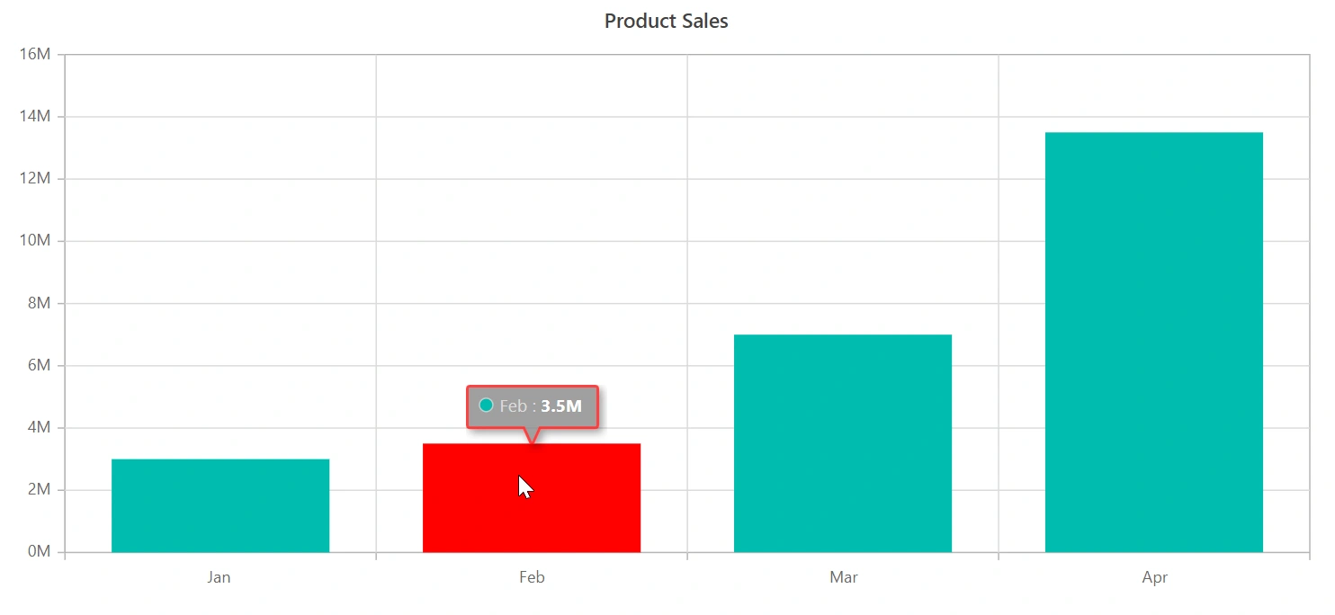
Tooltip customization
The Fill and Border properties are used to customize the background color and the border of the tooltip respectively. The ChartTooltipTextStyle is used to customize the tooltip text. The HighlightColor property is used to customize the point color while hovering for tooltip.
@using Syncfusion.Blazor.Charts

<SfChart Title="Product Sales" HighlightColor="red">
    <ChartPrimaryXAxis ValueType="Syncfusion.Blazor.Charts.ValueType.Category" />

    <ChartPrimaryYAxis LabelFormat="{value}M" >

    </ChartPrimaryYAxis>

    <ChartTooltipSettings Enable="true" Fill="gray">
        <ChartTooltipBorder Color="#FF0000"  Width="2"></ChartTooltipBorder>
    </ChartTooltipSettings>

    <ChartSeriesCollection>
        <ChartSeries DataSource="@SalesReports" XName="X" YName="Y" Type="ChartSeriesType.Column">
        </ChartSeries>
    </ChartSeriesCollection>
</SfChart>

@code{
    public class Data
    {
        public string X { get; set; }
        public double Y { get; set; }
        public string Text { get; set; }
    }

    public List<Data> SalesReports = new List<Data>
	{
       new Data{ X= "Jan", Y= 3, Text= "January" },
       new Data{ X= "Feb", Y= 3.5, Text= "February" },
       new Data{ X= "Mar", Y= 7, Text= "March" },
       new Data{ X= "Apr", Y= 13.5, Text= "April" }
    };
}
Enabling highlight for series with tooltip
By enabling the EnableHighlight property in ChartTooltipSettings, all points in the hovered series will be highlighted, while points in other series are dimmed. This feature enhances focus and clarity by drawing attention to the selected series.
@using Syncfusion.Blazor.Charts

<SfChart Title="Unemployment Rates 1975-2010">
    <ChartSeriesCollection>
        <ChartSeries DataSource="StepChartValues" Type="Syncfusion.Blazor.Charts.ChartSeriesType.StepLine" XName="Year" YName="Y" Name="China">
            <ChartMarker Visible="true" Width="10" Height="10">
            </ChartMarker>
        </ChartSeries>
        <ChartSeries DataSource="StepChartValues" Type="Syncfusion.Blazor.Charts.ChartSeriesType.StepLine" XName="Year" YName="Y1" Name="Australia">
            <ChartMarker Visible="true" Width="10" Height="10">
            </ChartMarker>
        </ChartSeries>
        <ChartSeries DataSource="StepChartValues" Type="Syncfusion.Blazor.Charts.ChartSeriesType.StepLine" XName="Year" YName="Y2" Name="Japan">
            <ChartMarker Visible="true" Width="10" Height="10">
            </ChartMarker>
        </ChartSeries>
    </ChartSeriesCollection>
    <ChartTooltipSettings Enable="true" EnableHighlight="true">
    </ChartTooltipSettings>
</SfChart>

@code {
    public List<StepChartData> StepChartValues = new List<StepChartData>
    {
        new StepChartData { Year = "1975", Y = 16, Y1 = 10, Y2 = 4.5 },
        new StepChartData { Year = "1980", Y = 12.5, Y1 = 7.5, Y2 = 5},
        new StepChartData { Year = "1985", Y = 19, Y1 = 11, Y2 = 6.5 },
        new StepChartData { Year = "1990", Y = 14.4, Y1 = 7, Y2 = 4.4 },
        new StepChartData { Year = "1995", Y = 11.5, Y1 = 8, Y2 = 5 },
        new StepChartData { Year = "2000", Y = 14, Y1 = 6, Y2 = 1.5 },
        new StepChartData { Year = "2005", Y = 10, Y1 = 3.5, Y2 = 2.5 },
        new StepChartData { Year = "2010", Y = 16, Y1 = 7, Y2 = 3.7 }
    };

    public class StepChartData
    {
        public string Year { get; set; }
        public double Y { get; set; }
        public double Y1 { get; set; }
        public double Y2 { get; set; }
    }
}
Displaying tooltip for nearest data point
The ShowNearestTooltip property in the ChartTooltipSettings displays tooltip for the data point nearest to the cursor. It automatically identifies and highlights the closest point within a defined interaction zone, enhancing usability and accessibility, especially when dealing with densely packed or overlapping data points.
NOTE
By default,
ShowNearestTooltipproperty in ChartSeries is set to false for all series. When this property is enabled for a specificChartSeries, the tooltip is displayed for the nearest data point in that series.
@using Syncfusion.Blazor.Charts

<SfChart Title="Unemployment Rates 1975-2010">
    <ChartSeriesCollection>
        <ChartSeries DataSource="StepChartValues" Type="Syncfusion.Blazor.Charts.ChartSeriesType.StepLine" XName="Year" YName="Y" Name="China">
            <ChartMarker Visible="true" Width="10" Height="10">
            </ChartMarker>
        </ChartSeries>
        <ChartSeries DataSource="StepChartValues" Type="Syncfusion.Blazor.Charts.ChartSeriesType.StepLine" XName="Year" YName="Y1" Name="Australia" ShowNearestTooltip="false">
            <ChartMarker Visible="true" Width="10" Height="10">
            </ChartMarker>
        </ChartSeries>
        <ChartSeries DataSource="StepChartValues" Type="Syncfusion.Blazor.Charts.ChartSeriesType.StepLine" XName="Year" YName="Y2" Name="Japan">
            <ChartMarker Visible="true" Width="10" Height="10">
            </ChartMarker>
        </ChartSeries>
    </ChartSeriesCollection>
    <ChartTooltipSettings Enable="true" ShowNearestTooltip="true">
    </ChartTooltipSettings>
</SfChart>

@code {
    public List<StepChartData> StepChartValues = new List<StepChartData>
    {
        new StepChartData { Year = "1975", Y = 16, Y1 = 10, Y2 = 4.5 },
        new StepChartData { Year = "1980", Y = 12.5, Y1 = 7.5, Y2 = 5},
        new StepChartData { Year = "1985", Y = 19, Y1 = 11, Y2 = 6.5 },
        new StepChartData { Year = "1990", Y = 14.4, Y1 = 7, Y2 = 4.4 },
        new StepChartData { Year = "1995", Y = 11.5, Y1 = 8, Y2 = 5 },
        new StepChartData { Year = "2000", Y = 14, Y1 = 6, Y2 = 1.5 },
        new StepChartData { Year = "2005", Y = 10, Y1 = 3.5, Y2 = 2.5 },
        new StepChartData { Year = "2010", Y = 16, Y1 = 7, Y2 = 3.7 }
    };

    public class StepChartData
    {
        public string Year { get; set; }
        public double Y { get; set; }
        public double Y1 { get; set; }
        public double Y2 { get; set; }
    }
}
NOTE
Refer to the Blazor Charts feature tour page for its groundbreaking feature representations and also explore the Blazor Chart Example to know various chart types and how to represent time-dependent data, showing trends at equal intervals.