Getting Started with Blazor CircularGauge Component
24 Mar 20257 minutes to read
This section briefly explains about how to include Blazor CircularGauge component in your Blazor WebAssembly App using Visual Studio and Visual Studio Code.
To get started quickly with Blazor CircularGauge component, check on the following video:
Prerequisites
Create a new Blazor App in Visual Studio
You can create a Blazor WebAssembly App using Visual Studio via Microsoft Templates or the Syncfusion® Blazor Extension.
Install Syncfusion® Blazor CircularGauge and Themes NuGet in the App
To add Blazor CircularGauge component in the app, open the NuGet package manager in Visual Studio (Tools → NuGet Package Manager → Manage NuGet Packages for Solution), search and install Syncfusion.Blazor.CircularGauge and Syncfusion.Blazor.Themes. Alternatively, you can utilize the following package manager command to achieve the same.
Install-Package Syncfusion.Blazor.CircularGauge -Version 29.1.33
Install-Package Syncfusion.Blazor.Themes -Version 29.1.33
NOTE
Syncfusion® Blazor components are available in nuget.org. Refer to NuGet packages topic for available NuGet packages list with component details.
Prerequisites
Create a new Blazor App in Visual Studio Code
You can create a Blazor WebAssembly App using Visual Studio Code via Microsoft Templates or the Syncfusion® Blazor Extension.
Alternatively, you can create a WebAssembly application using the following command in the terminal(Ctrl+`).
dotnet new blazorwasm -o BlazorApp
cd BlazorApp
Install Syncfusion® Blazor CircularGauge and Themes NuGet in the App
- Press Ctrl+` to open the integrated terminal in Visual Studio Code.
- Ensure you’re in the project root directory where your
.csprojfile is located. - Run the following command to install a Syncfusion.Blazor.CircularGauge and Syncfusion.Blazor.Themes NuGet package and ensure all dependencies are installed.
dotnet add package Syncfusion.Blazor.CircularGauge -v 29.1.33
dotnet add package Syncfusion.Blazor.Themes -v 29.1.33
dotnet restore
NOTE
Syncfusion® Blazor components are available in nuget.org. Refer to NuGet packages topic for available NuGet packages list with component details.
Register Syncfusion® Blazor Service
Open ~/_Imports.razor file and import the Syncfusion.Blazor and Syncfusion.Blazor.CircularGauge namespace.
@using Syncfusion.Blazor
@using Syncfusion.Blazor.CircularGauge
Now, register the Syncfusion® Blazor Service in the ~/Program.cs file of your Blazor WebAssembly App.
using Microsoft.AspNetCore.Components.Web;
using Microsoft.AspNetCore.Components.WebAssembly.Hosting;
using Syncfusion.Blazor;

var builder = WebAssemblyHostBuilder.CreateDefault(args);
builder.RootComponents.Add<App>("#app");
builder.RootComponents.Add<HeadOutlet>("head::after");

builder.Services.AddScoped(sp => new HttpClient { BaseAddress = new Uri(builder.HostEnvironment.BaseAddress) });

builder.Services.AddSyncfusionBlazor();
await builder.Build().RunAsync();
....
Add stylesheet and script resources
The theme stylesheet and script can be accessed from NuGet through Static Web Assets. Include the stylesheet and script references in the <head> section of the ~/index.html file.
<head>
    ....
    <link href="_content/Syncfusion.Blazor.Themes/bootstrap5.css" rel="stylesheet" />
    <script src="_content/Syncfusion.Blazor.Core/scripts/syncfusion-blazor.min.js" type="text/javascript"></script>
</head>
NOTE
Check out the Blazor Themes topic to discover various methods (Static Web Assets, CDN, and CRG) for referencing themes in your Blazor application. Also, check out the Adding Script Reference topic to learn different approaches for adding script references in your Blazor application.
Add Blazor CircularGauge component
Add the Syncfusion® Blazor CircularGauge component in the ~/Pages/Index.razor file.
<SfCircularGauge>
    <CircularGaugeAxes>
        <CircularGaugeAxis>
            <CircularGaugePointers>
                <CircularGaugePointer></CircularGaugePointer>
            </CircularGaugePointers>
        </CircularGaugeAxis>
    </CircularGaugeAxes>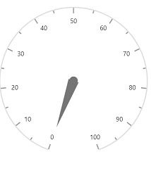
</SfCircularGauge>- Press Ctrl+F5 (Windows) or ⌘+F5 (macOS) to launch the application. This will render the Syncfusion® Blazor CircularGauge component in your default web browser.
Set pointer value
Pointers are used to indicate values on an axis. You can change the pointer value using the Value property in CircularGaugePointer.
NOTE
In CircularGauge, you can configure multiple axes. On each axis, you can add a pointer.
<SfCircularGauge>
    <CircularGaugeAxes>
        <CircularGaugeAxis>
            <CircularGaugePointers>
                <CircularGaugePointer Value="35">
                </CircularGaugePointer>
            </CircularGaugePointers>
        </CircularGaugeAxis>
    </CircularGaugeAxes>
</SfCircularGauge>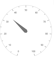
Adding title for Blazor CircularGauge
Title can be added to the CircularGauge to provide a quick information to the users about the context of the rendered CircularGauge. You can add a title using Title property in SfCircularGauge.
<SfCircularGauge Title="Speedometer">
    <CircularGaugeTitleStyle Color="blue" FontWeight="bold" Size="25"></CircularGaugeTitleStyle>
    <CircularGaugeAxes>
        <CircularGaugeAxis>
            <CircularGaugePointers>
                <CircularGaugePointer>
                </CircularGaugePointer>
            </CircularGaugePointers>
        </CircularGaugeAxis>
    </CircularGaugeAxes>
</SfCircularGauge>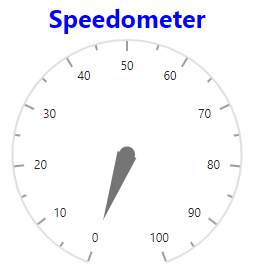
Adding ranges in the Blazor CircularGauge
Range is used to specify a group of scale values in the gauge. You can set the range start and end using Start and End properties in the CircularGaugeRange.
<SfCircularGauge>
    <CircularGaugeAxes>
        <CircularGaugeAxis>
            <CircularGaugeRanges>
                <CircularGaugeRange Start="40" End="80">
                </CircularGaugeRange>
            </CircularGaugeRanges>
        </CircularGaugeAxis>
    </CircularGaugeAxes>
</SfCircularGauge>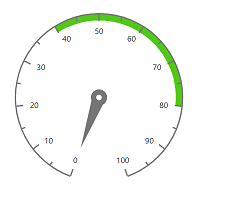
NOTE