Getting Started with Blazor ComboBox Component in Blazor Web App
7 Jul 20268 minutes to read
This section briefly explains how to include the Blazor ComboBox component in your Blazor Web App using Visual Studio, Visual Studio Code, and the .NET CLI.
Create a new Blazor Web App
Create a Blazor Web App using Visual Studio via Microsoft Templates or the Blazor Extension.
Run the following command to create a new Blazor Web App.
dotnet new blazor -o BlazorWebApp --interactivity Auto
cd BlazorWebApp
cd BlazorWebApp.Client
Alternatively, create a Blazor Web App using Visual Studio Code via Microsoft Templates, the Blazor Extension, or the C# Dev Kit extension.
Run the following command to create a new Blazor Web App.
dotnet new blazor -o BlazorWebApp --interactivity Auto
cd BlazorWebApp
cd BlazorWebApp.Client
NOTE
Configure the appropriate Interactive render mode and Interactivity location while creating a Blazor Web App. For detailed information, refer to the interactive render mode documentation.
Install the required Blazor packages
Install the Syncfusion.Blazor.DropDowns and Syncfusion.Blazor.Themes NuGet packages. All Syncfusion Blazor packages are available on nuget.org. See the NuGet packages topic for details. If using the WebAssembly or Auto render modes in the Blazor Web App, install these packages in the .Client project.
- Go to Tools → NuGet Package Manager → Manage NuGet Packages for Solution.
- Search the required NuGet packages (
Syncfusion.Blazor.DropDownsandSyncfusion.Blazor.Themes) and install them.
Alternatively, you can install the same packages using the Package Manager Console with the following commands.
Install-Package Syncfusion.Blazor.DropDowns -Version 34.1.29
Install-Package Syncfusion.Blazor.Themes -Version 34.1.29
Open the terminal and run the following commands.
dotnet add package Syncfusion.Blazor.DropDowns -v 34.1.29
dotnet add package Syncfusion.Blazor.Themes -v 34.1.29
Open the command prompt and run the following commands.
dotnet add package Syncfusion.Blazor.DropDowns -v 34.1.29
dotnet add package Syncfusion.Blazor.Themes -v 34.1.29
Add import namespaces
After the packages are installed, open the ~/_Imports.razor file in the .Client project and import the Syncfusion.Blazor and Syncfusion.Blazor.DropDowns namespaces.
@using Syncfusion.Blazor
@using Syncfusion.Blazor.DropDowns
Register the Blazor service
Open the Program.cs file in the Blazor Web App and register the Blazor service. If the Interactive Render Mode is set to WebAssembly or Auto, register the Blazor service in Program.cs files of both the server and client projects in your Blazor Web App.
....
using Syncfusion.Blazor;
....
builder.Services.AddSyncfusionBlazor();
....
Add stylesheet and script resources
The theme stylesheet and script can be accessed from NuGet through Static Web Assets. Include the stylesheet and the script references in the App.razor file.
...
<link href="_content/Syncfusion.Blazor.Themes/fluent2.css" rel="stylesheet" />
...
<script src="_content/Syncfusion.Blazor.Core/scripts/syncfusion-blazor.min.js" type="text/javascript"></script>
Add Blazor ComboBox component
Open a Razor file located in the ~/Pages/*.razor (for example, Home.razor) and add the Blazor ComboBox component inside the Razor file.
NOTE
If the interactivity location is set to
Per page/componentin the Web App, define a render mode at the top of the Razor file (for example,InteractiveServer,InteractiveWebAssembly, orInteractiveAuto). If the interactivity is set toGlobalwithAutoorWebAssembly, the render mode is configured in theApp.razorfile by default.
@rendermode InteractiveAuto

<SfComboBox TValue="string" TItem="string" Placeholder="Select a game"></SfComboBox>
Run the application
Press Ctrl+F5 (Windows) or ⌘+F5 (macOS) to launch the application. The Blazor ComboBox component will render in your default web browser.
Open the terminal and navigate to the main project folder (for example, BlazorWebApp) and run the following command.
cd ..
cd BlazorWebApp
dotnet run
Open the command prompt and navigate to the main project folder (for example, BlazorWebApp) and run the following command.
cd ..
cd BlazorWebApp
dotnet run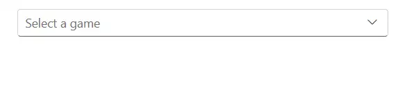
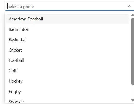
Binding data source
After initializing, populate the ComboBox with data using the DataSource property. Here, an array of string values is passed to the ComboBox component.
<SfComboBox TValue="string" TItem="Games" Placeholder="Select a game" DataSource="@LocalData">
    <ComboBoxFieldSettings Value="ID" Text="Text"></ComboBoxFieldSettings>
</SfComboBox>

@code
{
  public class Games
  {
    public string ID { get; set; }
    public string Text { get; set; }
  }
  List<Games> LocalData = new List<Games> {
    new Games() { ID= "Game1", Text= "American Football" },
    new Games() { ID= "Game2", Text= "Badminton" },
    new Games() { ID= "Game3", Text= "Basketball" },
    new Games() { ID= "Game4", Text= "Cricket" },
    new Games() { ID= "Game5", Text= "Football" },
    new Games() { ID= "Game6", Text= "Golf" },
    new Games() { ID= "Game7", Text= "Hockey" },
    new Games() { ID= "Game8", Text= "Rugby"},
    new Games() { ID= "Game9", Text= "Snooker" },
    new Games() { ID= "Game10", Text= "Tennis"},
  };
}
Custom values
The ComboBox allows users to input custom values that are not present in the predefined list. This support is enabled by the AllowCustom property. In this case, the text and value are treated as identical, and the custom value is posted with the form on submit.
<SfComboBox TValue="string" TItem="Games" AllowCustom="true" Placeholder="Select a game" DataSource="@LocalData">
    <ComboBoxFieldSettings Value="ID" Text="Text"></ComboBoxFieldSettings>
</SfComboBox>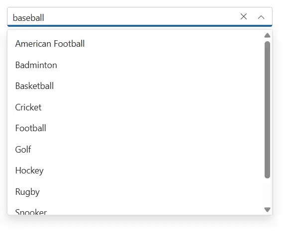
Configure the popup list
By default, the popup list width automatically matches the ComboBox input width, and the popup height is 350px. The height and width can be customized using the PopupHeight and PopupWidth properties, respectively.
<SfComboBox TValue="string" TItem="Games" PopupHeight="350px" PopupWidth="350px" Placeholder="Select a game" DataSource="@LocalData">
    <ComboBoxFieldSettings Value="ID" Text="Text"></ComboBoxFieldSettings>
</SfComboBox>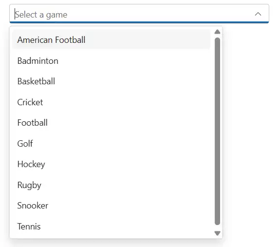
NOTE