Connector Customization in Blazor Diagram Component
3 Jul 202624 minutes to read
How to Customize Connector Decorators
Diagram allows you to customize the connector appearances. The following topics describe how to customize several properties of connectors.
-
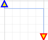
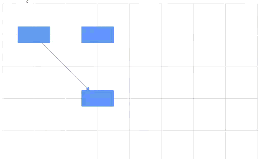
The starting and ending points of a connector can be decorated with shapes such as arrows, circles, diamonds, or custom paths. The connection end points can be decorated with the SourceDecorator and TargetDecorator properties of the connector.
-
The Shape property of
SourceDecoratorallows you to define the shape of the source decorator. Similarly, theShapeproperty ofTargetDecoratorallows to define the shape of the target decorator. -
To create custom shape for source decorator, use the PathData property. Similarly, to create custom shape for the target decorator, use the
PathDataproperty.
To learn more about connector customization, watch the following video:
- The following code example illustrates how to create decorators of various shapes.
@using Syncfusion.Blazor.Diagram

<SfDiagramComponent Width="1000px" Height="500px" Connectors="@connectors">
</SfDiagramComponent>

@code
{
    //Defines diagram's connector collection.
    DiagramObjectCollection<Connector> connectors = new DiagramObjectCollection<Connector>();

    protected override void OnInitialized()
    {
        Connector Connector = new Connector()
        {
            ID = "connector1",
            SourcePoint = new DiagramPoint()
            {
                X = 100,
                Y = 100
            },
            TargetPoint = new DiagramPoint() { X = 200, Y = 200 },
            Style = new ShapeStyle() { StrokeColor = "#6f409f", StrokeWidth = 1 },
            Type = ConnectorSegmentType.Orthogonal,
            SourceDecorator = new DecoratorSettings()
            {
                Shape = DecoratorShape.Circle,
                Style = new ShapeStyle() { StrokeColor = "#37909A", Fill = "#37909A", StrokeWidth = 1 }
            },
            TargetDecorator = new DecoratorSettings()
            {
                Shape = DecoratorShape.Custom,
                PathData = "M80.5,12.5 C80.5,19.127417 62.59139,24.5 40.5,24.5 C18.40861,24.5 0.5,19.127417 0.5,12.5 C0.5,5.872583 18.40861,0.5 40.5,0.5 C62.59139,0.5 80.5,5.872583 80.5,12.5 z",
                Style = new ShapeStyle()
                {
                    StrokeColor = "#37909A",
                    Fill = "#37909A",
                    StrokeWidth = 1,
                }
            }
        };
        connectors.Add(Connector);
    }
}A complete working sample can be downloaded from GitHub
How to Customize Connector Decorator Appearance
-
The source decorator’s StrokeColor, StrokeWidth, and StrokeDashArray properties customize the border color, width, and stroke pattern.
-
For the target decorator, configure the same properties (StrokeColor, StrokeWidth, and StrokeDashArray) to achieve the desired appearance.
The following code example illustrates how to customize the decorator appearance.
@using Syncfusion.Blazor.Diagram

<SfDiagramComponent Width="1000px" Height="500px" Connectors="@connectors">
</SfDiagramComponent>

@code
{
    DiagramObjectCollection<Connector> connectors = new DiagramObjectCollection<Connector>();

    protected override void OnInitialized()
    {
        Connector Connector = new Connector()
        {
            ID = "connector1",
            Style = new ShapeStyle()
            {
                Fill = "#6495ED",
                StrokeColor = "#6495ED",
                StrokeWidth = 1
            },
            SourcePoint = new DiagramPoint()
            {
                X = 100,
                Y = 100
            },
            TargetPoint = new DiagramPoint()
            {
                X = 200,
                Y = 200
            },
            Type = ConnectorSegmentType.Orthogonal,
            SourceDecorator = new DecoratorSettings()
            {
                Shape = DecoratorShape.Arrow,
                Height = 15,
                Width = 15,
                Style = new ShapeStyle() { StrokeColor = "blue", Fill = "yellow", StrokeWidth = 3 }
            },
            TargetDecorator = new DecoratorSettings()
            {
                Shape = DecoratorShape.Arrow,
                Height = 15,
                Width = 15,
                Style = new ShapeStyle()
                {
                    StrokeColor = "red",
                    Fill = "yellow",
                    StrokeWidth = 3
                }
            }

        };
        connectors.Add(Connector);
    }
}
A complete working sample can be downloaded from GitHub
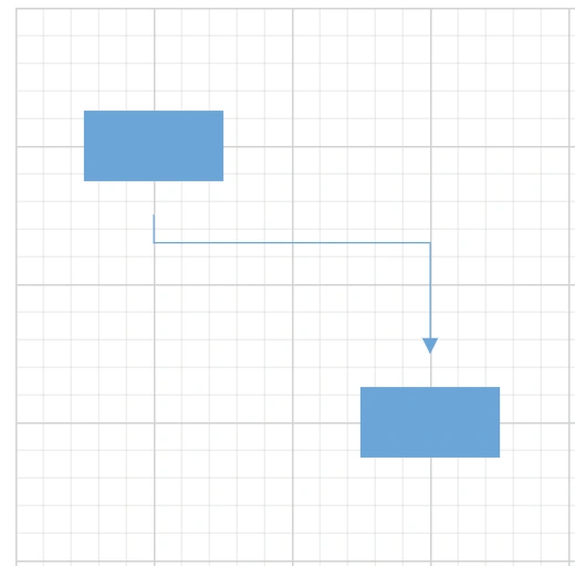
How to Set Padding for Connector
Padding adds space between the connector’s end point and the object to where it is connected.
-
The connector’s SourcePadding defines the space between the source point and the source node of the connector.
-
The connector’s TargetPadding defines the space between the end point and the target node of the connector.
-
The following code example shows how to set padding between connection endpoints and the connected nodes.
@using Syncfusion.Blazor.Diagram

<SfDiagramComponent Width="1000px" Height="500px" Connectors="@connectors" Nodes="@nodes">
</SfDiagramComponent>

@code
{
    //Defines diagram's nodes collection.
    DiagramObjectCollection<Node> nodes = new DiagramObjectCollection<Node>();
    //Defines diagram's connector collection.
    DiagramObjectCollection<Connector> connectors = new DiagramObjectCollection<Connector>();

    protected override void OnInitialized()
    {
        nodes = new DiagramObjectCollection<Node>()
        {
          new Node()
          {
                OffsetX = 100,
                OffsetY = 100,
                Height = 50,
                Width = 100,
                ID = "node1",
                Style = new ShapeStyle() { Fill = "#6BA5D7", StrokeColor = "#6BA5D7" },
                Shape = new BasicShape() { Type = NodeShapes.Basic, Shape = NodeBasicShapes.Rectangle }
          },
          new Node()
          {
                OffsetX = 300,
                OffsetY = 300,
                Height = 50,
                Width = 100,
                ID = "node2",
                Style = new ShapeStyle(){ Fill = "#6BA5D7", StrokeColor = "#6BA5D7" },
                Shape = new BasicShape() { Type = NodeShapes.Basic, Shape = NodeBasicShapes.Rectangle }
          }
        };
        Connector Connector = new Connector()
        {
            ID = "connector1",
            SourceID = "node1",
            TargetID = "node2",
            //Specifies the source and target padding values.
            SourcePadding = 20,
            TargetPadding = 20,
            TargetDecorator = new DecoratorSettings()
            {
                Shape = DecoratorShape.Arrow,
                Style = new ShapeStyle() { Fill = "#6BA5D7", StrokeColor = "#6BA5D7", StrokeWidth = 1 }
            },
            Style = new ShapeStyle()
            {
                StrokeColor = "#6BA5D7",
                StrokeWidth = 1
            },
            Type = ConnectorSegmentType.Orthogonal
        };
        connectors.Add(Connector);
    }
}
A complete working sample can be downloaded from GitHub
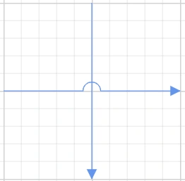
How to Enable Bridging
Line bridging draws a small arc where one connector crosses another to visually indicate the crossing. By default, BridgeDirection is Top. Depending upon the direction given bridging direction appears. Bridging can be enabled or disabled either with the Connector.Constraints on a connector or Diagram.Constraints on the diagram.
To learn more about connector bridging, watch the following segment:
The following code example illustrates how to enable line bridging.
@using Syncfusion.Blazor.Diagram

<SfDiagramComponent Width="1000px"@bind-Constraints="@diagramConstraints" Height="500px" Connectors="@connectors">
</SfDiagramComponent>

@code
{
    DiagramConstraints diagramConstraints = DiagramConstraints.Default | DiagramConstraints.Bridging;
    DiagramObjectCollection<Connector> connectors = new DiagramObjectCollection<Connector>();

    protected override void OnInitialized()
    {
        Connector Connector1 = new Connector()
        {
            ID = "connector1",
            // Bridge space value has been defined.
            BridgeSpace = 20,
            Style = new ShapeStyle()
            {
                Fill = "#6495ED",
                StrokeColor = "#6495ED",
                StrokeWidth = 1
            },
            SourcePoint = new DiagramPoint()
            {
                X = 200 , Y = 200
            },
            TargetPoint = new DiagramPoint()
            {
                X = 400,
                Y = 200
            },
            Type = ConnectorSegmentType.Orthogonal,
            TargetDecorator = new DecoratorSettings()
            {
                Shape = DecoratorShape.Arrow ,
                Style = new ShapeStyle()
                {
                    Fill = "#6495ED",
                    StrokeColor = "#6495ED",
                    StrokeWidth = 1
                }
            }
        };
        connectors.Add(Connector1);
        Connector Connector2 = new Connector()
        {
            ID = "connector2",
            Style = new ShapeStyle()
            {
                Fill = "#6495ED",
                StrokeColor = "#6495ED",
                StrokeWidth = 1
            },
            SourcePoint = new DiagramPoint()
            {
                X = 300,
                Y = 100
            },
            TargetPoint = new DiagramPoint()
            {
                X = 300,
                Y = 300
            },
            Type = ConnectorSegmentType.Orthogonal,
            TargetDecorator = new DecoratorSettings()
            {
                Shape = DecoratorShape.Arrow,
                Style = new ShapeStyle()
                {
                    Fill = "#6495ED",
                    StrokeColor = "#6495ED",
                    StrokeWidth = 1
                }
            }
        };
        connectors.Add(Connector2);
    }
}
A complete working sample can be downloaded from GitHub
Note: Bridging support is not applicable for layout.
The BridgeSpace property of connectors define the width of the line bridging. The default value is 10 pixels.
Limitation: BezierSegment does not support bridging.
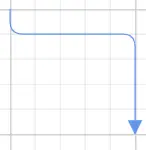
How to Update Corner Radius for Connector
Corner radius rounds the corners of connectors. Set the radius using the CornerRadius property.
@using Syncfusion.Blazor.Diagram

<SfDiagramComponent Width="1000px"  Height="500px" Connectors="@connectors">
</SfDiagramComponent>

@code
{
    DiagramObjectCollection<Connector> connectors = new DiagramObjectCollection<Connector>();

    protected override void OnInitialized()
    {
        Connector Connector = new Connector()
        {
            ID = "connector1",
            Style = new ShapeStyle()
            {
                Fill = "#6495ED",
                StrokeColor = "#6495ED",
                StrokeWidth = 1
            },
            SourcePoint = new DiagramPoint()
            {
                X = 100,
                Y = 100
            },
            TargetPoint = new DiagramPoint()
            {
                X = 200,
                Y = 200
            },
            //Specify the corner radius value.
            CornerRadius = 10,
            Type = ConnectorSegmentType.Orthogonal,
            TargetDecorator = new DecoratorSettings()
            {
                Shape = DecoratorShape.Arrow,
                Style = new ShapeStyle()
                {
                    Fill = "#6495ED",
                    StrokeColor = "#6495ED",
                    StrokeWidth = 1
                }
            }
        };
        connectors.Add(Connector);
    }
}
A complete working sample can be downloaded from GitHub
Limitation: BezierSegment does not support corner radius.
How to Customize Connector Appearance
-
The connector’s StrokeWidth, StrokeColor, StrokeDashArray, and Opacity properties customize the segment appearance.
-
The IsVisible property determines whether the connector is visible.
-
Default values for all Connectors can be set using the ConnectorCreating event callback method. For example, if all connectors have the same type or property, then such properties can be moved into
ConnectorCreating.
How to Customize Connector Segment Appearance
The following code example illustrates how to customize the segment appearance.
@using Syncfusion.Blazor.Diagram

<SfDiagramComponent Width="1000px" Height="500px" Connectors="@connectors">
</SfDiagramComponent>

@code
{
    DiagramObjectCollection<Connector> connectors = new DiagramObjectCollection<Connector>();

    protected override void OnInitialized()
    {
        Connector Connector1 = new Connector()
        {
            ID = "connector1",
            SourcePoint = new DiagramPoint()
            {
                X = 100,
                Y = 100
            },
            TargetPoint = new DiagramPoint()
            {
                X = 200,
                Y = 200
            },
            Style = new ShapeStyle()
            {
                StrokeColor = "red",
                StrokeWidth = 2,
                StrokeDashArray = "2,2"
            },
            Type = ConnectorSegmentType.Orthogonal,
            TargetDecorator = new DecoratorSettings()
            {
                Shape = DecoratorShape.Arrow,
                Style = new ShapeStyle()
                {
                    Fill = "#6f409f",
                    StrokeColor = "#6f409f",
                    StrokeWidth = 1
                }
            }
        };
        connectors.Add(Connector1);
    }
}A complete working sample can be downloaded from GitHub
How to Enable or Disable Connector Behavior
-
The Constraints property of a connector enables or disables certain features of connectors.
-
For detailed information, see Connector Constraints.
The following code illustrates how to disable selection.
@using Syncfusion.Blazor.Diagram

<SfDiagramComponent Width="1000px" Height="500px" Connectors="@connectors">
</SfDiagramComponent>

@code
{
    DiagramObjectCollection<Connector> connectors = new DiagramObjectCollection<Connector>();

    protected override void OnInitialized()
    {
        Connector Connector = new Connector()
        {
            ID = "connector1",
            SourcePoint = new DiagramPoint()
            {
                X = 100,
                Y = 100
            },
            TargetPoint = new DiagramPoint()
            {
                X = 200,
                Y = 200
            },
            Type = ConnectorSegmentType.Orthogonal,
            TargetDecorator = new DecoratorSettings()
            {
                Shape = DecoratorShape.Arrow,
                Style = new ShapeStyle()
                {
                    Fill = "black",
                    StrokeColor = "black",
                    StrokeWidth = 1
                }
            },
            Style = new ShapeStyle()
            {
                StrokeColor = "black",
                StrokeWidth = 1
            },
            //Disable the select constraint.
            Constraints = ConnectorConstraints.Default & ~ConnectorConstraints.Select,
        };
        connectors.Add(Connector);
    }
}A complete working sample can be downloaded from GitHub
How to Add Additional Information for Connector
- Use the AdditionalInfo property of a connector allows you to maintain additional information for the connector.
@using Syncfusion.Blazor.Diagram

<SfDiagramComponent Width="1000px" Height="500px" Connectors="@connectors">
</SfDiagramComponent>

@code
{
    DiagramObjectCollection<Connector> connectors = new DiagramObjectCollection<Connector>();

    protected override void OnInitialized()
    {
        Dictionary<string, object> ConnectorInfo = new Dictionary<string, object>();
        ConnectorInfo.Add("connectorInfo", "Central Connector");
        Connector Connector = new Connector()
        {
            ID = "connector1",
            SourcePoint = new DiagramPoint()
            {
                X = 100,
                Y = 100
            },
            TargetPoint = new DiagramPoint()
            {
                X = 200,
                Y = 200
            },
            Type = ConnectorSegmentType.Orthogonal,
            TargetDecorator = new DecoratorSettings()
            {
                Shape = DecoratorShape.Arrow,
                Style = new ShapeStyle()
                {
                    Fill = "black",
                    StrokeColor = "black",
                    StrokeWidth = 1
                }
            },
            Style = new ShapeStyle()
            {
                StrokeColor = "black",
                StrokeWidth = 1
            },
            //Define the add info value.
            AdditionalInfo = ConnectorInfo
        };
        connectors.Add(Connector);
    }
}A complete working sample can be downloaded from GitHub
How to Set Connector Z-Index
- The connector’s ZIndex property specifies the stack order of the connector. A connector with a higher
ZIndexis rendered above one with a lowerZIndex. The default value is -1.
The following code illustrates how to render a connector based on stack order.
@using Syncfusion.Blazor.Diagram
@using System.Collections.ObjectModel

<SfDiagramComponent Width="1000px" Height="500px" Connectors="@connectors">
    <SnapSettings Constraints="@snapConstraints"></SnapSettings>
</SfDiagramComponent>

@code
{
    SnapConstraints snapConstraints = SnapConstraints.None;
    //Define the diagram's connector collection.
    DiagramObjectCollection<Connector> connectors = new DiagramObjectCollection<Connector>();

    protected override void OnInitialized()
    {
        Connector Connector = new Connector()
        {
            ID = "connector1",
            // Set the source and target point of the connector.
            SourcePoint = new DiagramPoint() { X = 100, Y = 100 },
            TargetPoint = new DiagramPoint() { X = 200, Y = 200 },
            // Type of the connector segments.
            Type = ConnectorSegmentType.Straight,
            //Define the ZIndex property.
            ZIndex = -2,
        };
        connectors.Add(Connector);
    }
}A complete working sample can be downloaded from GitHub
How to Set Hit Padding for Connector
- The HitPadding refers to the space around the connector’s edges. To make it easy to select, selecting when the mouse comes near its vicinity area should be possible. The
HitPaddingproperty allows you to customize the vicinity area while selecting. The default value is 10 pixels. Within the hit padding region, the connector can be selected and deselected.
To learn more about connector hit padding, watch the following segment:
The following code illustrates how to set hit padding for a connector.
@using Syncfusion.Blazor.Diagram
@using System.Collections.ObjectModel

<SfDiagramComponent Width="1000px" Height="500px" Connectors="@connectors">
    <SnapSettings Constraints="@snapConstraints"></SnapSettings>
</SfDiagramComponent>

@code
{
    SnapConstraints snapConstraints = SnapConstraints.None;
    //Define the diagram's connector collection.
    DiagramObjectCollection<Connector> connectors = new DiagramObjectCollection<Connector>();

    protected override void OnInitialized()
    {
        Connector Connector = new Connector()
        {
            ID = "connector1",
            // Set the source and target point of the connector.
            SourcePoint = new DiagramPoint() { X = 100, Y = 100 },
            TargetPoint = new DiagramPoint() { X = 200, Y = 200 },
            // Type of the connector segments.
            Type = ConnectorSegmentType.Straight,
            //Define the HitPadding property.
            HitPadding = 20,
        };
        connectors.Add(Connector);
    }
}How to Set Source Padding and Target Padding for Connector
-
The connector’s SourcePadding defines the space between the source point and the source node.
-
The connector’s TargetPadding defines the space between the end point and target node.
The following code example illustrates how to leave space between the connection endpoints and the source and target nodes.
@using Syncfusion.Blazor.Diagram

<SfDiagramComponent Height="600px" Nodes="@nodes" Connectors="@connectors" />

@code
{
     DiagramObjectCollection<Node> nodes= new DiagramObjectCollection<Node>();
    DiagramObjectCollection<Connector> connectors= new DiagramObjectCollection<Connector>();

    protected override void OnInitialized()
    {
        Node node1 = new Node()
        {
            ID = "node1",
            Width = 100,
            Height = 100,
            OffsetX = 300,
            OffsetY = 300,

        };
        nodes.Add(node1);
        Node node2 = new Node()
        {
            ID = "node2",
            Width = 100,
            Height = 100,
            OffsetX = 300,
            OffsetY = 500,
        };
        nodes.Add(node2);
        Connector connector1 = new Connector()
        {
            ID = "connector1",
            SourceID = "node1",
            TargetID = "node2",
            TargetPadding = 10,
             SourcePadding = 10,
        };
        connectors.Add(connector1);
    }
}A complete working sample can be downloaded from GitHub
How to Set Connection Padding for Connector
- The connector’s ConnectionPadding defines the connection padding value of the connector.
The following code example illustrates how to set connection padding for a connector.
@using Syncfusion.Blazor.Diagram

<SfDiagramComponent Height="600px" Nodes="@nodes" Connectors="@connectors" />

@code
{
     DiagramObjectCollection<Node> nodes= new DiagramObjectCollection<Node>();
    DiagramObjectCollection<Connector> connectors= new DiagramObjectCollection<Connector>();

    protected override void OnInitialized()
    {
        Node node1 = new Node()
        {
            ID = "node1",
            Width = 100,
            Height = 100,
            OffsetX = 300,
            OffsetY = 300,

        };
        nodes.Add(node1);
        Node node2 = new Node()
        {
            ID = "node2",
            Width = 100,
            Height = 100,
            OffsetX = 300,
            OffsetY = 500,
        };
        nodes.Add(node2);
        Connector connector1 = new Connector()
        {
            ID = "connector1",
            SourceID = "node1",
            TargetID = "node2",
           ConnectionPadding = 50,
        };
        connectors.Add(connector1);
    }
}A complete working sample can be downloaded from GitHub
How to enable Connector Split
Connectors create links between points, ports, or nodes to represent the relationships between them. When EnableConnectorSplitting property is enabled, you can split a connector between two nodes when a new node is dropped onto the existing connector. This action creates a connection between the new node and the existing nodes.
When a node is dropped on a point-to-point connection, it connects as the source for the target connector. Dropping another node on the target connector with only a source connection will connect the dropped node as its target, creating a complete connection. If a node is dropped on an existing node-to-node connection, the connector between the two nodes splits, creating a connection between the new node and the existing nodes. The default value is false.
The following code illustrates how to enable connector splitting and create connections with a new node.
@using Syncfusion.Blazor.Diagram
<SfDiagramComponent @ref="Diagram" Width="1000px" Height="500px" Nodes="@nodes" Connectors="@connectors" EnableConnectorSplitting="true">

</SfDiagramComponent>
@code {
    //Reference the diagram
    SfDiagramComponent Diagram;
    // Initialize diagram's connector collection
    DiagramObjectCollection<Connector> connectors = new DiagramObjectCollection<Connector>();
    // Initialize diagram's node collection
    DiagramObjectCollection<Node> nodes = new DiagramObjectCollection<Node>();
    protected override void OnInitialized()
    {
        nodes = new DiagramObjectCollection<Node>() {
          new Node() {  OffsetX = 100,
            OffsetY = 100,
            Height = 50,
            Width = 100,
            ID = "node1",
            Style = new ShapeStyle(){ Fill = "#6495ED",
                StrokeColor = "#6495ED",},
            Shape = new BasicShape() { Type = NodeShapes.Basic, Shape = NodeBasicShapes.Rectangle }
          },
          new Node() {  OffsetX = 300,
            OffsetY = 300,
            Height = 50,
            Width = 100,
            ID = "node2",
            Style = new ShapeStyle(){ Fill = "#6495ED",
                StrokeColor = "#6495ED",},
           Shape = new BasicShape() { Type = NodeShapes.Basic, Shape = NodeBasicShapes.Rectangle }
          },
          new Node() {  OffsetX = 300,
            OffsetY = 100,
            Height = 50,
            Width = 100,
            ID = "node3",
            Style = new ShapeStyle(){ Fill = "#6495ED",
                StrokeColor = "#6495ED",},
           Shape = new BasicShape() { Type = NodeShapes.Basic, Shape = NodeBasicShapes.Rectangle }
          }
        };
        Connector Connector = new Connector()
            {
                ID = "connector1",
                //Source node id of the connector.
                SourceID = "node1",
                TargetDecorator = new DecoratorSettings()
                {
                    Style = new ShapeStyle()
                    {
                        Fill = "#6495ED",
                        StrokeColor = "#6495ED",
                    }
                },
                //Target node id of the connector.
                TargetID = "node2",
                Style = new ShapeStyle()
                {
                    Fill = "#6495ED",
                    StrokeColor = "#6495ED",
                },
                // Type of the connector
                Type = ConnectorSegmentType.Straight,
                Constraints = ConnectorConstraints.Default | ConnectorConstraints.AllowDrop,
            };
        connectors.Add(Connector);
    }
}
A complete working sample can be downloaded from GitHub
Note: Enable AllowDrop in the connector constraints to allow dropping a node.
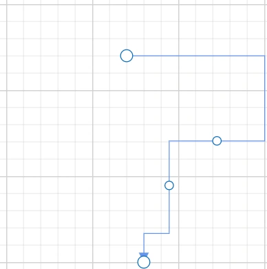
How to Limit Segment Thumbs in a Connector
The MaxSegmentThumbs property limits the number of segment thumbs displayed on a connector. Segment thumbs are interactive handles that allow users to modify the connector’s path. By setting this property, you can limit how many thumbs appear, helping to simplify the user interface and reduce visual complexity.
@using Syncfusion.Blazor.Diagram

<SfDiagramComponent @ref="diagram" id="diagram" Width="1400px" Height="600px" @bind-Connectors="connectors">
</SfDiagramComponent>

@code {
    private SfDiagramComponent? diagram;
    private DiagramObjectCollection<Connector> connectors = new DiagramObjectCollection<Connector>();

    protected override void OnInitialized()
    {
        // Create orthogonal connector with custom segments and styling.
        Connector orthogonalConnector = new Connector()
        {
            ID = "orthogonal",
            SourcePoint = new DiagramPoint() { X = 550, Y = 200 },
            TargetPoint = new DiagramPoint() { X = 650, Y = 300 },
            Style = new ShapeStyle() { StrokeColor = "#6495ED" },
            Constraints = ConnectorConstraints.Default | ConnectorConstraints.DragSegmentThumb,
            TargetDecorator = new DecoratorSettings()
            {
                Shape = DecoratorShape.Arrow,
                Style = new ShapeStyle() { StrokeColor = "#6495ED", Fill = "#6495ED" }
            },
            Type = ConnectorSegmentType.Orthogonal,
            // Define orthogonal segments (Type on each segment is redundant and omitted).
            Segments = new DiagramObjectCollection<ConnectorSegment>()
            {
                new OrthogonalSegment
                {
                    Length = 60,
                    Type = ConnectorSegmentType.Orthogonal,
                    Direction = Direction.Right
                },
                new OrthogonalSegment
                {
                    Length = 60,
                    Type = ConnectorSegmentType.Orthogonal,
                    Direction = Direction.Bottom
                }
            },
            MaxSegmentThumbs = 2
        };
        connectors.Add(orthogonalConnector);
    }
}
A complete working sample can be downloaded from GitHub.
The following example demonstrates how to update the MaxSegmentThumbs value at runtime for both selected connectors and all connectors in the diagram.
@using Syncfusion.Blazor.Diagram
@using Syncfusion.Blazor.Buttons

<div class="d-flex flex-column gap-3">
    <div class="d-flex align-items-center gap-3 p-3 bg-light rounded">
        <SfButton Content="Update Selected Connectors (Max 5)" IsPrimary="true" OnClick="UpdateSelectedConnectorThumbs" CssClass="btn-selected">
        </SfButton>
        <SfButton Content="Update All Connectors (Max 6)" OnClick="UpdateAllConnectorThumbs"CssClass="btn-all">
        </SfButton>
    </div>
    <SfDiagramComponent @ref="diagram" id="diagram" Width="1400px" Height="600px" @bind-Connectors="connectors">
    </SfDiagramComponent>
</div>

@code {
    private SfDiagramComponent? diagram;
    private DiagramObjectCollection<Connector> connectors = new DiagramObjectCollection<Connector>();

    protected override void OnInitialized()
    {
        // Create orthogonal connector with custom segments and styling.
        Connector orthogonalConnector = new Connector()
        {
            ID = "orthogonal",
            SourcePoint = new DiagramPoint() { X = 550, Y = 200 },
            TargetPoint = new DiagramPoint() { X = 650, Y = 300 },
            Style = new ShapeStyle() { StrokeColor = "#6495ED" },
            Constraints = ConnectorConstraints.Default | ConnectorConstraints.DragSegmentThumb,
            TargetDecorator = new DecoratorSettings()
            {
                Shape = DecoratorShape.Arrow,
                Style = new ShapeStyle() { StrokeColor = "#6495ED", Fill = "#6495ED" }
            },
            Type = ConnectorSegmentType.Orthogonal,
            // Define orthogonal segments (Type on each segment is redundant and omitted).
            Segments = new DiagramObjectCollection<ConnectorSegment>()
            {
                new OrthogonalSegment
                {
                    Length = 60,
                    Type = ConnectorSegmentType.Orthogonal,
                    Direction = Direction.Right
                },
                new OrthogonalSegment
                {
                    Length = 60,
                    Type = ConnectorSegmentType.Orthogonal,
                    Direction = Direction.Bottom
                }
            },
            // Limit the number of visible/draggable segment thumbs.
            MaxSegmentThumbs = 2
        };
        connectors.Add(orthogonalConnector);
    }

    // Updates MaxSegmentThumbs to 5 for all currently selected connectors at runtime.
    private void UpdateSelectedConnectorThumbs()
    {
        if (diagram?.SelectionSettings?.Connectors != null)
        {
            for (int i = 0; i < diagram.SelectionSettings.Connectors.Count; i++)
            {
                // Set segment thumb limit for selected connector only.
                diagram.SelectionSettings.Connectors[i].MaxSegmentThumbs = 5;
            }
        }
    }

    // Updates MaxSegmentThumbs to 6 for all connectors in the diagram at runtime.
    private void UpdateAllConnectorThumbs()
    {
        if (diagram?.Connectors != null)
        {
            for (int i = 0; i < diagram.Connectors.Count; i++)
            {
                // Set segment thumb limit for each connector in diagram.
                diagram.Connectors[i].MaxSegmentThumbs = 6;
            }
        }
    }
}A complete working sample can be downloaded from GitHub.
Note: The
MaxSegmentThumbsproperty is applicable only when the connector type is set to Orthogonal.