Automatic Layout in Diagram Component
3 Jul 202616 minutes to read
The Diagram component includes a set of built-in automatic layout algorithms that arrange nodes within the diagram area based on predefined layout logic. This feature, referred to as Layout, simplifies organizing nodes and their connections, providing a clear and visually appealing structure for diagrams. The Diagram component supports the following layout algorithms:
- Organizational chart layout
- Flowchart layout
- Mind map tree layout
- Radial tree layout
- Hierarchical tree layout
- Complex Hierarchical tree layout
- Force-Directed tree layout
Defining layout
To implement an automatic layout in a diagram, configure the layout settings within the SfDiagramComponent. The layout Type, spacing, and other properties control how nodes and connectors are arranged in the diagram.
The following code illustrates how to configure an automatic layout:
@using Syncfusion.Blazor.Diagram
<SfDiagramComponent Height="600px" Nodes="@_nodes" Connectors="@_connectors" NodeCreating="@OnNodeCreating" ConnectorCreating="@OnConnectorCreating">
<Layout Type="LayoutType.HierarchicalTree" @bind-HorizontalSpacing="@HorizontalSpacing" @bind-VerticalSpacing="@VerticalSpacing">
</Layout>
<SnapSettings>
<HorizontalGridLines LineColor="white">
</HorizontalGridLines>
<VerticalGridLines LineColor="white">
</VerticalGridLines>
</SnapSettings>
</SfDiagramComponent>
@code
{
//Defines diagram's connector collection.
private DiagramObjectCollection<Connector> _connectors = new DiagramObjectCollection<Connector>();
//Defines diagram's node collection.
private DiagramObjectCollection<Node> _nodes = new DiagramObjectCollection<Node>();
private LayoutType type = LayoutType.ComplexHierarchicalTree;
private int HorizontalSpacing = 50;
private int VerticalSpacing = 50;
private void OnNodeCreating(IDiagramObject obj)
{
Node node = obj as Node;
node.Height = 60;
node.Width = 110;
node.Style = new ShapeStyle() { Fill = "#6BA5D7", StrokeWidth = 2, StrokeColor = "none" };
}
private void OnConnectorCreating(IDiagramObject connector)
{
(connector as Connector).Type = ConnectorSegmentType.Orthogonal;
(connector as Connector).CornerRadius = 5;
(connector as Connector).TargetDecorator = new DecoratorSettings() { Style = new ShapeStyle() { Fill = "#6CA0DC", StrokeColor = "#6CA0DC" } };
(connector as Connector).Style = new ShapeStyle() { StrokeColor = "#6CA0DC" };
}
protected override void OnInitialized()
{
_nodes = new DiagramObjectCollection<Node>()
{
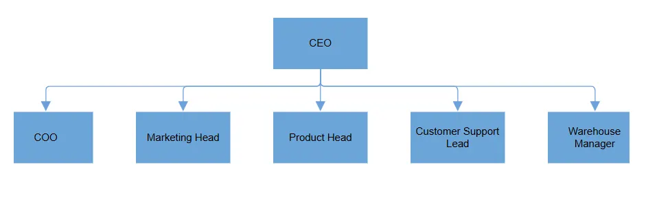
new Node() { ID = "node1", Annotations = new DiagramObjectCollection<ShapeAnnotation>() { new ShapeAnnotation { Content = "CEO" } } },
new Node() { ID = "node2", Annotations = new DiagramObjectCollection<ShapeAnnotation>() { new ShapeAnnotation { Content = "COO" } } },
new Node() { ID = "node3", Annotations = new DiagramObjectCollection<ShapeAnnotation>() { new ShapeAnnotation { Content = "Marketing Head" } } },
new Node() { ID = "node4", Annotations = new DiagramObjectCollection<ShapeAnnotation>() { new ShapeAnnotation { Content = "Product Head" } } },
new Node() { ID = "node5", Annotations = new DiagramObjectCollection<ShapeAnnotation>() { new ShapeAnnotation { Content = "Customer Support Lead" } } },
new Node() { ID = "node6", Annotations = new DiagramObjectCollection<ShapeAnnotation>() { new ShapeAnnotation { Content = "Warehouse Manager" } } },
};
_connectors = new DiagramObjectCollection<Connector>()
{
new Connector() { ID = "connector1", SourceID = "node1", TargetID = "node2" },
new Connector() { ID = "connector2", SourceID = "node1", TargetID = "node3" },
new Connector() { ID = "connector3", SourceID = "node1", TargetID = "node4" },
new Connector() { ID = "connector4", SourceID = "node1", TargetID = "node5" },
new Connector() { ID = "connector5", SourceID = "node1", TargetID = "node6" }
};
}
}A complete working sample can be downloaded from GitHub
How to Update Layout
Use the DoLayoutAsync function to re-arrange nodes in the diagram when any of the following occur:
- Add
- Remove
- Move
- Resize
- Spacing
- Orientation
- Layout Type
- Alignment
This function refreshes the layout to reflect recent updates. Invoking this method ensures that the diagram remains visually consistent and properly aligned following changes to its structure or properties. It offers an efficient mechanism for updating the diagram layout in response to user interactions or programmatic modifications, thereby maintaining smooth transitions and an organized appearance.
The function can be called on-demand, making it flexible for use in scenarios where automatic layout updates are required only at specific times, such as after multiple changes or interactions.
How to Configure Spacing in Layouts
The HorizontalSpacing and VerticalSpacing properties customize the space between successive nodes in the diagram, both horizontally and vertically. These properties help control the overall layout and visual organization of nodes, ensuring clear and consistent spacing across the diagram.
-
HorizontalSpacing: Space between nodes along the horizontal axis. Useful for flowcharts, organizational charts, or radial layouts. -
VerticalSpacing: Space between nodes along the vertical axis. It ensures a balanced distribution of nodes in layouts such as hierarchical trees or mind maps.
Default values: HorizontalSpacing is 30 and VerticalSpacing is 30. Modify these to achieve the required layout density.
<SfDiagramComponent @ref="_diagram" Width="900px" Height="800px">
    <Layout Type="LayoutType.ComplexHierarchicalTree" @bind-HorizontalSpacing="@HorizontalSpacing" @bind-VerticalSpacing="@VerticalSpacing"/>
</SfDiagramComponent>

@code
{
    private SfDiagramComponent _diagram;
    // Initializing the Horizontal and Vertical value.
    private int HorizontalSpacing = 60;
    private int VerticalSpacing = 70;

    // Update the spacing.
    private void UpdateSpacingAsync()
    {
        _diagram.BeginUpdate();
        HorizontalSpacing += 10;
        VerticalSpacing += 10;
        _diagram.EndUpdateAsync();
    }
}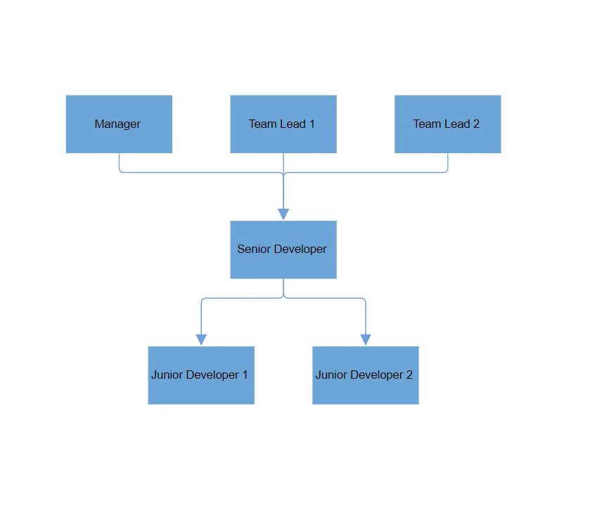
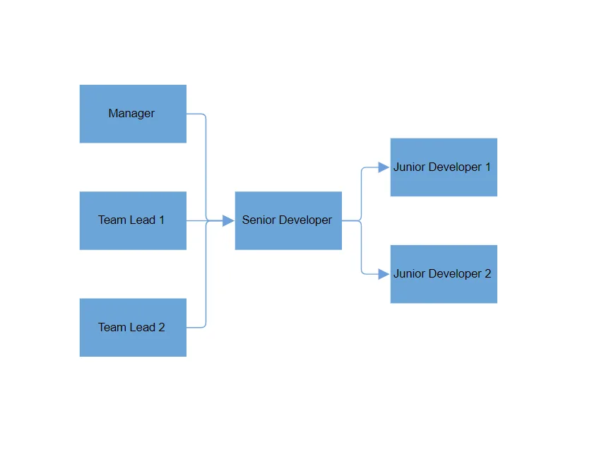
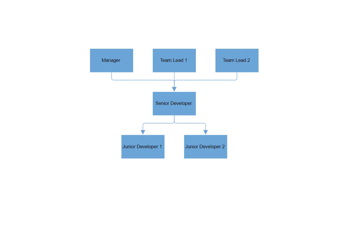
How to Configure Layout Orientation
Orientation is used to arrange the layout based on the direction. It determines how the nodes are aligned in the diagram. The default value for orientation is TopToBottom, which arranges the nodes vertically with the root placed at the top.
| Orientation Type | Description |
|---|---|
| TopToBottom | Aligns the layout from top to bottom. The root node is placed at the top of the diagram. |
| BottomToTop | Aligns the layout from bottom to top. The root node is placed at the bottom of the diagram. |
| LeftToRight | Aligns the layout from left to right. The root node is placed on the left side of the diagram. |
| RightToLeft | Aligns the layout from right to left. The root node is placed on the right side of the diagram. |
<SfDiagramComponent @ref="_diagram" Width="900px" Height="800px">
    <Layout Type="LayoutType.ComplexHierarchicalTree" @bind-Orientation="@orientation"/>
</SfDiagramComponent>

@code
{
    private SfDiagramComponent _diagram;
    // Initializing the orientation value.
    private LayoutOrientation orientation = LayoutOrientation.LeftToRight;
}
Note: Orientation is not applicable to the RadialTree layout. For the Flowchart layout, only TopToBottom and LeftToRight orientations are supported.
How to Configure Layout Alignments
HorizontalAlignment and VerticalAlignment control how the layout is positioned or stretched along the horizontal and vertical axes, respectively. These settings determine the positioning of the diagram elements (nodes and connectors) within the available space.
The HorizontalAlignment property defines horizontal alignment within the container. The default value is Auto, which aligns automatically based on content.
The possible values for HorizontalAlignment are:
| Horizontal Alignment | Description |
|---|---|
| Stretch | Stretches the diagram element horizontally to its immediate parent, filling the available space. |
| Left | Aligns the diagram element to the left side of its immediate parent. |
| Right | Aligns the diagram element to the right side of its immediate parent. |
| Center | Aligns the diagram element horizontally to the center of its immediate parent. |
| Auto | Aligns the diagram element based on its immediate parent’s horizontal alignment property (default behavior). |
<SfDiagramComponent @ref="_diagram" Width="900px" Height="800px">
    <Layout Type="LayoutType.ComplexHierarchicalTree" @bind-HorizontalSpacing="@HorizontalSpacing" @bind-VerticalSpacing="@VerticalSpacing" @bind-HorizontalAlignment="@horizontalAlignment"></Layout>
</SfDiagramComponent>

@code
{
    private SfDiagramComponent _diagram;
    private int HorizontalSpacing = 40;
    private int VerticalSpacing = 40;
    // Initializing the HorizontalAlignment value.
    private HorizontalAlignment horizontalAlignment = HorizontalAlignment.Center;
}
The VerticalAlignment property defines how the layout is aligned vertically within the container. The default value is Auto, which means the layout adjusts based on its content.
The possible values for VerticalAlignment are:
| Vertical Alignment | Description |
|---|---|
| Stretch | Stretches the diagram element vertically to its immediate parent, filling the available space. |
| Top | Aligns the diagram element to the top side of its immediate parent. |
| Bottom | Aligns the diagram element to the bottom side of its immediate parent. |
| Center | Aligns the diagram element vertically to the center of its immediate parent. |
| Auto | Aligns the diagram element based on its immediate parent’s vertical alignment property (default behavior). |
<SfDiagramComponent @ref="_diagram" Width="900px" Height="800px">
    <Layout Type="LayoutType.ComplexHierarchicalTree" @bind-HorizontalSpacing="@HorizontalSpacing" @bind-VerticalSpacing="@VerticalSpacing" @bind-VerticalAlignment="@verticalAlignment"></Layout>
</SfDiagramComponent>

@code
{
    private SfDiagramComponent _diagram;
    private int HorizontalSpacing = 40;
    private int VerticalSpacing = 40;
    // Initializing the VerticalAlignment value.
    private VerticalAlignment verticalAlignment = VerticalAlignment.Bottom;
}
How to Configure Layout Margins
The LayoutMargin property defines the space between the viewport and the layout, creating padding around the diagram. The default margin values are Left: 50, Top: 50, Right: 0, Bottom: 0.
You can customize the margin for each side (top, right, bottom, left) using the LayoutMargin object:
<SfDiagramComponent Height="600px">
    <Layout Type="LayoutType.OrganizationalChart">
        <LayoutMargin Top="@top" Bottom="@bottom" Right="@right" Left="@left"></LayoutMargin>
    </Layout>
</SfDiagramComponent>

@code
{
    // Initializing the Margin.
    private int left = 60;
    private int top = 50;
    private int bottom = 50;
    private int right = 60;
}
How to Handle Connector Segment Overlap in Layout
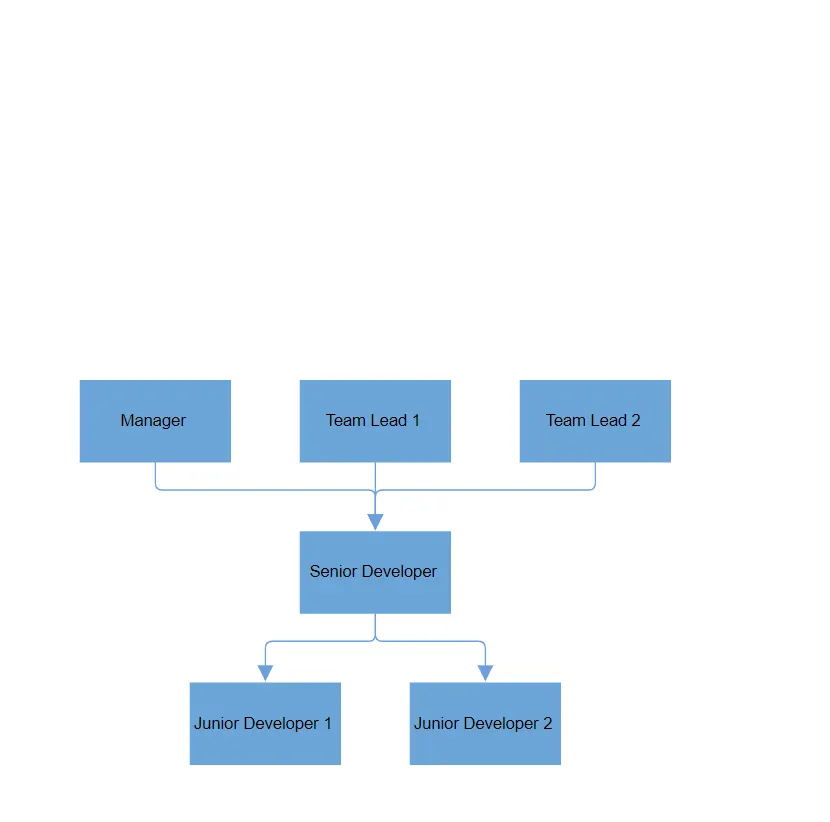
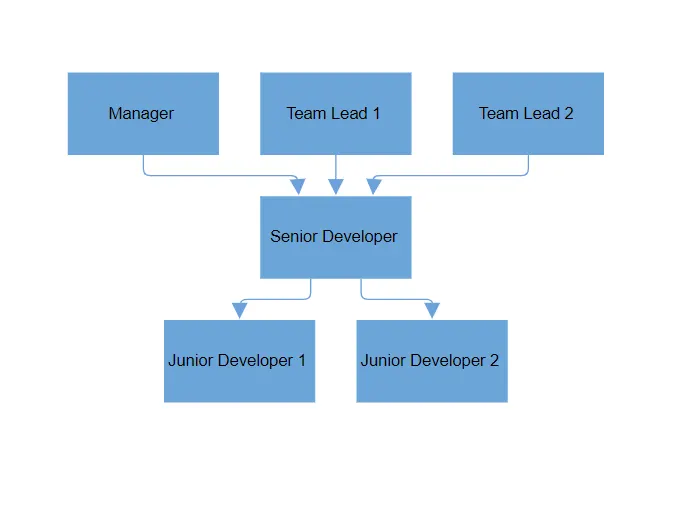
The SamePoint property controls whether connectors in the layout should be arranged to avoid overlapping other connectors. Setting this property to true, ensures connectors are spaced out properly to avoid any overlap, making the layout more readable and visually clear.
- true: Connectors are arranged to avoid overlapping with other connectors (default).
- false: Connectors can overlap with each other.
Here’s an example of how to use this property:
<SfDiagramComponent @ref="_diagram" Width="900px" Height="800px">
    <Layout Type="LayoutType.ComplexHierarchicalTree" SamePoint="false"></Layout>
</SfDiagramComponent>

@code
{
    private SfDiagramComponent _diagram;
}
See also
-
Create and Render the Organization Chart Diagram by Using SQL Database
-
How to Create the Org Chart Blazor Diagram by Using MDF Database
-
How to Change the Parent Child Relationship in Layout at Runtime
-
How to Customize Connector Styles in a Hierarchical Layout in Blazor Diagram
-
How to Disable Node Interaction While Maintaining Layout Updates in Blazor Diagram
-
How to Embed Diagrams Inside Panels of a Dashboard Layout in Blazor
-
How to Generate a Hierarchical Layout with Annotation at Runtime
-
How to Integrate SfDiagramComponent into a SfTab in a Blazor Application